I Didn’t Know That! Adobe Photoshop CS6 Help and Tutorials Download

If you are like me, I have been frustrated recently with all the software that does not come with a manual. Usually you can find the manual on line and that is OK, but I am a person that likes to have the “book” in my hands. I was lucky enough to find the newest info from Adobe and if you would like to download it like I did, here is the PDF link to the 765 page PDF file called the Adobe Photoshop Help and Tutorials. I have also included the website link for Help documents for Creative Suite CS5, CS5.1, CS5.5, and CS6 applications (PDF and HTML) for all their associated programs. I am hoping this will help when I have a problem in Photoshop. There is also a link to a 66 page reference file on Photoshop CS6 Adobe Bridge, Mini Bridge and Camera Raw specifically. So far I have not found one for Lightroom, but I am still looking. Hope you get some use from it also……Digital Lady Syd
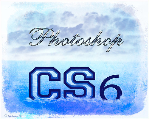
Here is a quick explanation of how I created this image: Created New Document and then added a Color Fill Adjustment Layer and used the a sampled light blue color from the Photoshop logo. Created the Photoshop text using Comsi Script 40 that I have had for ages and added a layer style I created following a tutorial called Elegant Glass-Gorgeous Text Effect. Next I used a different font called Freshman – added my Thin Double Edge Frame Layer Style and used dark blue and light blue for colors. Caleb Kimbrough from Lost & Taken’s Summer 4 texture was applied placing it above the Color Fill Adjustment Layer and setting the layer to Overlay at 100% opacity. On a New Layer above it, using my SJ Cloud 5 brush enlarged to fit, a darkish blue color was brushed once to look nice – the layer was then set to 39% opacity. The CS6 text layer was rasterized and then Free Transformed to make larger – a layer mask was applied and the center of the letters was lightly painted out to show the water inside. A New Layer was created and some white water looking waves were placed along the bottom edge of the type to make it look like it was floating. This layer was set to 56% opacity. The ShadowHouse Creations Mask Overlay MO8-2912-5 was placed on top and set to Overlay blend mode to frame the image.


Leave a Reply
You must be logged in to post a comment.