Using a Color Fill Adjustment Layer as a Spotlight

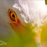
This image is of the Philippine Ground Orchid, a very dainty small pink flower. I am using this image as an example of how you can use a Color Fill Adjustment Layer as a subtle spotlight to direct the eye in the image but with a color vignette feel. I processed this image using Russell Brown’s Paper Texture Panel (I just love this panel and these textures – check out my blog Russell Brown’s Paper Texture Panel – A Real Winner! to download and use for free). Flypaper’s Apple Blush Texture was set to Hard Light Blend Mode at 71% Opacity and gave the image a very greenish look but with that great canvas texture. The Muscatel Texture was added next and set to Overlay Blend Mode at 29% Opacity to slightly darken the image and add some orange tones. Since I felt like the green was still a little overwhelming, a Color Fill Adjustment Layer was added – a royal blue color was selected and set to 54% Opacity. In the Color Fill Adjustment Layer’s white Layer Mask, a very soft large brush was set to 15% opacity and with black set as the color, the blue color was gently painted out to give the subtle spotlight effect from the light green tones underneath that will direct the eye. This is a great little trick if you need to draw the eye into a certain part of an image and works very well with flower images. I also like adding my own colors into an image. Have fun experimenting…..Digital Lady Syd
Digital Lady Syd’s Related Blogs:
That Soft, Dreamy Look
Russell Brown Texture Panel Landscape Image
Adding a Texture for Flair!
Keeping Focus Where You Want It Using Focal Point 2 and Color Fill Adjustment Layer


Leave a Reply
You must be logged in to post a comment.