A Vintage Landscape Look on a Scottish Monument

I loved the way this image turned out – never expected it to be this pretty considering it was an image I snapped while standing on the street in front of our hotel. It is Nelson Monument (in center) and Acropolis (aka National Monument of Scotland on left corner) on Calton Hill – I did not get to visit this site but wish I had. This was not difficult to process once I got going. After cleaning up a rather boring image, Topaz (see sidebar for website link) Simplify 4 was opened and a preset I call the John Barclay BuzSim Setting preset was used, (The settings are: Simplify: Colorspace RGB, Simplify Size 0.19, Details Boost 1.00, and Details Size 0.20; Adjust: Brightness 0.01, Contrast 1.08, Saturation 1.03, Saturation Boost 1.15, Structure 1.00, and Structure Boost 1.00; and Edges: Edge Type – Color Edge Normal, Edge Strength 0.00, Simplify Edge 0.30, Reduce Weak 10.00, Reduce Small 0.20 and Flatten Edge 0.00.) I listened to one of John’s excellent videos on Topaz Labs and created this preset which has a very subtle result. Next I added 2 lil Owls (see sidebar for website link) Workshop 6 – Texture 1 which has the beautiful turquoise and light yellow sky color – the layer was set to Overlay Blend Mode. The beautiful text was supplied by my favorite Shadowhouse Creations – his Text Brush 5. I actually clipped a bright green Color Fill Adjustment Layer to the text (to clip just ALT+click between the two layers and the color fill adjustment layer will only affect the layer below) – then the text layer was set to 55% opacity. Another 2 Lil’ Owls Texture – texture 4 was used as an overlay frame (follow the steps in my blog How To Make Frames or Borders – scroll down to the section called “To save the frame you created as an overlay to use again”). A light yellow Color Fill Adjustment Layer was clipped to the texture file. A Curves Adjustment Layer where the red, green and blue channels were adjusted to get this slight vintage feel. The last thing done was to add a Color Fill Adjustment Layer to the whole image using a soft cream color (#c6c3bd) and then Nelson Monument was painted out in the layer mask so the eye is drawn to that area of the image. Had a lot of fun as usual – never get tired of this!…..Digital Lady Syd
Adding Texture to a Landscape
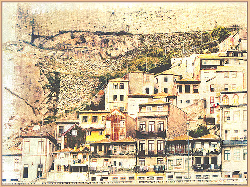
Usually I use my own images to alter, but I found this beautiful texture image of old buildings in Porto, Portugal, from Mayang’s Free Textures (scroll down a ways in link to see original) and it seemed like a good candidate to see what I could do with some more textures to enhance it some. Click their link to see the original image and lots of others that can be used for personal use.
This image was first processed using Topaz (see sidebar for website link) photoFXlab. First duplicated the layer. On top layer the Black & White Effects plug-in was opened and Hand Tinted Chiffon was selected with Transparency set to 1.00 and Vignette Strength to .45. After applying the plug-in, back in photoFXlab this layer was set to Linear Light at 100%. A +From Stamp layer was created and these Adjustment tab sliders set: Tint -8, Saturation 17, and Dynamics -28. Next exited to Photoshop where some clean up was done and French Kiss Artiste Collection Fantasie texture was applied. Two Hue/Saturation Adjustments Layers were added with black filled layer masks – the red-orange color needed to be adjusted and the greens above the buildings were off. These areas were painted back in the masks to create the correct tone in the image. An Ash texture (no long available – but Shadowhouse Creations has a very similar texture called ArtGrunge 5 which would give a very similar effect) and it was set to Hard Light blend mode at 45%. A hazy feel was added to the image by adding a Levels Adjustment Layer and just moving the Output Level black tab to 80. A Curves Adjustment Layer was added next to just slightly add contrast. This image had a very low resolution on it so I created a composite layer on top (CTRL+ALT+SHIFT+E) and went to Image -> Image Size and checked the Resample Image box and set the resolution to 240, leaving the size alone. The last step was adding my Mid Size Double Edge Frame layer style – sampled colors in the image for frame colors. I was really pleased with how painterly this image turned out. It is a little different from creating a flower type texture image, but you can really add some creative aspects with a little experimenting. And thank you Mayang.com for supplying such a interesting image to work with!….Digital Lady Syd

