I Didn’t Know That! Converting Lightroom Preset to Adobe Camera Raw Preset
 |
I occasionally come across a need to take a Lightroom preset and use it as a preset in Adobe Camera Raw. This is not as complicated as it seems. Below are the steps required to accomplish this task.
1. Apply the preset in Lightroom and make sure you know which panels and sliders you used. (If preset not already created, to save preset in Lightroom, on left side of Presets line, click (+) for “Create New Preset.” Name preset.)
2. Right click on image in Lightroom and select Edit in -> Open as Smart Object in Photoshop. The image is opened in Photoshop with the Smart Object icon on bottom right of thumbnail in Layers Panel.
3. Double click on thumbnail and it opens up into Adobe Camera Raw. Go to Presets panel (9th icon over on righthand side under the histogram) and the click folder icon at the bottom of the panel to open the New Preset dialog. Name and click the items you want included in the preset, then click OK. Your new preset shows up in the Presets panel.
You can now use your Lightroom preset anytime you want in Adobe Camera Raw also. I usually start my personal preset names off with an SJ so I know they are mine. It is easy to get presets from many different sources as time goes on so it helps to know which are yours.
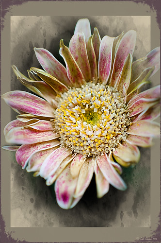
The image above is of a miniature mum in my yard. Hover over the image to see how the image looked with just a Lightroom preset I created called Dark Vignette – it makes the background very dark behind the flower. For information on how to create this preset and how the image was finished, see bottom of blog for details.
Hope this helped you get a little more organized…..Digital Lady Syd
To create this preset, changes were made to: the Tone Curve set to Highlights -24, Lights +41, Darks -56, and Shadows -54; HSL – Luminance sliders set to Red -41, Orange -9, Purple -2, Magenta -50 and all others 0, and Saturation sliders set to Red -2, Purple +32, Magenta +59 and all others set to 0; Effects Post-Crop Vignetting Style set to Highlight Priority with Amount -61, Midpoint 33 Feather 0 and others set to 0. To finish, image was sharpened and OnOne PhotoFrames (see sidebar for website link) acid burn controlled 15 was added and reduced in size in the plug in, and then grunge 12 was added on top – in Photoshop petals were painted over frame edge using a layer mask on first acid burn frame.
Digital Lady Syd Related Blogs:
Colorful Blown Out Look Lightroom and Adobe Camera Raw Preset
Settings for Vivid Drawing Look ACR/Lightroom Preset and NIK Color Efex Pro 4 Pseudo HDR Recipe
Photoshop CS5 and Elements: Hand-Tinting the Easy Way
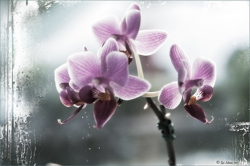 |
The above purple orchard was on the table at the Ming Court Restaurant in Orlando, Florida (one of our favorite restaurant in Orlando). I was not really happy with the original image (hover over image to see) – the flowers came out a little soft to my liking. I was pleased to see this hand-painting technique saved a beautiful flower image and gave it a soft painterly feel.
The steps to create this look are easy and could probably be put in an action. The process was taken from an article in Mastering Digital Photo Processing Magazine from the Fall 2008 issue. Here are the basic steps to creating this image:
1. Do any exposure adjusting in Lightroom or Adobe Camera Raw.
2. In Photoshop, create two copies of the original layer and turn off the top layer.
3. On middle layer convert image to black and white – I used the Black and White Adjustment Layer to get a nice conversion. There are so many ways to do this – choose your favorite. For Elements users, go to Enhance -> Convert to Black and White and select one of the canned styles as a starting point – then adjust the sliders, especially the contrast slider.
4. Turn on the top layer and add a Gaussian Blur filter with a Radius set to 18. Change blend mode to Overlay (or try others if you do not like the effect) and lower the opacity to get the pleasing hand-painted look. The opacity for the above was 61%.
Optional Step – Can add a Photo Filter Adjustment Layer. Choose a color using the Color swatch and adjust the Density slider. The magazine suggested this can “increase the sense of oils being applied over a black-and-white print.” I did not do this here, but it did give an interesting look with the default Warming Filter (85) color.
5. At this point a New Layer was created and the Sharpen Tool was used to show definition more clearly between the flower petals.
6. A Curves Adjustment Layer was added for contrast. Elements users add Levels Adjustment Layer.
7. To add a border or layer style, create a Composite Layer on top (CTRL+ALT+SHIFT+E). OnOne’s PhotoFrame Taufer_Texture_10 was added to give the frosted window effect – one of my favorite looks. (See sidebar for OnOne’s website link.)
That’s it! A pretty easy workflow and it gives a beautiful soft look. Hope you enjoy trying this short and sweet workflow – until next time…..Digital Lady Syd
Another OnOne Perfect Effects Pix – Got to Love It!
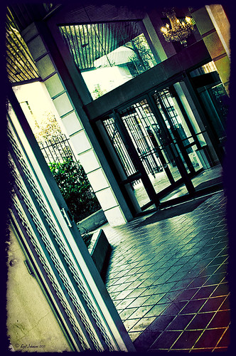 |
I discovered I really liked this image of an entryway into a building in Jackson, Mississippi, that was completely empty. Really sad to see such a nice space and nothing in it. Anyway, when I took the picture there was some vertical distortion (hover over image to see original) that I was not able to get rid of easily. While inside the Lens Correction Filter trying to straighten up these bowing lines, I discovered that the image looked really neat twisted – so that is how this picture started out.
The image was still a little flat so I decided to experiment some more in the updated plug-in from OnOne called Perfect Effects (see sidebar for website link). This image has three effects stacked – in Black & White tab, Roadie filter was chosen and set to Overlay blend mode at 73%; in Movie Looks, Urban Sickness set to Color blend mode at 78%; and in Vintage, Nicely Toasted set to Darken blend mode at 100%. The layer was duplicated and rasterized (right click layer and select rasterize to get rid of smart object) and the Sponge Tool was applied to the yellow leaves in the background to color them a bit more. On a duplicate layer a High Pass filter set to 9.1 was to sharpen the image and set to Soft blend mode. A final Curves Adjustment Layer was added for contrast and OnOne.s PhotoFilter acid burn controlled frame. That is it and I love the results!
This is how I like to experiment – just try different things as you go into the various parts of Photoshop – it can be amazing what you come up with. I did not imagine this image as a diagonal, but it really does the image justice. I hope this will give you some inspiration to try this technique on some of your pictures – it can be quite interesting…..Digital Lady Syd
Digital Lady Syd’s Related Blogs:
Digital Lady Syd’s Review of OnOne Perfect Effects
Pseudo HDR in OnOne Perfect Effects
First Try – OnOne’s Perfect Effects 3
Elements or CS5: Stacking the Same Image for Effect
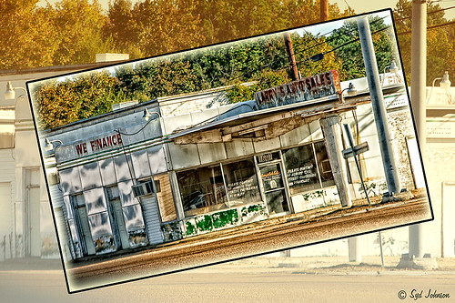
This image was created in Photoshop Elements 10 – it is of an old abandoned gas station not too far from the airport in Jackson, Mississippi. I am still figuring out this program so this was definitely just playing around and getting used to what the program can do. To create this optical illusion, follow these steps.
1. Open up image into Elements (or CS) and duplicate the layer (click OK in the dialog that opens).
2. In this case the top layer was taken into Nik Color Efex Pro 4 and an HDR preset was added to create the HDR effect. (If you have the plug-in or are using it as a trial version, my blog “Settings for Vivid Drawing Look ACR/Lightroom Preset and NIK Color Efex Pro 4 Pseudo HDR Recipe” has the preset settings you can enter manually or download already as a preset.) Any effect can be applied here.
3. After coming back into Elements (or CS), add a Layer Style was added – used an inner Glow using the default color at 114 pixels and opacity at 75%, and a black Stroke set to 18 pixels at 100% opacity. At this point the image can be transformed and rotated like the image above.
4. Next the bottom layer was highlighted and a New Layer was added below (ALT+click on the New Layer Icon) and filled with a beige color (CTRL+Backspace).
5. Set the image layer to Multiply blend mode at 88% opacity to make the bottom image much softer.
6. Go to the Adjustment Layers (third icon at bottom of Layers Palette) and select Gradient Map – the Light Brown gradient was chosen and the Layer was set to Soft Light blend mode to make image even softer.
7. Finally add a Levels Adjustment Layer to bring back a little contrast of the whole image.
8. The Sharpen Tool or Unsharp Mask filter can be added at this point if you want to sharpen the top layer image but since the Pseudo HDR preset was applied in NIK, it oversharpened the above image.
9. I created a Text Layer with my name and the copyright symbol was added using the Custom Shape Tool.
I was really pleased with the results and it gives an interesting effect. Try experimenting with the different layer combinations and see what you can get. It could turn out to be unexpectedly interesting!…..Digital Lady Syd
Another Pseudo HDR Image with NIK CEP4 – Got to Love the Effect!
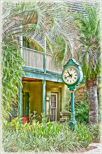
I am loving this pseudo HDR effect with NIK Color Efex Pro 4 (CEP4). This image just about represents my look when I am processing a picture – just love the sharpness and color. Before it took a lot more manipulation to get to the same place but with CEP4, it just pops into place. The steps I used to process this image are as follows:
1. In Lightroom, I applied my Vivid Drawing Look ACR/Lightroom Preset (see below for my blog link where you can manually apply the settings or download the presets). The Exposure, Blacks and Fill Light were adjusted just a bit and it was opened up in Photoshop.
2. Open image up as a regular copy and do any clean up using Clone Stamp or Healing Brush.
3. Duplicate cleaned up image layer and Convert to a Smart Object by right clicking on the layer and selecting Convert to a Smart Object.
3. Go into CEP4 and use the following filter effects stacked top to bottom:
- Apply Tonal Contrast, Darken/Lighten Center, Detail Extractor, (these three filters are contained in my Pseudo HDR1 recipe (see Settings for Vivid Drawing Look ACR/Lightroom Preset and NIK’s CEP4 Pseudo HDR Recipe to download or enter slider amounts manually);
- Glamour Glow with 3 control points (each covering 20% of image) to remove most of the effect from clock face and center of porch (Glow 32%, Saturation -100%, and Glow Warmth -47%, Shadows 41%, and Highlights 44%);
- Photo Stylizer adding a plus control point in center of image to place effect just there covering 42% of image (Varitone, Style 6, Strength 67%); and
- Vignette (Vignette Color whitish as sampled from image, Shape 2, Adapt Edges 0%, Transition 80%, Size 0%, and Opacity 43%).
3. After coming out of the plug-in and back into Photoshop, the image was sharpened with the Unsharp Mask filter although I now prefer the more localized use of the Sharpen Tool.
4. Added Inner Glow and Stroke Layer Styles.
5. Added a Curves Adjustment Layer to get that good final contrast.
6. One of the things I did do on this image was double-click on the right side of the Color Efex Pro 4 layer inside the Smart Object and reduced the effect to 75%.
I love the final result – it really looks like the old historic St. Augustine on the day I visited. Try this little recipe on one of your detailed images and see if you like what you see…..Digital Lady Syd
Related Digital Lady Syd blogs:
Pseudo HDR Using NIK Color Efex Pro 4
Where Am I?
With One Good Photo – Try the Pseudo HDR Effect
Why I Love Topaz Adjust!
Defringe that Nasty Blue Edge from Trees On a Bright Blue Sky!
 |
This is a short but sweet way to get rid of most of those blue and cyan edges on trees shot in bright light against a blue sky. There are just times you have to take that image in the bright light of day and the fringe occurs frequently. These tips also work when you have a horizon line in a landscape shot that has similar issues.
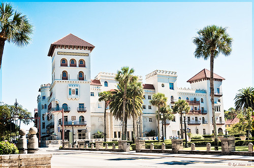
Hue/Saturation Adjustment Layer: The image above has that very problem and this method was used to get rid of most of the fringe. Hover the above image to see the before defringing image.
1. Simply add a Hue/Sat Adjustment Layer in Photoshop and in the Master field drop-down, adjust the Saturation slider left quite a bit and possibly the Hue slider a little until the blue edging disappears. For the above both Blue (Saturation set to -50 and Hue set to -8) and Cyan (Saturation set to -64).
2. Then Fill the attached adjustment layer mask with black (click on mask and CTRL+Backspace).
3. Click on the black layer mask and use a white brush to paint around the edges at roughly 40% opacity to remove the fringe color. You may have to go over it a couple of times but it will look more natural than setting the brush to 100% and painting over just once. You may need to adjust the opacity of the brush down more so the desaturation is not so noticeable.
Sponge Tool Method: Perhaps the easiest way to get rid of any extra fringe that might still be lurking in the image is to select the Sponge Tool and set it to Mode Desaturate. Turn off Vibrance in the Options Bar since that will only work on the more or less saturated colors and not the already saturated colors which we want to get rid of. Brushed over the fringe areas but try not to discolor too much of the neighboring sky also – it will look white and not the natural blue sky color.
Camera Raw Method: Open image in Lightroom or ACR and go to the Lens Correction Panel Manual Tab in the Chromatic Aberration section, set the Defringe to All Edges and adjust the Red/Cyan slider to the left and Blue/Yellow slider to the right to get the best result. This may take a bit of adjusting to get the right balance and watch out for any color shifts in the sky area around the leaves. There is no way to use a Saturation Adjustment Brush effectively to paint out the fringe as it does not have the choice of colors to remove – it desaturates everything you paint over – and it is hard to just pinpoint the fringe.
Saturation Layer: Digital Lady Syd’s Favorite way to eliminate a slight fringe edge is with a tip I presented a while back in a Tidbits Blog called “Selective Desaturation – the Easy Way!” This is a very simple technique – simply add a New Layer on top of your image and set the blend mode to Saturation, select the Brush Tool, set color to black (white or gray will also work) and 15% opacity in the Options Bar. Paint over the area you want to desaturate several times until you get the look you are after. If too much desaturation occurs, add a layer mask back and use a black brush to paint back any areas that you did not mean to desaturate. I think this gives as good a result as the first method so give it a try if you do not like the results using any of the other methods. I would post the image again but it is very similar to after image above.
Here are four options to try: Bottom line, try it and if you don’t like the results, don’t use it and try something else!
The final thought is a great quote I found from TWCDM’s Blog: “While these tricks are fine and dandy the best way to fix purple fringing to is avoid it in the first place. You can prevent purple fringing by using high quality lenses, stopping down your lens (shooting at an aperature of f8-f22), and if you are using a zoom lens avoid using the maximum and minimum focal range. A lenses “sweet spot” is usually somewhere in the middle focal lengths.” If you shoot it right to begin with you will not have this problem. (That apparently is my problem – hum!)
Hope these tips help you on those bright outdoor daytime images…..Digital Lady Syd
Get Rid of Those Power Lines Fast – with Paths and Spot Healing Tool!
Since I like to shoot old buildings, and there always seems to be a never-ending batch of power lines in these images, here is the technique that works best to clean up those lines.This tip is from Bryan Hughes, Product Manager for Adobe Photoshop, called simply “Remove Power Lines.” Below is an example of an image of the State Capital Building in Jackson, Mississippi, that had some real problems with lines. Hover over the image to see the original power-lined shot. It was processed with Topaz’s Black and White Effects plug-in.
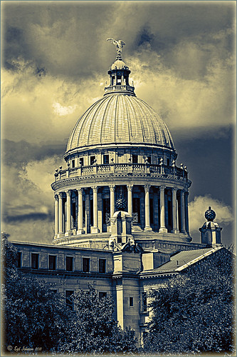 |
Most of the lines were removed following the steps below:
- Select the Pen Tool (P).
- Go to the Path Panel and click along the wire setting anchor points as you go.
- Next select the Spot Healing Brush (J) – in Options Bar be sure that the Content Aware box is checked and that the size of the brush is roughly twice the size of the wire you want to remove.
- In the Paths Panel, click the “Stroke Path with Brush” icon at bottom of panel (2nd over from left).
- Once the wire disappears, delete the Work Path by clicking on the Trash Can. If the wire did not completely disappear, just paint with the Spot Healing brush over the exposed area to clean up.
This technique works great as long as you are not in front of areas like the building columns or details. I found in this case, still use the Spot Healing Brush on these areas – but just click once and move along. It will do an amazing job in most cases. Note: To get rid of the path line on the image, open Path Panel and press DEL to remove the work path.
In the image above, the only areas that caused a problem was where one line went through the large ornamental balls – these had to be copied onto another layer, transformed, and layer masked to line up. Otherwise, no major problems and very fast even though there were lots of power lines. The traffic light was cloned out, and street light was removed using Edit -> Fill – Content-Aware after selecting with Lasso Tool. The new Topaz Black and White Effects was used to create the color effect on this image.
Try using this tip – it is really fast and great to have in your arsenal of quick tricks…..Digital Lady Syd
Selective Desaturation – the Easy Way!
I came across this technique from John Paul Caponigro – absolutely the best when it comes to color and artistic applications of Photoshop. Check out his website if you have not already – it is full of useful information and articles and is very inspirational.
This is a very simple technique – simply add a New Layer on top of your image and set the blend mode to Saturation, select the Brush Tool, set color to black (white or gray will also work) and 15% opacity in the Options Bar. Paint over the area you want several times to building up the desaturated effect until you get the look you are after.
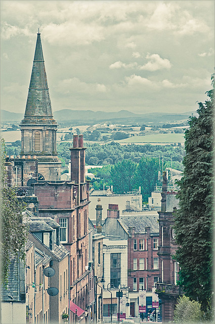 |
I have a few favorite images that I like to use for new techniques and this one of a street in Edinburgh, Scotland is one of them. The image was processed in Lightroom using one of my favorite presets, Matt’s 70’s Look preset (here is the ACR preset), applied (without the vignetting), and then it was brought into Photoshop. The green trees and the bright green bush in the right front were way too saturated for this vintage look. Therefore, the colors were slowly desaturated until they matched the image. Hover over the image as it came in from Lightroom and see the original bright green colors.
After each brush stroke, you can Edit -> Fade Effect if it was too much of a change – this can only be done immediately after applying the stroke. The layer opacity can also be reduced for overall reduction of the effect or a layer mask can be applied and paint in just specific areas. Very flexible way of localizing a change.
This technique can be very useful when you want to just de-emphasize something that is too bright in the image, especially on small areas. Also, green foliage tends to be over-bright as in this picture and it can be toned down just a small amount very easily.
Hope you find the tip useful – it is just one of those little things that help make or break a picture. Until next time…..Digital Lady Syd
Straightening with Puppet Warp!
Who knew???? I listened to a short video by Bryan Hughes (the newest inductee to the Photoshop World Hall of Fame) who is the Product Manager for Adobe Photoshop. I had the fortune to attend one of his classes at Photoshop World a few years back and he was great. I picked up this trick listening to one of his videos, “Puppet Warp to Straighten Images,” that I thought would really work with this image. Below is the image I used the puppet warp on to straighten the columns in St. Giles Cathedral in Edinburgh, Scotland. Hover or click to see the original image before the puppet warp was applied.
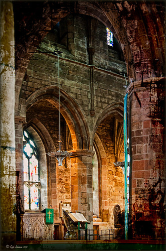 |
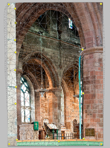
It is pretty easy to do but it did take me a couple of tries before I was able to get the lines straight. To access in Photoshop CS5, go to Edit -> Puppet Warp. Press Enter to return to Photoshop. To remove the crazy mesh lines as shown below, uncheck in the Options Bar.
Here are a couple of tips:
1) Convert your image to a Smart Object (right click layer and select Convert to Smart Object) – then you can come back and adjust your image if you do not like the results later.
2) Do what the video says, first place a pin at each corner of the image so you do not move the whole image when you adjust a new pin.
3) Find two places that you want to straighten and set new pins. Then drag or use the arrow keys and move very carefully to get the line to straight. If it starts to bend a little strange, set a pin down and put another one between to adjust the line more subtlety with the arrow keys again. Below is a screen capture of what the puppet warp on the image looked like right before I clicked Enter to set. See all the yellow pins down the left side – it took this many to get the column to line up right.
I believe Puppet Warp works as well as the Lens Correction Filter in many cases – it just takes a little practice to get it right. Give it a try, you might be surprised how good it works!…..Digital Lady Syd
PS. If you would like to know how I did the digital workflow for this image, see my Fun Photoshop Blog “Digital Landscape Effects with Nik Software.”
Just Another Topaz Black & White Effect Example
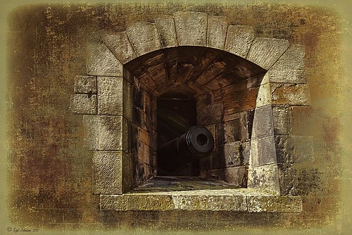
This image was taken at Edinburgh Castle in Scotland. I just keep playing around and finding new looks for images. The cannon and opening were selected and placed on their own layer, then a white layer was added below it, and a texture from ShadowHouse Creations Another Mixed Bag Texture Set (some really beautiful free textures on this site) was added. On several layers above and below using different colors from the image, various brush marks were added using Gorjuss Grunge Again brushes (unfortunately these are no long available), some really nice brushes to add a bit of color and detail. Create a composite and duplicate this layer. Next use the Topaz Black and White plug-in with the Opalotype Collection Effect and Yellow Lilac preset as a start. A lot of changes were made in the Conversion and Finishing Touches panels and Detail and Burn brushes were used to emphasize the stone. (See my Fun Photoshop Blog “Topaz B&W Effects Plug-in – a Real Winner!) and Tidbits Blog “Topaz B&W Effects vs. Nik’s Silver Efex Pro” for more information on this plug-in.) The plug-in layer was set to 52% opacity back in Photoshop. A Curves Adjustment Layer was added and some sharpening applied. It was a really fun image to do.
Hope you got an idea for creating a little different effect with this plug-in…..Digital Lady Syd
I Didn’t Know That! Randomizing Gradients
Once again I stumbled upon another interesting feature in Photoshop. I learned from the new Practical Photoshop Magazine that you can actually generate a randomized gradient when in the Gradient Editor. This is not a feature that pops right out at you when looking for it.
- First click on the Gradient Tool and in the Options Bar, double click on the gradient preview window to bring up the Gradient Editor.
- Set the Gradient Type to Noise, Roughness to 100%, and check the Add Transparency box. If not set to Noise, you will never find the button.
- Click the Randomize button several times until you get the lines you like – then click OK
- Now drag the Gradient Tool on your layer to create the gradient.
Below is an image I used a Randomized Gradient to create a colorful background. I threw in a few of my cloud, a bird, tree and grass brushes from some of the posts I have done on my Fun Photoshop Blog.
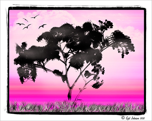
Totally cool and fun! And now you know…..Digital Lady Syd
Complimenting Those Complementary Colors
Have you ever started an image and thought – what color will really make my image pop with the color I am using?
I found this tip in a wonderful book (which it and its latest version are chocked full of tidbits and, no, they are not the same as some on Amazon have said) called “The Photoshop WOW! Book for CS/CS2” by Linnea Dayton and Cristen Gillespie. Remember, in this case complementary colors are based upon the “RGB Color Wheel.” (The “Artist Color Wheel” does not use the same complementary colors but here is a quick link that explains the basic difference.)
The very basic steps are as follows:
- It is easiest to convert your image to Black and White first. Use the Channel Mixer Adjustment Layer (click the Monochromatic box) or the Black and White Adjustment Layer – they can easily be deleted after you get your colors set up.
- Click on the Foreground swatch in the Toolbar to bring up the Color Picker. Move the vertical slider to pick a Color Family and choose a precise color in the large box.
- Create a New Layer above your current layer and fill with this Foreground Color (CTRL+BACKSPACE or COM+DELETE). Can now save color to Color Swatches by going to the Swatches Panel and clicking the “Create New Swatch of Foreground Color” icon to save.
- Now change the Layer Blend Mode to Difference – you will see the original Foreground color appear over the black areas, and the complementary color appear over the white.
- Exchange the Foreground and Background colors on the Toolbar swatch and sample the opposite color in the image for use on your image. Save new foreground color to the Swatches Panel to retain.
- Can now delete the adjustment layer converting the image to Black and White.
That’s it. In the photo below, I used a Channel Mixer Adjustment Layer with Monochromatic checked to make a black and white of my original image. Then I followed the above steps getting a brownish red as a complement to the light blue color.
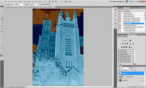
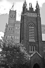
I posted the black and white image so you can see that the original Foreground color which is a fairly light blue color (in the black area of the image like the foreground trees and top of the church door) created a fairly light brown complementary color (in the white of the clouds – sample in the white cloud to get the exact complementary color). The book noted that if the original color is dark, the complement will be the opposite tonality and the same goes for light colors. Both colors will be equally saturated or neutral.
Well I hope this little tidbit will help you get that perfect color to really make your images pop. ……Digital Lady Syd

