Little Green Frog’s Makeover Using Nik’s Color Efex Pro 4!
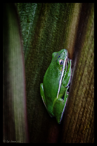
This little guy was hiding between a couple Queen Emma Lily leaves during a rather heavy rainstorm. Had to get his picture! He is a Green Treefrog and is one of the reasons I don’t get a good night’s sleep this time of year, but his coloring is beautiful!
I tried several different effects before settling on a recipe of Nik’s Color Efex Pro 4 filters. These filters were stacked as follows: Detail Extractor set to an Overall Opacity of 50%; Midnight using Neutral Color Set, the Blur slider reduced to 8%, and Overall Opacity of the filter set to 80%; Vignette Lens centered on frog and Overall Opacity set to 53%; and Image Borders – just a plain Type 13. This is a reminder that you don’t have to use the filter effect at 100% – just open up the Control Points panel at bottom of each filter panel and an Opacity slider appears that can be adjusted for the amount you want. Back in Photoshop, I used the LAB Sharpening technique to sharpen up just his body a little (see my blog Unsharp Mask Filter in LAB Mode). A Curves Adjustment Layer was added to increase contrast just a little and that was it. He has no idea how handsome he is!…..Digital Lady Syd
Digital Lady Syd Related Blogs:
NIK Color Efex Pro 4 – Digital Lady Syd’s Review!
Pseudo HDR Using NIK Color Efex Pro 4
White Daisies! Using Color Efex Pro Midnight Filter
Nik Color Efex Pro 4 Just Does It Right!
Topaz Adjust’s French Countryside Preset – Beautiful!
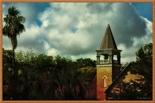 |
Thought I would do another Before and After where I show what one of my favorite presets in Topaz Adjust 5 (see sidebar for website link) looks like when applied. This image was taken in full light and I really took the image as a test shot before visiting some of the wonderful historic sites in St. Augustine, Florida. I really love steeples and cupolas on buildings. I had a hard time deciding what to do with it – it was a hand-held three HDR image. I processed it in Photoshop’s Merge to HDR Pro, only checking the Remove ghosts box before exiting to Photoshop (hover over image to see the tone-mapped image). Some image clean up was done, and two curves adjustment layers, one for contrast and one for color tone, were added since the image was not processed in Lightroom or Camera Raw. After much experimentation, I finally settled on using Topaz Adjust 5 and the French Countryside preset. It seems to soften the image just enough, yet retains some detail in the image – the trick is to adjust the Detail tab’s Threshold slider to bring back some of the details. Then I added Caleb Kimbrough Summer 4 Texture – one of my favorite textures to add the red and green tones into the image for that warm feel. (Also check out his site for many other wonderful textures.) The image took on a totally different feel. Try this preset if you have Adjust…..Digital Lady Syd
Digital Lady Syd Related Blogs:
Why I Love Topaz Adjust!
Topaz Adjust 5 Is Here! First Look!
Making An Ordinary Image Your Own
Hibiscus Flowers – I Love to Photograph Them!

These beautiful Red Chinese Hibiscus blooms appeared on Mothers Day last week so I had to take their picture! Used my favorite artistic plug-in – Topaz Black and White Effects (see sidebar for website link) – and applied a preset I had created earlier called Water Landscape Sunny (Adaptive Exposure section – Adaptive Exposure 0.18, Region as 26.10, Detail 1.11, and Detail Boost 1.09; Quad Tones which creates the interesting effect used Color 1 Region set to R1G1B12 and 9.60, Color 2 Region set to R63G78B85 and 95.97, Color 3 Region set to R216G211B129 at 141.2, and Color 4 Region set to R255G254B237 and 255.0; Edge Exposure set to Edge Size 0.19, Edge Exposure -0.43, and Edge Transition 0.27 for all sides; and Transparency set to 1.00.) While in the plug-in, the Detail brush was used to sharpen the center of the flowers and to go around the petal edges where they overlap each other. Next ShadowHouse Creations Marshmellow Skies texture set to Overlay at 100% opacity was added to give the soft green-turquoise feel to the background – a white layer mask and a soft black brush was used to take the texture effect off the flowers. A Curves Adjustment Layer was added and OnOne PhotoFrame (see sidebar for website link) grunge 04 set to 75% opacity was also added. Not hard and once again a really beautiful effect. I love Black and White Effects! I could do this all day! As you can see by the number of related blogs below, this is definitely one of my favorite plug-ins – check them out for several other examples on how to use it!…..Digital Lady Syd
Digital Lady Syd Related Blogs:
Black and White Effects on Outside Art
Cleaning Up a Messed Up Photo
Topaz Black and White Effects Quad Tones Are Great!
Sunny Preset for Topaz Black and White Effects
My Office Friend Ted
Loving Both Filters!
The Art Corner: Painting and Sculpture by Tassaert
Quad Tones in Topaz Black and White Effects Plug-in
Get Rid of Those Power Lines Fast – with Paths and Spot Healing Tool!
Topaz B&W Effects vs. Nik’s Silver Efex Pro
Just Another Topaz Black and White Effect Example
Topaz B&W Effects Plug-In-A Real Winner!
White Daisies! Using Color Efex Pro Midnight Filter
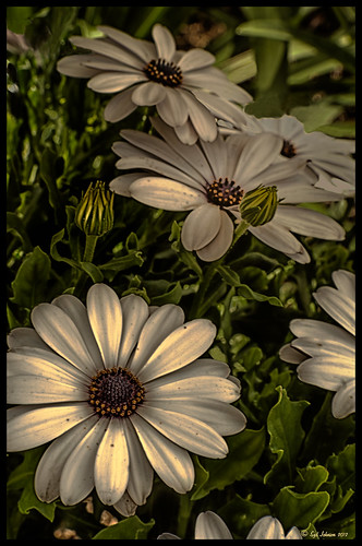
These beautiful daisies are growing in my front yard – first time I had seen this variety with the navy and orange centers. (Hover over image to see the image as it came from Lightroom.) Got a chance to try out the new Color Section in the Lens Correction Panel in Lightroom 4’s update (Adobe Camera Raw 7.1 for Photoshop) and it worked great! See New Color Fringe Correction Controls for information on this new tool. Next used Nik Color Efex Pro 4 with Detail Extractor, Midnight and Image Borders filters stacked. The Midnight Filter set to Sepia Color Set really gave this image the lovely soft feel. Added a few control points in Nik Viveza 2 to bring out the structure of the flower centers and buds. Added a Curves Adjustment Layer and painted out a few of the distracting light points. That was it……Digital Lady Syd
Digital Lady Syd Related Blogs:
NIK Color Efex Pro 4 – Digital Lady Syd’s Review!
Nik’s Viveza 2 Plug-In – A Hidden Gem!
Nik Color Efex Pro 4 Just Does It Right!
Black and White Effects on Outside Art
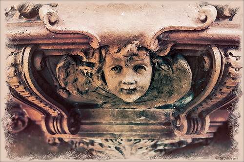
I call this image “Who’s Looking at You?” I almost fell down taking this image and everybody at the Flagler College (old Ponce de Leon Hotel in St. Augustine, Florida) thought it was funny as the tour guide just said one of her rules was no one was allowed to fall down! Oh my! Anyway, I was totally struck by the beautiful face on this figure which is part of the Ladies Side Courtyard Entrance. I do not know who actually created the figure but it appears to be similar to the Lion Statues outside the entranceway (see my Tidbits Blog Loving Both Filters!) Used Topaz Black and White Effects on image selecting the Cyanatype Collection -> Cerulean Dynamic preset to get the color effect started. Also used a Gradient Fill Adjustment Layer using a Gorgeous Gradient Royal set to Linear Style, 90 degrees, and Reverse with layer set to Overlay blend mode and 62% opacity – painted out the face a little using a white layer mask and low opacity black brush. Sharpened the face and that was it. I loved the final result!…..Digital Lady Syd
I Didn’t Know That! Converting Lightroom Preset to Adobe Camera Raw Preset
 |
I occasionally come across a need to take a Lightroom preset and use it as a preset in Adobe Camera Raw. This is not as complicated as it seems. Below are the steps required to accomplish this task.
1. Apply the preset in Lightroom and make sure you know which panels and sliders you used. (If preset not already created, to save preset in Lightroom, on left side of Presets line, click (+) for “Create New Preset.” Name preset.)
2. Right click on image in Lightroom and select Edit in -> Open as Smart Object in Photoshop. The image is opened in Photoshop with the Smart Object icon on bottom right of thumbnail in Layers Panel.
3. Double click on thumbnail and it opens up into Adobe Camera Raw. Go to Presets panel (9th icon over on righthand side under the histogram) and the click folder icon at the bottom of the panel to open the New Preset dialog. Name and click the items you want included in the preset, then click OK. Your new preset shows up in the Presets panel.
You can now use your Lightroom preset anytime you want in Adobe Camera Raw also. I usually start my personal preset names off with an SJ so I know they are mine. It is easy to get presets from many different sources as time goes on so it helps to know which are yours.
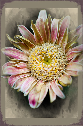
The image above is of a miniature mum in my yard. Hover over the image to see how the image looked with just a Lightroom preset I created called Dark Vignette – it makes the background very dark behind the flower. For information on how to create this preset and how the image was finished, see bottom of blog for details.
Hope this helped you get a little more organized…..Digital Lady Syd
To create this preset, changes were made to: the Tone Curve set to Highlights -24, Lights +41, Darks -56, and Shadows -54; HSL – Luminance sliders set to Red -41, Orange -9, Purple -2, Magenta -50 and all others 0, and Saturation sliders set to Red -2, Purple +32, Magenta +59 and all others set to 0; Effects Post-Crop Vignetting Style set to Highlight Priority with Amount -61, Midpoint 33 Feather 0 and others set to 0. To finish, image was sharpened and OnOne PhotoFrames (see sidebar for website link) acid burn controlled 15 was added and reduced in size in the plug in, and then grunge 12 was added on top – in Photoshop petals were painted over frame edge using a layer mask on first acid burn frame.
Digital Lady Syd Related Blogs:
Colorful Blown Out Look Lightroom and Adobe Camera Raw Preset
Settings for Vivid Drawing Look ACR/Lightroom Preset and NIK Color Efex Pro 4 Pseudo HDR Recipe
Orchids with Russell Brown’s Paper Textures Panel
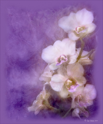
This was so easy and turned out so pretty. Need to darken the background of your image to get this effect. The the Flypaper Texture Creme Anglaise was added to give the painted look (in group of textures provided with Russell Brown’s Paper Texture Panel – see blog links below to download). A Hue/Saturation Adjustment Layer was added to darken the texture a bit more with Master set to Hue -146, Saturation -59, and Lightness -14. The flowers were painted out in the layer mask so they would not be affected by the color change, but it still did not have enough purple tone. Therefore a Color Fill Adjustment Layer was added with the color set to a deep blue (R101G33B227) set to 37% opacity. The flowers were once again painted out on the adjustment layer mask. The last step was OnOne PhotoFrame airbrush_06 (see sidebar for website link) and the color was sampled from the image to finish up. Very quick and easy effect…..Digital Lady Syd
Digital Lady Syd Related Blog:
Russell Brown’s Paper Texture Panel – A Real Winner!
Russell Brown’s Paper Texture Panel Updated!
Russell Brown Texture Panel Landscape Image
Whale Watching with Nik’s Color Efex Pro 4 & Viveza 2
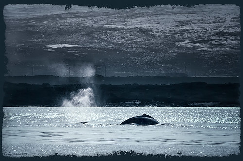
One of the many photos of a great whale watching trip on the Big Island in Hawaii. (See Hawaii Ocean Sports for information on whale watching boat trip.) This image used one of the workflows I like to use for quick processing of my images. The RAW file was adjusted in Lightroom where the Highlights, Shadows, Whites and Blacks sliders were moved. Next the Exposure and Contrast sliders were adjusted, and finally it was straightened and cropped. The image was brought into Photoshop and opened in Nik’s Color Efex Pro where five filters were added in this stack order: B&W Conversion (Dynamic Contrast), Photo Stylizer (Cool Silver – Style 1), Low Key, Darken/Lighten Center, and Detail Extractor applied just to background area with Control Points. Not sure how I came up with this combination, but I really liked the final result. Nik’s Viveza 2 was used to sharpen up the whale and water blowing up behind him. OnOne PhotoFrame acid controlled 12 (see sidebar for website link) was added using a matching color from image. That was it!
The combination of Color Efex Pro and Viveza is a pretty powerful combination. I do not process any image now without at least going into Viveza – it is a fabulous finishing plug-in…..Digital Lady Syd
Digital Lady Syd Related Blogs:
Nik’s Viveza 2 Plug-In – A Hidden Gem!
Detail Pop Using Nik Color Efex Pro and Viveza
Using NIK’s Color Efex Pro 4 and Viveza Together
Cleaning Up a Messed Up Photo
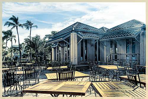 |
Here is another before and after for you. The image of the KPC Seafood Restaurant at the Hilton Waikoloa Village on the Big Island in Hawaii. At night it was wonderful to eat outside under the dark starlit sky with the ocean waves in the background. I wanted to add this image to a Hawaiian slideshow I am creating in Lightroom 4 and was really disappointed at how bad the original image appeared. I liked the tone in the wood and the sky was rally nice but otherwise, it was not too good an image. I tried several techniques, walked away from it for a day, and came back to it. I finally got the nice result shown above (hover over image to see the original). To get this result, I removed the palm tree going straight up to nowhere. Next I went into Nik’s Viveza 2 to get rid of the hazy feeling. I usually use this filter later in my workflow, but this image needed a quick tune-up before I could do anything else. Then I went into Topaz’s Black and White Effects (see sidebar for website link) and by playing with the Quad Tones, got this really nice result. (For settings, see below.) A Curves Adjustment Layer was added to enhance the contrast of the building, but the blue in the sky was painted black in the mask to keep it from being affected by the curve change – the blue of the sky competed too much with the blue tones in the restaurant. Noise was removed from the whole image (see Russell Brown ACR blog below to do this). Localized sharpening was done and Puppet Warp was used to straighten the vertical lines of the restaurant. I feel like I was able to save an otherwise very bad image by using these two plug-in filters, and I might add two of my very favorites. For information on how to do some of my workflow steps, see my blog links below. …..Digital Lady Syd
Digital Lady Syd Related Blogs:
Nik’s Viveza 2 Plug-In – A Hidden Gem!
Quad Tones in Topaz Black and White Effects Plug-in
I Didn’t Know That! Curves Adjustment Layers
Edit Layers with ACR (Adobe Camera Raw) Script
Straightening with Puppet Warp!
A preset was created in Topaz Black and White Effects using these settings as shown on the final version of image above: Conversion: Basic Exposure settings – Contrast 0.08, Brightness 0.05, Boost Blacks 0, and Boost Whites 0; Adaptive Exposure settings – Adaptive Exposure 0.56, Regions 7.06, Protect Highlights 0, Protect Shadows 0, Detail 2.17, and Detail Boost 1.04; and Color Sensitivity settings – Red (-0.15), Yellow (0.38), Green (-0.42), Cyan (0), Blue (-0.09), and Magenta (0). Finishing Touches: Silver and Paper Tone settings – Tonal Strength 0.63, Balance 0, Silver 32.00, Silver Tone Strength 0.50, Paper Tone 32.00, and Paper Tone Strength 0; Quad Tone settings: Color 1 Region (Color R0G0B0), 24.68, Color 2 Region (Color R86G102B136) 69.92, Color 3 Region (Color R229G223B164) 154.9, and Color 4 Region (Color R255G252B206) 255.0; Vignette settings – Center (2796,1607), Vignette Strength (-0.09), Vignette Size 0.53, Vignette Transition (0.63), and Vignette Curvature 0.75; and Transparency settings – Overall Transparency 0.59)
Humorous Shots Are Sometimes the Best
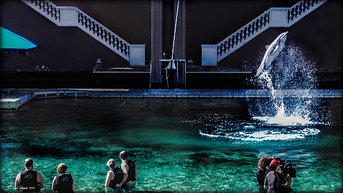
This image is one I found in my video I took while watching the dolphin program at the Dolphin Learning Center, one of the activities offered at the Hilton Waikoloa Village on the Big Island in Hawaii. When I processed this image, it seemed no one was paying any attention to the dolphin that is flying out of the water. Really struck me as a very funny shot! Anyway, thought I would share it.
The image was processed using two Virtual Copies of the image in Lightroom, one enhancing the water and dolphin and the other the people and pool. I selected the two Virtual Copies, right clicked and chose Edit In -> Open as Layers In Photoshop. This stacked the two Virtual Copies as layers in Photoshop. The one version layer created for the dolphin was masked out using a black layer mask. Then with a very low opacity white brush, the areas I liked from that version were painted back in on the black layer mask to give a little more contrast to the image. Really liked the result. This is a great way to pull detail out of a single image…..Digital Lady Syd
I Didn’t Know That! Export Layers to Files in Photoshop
 |
Every now and then I run into a situation where I want to take one of the layers I am working on in Photoshop and save it down as a separate file. Now it is possible to delete all the files and rename the file, etc., etc., etc. but this can take a while to do and it could cause you to lose the file you are working on if you get careless. This week I wanted one of the sky images I had imported into my image a while back to use again and to put in my Sky folder since I like it. (Hover over image to see sky image created from layer in psd file.) I found out there is a little known script sitting in Photoshop that will accomplish just what I wanted to do in just seconds.
Steps to Export Layer(s) to Files in Photoshop:
1. In your image, turn off all layers you do not want to create images of by clicking on the eyeballs on the left of the each layer in the Layers Panel. (To do this quickly, you can highlight the layer you want to export to a file and ALT+Click on the eyeball – all the other layers are turned off immediately.)
2. Go to File -> Scripts -> Export Layers to Files.
3. The Export Layers to Files dialog appears. Fill out as shown. Be sure to capture all the check boxes or you will get image files for each layer in your file.
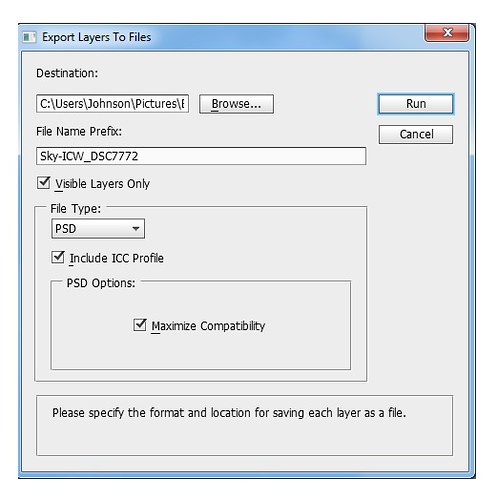
4. Click Run and that’s it – really quick and easy!
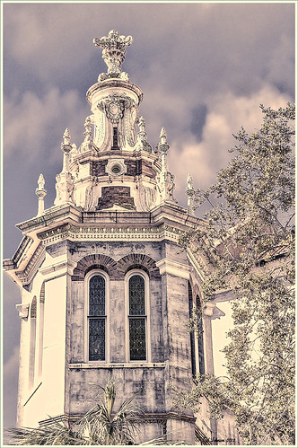
The image is of the Flagler Presbyterian Church in St. Augustine, Florida, where Henry Flagler and his family are buried. Topaz Adjust 5 and Topaz Black and White Effects were used on this image (see sidebar for website link). The sky is the one I moved in from an image I took on the International Coastal Waterway near St. Augustine while sailing.
Give this script a try next time you want to break apart an image…..Digital Lady Syd
Adding Copyright Information to Your Image
Well since it is that time of year when everything that has a date in it has to be updated, I am going to review with you how to put a copyright symbol and name on an image. This is pretty basic, but it is easy to forget how to do since you only have to do it once a year. This can be done in both Photoshop CS5/CS6 and Elements. And the time-savings by having it handy definitely makes it worth creating!

Simple steps:
1. Start a new document in Photoshop, set the foreground color to black, and Create a New Layer on top. For CS5/CS6 users, make sure the Image -> Mode is set to 8 bit.
2. It used to be that you could get a copyright symbol to appear with CTRL+ALT+C, but in CS5 on and Elements, the Canvas Size dialog box opens up so this does not work anymore. To find the copyright symbol, the work around is to select the Custom Shape Tool. For Photoshop users, in the Options bar set the tool to Fill Pixels (4th icon for over CS5 and 2nd icon over for CS6) and then select Shape from drop-down menu – highlight the copyright symbol from the default shape list in the drop-down menu (I like the one included in the Symbols set that can be loaded from the fly out menu in the Shape field). For Elements users, click the Shape drop-down menu, click the double arrow fly-out menu, and select Symbols – then select the copyright symbol. Drag out a Copyright symbol in black but do not make it too big. Hold SHIFT while doing this to keep the constrain and keep the symbol round.
3. Select the Text Tool and create a text layer with your signature in a font you use. Line it up with the Copyright Symbol and adjust text size to line up with the copyright symbol. I had to make my numbers smaller as they appear bigger than the letters when typed. The font I use is Freehand 575, a font I bought a while ago but there are many places to download free ones.
4. With the Rectangular Marquee Tool create a selection around both the symbol and the text. Make this a pretty tight rectangular – you do not need a lot of space around it.
5. Go to Edit -> Define Brush and name it – I called mine 2012 Copyright so that in Photoshop it will appear at the top of my Tool Picker Preset brush list in Step 8 and click OK. Deselect the Marquee Selection (CTRL+D).
6. Select the Brush Tool. In Photoshop the new brush will appear at the end of the Brush Presets Panel list. In Elements the brush will be at the end of the brush list in the brush drop-down menu (2nd arrow pointing down) at the top left Options Bar.
7. Now test out the brush and see what size you want as a default – I set mine at 367 which seems to work pretty well on 12 megapixel images.
8. The last step in crucial so that if you accidentally delete your brush or change the ones load, you can add it in easily.
Elements folks need to go to Edit -> Preset Manager and choose Save Set – then save the brush in the brushes preset file for the program (in Windows 7, go to (User Name) -> AppData -> Roaming -> Adobe -> Photoshop Elements -> 10.0 -> Presets -> Brushes) – I called mine SJ-Copyright Brush. Now anytime you need to add it to the brush group you are using, your Brush Preset Manager will go to this file so it can be reloaded.
Photoshop users, go up to the Tool Picker Preset, top left icon in the Options Bar, and open up the drop-down list. This contains the Preset List for the Brush Tool which means every time the Brush Tool is chosen, this group is available for quick access. Be sure the Current Tool Only box is checked or else a huge list shows up. Click on the bottom icon on the right side that says Create New Tool Preset. Keep the same name using a number first. This saves time by putting your brush at the top of the list since the Brush Tool Preset Picker has many Photoshop brushes in this list, and it is handy to keep the ones you use all time here also. Be sure to save this down as a set in the Preset Manager (2nd icon over at the bottom of the Brush Panel and then select Preset Type Tools – highlight the ones you created, drag to set up a different order if you want, and save. I usually make it a date like 010113 SJ – can back up all your created presets here) so that it is saved on your computer. If you load other people’s tools and lose yours, you can easily add them back in. See Step 8 in my Fun Photoshop How to Create Photoshop Brushes from Objects or Text blog for more info on how to do this.
That’s it! Now it is available every time you finish an image. Just add a New Layer on the top of your image, open the Tool Preset Picker for Photoshop or choose your brush in the brush drop-down list for Elements, select a nice color, and click once to paint in. The size of the brush can be changed – just CTRL+X to delete and change the size and click again. Sometimes it is helpful to adjust the opacity when the copyright becomes distracting in the image. Very handy…..Digital Lady Syd
Black and White Photo or Not? Give It a Try on That Difficult Image
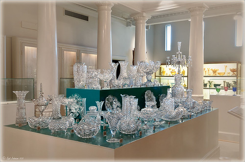 |
This image is of the beautiful cut glass display at the Lightner Museum located in the old Alcazar Hotel in St. Augustine. As you can see it is a very nice collection and I wanted to find out if the color in the image was distracting from actually seeing the ornate cut glass. See the black and white conversion by hovering over the color image. As I discovered, this image turned out to be a difficult choice to process no matter which effect you want.
Color Version
The top image was processed using the NIK Color Efex Pro 4 (CEP4) plug-in on a Smart Object layer (right click image and select “Convert to a Smart Object” since CEP4 will keep your settings and control points in case you want to adjust the results later) and stacking several filters including from top to bottom: Tonal Contrast, Darker/Lighten Center, Vignette, Glamour Glow, and Pro Contrast. Various control points were added to selectively choose areas for some of these effects. In Photoshop the cut glass edges were selectively sharpened using the Sharpen Tool on it own layer, and a final Curves Adjustment layer was added to get the correct contrast. Overall, this image is attractive since the blue-green sets off the glassware nicely.
Since there are some bright colors in the background that might be distracting from the main focus point, and the museum walls and columns have what I consider to be a rather bland creamy color to it, a black and white conversion might be appropriate to tone down some of the distraction and get rid of the creamy tones.
Black and White Version
I duplicated the cleaned up image layer and turned it into a Smart Object as above. Once in the NIK silver Efex Pro 2 (SEP2} plug-in, from the side preset panel the o14 Grad ND (EV -2) preset was selected and it really made the glass pop out clearly. In Photoshop the Sharpen Tool was used to bring out some of the glass edges (again, do this on a New Layer above the image) and the opacity of this layer is reduced so artifacts are not viewed. A final Adjustment Curve is added to give just the right amount of contrast. The items on the back wall initially appear to be more distracting than in the color image but the creamy tones did convert to the white tones nicely.
Conclusion
The image may not work as a black and white and the only way to figure this out is to try it. In this case SEP2 was used to convert the image to black and white, but the conversion can be done in lots of ways – in Adobe Camera Raw or Lightroom using a preset, or in Photoshop using a Black and White Adjustment Layer or Channels, as just a couple examples. NIK’s SEP2 is an excellent way to find out quickly since the presets allow you to glance over many black and white variations – if the image is really not going to look good as a black and white, you will know it.!
I am on the fence about which version I like best. The image was not the best choice to process to begin with and the glass creates a huge challenge just to get enough contrast to make the it stand out. Still it was good practice and I like the picture because I liked the cut glass collection. Just remember sometimes the image you want to process is not that great and does not work – but at least try a couple different effects including black and white and maybe there is a good shot hidden in there!…..Digital Lady Syd
Related Digital Lady Syd Blogs:
NIK’s Champion Plug-in – Silver Efex Pro 2
Topaz B&W Effects vs. Nik’s Silver Efex Pro
Topaz B&W Effects Plug-In – A Real Winner!
Elements & CS5 Friday: Adding a Texture for a Totally New Look to an Image
Friday blogs are going to be for Adobe Photoshop Elements along with some techniques crossing over with Adobe Photoshop CS5. I realize there is a huge group of digital fanatics out there using the quite capable little sister to CS5. So let’s start.
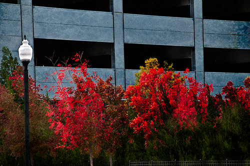 |
Unfortunately these beautiful trees are in a very run-down part of the city and located in front of a parking garage. I guess my point is that just because something is not in a gorgeous settng, it can make a really nice image with just a little effort. Hover over the image to see what the original image looked like.
To achieve this nice effect, all that was done is to add an interesting texture image as a layer on top of your basic picture. In this case, a really grungy looking texture creates this wonderful effect on the building and in the tree colors. This free texture is from Shadowhouse Creations and is called You’d Be Surprised – download it here. This is one of the best texture sites I have found on the internet – beautiful textures all for free!
Here are the steps required to create this look:
1. Open your image in Photoshop Elements (or CS5).
2. Clean up any areas that need to be touched up using the Clone Stamp Tool or Content Aware Healing Brush.
3. Go to File -> Open and navigate to the downloaded texture, in this case You’d Be Surprised, to open in Elements (or CS5) as a separate image.
4. Select image (CTRL + A), copy (CTRL + C) and then go to the original image and paste (CTRL +V) into the file which now puts the new image on top of your image. Close the texture image without saving.
5. Since the texture is probably too small to cover your image, we will use a Free Transform (CTRL+T) to expand the image – just drag the corners out to completely cover the original layer underneath.
6. Change the texture layer to Overlay Blend Mode at the top of the Layers Panel (click on down arrow to the right of Normal).
7. (Optional Step) If certain areas would look better without the texture, highlight this layer and click the Add a Mask icon (2nd icon over from left at bottom of the Layers Panel). This adds a white layer mask – click on it in the Layers Panel and paint with a black soft brush set to 50% opacity. Paint into areas you do not want the texture affecting.
For this image, the lamppost and light were painted out in black along with a little bit of the red leaves in the trees to increase the color range in the leaves, and some of the dark green bushes to add some lighter highlights for interest.
8. (Optional Step) To sharpen parts of the image to make certain areas stand out, click on the Create a New Layer icon (1st icon at the bottom of the Layers Panel and 6th icon from left for CS5). Select the Sharpen Tool (it is nested with the Blur Tool and Smudge Tool – 3rd icon from the bottom on the Tool Bar or 11 from bottom for CS5) and leave the top options set to the default settings except check Sample All Layers. On this new layer, with a soft edged brush paint over the objects you want to sharpen – since the brush is set to a default Strength of 50%, go over the object a few times to build up a really sharp effect. Watch out for artifacts if too much is applied. The nice thing is, since this sharpening is on its own layer, it can be deleted and started over or the opacity can be reduced if too much is added.
In the image above, just the lamppost and light and a few of the top red and yellow leaves were sharpened.
You are done! And this texture creates a very beautiful look. Look at some of the other images Shadowhouse Creations used with this texture at the download site link above.
Well I hope you enjoyed this blog – I did. I love working with textures and this workflow can be used over and over again to achieve some beautiful results using any texture. Have Fun Creating!…..Digital Lady Syd
Little Nighttime Fun from Topaz!
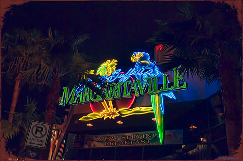
Just listened to another interesting video from Topaz Labs on “Creating Striking Night Images.” If you are using or trying any of their Photoshop plug-ins, Topaz always has some interesting videos for creative uses at their Topaz Lab site. I followed the referenced video steps for processing this nighttime image taken on the Las Vegas Strip of Margaritaville. The video suggests that you first use their DeNoise Filter (this image did not require it), Topaz Adjust where they suggest using the Photo Pop preset was used with Shadow slider setting changed to 0, contrast slider moved left a little, and checking Process details independent of exposure box; and finally Topaz Lens Effects using the Single Tone – Hint of Blue Light and then adding some yellow cast to the mix. (See sidebar to get to Topaz’s site to download trials of these products.) The video also discussed taking long exposure nighttime photos. Since this was not a true long exposure night image, I used my Rick Sammon Spicify Soft Artsy preset using settings from the Topaz video “Rick Sammon’s Top Topaz Tricks, Tips and Techniques.” An OnOne PhotoFrame was added to finish off the look.
This image was a lot of fun to work on and pretty easy to do! I am looking forward to trying this processing technique on a serious nighttime image. Give this video a listen if you want some great nighttime tips…..Digital Lady Syd
Spooky Halloween Fun!
A little Halloween fun here. Basically using the Halloween brushes I listed in my “Halloween Resources – Time to Go Batty!” blog of a few days ago. The same two sets of Halloween brushes were used (Obsidian Dawn’s Halloween Vector Photoshop brushes and Halloween Brush Set by anodyne at Deviant Art), the orange sky was Obsidian Dawn’s Clouds 16 and 17, the beige background texture is from ShadowHouse Creation – Assorted Paper TS-P-6, my favorite font Fantaisie Artistique font, and a grunge background (acid burn controlled 11) from OnOne PhotoFrames (see sidebar for link to OnOne Software website) was used. Some background grunge was added and that is about it.
It is pretty easy to get a nice effect – just use lots of layer masks and brushes – it really is fun to put it all together.
Hope everyone has a great Halloween! …… Digital Lady Syd
Settings for Vivid Drawing Look ACR/Lightroom Preset and NIK Color Efex Pro 4 Pseudo HDR Recipe
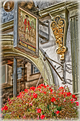 |
The image is from The Royal Mile in Edinburgh, Scotland. Deacon Bodie has a very colorful history and this sign locates a pub named in his honor.
The above image used SJ-Vivid Drawing Look preset as a starting point in Adobe Camera Raw (note: change file extension to .xmp in zip folder to get file to work) and Lightroom. In my Fun Photoshop Blog “Pseudo HDR Using NIK Color Efex Pro 4“, I created a recipe for NIK Color Efex Pro called SJ-Pseudo HDR1. This recipe was applied without any changes to it. Back in Photoshop a Curves Adjustment Layer was added, and a High Pass Filter (radius 9.1) applied to a duplicate layer (set to Soft Blend Mode) was used to sharpen the image. That is it. Hoover over the image to see how it looks with just the Vivid Drawing Look preset applied.
Settings for Presets
For those of you who do not like to download files or might want to tweak what I have created, here are the settings for my favorite HDR feel ACR and Lightroom preset. Also the recipe I put together for NIK Color Efex Pro4 has been provided.
SJ Vivid Drawing Look settings: To make this preset in either Lightroom Develop Panel or Adobe Camera Raw, use these settings: Basic section: Exposure -o.32, Recovery +38, Fill Light +72, Blacks +12, Brightness +52, Contrast +55, Clarity +54, Vibrance 0 and Saturation 0; Tone Curve section: Highlights -30, Lights +16, Darks +23, Shadows -23, and Point Curve Linear; Split Toning Section: Highlights – Hue 50, Saturation 11, Balance 0, Shadows – Hue 50, and Saturation 34; Sharpening section: Amount 48, Radius 1.0, Detail 35, and Masking 69; Noise Reduction section: Luminance 82, Detail 95, Contrast 44, Color 20, and Detail 50; and Post-Crop Vignetting section: Style – Highlight Priority, Amount -18; Midpoint +47, Roundness 0; Feather +57, and Highlights 0.
SJ Pseudo HDR 1: To make this recipe, the filters and settings are as follows: Tonal Contrast (Highlights -37%; Midtones -30%; Shadows -12%; Saturation +5%; Contrast Type set to Standard; and Shadows +58%; Darken/Lighten Center (Use#2 for lighten area; Center Luminosity -10%; Border Luminosity -64%; and Center Size +30%; Place Center in image); and Detail Extractor (Detail Extractor +69%; Contrast +56%; Saturation +16%; Effect Radius – Fine; and Shadows +14%.
I hope you put these presets to good use. I think they are both good starting points to creating that great pseudo HDR effect. Have fun. Have trying these out…..Digital Lady Syd
Halloween Resources – Time To Go Batty!
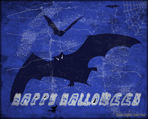
Not sure how everyone elses kids are or were, but I think mine liked Halloween as much as Christmas! So to kick off this (at least 2nd biggest) holiday season, I created the above image.
Only a few resources were used and they are provided free for our use. All the objects were from Obsidian Dawn’s SS-Halloween-Vectors brushes (and include a lot more than what is used above) and are definitely of the high quality you expect from this site. The cobweb in the upper right corner was provided from a nice set of brushes called pureanodyne_halloween at Deviant Art – these are actually from a set created in 2004. The Happy Halloween font is called Groovy Ghosties and can be downloaded from DaFont.com. And my signature font is my favorite fun font – Fantaisie Artistique from DaFont. The white cracks and grungy textures are from OnOne PhotoFrames (see sidebar for link to site) called Taufer Texture 01 and Grunge 05. Now this effect could very easily be done in Photoshop using a few creative brushes on a couple layers, but the plug-in was really fast and I could experiment with different colors and textures very quickly. I guess that is the main reason why you buy Photoshop plug-ins – they all have to be based on some form of Photoshop technique.
Try out a few of these Halloween brushes – they do a really nice job for this time of year! Have fun experimenting and look out for low flying bats!…..Digital Lady Syd
Think Pink! Rally for the Cure Pink Rose
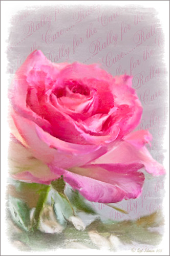 |
Since October is Breast Cancer Awareness month in the United States, last week I participated in a “Rally for the Cure” golf tournament. This beautiful pink rose came from this event. I am really pleased with the results for the above image that used the new Mixer Brush panel from one of my favorite Photoshop gurus, Russell Brown. Hover over the image to see the before photograph used to create this painterly effect.
One of the best new features in Adobe Photoshop CS5 are the Mixer Brushes. (See my Fun Photoshop Blog “Adobe Photoshop CS5’s Mixer Brushes” where I talk about how to use and create your own Mixer Brushes.) Dr. Brown created a new panel to load into Photoshop called the Painting Assistant that makes the whole painter process much simpler. I was able to create the above in very little time using this new panel. Basically it contains six button steps with very clear instructions listed – just click each button after you finish each step. This is pretty ingenious in my mind, but then that is what Dr. Brown is known for! To download the panel and a video, click here and scroll down to the 6th item. A text layer using the “Old Script” font was created and set on a slant using Free Transform – then a layer mask was used to paint out the lettering from the rose.
Give this technique a try, especially if you like the painterly look. It is very easy to do since the Mixer Brushes are already set up for your use. And if you get a chance to participate in a “Rally for the Cure” event, please do – they are always lots of fun and the proceeds could not go to a better cause!…..Digital Lady Syd
Colorful Blown Out Look Lightroom and Adobe Camera Raw Preset
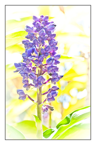 |
While in Hawaii, after taking a lot of beautiful flower images, I created the above effect as a Lightroom preset that I have used many times. It looks especially nice for a calendar image. Hover over image above to see the original.
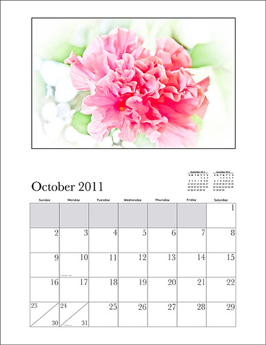
This preset I call “Colorful Blown Out” and mainly has Basic and Luminance settings. You can download the free Lightroom preset here and the Adobe Camera Raw preset here. For a softer look, try increasing the Recovery slider and the Brightness slider. It is a good starting point for a very nice flower look. For information on where to download the calendar template and how to apply it, see my Photoshop Fun Blog Free Calendar Template for instructions.
Give it a try on other types of images too. Hope you enjoy!…..Digital Lady Syd
Get Rid of Those Power Lines Fast – with Paths and Spot Healing Tool!
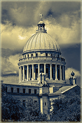
Since I like to shoot old buildings, and there always seems to be a never-ending batch of power lines in these images, here is the technique that works best to clean up those lines.This tip is from Bryan Hughes, Product Manager for Adobe Photoshop, called simply “Remove Power Lines.” Below is an example of an image of the State Capital Building in Jackson, Mississippi, that had some real problems with lines. Hover over the image to see the original power-lined shot. It was processed with Topaz’s Black and White Effects plug-in.
 |
Most of the lines were removed following the steps below:
- Select the Pen Tool (P).
- Go to the Path Panel and click along the wire setting anchor points as you go.
- Next select the Spot Healing Brush (J) – in Options Bar be sure that the Content Aware box is checked and that the size of the brush is roughly twice the size of the wire you want to remove.
- In the Paths Panel, click the “Stroke Path with Brush” icon at bottom of panel (2nd over from left).
- Once the wire disappears, delete the Work Path by clicking on the Trash Can. If the wire did not completely disappear, just paint with the Spot Healing brush over the exposed area to clean up.
This technique works great as long as you are not in front of areas like the building columns or details. I found in this case, still use the Spot Healing Brush on these areas – but just click once and move along. It will do an amazing job in most cases. Note: To get rid of the path line on the image, open Path Panel and press DEL to remove the work path.
In the image above, the only areas that caused a problem was where one line went through the large ornamental balls – these had to be copied onto another layer, transformed, and layer masked to line up. Otherwise, no major problems and very fast even though there were lots of power lines. The traffic light was cloned out, and street light was removed using Edit -> Fill – Content-Aware after selecting with Lasso Tool. The new Topaz Black and White Effects was used to create the color effect on this image.
Try using this tip – it is really fast and great to have in your arsenal of quick tricks…..Digital Lady Syd
Topaz B&W Effects vs. Nik’s Silver Efex Pro
I did a blog on my Fun Photoshop Blog called “Topaz B&W Effect Plug-in – A Real Winner!” that touched on some of the differences of Topaz’s new plug-in and the great black and white standard plug-in by Nik called Silver Efex Pro 2.0. I thought I would just mention a few other things I noticed that are definitely different about the two programs.
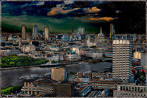
Below is one of my favorite images for trying out new effects (the original has some basic flaws so I can see if the product will correct it) and was taken from the London Eye. Topaz B&W Effects was applied (hover over or click on image to see the Nik version).
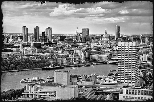 |
This is as close as I could get to making the two plug-ins look alike. The sky and some of the buildings’ contrast and detail are slightly different, but overall the results are pretty much the same. I am not sure which version I like best.
The image below I also used Topaz B&W Effects.
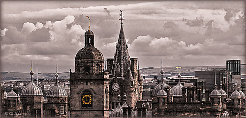
In this case, I could not duplicate the results in either NIK Silver Efex Pro 2.0 or Color Efex Pro 3.0. I liked the results and was surprised how nice the image turned out. By the way, I created for the Topaz plug-in a SJ-Cityscape preset for use in the Traditional Collection for both of the Topaz images – it can be downloaded here.
My final thought is to say that I think there is a place for both black and white plug-ins. Nik’s black and white plug-in is considered the best and I am not sure Topaz has created a better one, but it is very close. Topaz B&W Effects is definitely a great product since it does several things the other plug-in cannot do – and I really like that.
Well I hope you have fun (I sure am) trying out both of these excellent products. I plan on experimenting more with Topaz’s B&W Effects and will post more on it later……Digital Lady Syd
PS. Be sure to download the 30 day trial for Topaz B&W Effects – it is a fully functional trial to try out!
Pseudo HDR in the Works
I am working on a new technique for the Pseudo HDR look I wrote about last week. (See my blog post called “With One Good Photo – Try the Pseudo HDR Effect“) that I will be posting on my Fun Photoshop Blog soon. Here is a preview of what I am working on – hover over image to see original image with just ACR adjustments made.
 |
Check out my Fun Photoshop Blog shortly for more examples and instructions on how to do this….Digital Lady Syd


