
A Very Scary Ride
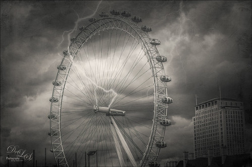
Had some fun with this image of the London Eye – I liked the black and white treatment on it as the colors were not very strong, but it was a bit boring so some lightning brushed onto the image was added. The Serge Ramelli’s B&W Medium Lighting preset was used in Lightroom to convert it to black and white. (See my Showing Some of Serge Ramelli’s Effects blog.) In Photoshop Topaz Studio’s (see sidebar for website link) AI Clear at default was applied, then Texture Effects Distressed Grunge preset. The lightning bolts were from Sparklestock’s 18 seamless Lightning Strokes no. 12 and Serge Ramelli’s lightning brush. Last step was a Curves Adjustment Layer. It looks pretty convincing to me!…..Digital Lady Syd
Using Old Wallpaper for a Vintage Look

Just another pretty image of my zinnias growing in my front yard. In Lightroom a preset I created from Jack Davis’ video (see my Can You Get a Painting Look With a Photoshop Action? Jack Davis Can! blog for link) – this was another part of the video where he shows you how to make an Antique Looking preset in ACR, but it can be done as easily in Lightroom. (It is also in his Facebook link for Lightroom presets download.) Once brought into Photoshop, a New Layer was created and the Mixer Brush was pulled out to define the leaves more, especially the ones in front. Fay Sirkis Four Season Classic FX Highlilghts #1 was used along with her 03 Palette Knife Blender brush, downloaded from her webinars on the NAPP website. She just completed a series of four videos where she goes over each season – wonderful videos if you want to learn to paint! Eventually this layer was set to 82%. On top of the Mixer Brush layer, Caleb Kimbrough vintage wallpaper2 was added (he has several free wallpapers to download) and set to Darker Color blend mode at 39% opacity. A layer mask was added and the flowers painted back into the image. Next an Overlay created from Kim Klassen’s Cloth & Paper texture Touch was applied and set to Multiply blend mode. A medium green Color Fill Layer was added, clipped to the overlay, and set to 70% opacity to add a little green tint to the edges. A Selective Color Adjustment Layer was added to get just the right color of red/magenta in the image. Then a Vibrance Adjustment Layer was added and set to +100 to add back a little color. The last step involved sharpening using a High Pass Filter, setting the mask to black, and painting back just the center of the flower and little bit of the wallpaper. Really loved the final vintage feel to the image……Digital Lady Syd
Aliona’s Birthday

Thought I would do a quick Lightroom post of an image I did of my very photogenic daughter-in-law on her birthday. She does not love this image, but I really love the vintage treatment. To begin the process, Matt Kloskowsky’s That 70’s Look preset was applied (the new version for Lightroom 4 is in the NAPP preset group but I am not sure where I found it). Three Adjustment Brushes were used on her face: 1) on eye iris the Exposure, Clarity and Sharpness were increased to make them pop a little; 2) the whites of her eyes were painted and the Saturation set to -52 to whiten a little; and 3) her lip color was changed to match her dress by using a little clarity and sharpness and a sampled pink color. In Photoshop all that was done was a little Liquify filter was used to adjust the dress folds. That was it – quick and easy and a beautiful look!…..Digital Lady Syd
Vintage Effect on Hanging Pots

The image was taken at the 24th Annual Native American Festival in Ormond Beach, Florida recently. I just loved the way this image turned out since it started out with a very cluttered background. It was an three image HDR image that was processed using Photomatix Pro’s Merge to 32-bit HDR in Lightroom. The resulting TIFF file was adjusted and Matt’s 70’s preset was applied before taking the image into Photoshop. Some background clean-up was done and the Kim Klassen cafe simplicity texture (sign up to get several beautiful free textures including this one) at 55% opacity was added to the image – really gives it that vintage feel. The pots were painted out with a low opacity black brush on a white layer mask. A Curves Adjustment Layer was added to give just a little more contrast in the image. That was it – very simple processing but one of my favorite images from the event.
It is amazing how pretty the results can be by trying different textures on an image. Really loved this one….Digital Lady Syd
Digital Lady Syd Related Blogs:
Check out my Textures category in the sidebar for more Tidbits Blogs
Check out my Fun Photoshop Blog (link at top of page) and click Textures category in the sidebar
Vintage Toy Processing

This image is of a really cute 6-year old that I met at the 39th Annual Turkey Run at the Daytona International Speedway who graciously agreed to pose for me. These vintage toys bring back a jolt from years past! Amazing you can still buy them! This image was processed in Lightroom using a Gritty Preset by Michael Rather from the True Grit Video – I use this preset a lot for this type of look. Then I increased the orange and red saturation a little to get the colors to pop. An adjustment brush set to Sharpen and Clarity was added to sharpen the lettering and detail on the toys only. In Photoshop Topaz (see sidebar for website link) photoFXlab was opened and from the Effects tab, the Retro Style I from Topaz Adjust 5 was applied. My favorite Adjustment tab brush Dynamics was increased along with the Sharpness. Then using the Masks tab, the effect was removed from the boy’s face. The layer was then set to Darken blend mode at 88% opacity. Back in Photoshop a High Pass Filter set to 8 and Soft Light blend mode was used to sharpen the photo. The last step involved adding French Kiss’s Glorious Grunge Edging free overlay with some of the lines removed in the center so as not to be distracting. The last step was using Nik Viveza2 (all time favorite plug-in) to direct the eye to the cute kid and toys. That’s it!…..Digital Lady Syd
Digital Lady Syd Related Blogs:
Trying Out Some New Techniques!
Digital Lady Syd’s Review of Topaz photoFXlab v1.1
Using photoFXlab v1.1
Using Topaz photoFXlab to Replace Skies
Feeling Butterflies!

Really liked the way this image turned out and it was a fairly simple process. After setting the Lens Correction panel and Cropping the image, a Blue Sky-Heavy Green preset created from Dave duChemin’s Lightroom 3 book (the preset contains only Split Toning panel – Highlights Hue 220 and Saturation 25, Balance -15, and Shadows Hue 120 and Saturation 20) and Matt Kloskowski’s preset Focal Point (Portrait – Bottom Right) were applied. Since the first preset only affected the Split Toning panel and the Focal Point preset did not change this panel, both could be applied in Lightroom without a problem. The image was brought into Photoshop and first Topaz (see sidebar for website link) Detail was applied (Detail Setting used: Small Detail .5, Medium Detail .3, and Large Detail .3; and Tone: Brightness .03, Contrast -.16, Cyan-Red .26, Magenta-Green -.37, and Yellow-Blue .44) and Topaz DeNoise 5 (Noise Reduction slider .42 and Recover Detail slider .36).

Now the out-of-focus pink flowers looked bad, so a New Layer was created to paint in the over-exposed white spots to keep the eye from wandering to those areas. On another New Layer using a 15% opacity soft edge brush the straight green stem was painted darker sampling in the image to add a slightly darker green. Another Hue/Saturation Adjustment Layer was added and the Yellow Saturation set to +40. It took a while to settle on a final result but since the Adjustment Layers are all non-destructive, it was easy to try different effects. A Gaussian Blur was applied to a Composite Layer (CTRL+SHIFT+ALT+E) created on top and using a Radius of 6.6. On a layer mask, the butterfly and foreground flowers were painted back in black on the mask. A lower 30% opacity brush was used to slightly paint back the flowers in the mid-ground left side. Next my Soft Sparkle Overlay Frame was applied but since it is a deep reddish brown, a Solid Color Adjustment Layer (Clip it to the layer by clicking ALT+Click between the frame layer and the adjustment layer) set to an off-white was used. Finally a Curves Adjustment was added contrast. Just Fun!……Digital Lady Syd
Digital Lady Syd Related Blogs:
How To Make Frames or Borders
Getting Rid of Those Blown Out Areas in Your Image
Trying Out Some New Techniques!

Just thought I would try out a couple new tricks. The image was a JPG shot with my little point-and-shoot Kodak camera at Flagler Beach on a beautiful early evening. A short Lightroom video called True Grit by Michael Rather was followed to create a nice gritty effect preset. I tried it on this landscape image (he used an image of a boy’s face) and really liked the effect. Next Topaz released Simplify 4 (see sidebar for website link) so I applied this plug-in to the photo in Photoshop. This is a free upgrade for anyone that has the bundle or has bought the Simpify plug-in previously. Lots of fun here. This was basically just playing around with the settings to get to know the program and getting a nice look. In Photoshop a Hue/Saturation Adjustment Layer was added where the Red Hue slider was moved so it was not so bright. I also added a layer mask to the Simplify layer and painted back in just a little of the white wave detail using a soft, low opacity black brush in the mask. The last step is my Black and White Layer Style. …..Digital Lady Syd
Digital Lady Syd Related Blogs:
Using Topaz Simplify for That Artistic Feel!
Blue Flowers and Layer Style Frame
I Didn’t Know That! Converting Lightroom Preset to Adobe Camera Raw Preset
Settings for Vivid Drawing Look ACR/Lightroom Preset and NIK Color Efex Pro 4 Pseudo HDR Recipe
 |
The image is from The Royal Mile in Edinburgh, Scotland. Deacon Bodie has a very colorful history and this sign locates a pub named in his honor.
The above image used SJ-Vivid Drawing Look preset as a starting point in Adobe Camera Raw (note: change file extension to .xmp in zip folder to get file to work) and Lightroom. In my Fun Photoshop Blog “Pseudo HDR Using NIK Color Efex Pro 4“, I created a recipe for NIK Color Efex Pro called SJ-Pseudo HDR1. This recipe was applied without any changes to it. Back in Photoshop a Curves Adjustment Layer was added, and a High Pass Filter (radius 9.1) applied to a duplicate layer (set to Soft Blend Mode) was used to sharpen the image. That is it. Hoover over the image to see how it looks with just the Vivid Drawing Look preset applied.
Settings for Presets
For those of you who do not like to download files or might want to tweak what I have created, here are the settings for my favorite HDR feel ACR and Lightroom preset. Also the recipe I put together for NIK Color Efex Pro4 has been provided.
SJ Vivid Drawing Look settings: To make this preset in either Lightroom Develop Panel or Adobe Camera Raw, use these settings: Basic section: Exposure -o.32, Recovery +38, Fill Light +72, Blacks +12, Brightness +52, Contrast +55, Clarity +54, Vibrance 0 and Saturation 0; Tone Curve section: Highlights -30, Lights +16, Darks +23, Shadows -23, and Point Curve Linear; Split Toning Section: Highlights – Hue 50, Saturation 11, Balance 0, Shadows – Hue 50, and Saturation 34; Sharpening section: Amount 48, Radius 1.0, Detail 35, and Masking 69; Noise Reduction section: Luminance 82, Detail 95, Contrast 44, Color 20, and Detail 50; and Post-Crop Vignetting section: Style – Highlight Priority, Amount -18; Midpoint +47, Roundness 0; Feather +57, and Highlights 0.
SJ Pseudo HDR 1: To make this recipe, the filters and settings are as follows: Tonal Contrast (Highlights -37%; Midtones -30%; Shadows -12%; Saturation +5%; Contrast Type set to Standard; and Shadows +58%; Darken/Lighten Center (Use#2 for lighten area; Center Luminosity -10%; Border Luminosity -64%; and Center Size +30%; Place Center in image); and Detail Extractor (Detail Extractor +69%; Contrast +56%; Saturation +16%; Effect Radius – Fine; and Shadows +14%.
I hope you put these presets to good use. I think they are both good starting points to creating that great pseudo HDR effect. Have fun. Have trying these out…..Digital Lady Syd
Colorful Blown Out Look Lightroom and Adobe Camera Raw Preset
 |
While in Hawaii, after taking a lot of beautiful flower images, I created the above effect as a Lightroom preset that I have used many times. It looks especially nice for a calendar image. Hover over image above to see the original.

This preset I call “Colorful Blown Out” and mainly has Basic and Luminance settings. You can download the free Lightroom preset here and the Adobe Camera Raw preset here. For a softer look, try increasing the Recovery slider and the Brightness slider. It is a good starting point for a very nice flower look. For information on where to download the calendar template and how to apply it, see my Photoshop Fun Blog Free Calendar Template for instructions.
Give it a try on other types of images too. Hope you enjoy!…..Digital Lady Syd
Selective Desaturation – the Easy Way!
I came across this technique from John Paul Caponigro – absolutely the best when it comes to color and artistic applications of Photoshop. Check out his website if you have not already – it is full of useful information and articles and is very inspirational.
This is a very simple technique – simply add a New Layer on top of your image and set the blend mode to Saturation, select the Brush Tool, set color to black (white or gray will also work) and 15% opacity in the Options Bar. Paint over the area you want several times to building up the desaturated effect until you get the look you are after.
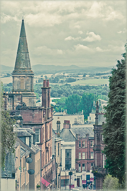 |
I have a few favorite images that I like to use for new techniques and this one of a street in Edinburgh, Scotland is one of them. The image was processed in Lightroom using one of my favorite presets, Matt’s 70’s Look preset (here is the ACR preset), applied (without the vignetting), and then it was brought into Photoshop. The green trees and the bright green bush in the right front were way too saturated for this vintage look. Therefore, the colors were slowly desaturated until they matched the image. Hover over the image as it came in from Lightroom and see the original bright green colors.
After each brush stroke, you can Edit -> Fade Effect if it was too much of a change – this can only be done immediately after applying the stroke. The layer opacity can also be reduced for overall reduction of the effect or a layer mask can be applied and paint in just specific areas. Very flexible way of localizing a change.
This technique can be very useful when you want to just de-emphasize something that is too bright in the image, especially on small areas. Also, green foliage tends to be over-bright as in this picture and it can be toned down just a small amount very easily.
Hope you find the tip useful – it is just one of those little things that help make or break a picture. Until next time…..Digital Lady Syd


