Take the Time to Get the Fun Shots!

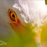
Going through my older photos I found this crazy image of an ostrich at The Old Village of Ayaymku outside Minsk in Belarus. (At this point I think I am the only person who has posted images on this charming place.) This was a totally fun place to visit – I am not sure they have had too many American tourists, but it is a very popular place for the locals, especial for bridal parties. In fact we saw two brides having photo-shoots while there! Here are a couple links to some of my other images posted on Flicker: The Old Village of Ayaymku and The Old Candy Shop at the Village. This is a replica of an old Belarusian village where there are many beautiful craft and food shops. And then they had this little zoo area with all kinds of animals, including this crazy guy! (Here is another Ostrich image from the Village.) He was mainly retouched in Lightroom 5 where David duChemin’s Toxic Warmth preset was applied. In Photoshop, Nik Viveza 2 was used to emphasize his eyes and tongue and downplay the background. Hope to present some more images from this Village in the future…..Digital Lady Syd
Digital Lady Syd Related Blogs:
Unexpected Humor in an Image
How to Pop a Picture in Lightroom 5
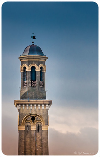
This image of a pretty cupola taken in London uses several of the new Lightroom 5 features. In fact nothing was done in Photoshop to this image. First it was cropped down – only had the very top as shown but it needed to be composed. Then the basic sliders were set just like in previous versions of Photoshop (see my How to Use Adobe Camera Raw (ACR) or Lightroom 4 Quickly blog for tips on this). The HSL panel was used to set the color. Two Graduated Filters were added – one for the blue sky (Temp -22 and Exposure -1.18) and one to bring out the pretty sky and cloud effect (Exposure -0.42, Highlights -60, Shadows 87, Clarity 55 and a light orange color Hue 28/Sat 59). Some Sharpening was done with an Adjustment Brush (Sharpness 100, Shadows -68, and Clarity 100) and the detail painted over. A Radial Filter was applied to just the the cupola – used -1.18 Exposure with the Invert Mask checked. A Post-Crop Vignetting was added using Highlight Priority Style, Amount +100, Midpoint 18, Roundness -100, and Feather 0 – this gives the nice white frame. That was all that was done – a very plain image turned out to be quite striking!…..Digital Lady Syd
Digital Lady Syd Related Blogs:
Lightroom 5′s New Upright Adjustments Section
My Favorite Adobe Lightroom 5 Features
Aliona’s Birthday

Thought I would do a quick Lightroom post of an image I did of my very photogenic daughter-in-law on her birthday. She does not love this image, but I really love the vintage treatment. To begin the process, Matt Kloskowsky’s That 70’s Look preset was applied (the new version for Lightroom 4 is in the NAPP preset group but I am not sure where I found it). Three Adjustment Brushes were used on her face: 1) on eye iris the Exposure, Clarity and Sharpness were increased to make them pop a little; 2) the whites of her eyes were painted and the Saturation set to -52 to whiten a little; and 3) her lip color was changed to match her dress by using a little clarity and sharpness and a sampled pink color. In Photoshop all that was done was a little Liquify filter was used to adjust the dress folds. That was it – quick and easy and a beautiful look!…..Digital Lady Syd
Big Sky Preset for Lightroom 4.1

This is my “big sky” view above my little lake and what I have been seeing every afternoon this summer in Florida. Beautiful but very scarey! I wanted to try out Matt Kloskowski‘s (one of the Photoshop Guys from NAPP) new free Lightroom presets called Big Sky as a starting point – Strong in this case. After making adjustments in Lightroom, the image was taken into Photoshop and first Nik’s Color Efex Pro 4 was applied stacking these filters: Brilliance/Warmth with Sat at 32%, Warmth 49%, and Perceptual Sat 40%; High Key With Dynamic High Key set to 61%; and Pastel Using Method 2. Next two Selective Color Adjustment Layers were created with black filled into their layer masks. One Adjustment layer was for the green grass so in the layer mask I painted back just the green area for that layer and the other targeted for the slight reddish color in the roofs. Next the new Color Lookup Adjustment Layer set to 3DLUT DropBlues.3DL was added – the sky was then painted over with a light gray to soften the change. (To learn more about Color Lookup, see TipsSquirrel’s Richard Hoffman’s short video here.) Next Nik Viveza 2 was used to smooth out the clouds and sharpen the house lines. Finally Imagenomics Noiseware was set to Full Stronger Noise preset. The last steps created a Curves Adjustment Layer for a little more blue using just the Blue Channel to increase the color and set to 70% opacity. Finally my Layer Style frame was used sampling the colors from the image (see DLS Free Layer Style Frames). I liked the way the preset worked – it looks very similar to how it appeared originally in Lightroom without all the adjustments and blue cast. The final result looks a bit like an architectural rendering seen in house brochures. And you got to love the clouds!…..Digital Lady Syd
Lightroom 4’s Graduated Filter – Check it Out for Landscapes!
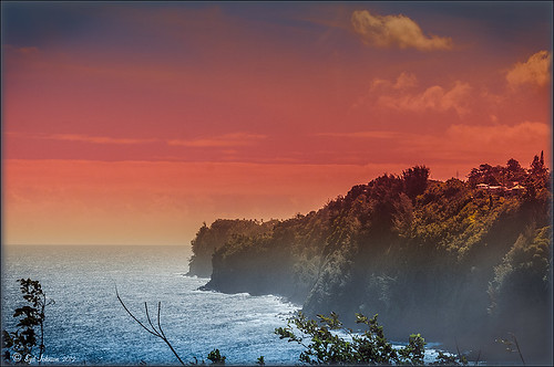
I have never used Lightroom’s Graduated Filter much as I usually do that kind of adjustment in Photoshop with the Gradient Tool on a mask. Recently I came upon a very interesting blog/videos, Adobe Photoshop Lightroom 4’s Graduated Filter Controls by David Marx, that discussed how much improved the Graduated Filter is and how to use it get some great landscape effects.
The image above is on the way to Hilo from Waipi’o Valley and shot through a car window???? Still thought it would be a good opportunity to see what I could do with it using this technique since the valley and water were so pretty and the clouds in the sky were a nice addition. This image was first tweaked in Lightroom globally, then 5 graduated filters were added, four for the sky colors and one for the water color coming up from below. I used the Color Wash technique on all four sky filters created, making some quite small to give a nice sunrise feel to the image. Finally it was taken into Photoshop where a layer using BBs Fogs and Mists Brushes were used to create an early morning foggy feel was added (and to cover up some uneven lighting on the valley walls) and for some noise reduction using Imagenomics Noiseware‘s Default setting (you could use Lightroom Noise Removal for a pretty nice result). Here is a small image of the original so you can see what the Camera Raw file looked like:

Once again, a pretty bad image was turned into something that really reminds me of my trip to the Big Island, even though it is not exactly as I shot it???? If you own Lightroom 4, definitely take a look at these very easy to follow videos – the results are quite amazing…..Digital Lady Syd
32-Bit HDR Using Lightroom and CS6
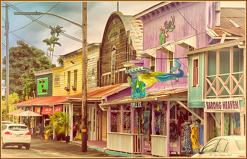
This is a beautiful little town called Honomu is on the road to Akaka Falls on the Hilo side of the Big Island. I love how this image turned out – the original tonemapped file was totally flat. This image was processed as a 32-bit HDR image in Photoshop CS6’s Merge to HDR program, then brought back into Lightroom 4.1 as a TIFF file where it was adjusted using mainly the Basic sliders, then edited back in Photoshop CS6 as a 16-bit PSD file. From there, Nik’s Color Efex Pro 4‘s was opened and these filters stacked: Detail Extractor at 68%, Graduated Filters using Blue No.1 as the sky was an ugly gray color, and finally the Film Efex Vintage set to Film Type 21. Next Nik’s Viveza 2 was added and that is what really made the difference in this image – the detail was popped in the signage areas but smoothed in the sky. Imagenomics Noiseware was added to smooth out the roughness of the whole image. The frame I used is called SJ Thin Double Edge Frame and can be downloaded at my Tidbits Blog DLS Free Layer Style Frames. The colors for frame were sampled from the image. Once again an image that did not have too much going for it turned out really nice……Digital Lady Syd
Digital Lady Syd Related Blogs:
New Lightroom and Photoshop 32-bit Processing Capability
Where Am I?

I have not posted a Where Am I in a while, so here goes. This weekend while watching the Scottish Open at Castle Stuart Golf Links, I started reminiscing about my trip to Scotland a few years ago and what a beautiful county it is. This particular day it was raining, rather typical late summer weather in this region. I am standing at the top of the beautiful Urquhart Castle which overlooks Loch Ness. We were on a tour that arrived by boat and it was beautiful in spite of the ugly weather. This is a great castle to visit and explore if you get in this part of the world.
This image was processed in Lightroom on two different virtual copies – one to bring the sky in nicely, and one for the castle and surrounding grounds. The copies were selected and opened in Photoshop by going to Edit In -> Open as Layers in Photoshop so they were in one file. The castle layer was placed on the bottom and the sky layer on top. Added a layer mask to the sky layer and used a Black to Transparent linear gradient so only the sky still showed from the top layer. A composite was made and in Nik’s Color Efex Pro 4, the Detail Extractor filter was applied using the Detail slider at 42% and (-) control points applied to the sky and water, a Darken/Lighten Center filter was applied, and a dark Vignette filter. There was quite a bit of noise in the sky so Imagenomics Noiseware was applied at Stronger Luma Noise (I recently bought this plug-in as I found it to be very good.) The Sharpen Tool was used to bring back a little detail in the hillside foliage and the people after applying the noiseware – very subtle change here. A Curves Adjustment Layer was added and Nik’s Viveza 2 – just added that pop in parts of the castle stonework with layer set to 63%.
The results came out very nice and how I remember it – to be honest I think it really was a lot drearier than it appears here but this is how I want to remember it!…..Digital Lady Syd
Digital Lady Syd Related Blogs:
Can a Pseudo HDR Image be as Good as the Real Thing? (Part Two)
I Didn’t Know That! Converting Lightroom Preset to Adobe Camera Raw Preset
 |
I occasionally come across a need to take a Lightroom preset and use it as a preset in Adobe Camera Raw. This is not as complicated as it seems. Below are the steps required to accomplish this task.
1. Apply the preset in Lightroom and make sure you know which panels and sliders you used. (If preset not already created, to save preset in Lightroom, on left side of Presets line, click (+) for “Create New Preset.” Name preset.)
2. Right click on image in Lightroom and select Edit in -> Open as Smart Object in Photoshop. The image is opened in Photoshop with the Smart Object icon on bottom right of thumbnail in Layers Panel.
3. Double click on thumbnail and it opens up into Adobe Camera Raw. Go to Presets panel (9th icon over on righthand side under the histogram) and the click folder icon at the bottom of the panel to open the New Preset dialog. Name and click the items you want included in the preset, then click OK. Your new preset shows up in the Presets panel.
You can now use your Lightroom preset anytime you want in Adobe Camera Raw also. I usually start my personal preset names off with an SJ so I know they are mine. It is easy to get presets from many different sources as time goes on so it helps to know which are yours.
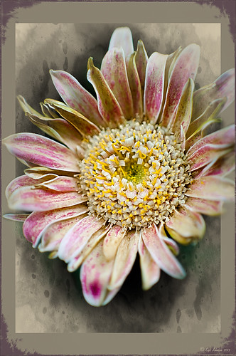
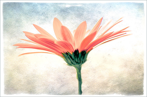
The image above is of a miniature mum in my yard. Hover over the image to see how the image looked with just a Lightroom preset I created called Dark Vignette – it makes the background very dark behind the flower. For information on how to create this preset and how the image was finished, see bottom of blog for details.
Hope this helped you get a little more organized…..Digital Lady Syd
To create this preset, changes were made to: the Tone Curve set to Highlights -24, Lights +41, Darks -56, and Shadows -54; HSL – Luminance sliders set to Red -41, Orange -9, Purple -2, Magenta -50 and all others 0, and Saturation sliders set to Red -2, Purple +32, Magenta +59 and all others set to 0; Effects Post-Crop Vignetting Style set to Highlight Priority with Amount -61, Midpoint 33 Feather 0 and others set to 0. To finish, image was sharpened and OnOne PhotoFrames (see sidebar for website link) acid burn controlled 15 was added and reduced in size in the plug in, and then grunge 12 was added on top – in Photoshop petals were painted over frame edge using a layer mask on first acid burn frame.
Digital Lady Syd Related Blogs:
Colorful Blown Out Look Lightroom and Adobe Camera Raw Preset
Settings for Vivid Drawing Look ACR/Lightroom Preset and NIK Color Efex Pro 4 Pseudo HDR Recipe
Just a Pretty Red Flower
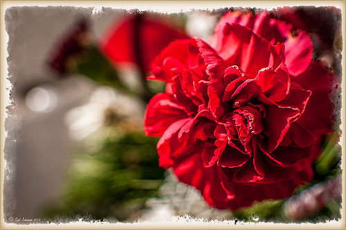
I really liked how the background blurred in this photograph of a red carnation I took on my back porch. I used a 60 mm AF Nikkor Micro lens at F/3.2, 1/300 second, ISO 200 at -1 Exposure Compensation. It was processed in the new Lightroom 4 Beta version setting (Highlights to -100, Shadows +100, White +27, Blacks -29, and Clarity +100; then the Exposure and Contrast) before taking the photo into Photoshop where a Sharpen Tool layer, Curves Adjustment Layer, and OnOne PhotoFrame acid burn controlled 12 were applied. A Layer Style including a stroke and inner glow in gold was the last step. Very little processing and it turned out beautifully.
It just goes to prove that if you get a good shot, it does not take much post processing – the image looks great to begin with. It also is nice to have a good lens and this is one of my favorites……Digital Lady Syd
Trying Out Lightroom 4 Beta
Well it is here – it’s been almost two years since Lightroom 3 came out so the new version is ready for testing. Anyone can download it to beta test and it will be available for use until March 31, 2012. So give it a try – it now edits video. Adobe has replaced the Recover and Fill Light with Shadows and Whites sliders giving a much improved result. The Adjustment Brush and Gradient now have the same choices as the Basic Panel sliders so you can localize changes to particular parts of the image – this is a big upgrade IMHO. Clarity slider no long gives halos when set over 80 – another great enhancement. They now have a Book module where you can design your own photo books and a Map module to help with CPS classifying. There is soft-proofing for your images before printing to see how they will look when printed, and in the Print module, there are Brightness and Contrast sliders to help with the conversion from monitor to print media. Guess there are lots of other little things going on in the new version, but I have not had time to do a complete run through. The biggest drawback as far as I can tell is that the presets do now work great from Lightroom 3 because of the slider changes in the Basic Panel – this will take a while to adjust your old ones over to the new version. Otherwise it seems to be a great new upgrade. So far plug-ins seem to working – the image of above used OnOne’s Perfect Layers plug-in and it ran fine in Lightroom 4 beta. (The texture is Shadowhouse Creations Oil Painting 3.)
Download the beta version of Adobe Lightroom 4
Two great resources for information about the new features are :
Launch Center – Lightroom 4 from NAPP featuring Scott Kelby and Matt Kloskowski (Owner of Killer Lightroom Tips blog)
Introduction to Lightroom 4 Beta from Adobe featuring Julieanne Kost (One of my favorite gurus)
This program is definitely worth taking a look at if you do photography or Photoshop much at all. I love this program – the simplicity of the layout makes it very easy to use. Download the free beta version and see what you think! Once I get a chance to try out all the new features, I will report back – I am a Lightroom nut too!…..Digital Lady Syd
Create a Great Shot with a Good Crop
Thought I would show you what a difference a good crop can do for turning an ordinary image into something that has some real eye appeal. The rain on the petals could not even be seen in the original shot.
For Lightroom Users: The above image was first cropped in Lightroom using the Crop Tool, but you can do this in Adobe Camera Raw or even Photoshop or Elements to get the correct look. I have found that by zooming in on an image using the Navigator at a canned magnification zoom like 2:1, then using the hand to move the image around, gives you a quick feel for what kind of crop you need. Then it was adjusted using the other sliders.
For Photoshop or Elements: Open your image in Adobe Camera Raw and select the Crop Tool from the Camera Raw Tools at top (6th icon over). Use the Zoom pop-down box in the lower left to try different zoom magnifications. Hold down the Space Bar to move image around to see how a crop would look. Click the little arrow in the right bottom corner of the Crop Tool – this should be set to Constrain to Image and in my case, 2 to 3 since I want a 4 X 6 image to print. There are corner tabs that can be pulled out to adjust the crop at this point and get the final look. Now do your adjustments in ACR and the final crop will be applied once it is opened in Photoshop or Elements. Similar steps can be done using the Crop Tool in Photoshop or Elements after exiting ACR.
Below is my original RAW file. As you can see, it was blown out a bit and not well composed. Note that sometimes the close-up cropping just does not work for the image. JPG’s usually do not have as much information as RAW files and may not have enough information to give a clean close-up crop. But it is still worth a try to see.
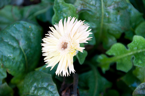
After applying ACR adjustments, the image was opened up in Topaz Black and White Effects plug-in using a Traditional Collection preset as a starting point. A Transparency of 1.00 was set to bring back the some color into the black and white image, and Quad Tones were added using the colors Black, Darker Blue, Light Blue and White to add the bluish tones. In Local Adjustments the center color was painted back in, details painted in, and a little dodge to add contrast.
Next time you think an image is just not going to work, try some different types of cropping. You might find a really interesting look!…..Digital Lady Syd
The Art Corner: Little Girl Knitting – A Mystery Sculpture!
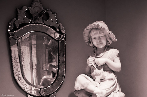
I recently was visiting the Lightner Museum located in the old Alcazar Hotel in St. Augustine, Florida, and found this beautiful sculpture of a little girl sitting on a big pedestal in the corner. I think it turned out to be my favorite piece in the museum and the gorgeous antique mirror next to her is perfect for the setting. The sculpture is by Ella Pollock Bidwell of which very little known. The art was signed by the artist with Florence 1889, Carrera Marble was the medium used, and listed on a separate line “American(?).”
The Museum’s information sign by the work states “Despite the fact that this is a highly executed work of are, no concrete information has come to light on Ella Pollock Bidwell. Whether she actually sculpted this from marble herself or only did a clay maquette to be copied by others is left for us to speculate. There is some possibility that Ella Pollock Bidwell may have been an American working in Italy as many American Artists of the 19th Century were want to do. Alas we have no proof to offer of this either. Although the Artist is unknown to us today, her legacy remains with us in this charming and beautifully crafted work of art.” While searching on-line, the Bidwell Family Crest and History came up and listed that in 1892, a woman by the name of Ella P. Bidwell came through Ellis Island from London at the age of 30. Can’t help but wonder if this is the same woman who did this beautiful sculpture. You also have to wonder if this woman made more beautiful sculptures during her lifetime – what a shame we do not know!
The image was processed mainly in Lightroom. I created the tinted preset from reading David duChemin’s book “Vision & Voice – Refining Your Vision in Adobe Photoshop Lightroom.” See my blog “Inexpensive Gifts for the Photoshop Lover on Your List” No. 2. This book is a great read if you use Lightroom – he teaches you how to make some very beautiful presets. I use them all the time. The one applied to this image I named Maasai Chocolate split-tone & vignette to use as a starting point, but ended up changing several of the settings in the Black & White Mix. The image was also cropped to bring the mirror and the girl into closer view. In Photoshop a Curves Adjustment Layer was added and the Sharpen Tool was used on its own layer to locally sharpen parts of her features. Finally her face was Dodged just a small amount. I really loved the results of this preset on the sculpture…..Digital Lady Syd
Why I Love OnOne’s Perfect Layers!
OnOne’s Perfect Layers plug-in was used to add the texture to this image. It could have been done in Photoshop just as easily (and a lot of people say this), but the reasons I like Perfect Layers is that:
(1) you just have to click a button to get rid of a texture you are trying and do not like;
(2) just load a new texture to apply and add several others if you want. Much easier that placing a texture from Bridge and then going to the Layers Panel to try different blend modes.
(3) can create several virtual copies with different effects in Lightroom and bring them all into Perfect Layers as one file with lined up layers where the blend modes can be changed, textures added, and areas masked out. Major cool!
(4) even though it is not a Smart Object, when you open the PSD file in Photoshop, all the layers created in Perfect Layers are in place and reconstructed right there.
I am all for doing things faster and better and Perfect Layers does just that. I am not sure I have created a bad texturized image since getting this program. And that is why I Love Perfect Layers!
The image is of a building in Stirling, Scotland. The beautiful texture is provided free by ShadowHouse Creations and is called Oil Painting One (it has a nice short tutorial with the download that is very good also.) An OnOne PhotoFrame called acid burned controlled 05 was added and the image sampled to get a matching frame color.
Give Perfect Layers a try if you use Adobe Lightroom – can download a trial of Perfect Layers by clicking on the OnOne Perfect Photo Suite link on the side. Until Later…..Digital Lady Syd
Digital Lady Syd’s Related Posts:
“Perfect” Perfect Layers
Clarifying Clarity! Adobe Camera Raw and Lightroom Quick Trick
New Plug-In for Lightroom
Colorful Blown Out Look Lightroom and Adobe Camera Raw Preset
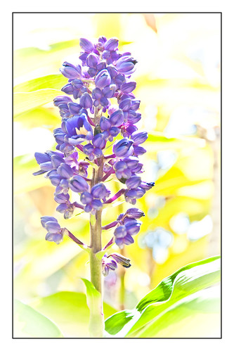 |
While in Hawaii, after taking a lot of beautiful flower images, I created the above effect as a Lightroom preset that I have used many times. It looks especially nice for a calendar image. Hover over image above to see the original.
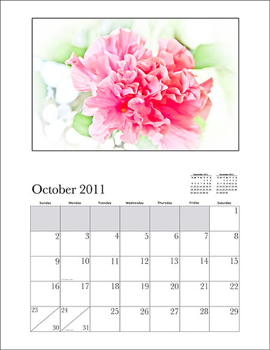
This preset I call “Colorful Blown Out” and mainly has Basic and Luminance settings. You can download the free Lightroom preset here and the Adobe Camera Raw preset here. For a softer look, try increasing the Recovery slider and the Brightness slider. It is a good starting point for a very nice flower look. For information on where to download the calendar template and how to apply it, see my Photoshop Fun Blog Free Calendar Template for instructions.
Give it a try on other types of images too. Hope you enjoy!…..Digital Lady Syd
“Perfect” Perfect Layers!
I keep finding excuses to use Perfect Layers, this fairly new plug-in for Lightroom, by OnOne Software. I really did not think that I would use it that much, but then I start playing around with an image, and there I go, back into Perfect Layers! It is so easy to try out the effects of my favorite textures on my images, and it is easy to stack virtual copies (and other textures or images – the layers can be dragged up or down in the stack) to get a totally unexpected look.
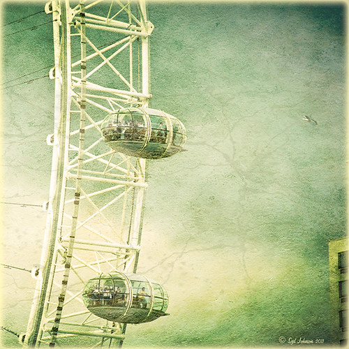
For this image of the London Eye, I cropped the original image and then created a Lomographic Preset (follow this very simple video from Michael Rather at the Digital Photography Connection on “Creating a Lomography Image) on a Virtual Copy of the cropped image. Select both the original and virtual copy images and open them up in Perfect Layers to create two layers stacked. A new image, Shadowhouse Creations Oil Painting-5 texture, was then imported and stacked as a layer on top and set to Hard Light. The top two layer’s opacity was adjusted to taste, and voila – a pretty nice texturized image! (By the way, I keep using this set of textures all the time – gives a real painterly canvas look to the image.) Here is a link to Lomo Presets from Matt Kloskowski’s Lightroom Killer Tips that have similar settings but a slightly different color and look. I have actually seen presets with a blue tint instead of green for this effect.
Definitely give this plug-in a try if you have Lightroom. I believe there is room for a lot of creativity and it is much quicker than going into Photoshop to see what results you are getting. Have fun creating!…..Digital Lady Syd

