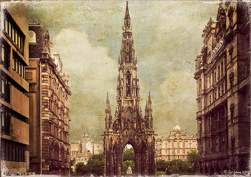
Textured Sky Adds Vintage Feel
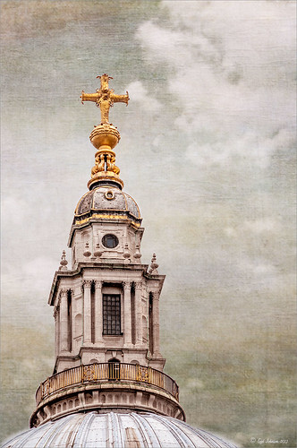
This is another tower image from London. Once again, I have no idea what it is connected to, but it is a beautiful cupola. I really liked the final cloth feel on the texture. This image was straightened and just the Basic Sliders were used in Lightroom. Once in Photoshop, I selected the tower, deleted the background, and tried several different texture backgrounds. I ended up with one of my very favorite Flickr Texture people, Lenabem-Anna Textures, Texture 278 – her textures are incredible! This one gives the cloth appearance with just a touch of clouds – perfect for an original image that had no clouds. For this image a Gaussian Blur was added using a Radius of 5.9 just to smooth out the texture in the background but leave the color in the texture. A Levels Adjustment Layer was added and the Midtones slider adjusted a little for more contrast to the whole image. To add the texture back into the whole image, the same texture was applied again on top. A Hue/Saturation Adjustment Layer was clipped (ALT+click between the layers to clip) to the texture and the Saturation slider was set to -100. The texture layer was set to Overlay blend mode at 67% layer opacity. A Color Balance Adjustment Layer was added on top to bring out the gold tones more in the tower. That was it. …..Digital Lady Syd
Digital Lady Syd Related Blogs:
Clarity with Texture!
Where Am I? Edinburgh, Scotland
Getting a Nice Painterly Landscape Effect with Topaz Simplify and Texture
Clarity with Texture!
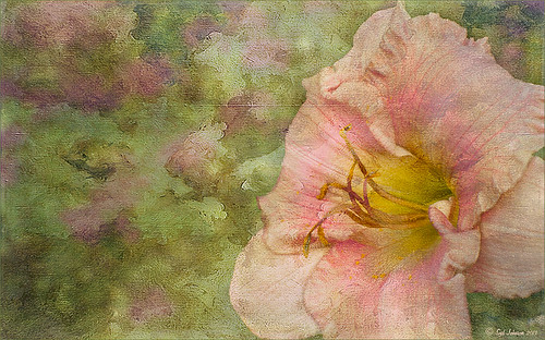
I love how this image turned out – totally me! This is a beautiful pink variety of a Day Lily – huge beautiful blooms that I bought at WalMart! Nothing was done in Lightroom other than the checking Enable Lens Profile and Remove Chromatic Aberration, and adjusting the Crop. In Photoshop the layer was duplicated and the new Topaz (see sidebar for website link) Clarity plug-in was applied using the settings shown below. Note that the Red Hue slider was set to -0.59 along with the other settings in the screenshot.
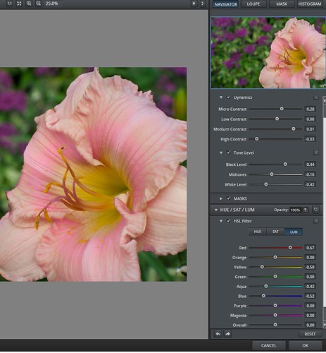
These settings bring out the pink a little more in the flower. A burn layer was created using my The Best Dodging and Burning Technique! blog, and a paint clean up layer to make the stamen stand out more. Now what really made this image pop was using the beautiful Texture 86 by Lenabem-Anna – check out all her fabulous textures on Flickr that can be downloaded for personal use. It was duplicated and on the bottom layer a layer mask was added where the pink flower was lightly painted out. I did not want to completely cover up the background purple flowers in the image so the opacity was set to only 61%. Since I wanted the flower to have some texture but not pick up the color from the it, two steps were performed: 1) the texture layer was duplicated and a black layer mask was added where the flower was lightly painted back. This time the layer as set to Hard Light and the layer opacity was only 35%; and 2) a Hue/Saturation Adjustment layer was clipped to the texture (ALT+click between the layers) and the Saturation slider in Master was set to -100 and Lightness +13. Now the texture color only appears in the background. Totally loved the final result! …..Digital Lady Syd
Digital Lady Syd Related Blogs:
Getting a Nice Painterly Landscape Effect with Topaz Simplify and Texture
Where Am I?
Digital Lady Syd Reviews Topaz Clarity

