I Didn’t Know That! Use A Pattern Fill Layer to Add a Painted Texture
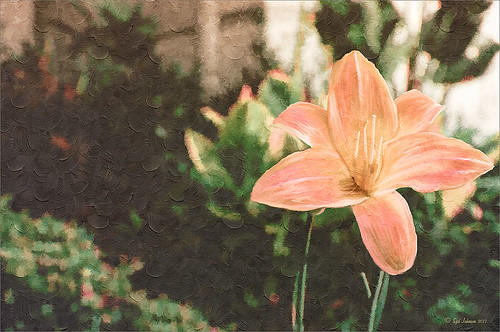
Love my Day Lilies! This was a yellow lily but using Topaz (see sidebar for website link) Clarity, I was able to turn it to this pretty pink color. (My preset I call Crazy Color Palette settings are: Clarity Section – Dynamics: Micro Contrast -0.36, Low Contrast 0.39, Medium Contrast -0.36, and High Contrast -0.39; no Tone Level settings; HSL Filter Section settings: Hue – Red -1.00, Yellow -1.00, Green +1.00, Blue +1.00, and Magenta -0,52; Sat – Red -.50, Yellow 0.27, Green -0.09, Blue -0.03, and Magenta +0.59; and Lum – Red -0.03, Yellow 0.41, Green -0.23, Blue -0.20. All not mentioned are set to 0. Then I changed to Micro Contrast slider to 0.55.) Apply and then go back to Photoshop and opened Topaz Simplify and apply Oil Paint preset. A layer was added on top and Fay Sirkis’s 03 Palette Brush Blender was used to smooth out the flower rough edges from the Simplify. A old Florabella Action (that is no longer for sale) was run on the flower and and Kim Klassen’s Cloth & Paper Prague texture was also applied at 15% opacity. The flower was painted out so the texture did not affect it, only the background. Created a New Layer using the Sponge Tool to saturate more in the flower itself. A little burning and clean up was done on the flower. A Curves Adjustment layer was added to add back a little contrast. Then a Pattern Fill Layer was added with one of the patterns in Jack Davis’s Wow Patterns (see my blog Can You Get a Painting Look With a Photoshop Action? Jack Davis Can! for download link) and set to Soft Light blend mode at 59% opacity. I have never used the Pattern Fill Layer to add a painterly texture to an image, but it turned out really nice……Digital Lady Syd
Painting a Dragon
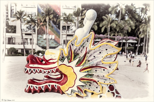
This was the head on a wood boat pulled up on the sand in front of the Rainbow Tower at the Hilton Waikoloa Village on Waikiki Beach in Oahu, Hawaii. Recently I did a blog called Can You Get a Painting Look With a Photoshop Action? Jack Davis Can! where his Wow Smart Object Painting1 Action was applied to several images. This image uses the same action to create a nice basic painting. A darken layer was added above to show emphasize the edges for the dragon from the background image (see my The Best Dodging and Burning Technique blog). At this point I thought it looked pretty good, but the background was competing with the dragon in color, so I decided it needed to be pulled back some. Topaz (see sidebar for website link) Black and White Effects was used to soften the background. Several of the presets created really interesting looks due to the canvas effect being applied in the action first. I settled on an old wedding preset I had created back in version 1. (If you are interested, here they are: Conversion – Basic Exposure: Contrast 0.04, Brightness 0.10, Boost Blacks 0.35, and Boost Whites 0.01; and Finishing Touches – Silver and Paper Tones: Tonal Strength 0.44, Balance 0.96, Silver Hue 5.81, Silver Tone Strength 0.85, Paper Hue 77.42, and Paper Tone Strength 0.38; Transparency – Overall Transparency 0.80. A white border was then created around edge using Right Edge Size 0.11/Edge Exposure -1.00/Edge Transition 0.09; Left Edge Size 0.14/-1.00/0.08; Top 0.20/-1.00/0.09; and Bottom 0.09/-1.00/0.16.) Back in Photoshop a New Layer was created and the Clone Stamp was used to even out the border just a little around the image. A Curves Adjustment Layer was added to add contrast to the dragon and further separate it from the background – then the layer mask was filled with black (CTRL+I in mask) and just the dragon was painted back in white to reveal it (see my Using Curves Adjustment Layers to Get Rid of Shadows and Highlights blog). The last step was to add a Hue/Saturation Adjustment Layer to further adjust the background saturation (Saturation was set to -41 in Master) – but this time the dragon was painted in black to hide adjustment on it. This really turned out how I remember this image……Digital Lady Syd
Digital Lady Syd Related Blogs:
Digital Lady Syd Reviews Topaz Black & White Effects 2.1
Meeting a Belarusian Horse!
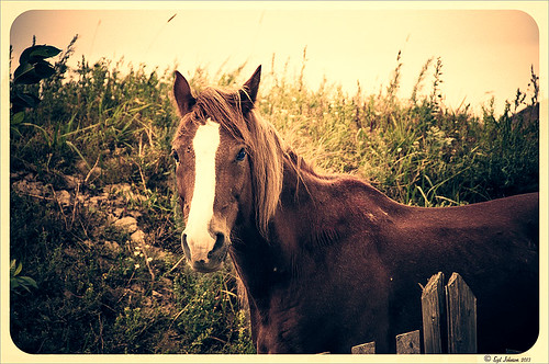
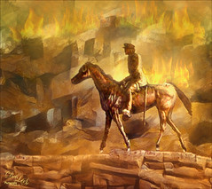
This beautiful horse was in a field outside an old wooden windmill in Belarus. I had forgotten I had taken his pix. Since I did a blog called Can You Get a Painting Look With a Photoshop Action? Jack Davis Can!, this image was processed in Lightroom using his Wow! Antique 03 preset, which included the framing. Check out my other blog for downloading info of his Lightroom presets. The image was taken into Photoshop and the Burn and Dodge Tools were used directly on a duplicate copy of the background. I would never have tried this if I had not watched a short video on Lynda.com called Black and White with Lightroom and Photoshop by Bryan Hughes O’Neill, Adobe Photoshop Senior Product Manager who really knows what all the sliders do in these programs. It was very interesting and I learned to use these tools. The main thing to remember is to keep Protect Tones checked. With the Dodge Tool set to Shadows at 50% Exposure, the horses eyes were painted over to make them pop. Burning Tool was used to separate his face from the field using Midtones and Highlights selected. A New Layer was created for the Sharpen Tool – therefore be sure to check Sample All Layers and Protect Detail in Options Bar. The Strength was set to 12% and the effect was built up slowly where sharpening needed to be added. It does not introduce a lot of artifacts this way. A Curves Adjustment Layer was added on top and dragged down in image to get a little more contrast. That was all that was done to get this lovely effect. What a beautiful creature!…..Digital Lady Syd
Digital Lady Syd Related Blogs:
Using Old Wallpaper for a Vintage Look
My Favorite Adobe Lightroom 5 Features

