This image was created from a single white daisy shot taken in my front yard. The flower was cut out of this image by selecting the flower using a layer mask and then applying the layer mask. The flower color was changed using a Hue/Saturation Adjustment Layer clipped to the flower layer (CTRL+ALT between the layers to clip). French Kiss Bohemian texture was placed underneath the flower and the color changed to the violet colors. Distressed Textures HR Strawberry Juice On My Finger was added on top and set to 52% opacity. Only the center of the flower was painted out using a layer mask. The flower was duplicated two more times and Free Transformed (CTRL+T) and rotated – different colors were chosen for the other flowers using Hue/Saturation Adjustment Layers clipped to the flowers. Kim Klassen‘s Unleashed texture was added as an overlay (see my How to Create an Overlay Out of a Texture blog.) A Hue/Saturation Adjustment Layer was clipped to the texture and set to a violet color. Some text was added using Rough Typewriter font. A New Layer was added on top and a grunge brush I had created a long time ago was added in pinks and violets and set to 66% layer opacity. A Curves Adjustment Layer was added as a last step. I just love to play with textures and make textures…..Digital Lady Syd
Digital Lady Syd Related Blogs:
Texture Resources – So Many Choices! So Many Choices!
Painterly Textures to Create a Beautiful Floral Image
08/01/2013 | Categories: Photoshop Tips, Textures | Tags: Distressed Textures, French Kiss Textures, Kim Klassen Textures | Leave A Comment »

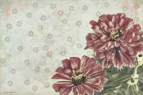
Just playing with my Zinnias. I was trying to a vintage, wallpaper feel behind them. I actually opened Topaz (see sidebar for website link) photoFXlab from Lightroom. Here are the steps completed: Applied Topaz Clarity – SJ Illustrative Look – with a few adjustments, duplicated layer, set Dynamics slider to 9 and Saturation -17, duplicated layer, enter Topaz Adjust and apply my Rick Sammon Spicify Soft Artsy, back in photoFXlab the Adjustments settings stayed on this layer, duplicated layer, duplicate layer, in B&W Effects applied SJ_Quad_DkB_GR_Yel_Wh preset, an exited the plug-in to Photoshop. Just a few steps here. Guess what I am trying to show is that there is a lot of versatility here with photoFXlab. Once in Photoshop some clean up was done and French Kiss Studio Selections 3 White Wash texture was applied (I use this texture a lot and it is in a very reasonably priced set). On the white was I used Brush Lovers Art Flowers 2000 (liked the brush best when applied directly to the French Kiss WhiteWash texture – just looked better). This brush was set up as a preset – had to select the dark red color 4e322e and dark green color 3c3e38. In the Brush Panel I turned on Shape Dynamics, Scattering and Smoothing, Size 394 px, Spacing 434% and then Color Dynamics was added and size changed to 201 px. A layer mask was added to the layer to lightly brush out texture from the flower, but leaving a little to keep the grain intact. A Curves Adjustment Layer was clipped to the texture to bring out the cool texture a little bit more. 2 Lil’ Owls Studio Color Bokeh Grunge Set 4 (see sidebar for website link) was applied at 50% opacity and in the layer style, the Blend If This Layer’s white tab was set to 164. The last step involved adding two New Layers where just a couple strokes were applied, one layer using green and one the dark red color to add a little grunge feel to the image. The brush used was Nakatoni Custom Brushes texture brush (does not appear to be available anymore but any soft grunge brush would do). The preset settings are listed below. ….Digital Lady Syd
Here are the plug-in preset settings used if you are interested:
Topaz Clarity SJ Illustrative Look settings: If you would like the illustrative look, here are settings: in Clarity Section – Dynamics: Micro Contrast 1.00, Low Contrast 0.28, Medium Contrast -0.50, and High Contrast 0.06; Tone Level: Black Level 0.61, Midtones 0.14, and White Level 0.72; and in Hue/Sat/Lum Section – Hue: Only Red 0.16, Yellow -0.05, and Green -0.17 were adjusted; Sat: only Green -0.22 and Overall -0.45 were adjusted; and Lum: Only Orange 0.36, Yellow 0.89, Green -0.91, Aqua 0.30, and Blue -0.09 were adjusted.
Topaz Adjust Rick Sammon Spicify Soft Artsy settings: Adaptive Exposure section: Adaptive Exposure 0.50, Regions 25, Contrast -0.56, Brightness -0.13, Protect Highlights 0.03, and Protect Shadows 0.03; Details section: Strength 0.87, Detail Boost 1.15, Threshold 0.12, Radius 25.00, and Sharpen 1.01; Color section: Adaptive Saturation 0.33, Color Regions 10, Saturation 1.00, Saturation Boost 1.00, and Hue 0.00; and Noise section: Suppression 3.24, Amount 0.51, and check Use Topaz DeNoise.
Topaz B&W Effects SJ Quad DkB_Gr_Yel_Wh settings: Quad Tone: Color 1 Region: Color (R1/G1/B12) and set to 15.08, Color Region 2: Color (R63/G78/B85) and set to 143.9, Color Region 3: Color (R216/G211/B129) and set to 227.5, and Color Region 4: Color (R255/G254/B237) and set to 255.0: and Transparency: Overall Transparency 1.00.
05/28/2013 | Categories: Photoshop Filters, Textures | Tags: 2 Lil' Owls Studio textures, Adjust, B&W Effects, Clarity, French Kiss Textures, photoFXlab, Topaz Adjust 5, Topaz B&W Effects, Topaz Clarity, Topaz photoFXlab | Leave A Comment »

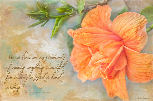
Love my beautiful hibiscus plants blooming on my back porch. This one has particularly lovely blooms. It was very quick and easy to process. Just processed a little in Lightroom and then in Photoshop applied my old standard Topaz (see sidebar for website link) Detail 3 using the Overall Medium Detail I preset. Painted over where the petals were blown out (see my Getting Rid of Those Blown Out Areas blog) on a separate layer. Than added French Kiss Tableaux Collection Creation texture and added a layer mask. Just painted back the flower – that is all it needed! It seems that if you have a really strong texture, it sometimes works best not to change blend modes but leave it set to Normal. Last step was to add the text using a really nice font called Quilted Butterfly at 78.01 points. (This font does require a $2 donation to use.) I loved the final effect!…..Digital Lady Syd
04/30/2013 | Categories: Textures | Tags: Detail, French Kiss Textures, Hibiscus, Textures, Topaz Detail 3 | Leave A Comment »

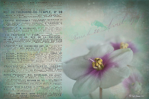
These beautiful violets I recently bought at Wal-Mart and they are so pretty. They really like the filtered light from my south facing window in my kitchen. I used my handy, dandy 60 mm Nikkor macro lens at F/4.8, 1/90 sec, and ISO 200. A Bower 0.5 x High Resolution Digital Lens with Macro was added to the lens. In Lightroom 4 I just followed my workflow in my blog How to Use Adobe Camera Raw (ACR) or Lightroom 4 Quickly. I painted over the center of the flower using an Adjustment Brush set to a high sharpening and just a little Clarity. In Photoshop a Curves Adjustment Layer was used to selectively remove a shadow behind the front flower (see my Using Curves Adjustment Layers to Get Rid of Shadows and Highlights blog). Painted Textures Seafoam textures was added and just the flower lightly painted back using a white layer mask and painting in black. Next 2 Lil’ Owls Affetto Grunge Mosaic texture (see sidebar for website link) was added and the center painted out so only the darkened edges remained on most of the image. French Kiss’s Vintage French Brush No. 2 set -Dec 1924 was placed on the left side of the image and set to 89% opacity. A Layer Style was opened on this overlay layer. A dark Stroke set to 3 pixels inside was added, a Pattern Overlay using that wonderful default Photoshop pattern Bubbles was checked to add some variation in the text (I think this is the first time I have ever used it!), and an Outer Glow at 39% opacity was used. A Color Fill Adjustment Layer was clipped to the overlay and set to a light blue color. On the upper right French Kiss’s Vintage French Brush 1903 (same link as above) writing was applied and another Color Fill Adjustment Layer was clipped using the purple color from the flower. That was it! Lots of fun to do!…..Digital Lady Syd
04/11/2013 | Categories: Photo Art, Photography, Textures | Tags: 2 lil Owls textures, flowers, French Kiss Textures, macro, Painted Textures, Textures, violets | Leave A Comment »

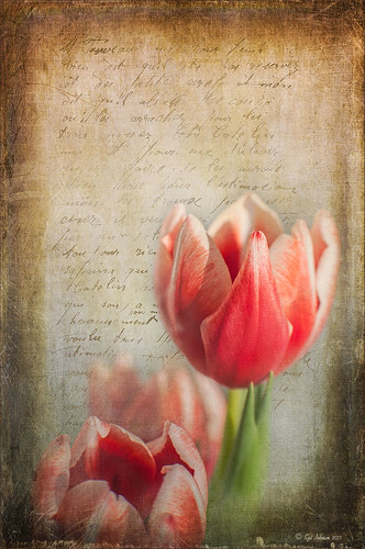
Love this image of my beautiful red tulips I got from the grocery a few weeks ago. I was experimenting with different settings and this one turned out perfect in my mind! It was shot with my 60 mm Nikon Macro Lens set at F/2.8, 1/3000, and ISO 400. Very little was done in Lightroom other then a little Basic slider adjustments following the workflow in my blog How to Use Adobe Camera Raw (ACR) or Lightroom 4 Quickly. I added a pretty texture (1) from 2 Lil’ Owls Studio textures (a free one from the site – see sidebar for website link) that I had first opened in Nik Color Efex Pro 4 and applied BiColor Filters using 40% opacity and Darken Center Filter to the texture. It gives more of a colorful look than the original texture. The beautiful French text is from French Kiss Glorious Grunge Letter 2 (a free download) – a brown colored Color Fill Adjustment Layer was clipped to the text (to clip just hold down ALT+click between the two layers in the Layers Panel, and the Adjustment Layer will attach to just the text). The text layer was set to 66% opacity. To keep the text from covering the flower, a Layer Mask was added to the text layer – with a black brush at 100% opacity, the text was removed from the flower itself. Next French Kiss Artiste Gateaux was added, set to Overlay blend mode and 28% Opacity. This makes the image look like a canvas – love this texture! The last step was a Curves Adjustment Layer added to the whole image to add some contrast. Sometimes it is just fun to play with an image you just like!…..Digital Lady Syd
Digital Lady Syd Related Blogs:
Check out my Textures category in the sidebar for more Tidbits Blogs
Check out my Fun Photoshop Blog (link at top of page) and click Textures category in the sidebar
01/29/2013 | Categories: Macro, Textures | Tags: 2 Lil' Owls Studio textures, Color Efex Pro, Free Text Overlay, French Kiss Textures, French Text, NIK Color Efex Pro 4, Text Overlay, Texture | Leave A Comment »

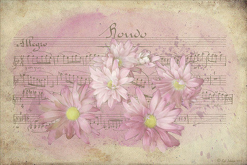
My musical flower image basically started out by my experimenting with some inexpensive French Kiss Brushes I recently bought. The background is from Shadowhouse Creations – Old Paper Texture 4. My flower image was added and a layer mask applied so that only a few daisies were showing. Once done, the layer mask was applied to the image (right click on layer mask and choose Apply Mask). A Color Balance Adjustment Layer was added and sliders in the Midtones (0, +13, -18), Highlights (), +11, -12), and Shadows (-31, +4, _32) were set to change the flower color somewhat. (I am listing the settings just to give you a feel for how these can be adjusted.) All the following brush layers were added underneath the image but above the texture layer – that way the brush strokes look like they are part of the texture and do not cover the image. It is also now easier to adjust the layer opacity and color. French Kiss Watercolor Spots 1_14 PNG brush file was applied on a New Layer and a bright pink Color Fill Adjustment Layer was clipped to it (ALT+click between the two layers to clip). Next a layer with one French Kiss Spatter4_14 brush PNG file stroke was applied and a purplish Color Fill Adjustment Layer was clipped to it. Another new layer and French Kiss Spatter 2_04 was applied with a deeper purple and set to 51% opacity. I seem to like adjusting a PNG file over the actual painted stroke – it seems easier to me but I am not sure it makes that much difference whether you actually stroke the image or use an overlay PNG stroke. French Kiss Vintage French Music in a set called French Kiss Vintage French Brushes 2 was added on top at 82% opacity, and a brown Color Fill Adjustment Layer was clipped to the layer. The music was painted off the flowers by using a layer mask. (Not sure why I placed it above the image – it would have been easier below.) The last step was a Curves Adjustment Layer to lighten up the image overall. This actually was not as hard as it sounds. Mainly just a lot of paint being spattered! What fun!…..Digital Lady Syd
01/22/2013 | Categories: Textures | Tags: French Kiss Textures, overlays, Photoshop Brushes, Shadowhouse Creations, Texture, Textures, watercolor brush | Leave A Comment »

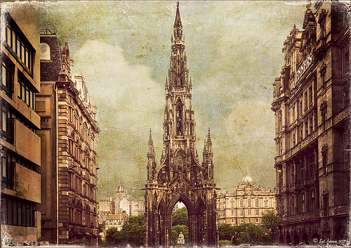
This is the beautiful Scott Monument in Edinburgh, Scotland. There is an excellent tutorial called Processing with Textures by Colleen of Chasing Dreams Photography that shows you how to create a vintage feel that looks somewhat like this. After doing basic processing in Lightroom, the image was brought into Photoshop where Lenabem-Anna Texture – 208 was added and set to Overlay blend mode at 17%. She has such beautiful textures that can be downloaded from FlickR – see her Use Information before downloading. This texture was chosen to lighten the dark image in the center. The texture was removed by painting a sampled color from the texture over the building areas using a low opacity brush. Next her beautiful vintage sky Texture – 230 was applied and set to Darken at 100% – a layer mask was used to remove texture from the parts of the image where the texture should not be covering. A vintage action was run on the background layer to add more of the effect and the layer was set to 49% opacity. On top Flypaper Elysium Copy Taster Texture was added but a Hue/Saturation Adjustment Layer was added with Saturation set to -100 so no color but just the scratches were seen. The texture was set Overlay blend mode at 45% opacity. French Kiss free Glorious Grunge Edging Overlay was added and a Solid Color Adjustment Layer using a cream color for the edging. A dark vignette was applied at 54%. To get a better feel for all these steps, check out the video. This image was a lot of fun to do and I really like the vintage look!…..Digital Lady Syd
01/17/2013 | Categories: Photo Art, Textures, Where Am I? | Tags: adding textures, Flypaper Textures, French Kiss Overlays, French Kiss Textures, How to Create a Textured Landscape, Lenabem-Anna Textures, Texture, Textured Landscape, Textures, vintage look | Leave A Comment »

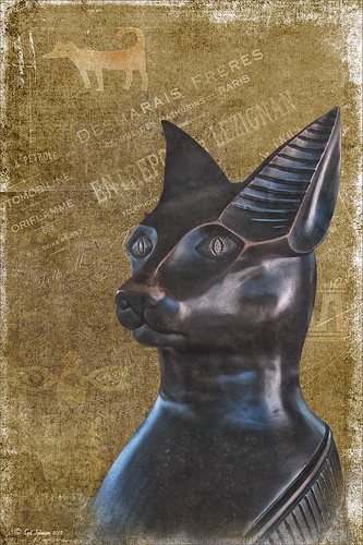
This beautiful cat statue was located outside the door to the breakfast buffet at the Hilton Waikoloa Village on the Big Island in Hawaii. After initial processing in Lightroom, the image was brought into Photoshop where French Kiss Bohemian Texture, a free download, was added behind the cat image. A black layer mask was added to the cat layer and the cat image was painted out with a white brush – it was refined by going into the Properties panel with the mask selected and clicking on the Mask Edge button to smooth out the selection. French Kiss Grunge No1 Chateau (a free download of PNG brush overlays) was placed on a layer above the texture but under the cat, and a brown Solid Color Fill Adjustment Layer was clipped to the layer (go to Layers -> New Layer -> Solid Color Fill and check Use Previous Layer to Create Clipping Group). The overlay was set to 69% opacity. Just above this layer another French Kiss overlay – Bohemian Template Overlay was applied (in set with Bohemian Texture download) with another Solid Color Fill Adjustment layer added using a soft cream color. The overlay texture was set to 48% opacity. Next above the cat image, French Kiss Artiste Impasto Texture (not free) was set to 32% to get a textured look on the cat – my own free gray Cat Painting Texture would probably work just as well. Now what was really neat is how I got the interesting animal and markings effect – they are from Tangaroa Dingbats font. By adding a layer style (double click on the layer) and selecting the Inner Glow with the default settings, and Pattern Overlay using my free Digital Lady Syd’s Smudge Texture as a pattern set to 258% scale, you get the soft orange-brown look. (To create a pattern from a texture, just open it up in Photoshop and go to Edit -> Define Pattern and it will appear at the bottom of your patterns list.) A separate text layer had to be created for each of the three objects selected and each text layer was set to approximately 30%. The Sharpen Tool was used on New Layer to sharpen the eyes just a little and that was it. I think it turned out pretty nice and it was a lot of fun to create. Try out using dingbats in your images to add a little different look to a texture…..Digital Lady Syd
01/15/2013 | Categories: Textures | Tags: dingbat fonts, dingbats, Free Textures, French Kiss Overlays, French Kiss Textures, Hilton Waikoloa Village | Leave A Comment »

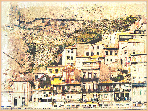
Usually I use my own images to alter, but I found this beautiful texture image of old buildings in Porto, Portugal, from Mayang’s Free Textures (scroll down a ways in link to see original) and it seemed like a good candidate to see what I could do with some more textures to enhance it some. Click their link to see the original image and lots of others that can be used for personal use.
This image was first processed using Topaz (see sidebar for website link) photoFXlab. First duplicated the layer. On top layer the Black & White Effects plug-in was opened and Hand Tinted Chiffon was selected with Transparency set to 1.00 and Vignette Strength to .45. After applying the plug-in, back in photoFXlab this layer was set to Linear Light at 100%. A +From Stamp layer was created and these Adjustment tab sliders set: Tint -8, Saturation 17, and Dynamics -28. Next exited to Photoshop where some clean up was done and French Kiss Artiste Collection Fantasie texture was applied. Two Hue/Saturation Adjustments Layers were added with black filled layer masks – the red-orange color needed to be adjusted and the greens above the buildings were off. These areas were painted back in the masks to create the correct tone in the image. An Ash texture (no long available – but Shadowhouse Creations has a very similar texture called ArtGrunge 5 which would give a very similar effect) and it was set to Hard Light blend mode at 45%. A hazy feel was added to the image by adding a Levels Adjustment Layer and just moving the Output Level black tab to 80. A Curves Adjustment Layer was added next to just slightly add contrast. This image had a very low resolution on it so I created a composite layer on top (CTRL+ALT+SHIFT+E) and went to Image -> Image Size and checked the Resample Image box and set the resolution to 240, leaving the size alone. The last step was adding my Mid Size Double Edge Frame layer style – sampled colors in the image for frame colors. I was really pleased with how painterly this image turned out. It is a little different from creating a flower type texture image, but you can really add some creative aspects with a little experimenting. And thank you Mayang.com for supplying such a interesting image to work with!….Digital Lady Syd
01/10/2013 | Categories: Photoshop Filters, Textures | Tags: B&W Effects, Black and White effects, Free Layer Style border, free layer style frame, French Kiss Textures, Layer Style border, Layer Style Frame, photoFXlab, plug-in, plugins, Shadowhouse Creations, ShadowHouse Creations Textures, Topaz Black and White Effects, Topaz photoFXlab | Leave A Comment »

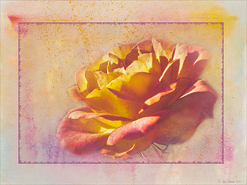
I took this beautiful little rose at Lowe’s with my inexpensive Kodak C1450 14-mp point-and-shoot camera and it turned out very nice! These little cameras really do a great job for those unexpected shots! Since most people have decent cameras on their phones (mine is still a 2 megapixel so I carry this camera), there really is no reason not to get the shot. It just may not be quite as sharp or colorful as your good camera, but at least you get the shot, the memory, and something you can work with in Photoshop. That is what I did with this rose – it was a little soft except where it was focused, but the colors were still beautiful and overall, not that bad an image.
One of the issues I had with this image is that it is a JPG and there was a lot of Chromatic Aberration in the image – I tried to remove it in Lightroom, but it still looked rather bad so I treated it with a soft texture treatment to blend in the petals where the bleeding was bad. Some noiseware was also applied. Two gorgeous textures were stacked from French Kiss Textures – Artiste Fantasie at 80% opacity and Artiste LaDanse set to 68% opacity and her Spatter Brushes were used over the rose. Following Dave Cross’s path tutorial from his Photoshop CS5 Finishing Touches for Photographers class at Kelby Training (but it is also in his really good Photoshop Finishing Touches book), I created a fancy edge around the flower. Dave’s book was published a while back, but most of the tutorials work fine in CS6.
So get the shot, even if you do not have your best equipment with you – it may be a great image anyway!…..Digital Lady Syd
01/08/2013 | Categories: Digital Lady Syd's Photoshop Rules, Photography, Photoshop Tools, Textures | Tags: French Kiss Textures, Texture | Leave A Comment »

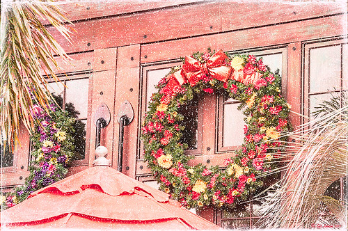
For this wonderful holiday, thought I would show this pretty image of wreaths from SeaWorld Orlando. Just a little basic processing in Lightroom before taking the image into Photoshop. Topaz (see sidebar for website link) Adjust 5’s High Key preset was applied with the Overall Transparency set to .24. Next Topaz Detail 3 was applied using the HDR Enhancement II preset. French Kiss’s Artiste Chamante texture was applied and set to Overlay at 100% opacity. My free Snow1 Overlay was next applied and set to 75% opacity. French Kiss’s Glorious Grunge Edging Overlay was applied next and a Solid Color Adjustment Layer set to a light pink was added. Since the edging did not seem to show up real well, it was duplicated along with the Adjustment Layer. That was all that was done and I love the final effect – the umbrella really added to the shot. Hope all are having a wonderful week!…..Digital Lady Syd
12/25/2012 | Categories: Photoshop Filters, Textures | Tags: Adjust, Detail, filters, free overlay, French Kiss Overlays, French Kiss Textures, plug-in, plugins, SeaWorld, SeaWorld Orlando, Snow Overlay, Topaz Adjust 5, Topaz Detail 3 | Leave A Comment »

Just felt like using a couple of my old standby favorite plug-ins to create a vintage feel to this image. This old red corvette image was taken at the 39th Annual Daytona Turkey Run at the Daytona International Speedway infield. I love the way the raceway seats are in the background – it just seems to the be the right setting for this old girl – I love corvettes! It was processed first in Lightroom starting out with cropping and applying one of David duChemin’s Lightroom 4 presets called Warmer Sunset -.66 Grad – I was surprised it gave such a nice vintage feel for starting post-processing of the image. From there several adjustments basic Lightroom adjustments were done and the chrome was sharpened using an Adjustment Brush. In Photoshop Nik Viveza 2 was used with control points placed on the windshield to clean up some window glare (this plug-in does an amazing job with window glare) and on the detailing on the car. Then Nik Color Efex Pro 4 was applied and several of my favorite filters were stacked – Darken/Lighten Center, Detail Extractor, and my favorite for getting this vintage feel, Film Efex Vintage set to Film Type 14 with an overall opacity of 56%. A Curves Adjustment Layer was added and French Kiss free Glorious Grunge Edging Overlay with the lines inside removed was applied and set to a tan color. I wish I could fix up this car – she really was a beauty!…..Digital Lady Syd
Digital Lady Syd Related Blogs:
Yellow Dogface Butterfly in her Glory!
Soft and Sharp Image at the Same Time!
12/20/2012 | Categories: Lightroom, Photoshop Filters | Tags: Color Efex Pro, corvette, free overlay, French Kiss Overlays, French Kiss Textures, Lightroom, Lightroom presets, NIK Color Efex Pro 4, Nik Viveza 2, plug-ins, plugins, vintage, Viveza | Leave A Comment »

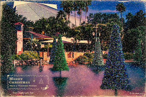
These “floating” trees were in the pond area at SeaWorld Orlando in October and they looked really strange. I decided to spruce them up a bit and give them that holiday feel – these must have been the first decorations they put up. I have said it before and I will say it again – whenever I cannot figure out something interesting to do with an image, OnOne’s (see website link on sidebar) Perfect Effects usually has the answer. In this case two effects were stacked: Nicely Toasted preset from the Vintage group – set to Hard Light at 74% opacity and Warm Vintage also from the Vintage Group with a few changes to Brightness (-45), Contrast (-40), and Darken Blend Mode with Strength 58. A Composite Channel Curve was set (In157/Out 138). My free Snow1 Overlay was added along with my free Merry Christmas PNG Overlay using an Outer Glow layer style set to a bluish color (Blend Mode Normal, Opacity 39%, Spread 8%, and Size 215 px) – use this trick to to make your text and overlays stand out if on a busy background. Added text layer for my name, and added French Kiss Glorious Grunge Edging Only with the grunge erased from the middle. All of these overlays used a Solid Color Adjustment Layer set to a soft cream color sampled from the roof of the building. (Layer -> New Fill Color -> Solid Color and check Use Previous Layer to Create Clipping Mask for each overlay). The text layer used the same color. A Curves Adjustment Layer was added and the mask filled with black – with a 30% opacity white soft brush, the areas I wanted affected were painted back in the mask. That was it. Hope you can use a few of these tricks to make some nice cards…..Digital Lady Syd
Digital Lady Syd Related Blogs:
Where to Find Those Cool Free Christmas Card Templates?
Free Christmas Card Vectors and Brushes
Beautiful Christmas Flowers
Some Free Christmas Overlays to Spice Up Your Christmas Cards
12/18/2012 | Categories: Photoshop Filters | Tags: Free Overlays, French Kiss Textures, OnOne Perfect Effects, overlays, Perfect Effects, plug-in, plug-ins, plugin, SeaWorld, SeaWorld Orlando | Leave A Comment »

Just thought I would post a little link to how my textures can work together. These are my miniature mums on my back porch – they were processed in Lightroom using my workflow (see How to Use Adobe Camera Raw (ACR) or Lightroom 4 Quickly). Once in Photoshop clean up was done first on some of the petals, and a High Pass Filter set to radius 8 and Soft Light blend mode to sharpen the flowers. Next my free Pastel Watercolor Texture set to Hard Light, and Cat Painting Texture set to Hard Light at 40% opacity. Last a couple of French Kiss Splatter brushes were added and my French Photography Overlay I created (see How to Create Personal Overlays for Your Images). That is all that was involved. Enjoy!…..Digital Lady Syd
12/11/2012 | Categories: Textures | Tags: Free Textures, French Kiss Textures, overlays, Texture | 1 Comment »

Really enjoying processing the beautiful little white mums still blooming on my back porch. I recently found yet another wonderful texture site and decided to give it a try. The flower image was first processed in Lightroom – a preset called Summer Haze by Matt Kloskowski (one of the Photoshop guys at NAPP) was first applied and it turned everything into this soft warm summery feeling. With the Basic sliders a few tweaks were added to increase Exposure and open up the Shadows a little, and then a couple adjustment brushes were created to add sharpening and clarity to the flower centers. Once in Photoshop some blown out highlights were softened (see Getting Rid of Those Blown Out Areas in Your Image and a little Burning was done to bring out some of the flower lines. Next a beautiful Kim Klassen Texture called Organic was added and set to Hard Light blend mode at 92%. (Join her site and get lots of her beautiful textures for free including this one!) A Levels Adjustment Layer was added to increase the contrast a little. Next I added one of my own overlays I created (see How to Create Personal Overlays for Your Images) and used a layer mask to remove part of it – just wanted a little showing. I also used a small splatter brush at 15% opacity to reduce parts of the lettering without reducing all of it. The last step involved adding my favorite French Kiss Glorious Grunge Edging Overlay – a free overlay that can be downloaded at her site. That was it!…..Digital Lady Syd
11/29/2012 | Categories: Lightroom, Photo Art, Textures | Tags: create a textured image, French Kiss Textures, Kim Klassen Textures, overlays, Photoshop, Texture, Textures | Leave A Comment »

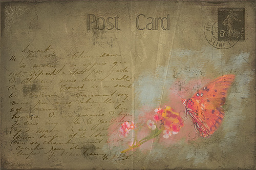
My butterflies certainly get around. This lovely lady is checking out my yellow and pink lantanas in my front yard. I had fun creating this antique post card effect. Not sure why I did it but it was fun. Thought I would share how I got this final result as it involves using overlays, which add such an interesting look to an image. The original butterfly image was processed using Nik Color Efex Pro 4‘s Detail Extractor filter and then Film Efex Nostalgic Film Type 1 filter. This gave a very solid looking, almost illustrative look, butterfly and flowers to work with. I added a black layer mask and painted back the parts I wanted to use for the image. Underneath this layer ShadowHouse Creations PC8 (Post Card) texture was added and a Solid Color Adjustment Layer clipped to the texture (CTRL+Click between the layers) using a lighter color to brighten it up. Two layers were created and light blue and pink were painted around the butterfly and flowers. Three of French Kiss’s overlays were added: 1904 for the writing, Grungy Flourish for the upper left corner design, and Stamp 2 – all from the French Script No 1 brush collection, and Glorious Grunge Edging for the outside of the postcard (this is free on her website and a really nice overlay effect). Also on a New Layer a single brush stroke of Paper Scratch Brush in Paper Damages Brush Set on Adobe Exchange was used to get the folds. This just sort of developed and it was fun to do. Got to love Photoshop!…..Digital Lady Syd
Digital Lady Syd Related Posts:
Artistic Daisy!
11/08/2012 | Categories: Photoshop Filters, Textures | Tags: French Kiss Overlays, French Kiss Textures, How to Create a Postcard, NIK Color Efex Pro 4, overlays, ShadowhHouse Creations, ShadowHouse Creations Textures, Textures, Vintage Postcard Look | Leave A Comment »

This yellow daisy has a very interesting texture by French Kiss Textures called Lakeside – she actually offers it for free at her website (she also has some great tutorials on how to use textures on her site). I was not that familiar with her textures until recently – she has some beautiful textures that have more of an artistic flair to them than most sites. This texture was actually placed behind my daisy. A Hue/Saturation Adjustment Layer was placed above the texture and the colors were changed from the blue-yellow-green to the green-purple tones by setting Hue to -117, Saturation to -41 and Lightness to -8. The daisy had been cut out as an object using Select -> Color Range and selecting just the flower and stem. The flower was processed in Topaz (see sidebar for website link) Simplify 4 using the Oil Paint Toned V preset – the Tone and Edge Sections were turned off and the color space set to RGB. The layer was set to 75% opacity to tone it down a little. A pink textured border (see my SJ PNG Borders) was placed round the image and the color was changed to light brown using another Hue/Saturation Adjustment Layer set to Hue +48, Saturation -3, and Lightness 0. A Curves Adjustment Layer was added to get the final contrast in the image. That was it. Try downloading her free texture package and see if you like them as much as I do!….Digital Lady Syd
Digital Lady Syd Related Posts:
Getting a Nice Painterly Landscape Effect with Topaz Simplify and Texture
A Little Hollywood for My Butterfly Model
Digital Lady Syd Reviews Topaz Simplify 4
11/06/2012 | Categories: Photoshop Filters, Textures | Tags: adjustment layer, borders, Free PNG Borders, French Kiss Textures, PNG border, Simplify, Textures, Topaz Simplify 4 | Leave A Comment »
