Just a Simple Picture?????
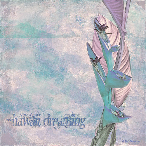
This image definitely uses the colors I just love! Took a red spica and turned it into this gorgeous pink and turquoise rendition. What I did! Just regular Lightroom slider tone work before going into Photoshop. The image needed to be widened so the Canvas was extended on the left side to make room for the objects and text. Topaz (see sidebar for website link) Detail 3 was added using little medium detail and large detail settings and the Dark Foliage tone preset from drop-down in that section. I decided to select the spica using a layer mask and then applied it to make it an object. It needed Topaz DeNoise 5, so it was applied with just an Overall Strength setting set to 0.29. Topaz Simplify was added using the Oil Paint II preset. Then French Kiss Collections Tableaux Mirage texture was placed underneath the single spica object as a background texture and left at Normal at 100% opacity. A Hue/Saturation Adjustment Layer was placed above the texture and set Master to Hue -14, Saturation +48 and Lightness -22. At this point I did not realize I was going with the bluish color palette – I thought I was using the orange and yellow colors. I did a little clean up on the spica and then added a New Layer and added Diamond Head volcano as an object. Added some reddish clouds on a New Layer using my Clouds 5 brush at 54% and added an Inner Shadow, Color Overlay and Drop Shadow to them in brown and pink colors. Next French Kiss Collections Studio 3 White Wash texture (probably my most used texture) was set to Overlay blend mode at 100% opacity. Still had a brilliant yellow background so a Hue/Saturation Adjustment Layer was added on top. The Master was chosen and set to Hue +100, Saturation -35, and Lightness +22. Now I had this beautiful blue and turquoise color that really calmed the image down. On top of that a Photo Filter Adjustment Layer was added and set to Warming Filter 81 and Density 25%. Text was added using the Angelic War font and two layer styles added to it – Outer Glow and Drop Shadow. Next an overlay was added using 2 Lil’ Owls The Artisan Collection Big Set (see sidebar for website link) 2-2 texture. To turn textures into overlays check out my How to Create an Overlay Out of a Texture blog. Added a Layer Style by clicking on the FX at the bottom and moved the Underlying Layer black tab to 117/200 (this gives priority to the shadows of the underlying layer instead of the top one). See my How to Use Those Handy Blend-If Sliders! blog for more on this. Finally a Color Fill Adjustment Layer was clipped to the texture-overlay (ALT+click between the layers) and changed to a sampled color from the spica. Now I am done. Whew! Unfortunately this is how my brain works sometimes, but I really love the final result. I think it looks very Hawaiian and I could see this image on my wall!…..Digital Lady Syd


