Feeling Butterflies!

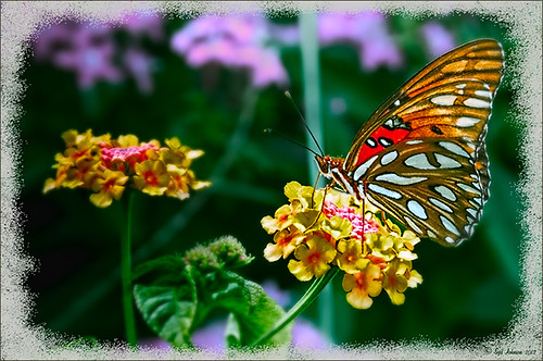
Really liked the way this image turned out and it was a fairly simple process. After setting the Lens Correction panel and Cropping the image, a Blue Sky-Heavy Green preset created from Dave duChemin’s Lightroom 3 book (the preset contains only Split Toning panel – Highlights Hue 220 and Saturation 25, Balance -15, and Shadows Hue 120 and Saturation 20) and Matt Kloskowski’s preset Focal Point (Portrait – Bottom Right) were applied. Since the first preset only affected the Split Toning panel and the Focal Point preset did not change this panel, both could be applied in Lightroom without a problem. The image was brought into Photoshop and first Topaz (see sidebar for website link) Detail was applied (Detail Setting used: Small Detail .5, Medium Detail .3, and Large Detail .3; and Tone: Brightness .03, Contrast -.16, Cyan-Red .26, Magenta-Green -.37, and Yellow-Blue .44) and Topaz DeNoise 5 (Noise Reduction slider .42 and Recover Detail slider .36).

Now the out-of-focus pink flowers looked bad, so a New Layer was created to paint in the over-exposed white spots to keep the eye from wandering to those areas. On another New Layer using a 15% opacity soft edge brush the straight green stem was painted darker sampling in the image to add a slightly darker green. Another Hue/Saturation Adjustment Layer was added and the Yellow Saturation set to +40. It took a while to settle on a final result but since the Adjustment Layers are all non-destructive, it was easy to try different effects. A Gaussian Blur was applied to a Composite Layer (CTRL+SHIFT+ALT+E) created on top and using a Radius of 6.6. On a layer mask, the butterfly and foreground flowers were painted back in black on the mask. A lower 30% opacity brush was used to slightly paint back the flowers in the mid-ground left side. Next my Soft Sparkle Overlay Frame was applied but since it is a deep reddish brown, a Solid Color Adjustment Layer (Clip it to the layer by clicking ALT+Click between the frame layer and the adjustment layer) set to an off-white was used. Finally a Curves Adjustment was added contrast. Just Fun!……Digital Lady Syd
Digital Lady Syd Related Blogs:
How To Make Frames or Borders
Getting Rid of Those Blown Out Areas in Your Image
10/30/2012 | Categories: Lightroom, Photoshop Filters | Tags: adjustment layers, borders, DeNoise, Detail, focus, frames, Free PNG border, Free PNG Frames, Lightroom, Lightroom preset, Overlay Mask, PNG border, Topaz DeNoise 5, Topaz Detail 2 | Leave A Comment »


