Just Bloomin’ Beautiful!
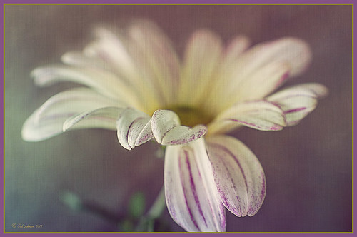
This miniature mum was in bloom again for the fall season. Just beautiful! This image was taken with my Micro Nikkor 60 mm f/2.8 macro lens set to Manual mode, 1/90 sec, F/5.6 and ISO 200. Very little processing but did use Flypaper Texture Rainbow Trout Taster and my Double Edge Frame Layer Style sampling the Inner Shadow color from the image. Enjoy!…..Digital Lady Syd
Digital Lady Syd Related Blogs:
The Macro Shot
Beautiful Soft Flowers
Digital Lady Syd’s Free Layer Style Frames
To download the free layer style frame above, a thinner version of it, and a nice black and white double edged frame, go to my Deviant Art site and click on the SJ Double Edge Frame Styles Download File button in upper right corner. To load into Photoshop, the Style Panel needs to be open (Windows -> Styles) – click on the upper right corner icon on panel to open pop-out menu and select Load Styles – navigate to folder where the file was downloaded and click Load. (To add them to listed styles in pop-out, load the style manually. If using Windows 7, go to Local C Drive/Users/user name/AppData/Roaming/Adobe/Adobe Photoshop CS6/Presets/Styles and move downloaded .asl file here – this adds file to Photoshop internal settings.) When using these styles, be sure the top layer is a complete layer (see Step 1 below) or it will not apply correctly.
TIP: If you want to use the colors from your image, just double click on the effect in the Layers Panel which brings up the dialog box for that effect. Click on the color swatch in the effect and when the Color Picker opens, sample image using the eyedropper that appears when hovering in your image – click to add that color into the frame. For the Inner Shadow effect, if you are not seeing any color update when sampling, change the Blend Mode to Normal from Multiply. Note that the next time you use the Layer Style, it will return to whatever colors you set originally, so save it as a New Layer Style if you want to keep the new color settings (see Step 5 below). Sampling colors from the image can often frame it beautifully!
Below are the steps on how to create my layer styles. I am using the frame colors seen above as they seem to look nice on many of my images.
1. Need to have an image layer on top for the layer style to work correctly. To do this, highlight the top layer in the Layers Panel and press CTRL+ALT+SHIFT+E to create a layer that combines all the active layers (eyeballs showing on left edge) in the image. Need to remember this shortcut as it is very useful when doing a lot of things in Photoshop!
2. Double-click on the top layer and the Blending Options dialog box appears. Be sure Blending Options: Default is highlighted on left side.
3. Check and click on Inner Shadow effect and change just these settings: Blend Mode to Multiply, Color Swatch set to brownish color (R165/G120/B0), Opacity 100, Distance 0, Choke 83, and Size 15 pixels.
4. Check and click on Inner Glow effect and change just these settings: Blend Mode Normal, Opacity 100, Color Swatch to greenish color (R115/G121/B42), Technique Softer, Source Edge, Choke 90%, and Size 19 pixels.
5. To save these settings as a Layer Style preset for using on other images, click the New Style button and name it and leave checked Include Layer Effects. Now click on Styles at top left in dialog box or open the Style Panel (Window -> Styles), and it will appear at bottom of the listed styles.
To create the little thinner frame around your image, in Step 3 set Size to 21 and in Step 4 set Size to 29. (For example, see my blog 32-Bit HDR Using Lightroom and CS6.) To create a nice Black and White framing, set Inner Shadow to Normal Blend Mode and Color Swatch to Black – still using Size 51 pixels, and Inner Glow to a White Color Swatch and Size 62 pixels. Of course you can adjust the sizes to look good on your image if they need it. If you do not like the way the style looks after applying, just CTRL+Z to delete and try another one. Try adjusting all the sliders and seeing if you can get an even nicer look.
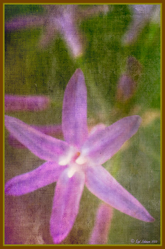
This image of my pretty little purple Agapanthus bloom was processed using Nik Color Efex Pro 4 – BiColor User Defined filter set to white and light pink colors, Darken/Lighten Center centered on the flower center, and Glamour Glow filters. Two textures were added using Dr. Brown’s Paper Texture Panel (see my blog Russell Brown’s Paper Texture Panel Updated!) and Flypaper’s Apple Blush taster texture using Linear Light at 39% opacity and Creme Anglaise taster texture set to Overlay at 100 opacity. The last step was clicking on my SJ Double Edge Frame layer style in Styles Panel to apply.
Try using these layer styles – I think you will like them. The framing gives a clean sharp edge to an image, especially for posting on the internet……Digital Lady Syd
Which Tool to Use – Smudge or Mixer Brush?
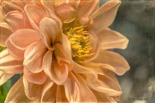
I ran across an old tutorial that was in the very first Photoshop Creative magazine back in 2006. It was on how to create a digital painting by using the Smudge Tool. Well that was something I had to try out – couldn’t believe I had not tried this before! I really like the Mixer Brushes, which is what I usually use (see my blog Adobe Photoshop CS5’s Mixer Brushes). Once I started playing around with the Smudge Tool using different brushes and sizes and opacities, it was actually fun. My curiosity got the best of me and now I needed to know what IS the difference between the two tools – they create very similar results? I was able to find a reasonable answer on the Internet at Model Mayhem.com. Here is what they said:
“The Smudge Tool simulates the effect you see when you drag a finger through wet paint. The tool picks up color where the stroke begins and pushes it in the direction you drag……The Mixer Brush simulates realistic painting techniques such as mixing colors on the canvas, combining colors on a brush, and varying paint wetness across a stroke.”
I think this is a nice short explanation of what is happening. For my Peach Dahlia I found it was nice to use both tools. It seemed it was easier to blend colors with the Mixer Brush and then smooth edges and shape color using the Smudge Tool. The Photoshop Wow Book for CS3 and CS4 (still my favorite Photoshop book) had a nice section on painting with the Smudge Tool. They recommended using the Natural Brushes that come with Photoshop and start by using short strokes, which samples the color underneath more frequently. Then use a small brush size for detail.
To create this image, first a blank layer was placed on top. Then these two brushes were used to paint: Mixer Brush – created tool preset brush with these settings: Stipple Dense 26 pixels from Natural Brushes set (Options Bar: No Current Brush Load, Load the Brush After Each Stroke, Wet 100%, Load 1%, Mix 91%, Flow 100%, Check Sample All Layers). Smudge Brush Tool Preset created using Stipple 54 pixels from Natural Brushes preset with Options Bar set to Mode Normal, Strength 78%, and Checked Sample All Layers. Be sure to save these brushes as Tool Presets so the Options Bar settings are retained – if just saved as brushes, the settings might not be correct. Also, note that if the Finger Painting box is checked in the Smudge Tool options bar, the smear stroke will start with the Foreground color. If turned off, the color under the cursor is sampled first. At 100% Strength, only the first color sampled is applied – at lower settings it fades out the first color and picks up the new one. Then I just alternated mixing and smudging until I liked what I saw. The last step involved adding three textures to the image to give a real painting look: the first one is a light gray canvas texture (I created it by taking a picture of a portion of the canvas on a large oil painting in my dining room – try this – you might really like the results) set to Soft Light at 53% opacity; next ShadowHouse Creations Old Photo 2 set to Overlay at 100% opacity – it provides the interesting edging on the image; and Flypaper Textures Aquaflora taster set to Overlay at 80% opacity. I painted out a little bit of the texture on the top two textures just to direct the eye to the center of the flower. A Curves Adjustment layer was added on top to give just a small contrast boost. Overall it was really fun to try out a new tool and learn something about it!…..Digital Lady Syd
Where Am I?
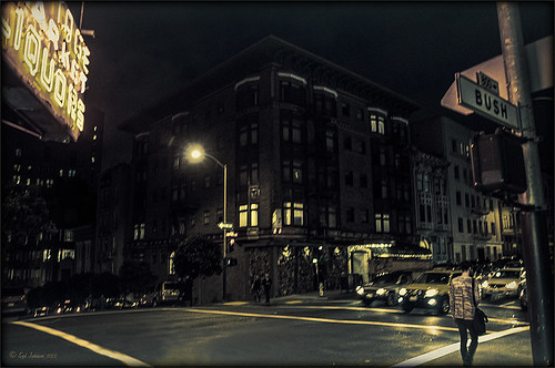
This is an image of San Francisco taken at night in February in a brisk and cold breeze. I just listened to another interesting webinar by Nichole Paschale from Topaz (see sidebar for website link) called Night Photography Enhanced with Adjust, Black and White Effects and Star Effects. I am always surprised how much I learn from these short videos – there were several good tips in this one, even though I know these programs pretty well. My image was not that great, but I needed a nighttime image to try some of the techniques on. Now I rather like the effect. Of course it uses one of my favorite plug-ins, Black and White Effects, so I am not surprised I like the results. The preset was set to my Old Vintage Effect (see Quad Tones in Topaz Black and White Effects Plug-in to create), one I use on a lot of my images. Next the Star Effects plug-in was used to enhance the streetlight using Sun Flare 1 preset. A Flypaper Texture Lemoncello Taster texture layer was added using the Multiply blend mode at 35% opacity. It still did not have the feel I wanted, so I added a Black and White Adjustment layer and mainly lowered the yellow and added some reds and greens and blues. The opacity was set to 26%. A layer style was added to frame the image. I can honestly say this is exactly how the street looked to me as I was walking to dinner on that cold dark night. If you have not tried out some of Topaz’s videos, give them a listen. Lots of cool things to try in them!…..Digital Lady Syd
Russell Brown Texture Panel Landscape Image
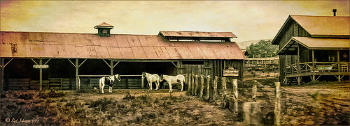
I call this photo Hawaiian Horses Chatting – they look deep in conversation. Hum?? Anyway, this weekend I did a Fun Photoshop Blog called “Russell Brown’s Paper Texture Panel – A Real Winner!” (I seem to like real winners!) This is another one of his great free Photoshop panels that creates texturized images very quickly and allows you to experiment easily to get an interesting effect. Check out my other blog for the download links and details on how this panel works. I will say that Flypaper Textures has given you several beautiful textures to play with in the panel until Russell gets an update to include other textures. This image used three Flypaper textures stacked: Texture Aquarius set to Soft Light Blend Mode at 84% layer opacity, Texture Creme Anglaise set to Multiply Blend Mode at 100%, and Texture Colosseum Sienna set to Vivid Light Blend Mode at 46%. I had been having a hard time getting a look I liked for this image until I tried the texture panel – it really surprised me how beautiful the effect ended up. Give this panel a try if you have Photoshop CS5 or CS6 and you love textures like I do. Definitely worth the effort!…..Digital Lady Syd

