Adding Copyright Information to Your Image
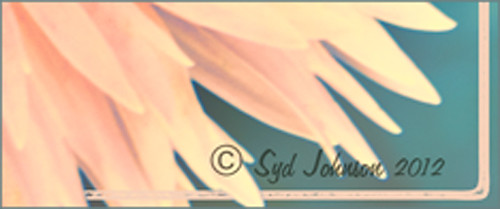
Well since it is that time of year when everything that has a date in it has to be updated, I am going to review with you how to put a copyright symbol and name on an image. This is pretty basic, but it is easy to forget how to do since you only have to do it once a year. This can be done in both Photoshop CS5/CS6 and Elements. And the time-savings by having it handy definitely makes it worth creating!

Simple steps:
1. Start a new document in Photoshop, set the foreground color to black, and Create a New Layer on top. For CS5/CS6 users, make sure the Image -> Mode is set to 8 bit.
2. It used to be that you could get a copyright symbol to appear with CTRL+ALT+C, but in CS5 on and Elements, the Canvas Size dialog box opens up so this does not work anymore. To find the copyright symbol, the work around is to select the Custom Shape Tool. For Photoshop users, in the Options bar set the tool to Fill Pixels (4th icon for over CS5 and 2nd icon over for CS6) and then select Shape from drop-down menu – highlight the copyright symbol from the default shape list in the drop-down menu (I like the one included in the Symbols set that can be loaded from the fly out menu in the Shape field). For Elements users, click the Shape drop-down menu, click the double arrow fly-out menu, and select Symbols – then select the copyright symbol. Drag out a Copyright symbol in black but do not make it too big. Hold SHIFT while doing this to keep the constrain and keep the symbol round.
3. Select the Text Tool and create a text layer with your signature in a font you use. Line it up with the Copyright Symbol and adjust text size to line up with the copyright symbol. I had to make my numbers smaller as they appear bigger than the letters when typed. The font I use is Freehand 575, a font I bought a while ago but there are many places to download free ones.
4. With the Rectangular Marquee Tool create a selection around both the symbol and the text. Make this a pretty tight rectangular – you do not need a lot of space around it.
5. Go to Edit -> Define Brush and name it – I called mine 2012 Copyright so that in Photoshop it will appear at the top of my Tool Picker Preset brush list in Step 8 and click OK. Deselect the Marquee Selection (CTRL+D).
6. Select the Brush Tool. In Photoshop the new brush will appear at the end of the Brush Presets Panel list. In Elements the brush will be at the end of the brush list in the brush drop-down menu (2nd arrow pointing down) at the top left Options Bar.
7. Now test out the brush and see what size you want as a default – I set mine at 367 which seems to work pretty well on 12 megapixel images.
8. The last step in crucial so that if you accidentally delete your brush or change the ones load, you can add it in easily.
Elements folks need to go to Edit -> Preset Manager and choose Save Set – then save the brush in the brushes preset file for the program (in Windows 7, go to (User Name) -> AppData -> Roaming -> Adobe -> Photoshop Elements -> 10.0 -> Presets -> Brushes) – I called mine SJ-Copyright Brush. Now anytime you need to add it to the brush group you are using, your Brush Preset Manager will go to this file so it can be reloaded.
Photoshop users, go up to the Tool Picker Preset, top left icon in the Options Bar, and open up the drop-down list. This contains the Preset List for the Brush Tool which means every time the Brush Tool is chosen, this group is available for quick access. Be sure the Current Tool Only box is checked or else a huge list shows up. Click on the bottom icon on the right side that says Create New Tool Preset. Keep the same name using a number first. This saves time by putting your brush at the top of the list since the Brush Tool Preset Picker has many Photoshop brushes in this list, and it is handy to keep the ones you use all time here also. Be sure to save this down as a set in the Preset Manager (2nd icon over at the bottom of the Brush Panel and then select Preset Type Tools – highlight the ones you created, drag to set up a different order if you want, and save. I usually make it a date like 010113 SJ – can back up all your created presets here) so that it is saved on your computer. If you load other people’s tools and lose yours, you can easily add them back in. See Step 8 in my Fun Photoshop How to Create Photoshop Brushes from Objects or Text blog for more info on how to do this.
That’s it! Now it is available every time you finish an image. Just add a New Layer on the top of your image, open the Tool Preset Picker for Photoshop or choose your brush in the brush drop-down list for Elements, select a nice color, and click once to paint in. The size of the brush can be changed – just CTRL+X to delete and change the size and click again. Sometimes it is helpful to adjust the opacity when the copyright becomes distracting in the image. Very handy…..Digital Lady Syd
Digital Lady Syd’s Free Christmas Card Template Using Photoshop Elements

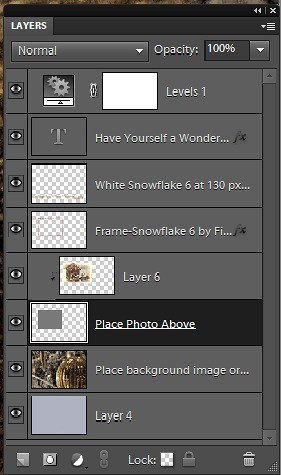
This template was processed completely in Photoshop Elements. Same steps as with the regular Photoshop program. Open up your other image(s), CTRL+A to select the whole image, and CTRL+C to copy the image. (These are both images I took last Christmas.) Switch to the template file, highlight the layer(s) that indicates where the photo(s) should be placed, and press CTRL+V to place the image above that layer. Then use the Move Tool to scale, rotate, and move the image(s) to place it. The Background Image layer was changed to 73% opacity. That’s it. Below is an image of the layers as they appear in the finished image above.

Note the Text Layer has a 1 pixel Stroke layer style set to Black and Outside. The Frame Layer has an Outer Glow layer style set to Blend Mode Screen at 75% opacity and Size 16 pixels to make the frame stand out a little. To find the Layer Styles in Elements, highlight your layer to add effect to, go to Menu -> Layer -> Layer Style -> Style Settings. I painted a little beige color over the white flakes to make the lettering stand out better. The white snowflakes and frame snowflakes brushes are Design by Firgs Snowflake Brush 6. (Firg’s Snowflake Shape Pack is not free but now are for sale. To try a different option download Obsidian Dawn’s free Snowflakes Photoshop Custom Shapes.)Font is Fantaisie Artistique – if you do not have it on your computer, your computer will substitute a different font or you can download it (right click on it after downloading to add to font list) and it will appear correct.
****DOWNLOAD LINK TO MY BASIC HOLIDAY CARD TEMPLATE****
This is pretty simple and you should be able to get lots of different looks. See my blog for other examples on how to use this template. Have a good time and enjoy!…..Digital Lady Syd
Digital Lady Syd’s Related Blogs:
Digital Lady Syd’s Free Christmas Card Template
Free Christmas Card Templates-Part 2
Free Christmas Card Vectors and Brushes
Some Holiday Cheer
Adobe Camera Raw – Not So Obvious in Photoshop Elements 10

Accessing Adobe Camera Raw (ACR) in Photoshop Elements is not that obvious. I decided to write a quick post here on how to accomplish this without too much stress and show the results you can get with just a few adjustments to the sliders. Usually you use ACR for processing RAW files, but a JPG can also be opened up in ACR following the same steps.
To access ACR in Elements, first go to File -> Open As and click on the drop down arrow on the left of the bottom box that by default shows Photoshop (*PSD, *PDD) where a long list of file formats is displayed. Select Camera Raw (with a whole bunch RAW formats listed). Now you are in the basic ACR plug-in. This dialog is composed of three panels – Basic, Detail and Camera Calibration. There is a Straightening Tool and Crop Tool at top of dialog that should be used now if image needs to be straightened or cropped.
When I work in Camera Raw, I use the histogram as a basic guide for enhancing an image. Watch the edges and move the sliders so that the ends just touch the sides on both ends. Below is my workflow for processing an image before taking it into Photoshop Elements.
BASIC Panel:
White Balance drop-down – Click on the eyedropper icon on top and run over areas that are of a neutral gray content – the RGB numbers will show under the left side of the histogram. When numbers are all pretty close in range, click on that place in image to adjust color cast. (Usually never touch this unless there is an obvious color cast in the image.)
Exposure slider – slowly move the slider until the white line stretches to the right edge of the histogram. (For this image, exposure slider was set to -0.35)
Blacks slider – slowly move the slider left until the white line stretches to the left edge of the histogram. (Blacks slider set to 0)
Recovery slider – move right until you get a pleasing look to the colors. It darkens the the brightest areas. (Recovery set to 99 – usually I do not use this much, but the histogram required it.)
Fill Light slider – this slider may not need to be moved at all – each image is different so give it a try. It opens up detail in the shadow areas. (This slider was left to 0.)
Temperature and Tint – these are not moved much if at all – use if you think there is a color cast in the image. Add a little yellow if the image seems too cool and you want to warm up the feel of the image. (In this case, the Temp slider was set to 7150 and the Tine was set to +4.)
Brightness slider – do not use this slider too much – it can tend to wash out colors. (Set to +53)
Contrast slider – don’t overdo using this but it can make an image pop. (Set to +63)
Clarity slider – add some but not more than +75 to add a bit of sharpness to the image but watch out for haloing if too much is used. I always use this slider. (Set to +63)
Vibrance slider – use if the colors need to pop just a bit more – it makes the colors that are not so bright a little more colorful. (Set to +28)
Saturation slider – usually do this adjustment in Photoshop.
DETAIL Panel:
Sharpening Section – I use this at the default – Amount 25%; Radius 1.0; Detail 25; and Masking 0. If noise in image, set Amount to 0 and do localized sharpening in Photoshop using the Sharpen Tool. (The default was used on this image.)
Noise Reduction Section – Use if any noise is apparent in the image – look at the image at 100% to find it. (Did not use on this image as there was no noise but I do not hesitate to use it if any is present.)
The Luminance slider can be very helpful in keeping the noise under control but you must find it at this early point in the image adjustment since you cannot come back into Camera Raw in Elements to fix.
Color slider – you may not need it if no color pixels in the dark areas.
CAMERA CALIBRATION Panel:
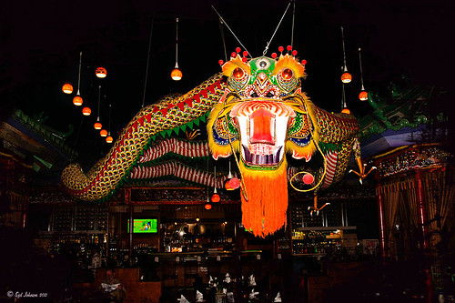
Adobe Standard is the default. In the drop-down, try some of the other choices. Camera Vivid gives some really bright colors. (For this bright colorful image, Camera Vivid was used.)
Click Open Image button and it now opens into the Editing Screen in Elements.
There is a lot of information on how to do this but once you get a workflow you are comfortable using, the image can be adjusted very quickly and results are definitely worth it.
Hope this workflow helps when trying to sort through the sliders. Have fun experimenting…..Digital Lady Syd
PS: This same workflow is a great starting point for ACR in CS5 – do open as a Smart Object so you can get back to the settings if needed.


