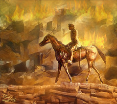
How I Am Feeling ATM
I like Mark English‘s work a lot and decided to try it again to get my creative vibe flowing. Not sure this is exactly a “self-portrait,” but I do think it represents my recent feelings. For info on how I discovered his art, check out my Masked Tidbits Blog with more info on this. No AI was used in this image – all digitally drawn and painted in Adobe Photoshop 2024. Just a couple things make this image unique for me – I created a brush to give a really heavy texture feel to the image. In a 50-pixel Chalk brush, I added a texture pattern from Jessica Johnson – she uses this pattern (TM-6) a lot in her brushes (see Texture section of brush to download-check the little + sign on right of pattern), but I did not use her Pattern Stamp brushes, just the texture. Since Transfer’s Flow Control Panel was set to Pen Pressure only, it can be painted over to get a more dense effect if needed. Used the same texture pattern in a layer style for the hair with the Pattern Overlay set to Opacity 17 and Scale 93 – layer was set to 46 Opacity and Fill 0, and just the hair was painted over on the layer. Otherwise just the same workflow for drawing. Lots of fun to create this…..Digital Lady Syd
My Older Selfie
Will keep this short! On my original Selfie image, first ran Dave Kelly’s AI action at 70%. Then used the Quick Selection Tool to select just the background and hair from the whole selection created by Dave’s action. Last step was to invert selection to run Generative Fill Prompt: Digital oil paint glamor look. Chose a variation and selected the resulting layer mask. On Generative Fill panel clicked the Invert Selection so background and hair were selected and ran Generative Fill again with this prompt: Digital Oil painting with fancy hair and wintry background. From these results, created a stamped layer and duplicated it as a New Document with just this layer (right click on layer and choose Duplicate Layer – then in Document drop-down select New). This was the starting point of this image and how I usually work with these AI results. From here created different layers on top and painted over the face, hair, coat and background. Used these brushes – Kyle T. Webster’s Winter 2024 set Thinner Oil (see Skiing Selfie blog for settings used with it – definitely a New Favorite for painting especially skin) and Right Angled for the background, his Summer 2018 Ocean Brush (for hair), and Fay Sirkis’s Short Streaky Detail Blender (not sure it is still available anymore), but any small detail mixer brush would probably work for the little edges of the hair. Used Viveva to pull the whole look together….Digital Lady Syd
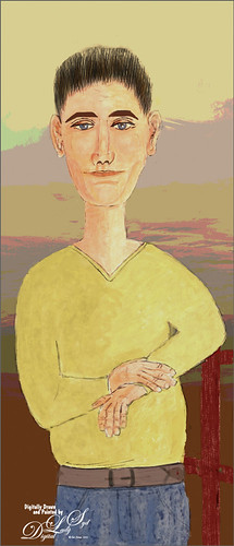
Modigliana Guy
Totally had fun creating this sort of cowboy-looking guy while trying to do another Modigliana figure as in my recent Fun Photoshop Blog (A Few Photoshop Digital Painting Tricks You May Not Know). Been following some of the tips in Aaron Blaise’s class on Clear Expression to learn face object placement (watch for great sales on his various classes). The painting took a long time to do, but eventually it was drawn to get a Modigliana perspective. The background was created with one of my Painter backgrounds and setting 9 Levels in a Posterize Adjustment Layer. A Kyle T. Webster Tilty Pencil Variant (from Winter 2022 set) Mixer was converted to a regular brush (changed Erodible Tip to Small Round and 9 px Tip; added Shape Dynamics Size Jitter 11%; Texture Scale slider changed to 28%, Brightness 60, Contrast 10, and Texture Each Tip checked; and Transfer With Opacity Jitter also checked – use all other settings from the Mixer and it turns into a really nice sketch brush). Also Kyle’s the Hunky and Heroes Heavy brushes from the free Bowie Set (located in the Adobe Cloud-search for Bowie Toolkit) were used to paint his clothes. Aaron Blaise’s favorite brush was used for the face and skin. Used The Etherington Brothers various tips for the face and hands – lots of good information here. He may not be the best thing I have ever drawn, but I am learning a lot about drawing!…..Digital Lady Syd
Just a Bird Buddy
This image was actually created while trying out some of the new Spring and Summer 2022 brushes by Kyle T. Webster (that come with PS). This bird was drawn from one of my camera pix taken at the Jacksonville Zoo of a Verreaux Eagle Owl. He was a pretty good size with huge eyes and appeared to be a rather calm kind of bird. I decided to have some fun and give him a different color palette and background. The rough and refined drawing brushes were created using one of Aaron Blaise‘s drawing tutorials (check out any of his YouTube tutorials to see how he does this – pretty easy). The underpainting effect used his Color Brush. The tree was created by making a selection of a tree with the Lasso Tool, then painting with Kyle’s Spring 2022 Woodchuck Joey brush over it using a couple different colors, and removing part of the right side of the tree using the Tilde (~) key (acts like an eraser but uses the brush currently selected). The skin texture was made from Kyle’s Summer 2022 Pellet CS brush with different colors. The little flowers used the Summer 2022 Soft Spat 1 brush also in different colors. The tree leaves were from Kyle’s Spring 2022 – Shrubbed brush. The rest just involved some lightening and darkening. The hardest part was painting the beak – this owl does have a very colorful beak. It was a lot fun just to try out new brushes!…..Digital Lady Syd
The Tiger
Watched the Kyle T. Webster (the Adobe Brush Evangelist) video called Brush Hour: Digital Pastels. I thought he would go over his various pastel brushes he has created for Adobe Photoshop, but instead he demonstrated how to create a relatively interesting pastel painting using just a few. This was my first attempt at trying a pastel painting, but it was a lot of fun – and a little bit challenging. The tiger is the actual sketch created using an Aaron Blaise tutorial (see my A Little Aaron Blaise Digital Drawing Practice Fun Photoshop Blog). I also adjusted one of my own pastel brushes to get the nice pastel background effect as I had trouble getting the correct pressure with Kyle’s brush. It has been a long time since I used traditional pastels and doing this digitally is definitely a lot less messy!…..Digital Lady Syd
Turtle and Child Sculpture
This image was taken on the Big Island in Hawaii at a small shopping center near Waimea – I wish I knew who did the original piece of sculpture as it is quite striking and beautiful. The photo background was very busy so I decided to try some digital effects to the image. It really is a faux digital painted image as the background painted effect used Topaz Studio (AI Remix – 0.69 opacity and Normal mode, Velvet Abstract preset set to Style Strength High, Brightness 0, Contrast 1.00, Sat 0.75, Hue 0, Smooth Edge 0.20, Sharpness 0.47, and Suppress Artifacts 0; Impression – 1.00 opacity and Normal mode, Type 16 Stroke, Number of Strokes Med, Stroke Length 0.56, and Painting Progress 0.16 – painted out the turtle and child and Texture – and Background Type Original; and Precision Detail – 1.00 opacity and Normal mode, Overall Small 0.60, and Lighting Midtones -0.47). Then on various layers in PS, different parts were painted using PS brushes to add more defined strokes and to clean up some of the Studio stroke overlap. One brush used was Kyle’s Real Watercolor-80 Round brush set to Normal brush mode to paint the face and body of the child. Black & White, Curves, and Levels Adjustment Layers were added on top. The Sharpen Tool was used on a separate layer to sharpen up the eyes a little. A Color Lookup Adjustment Layer using On1’s Loyalty Reward for May 2022’s Fun in the Sun6 LUT was added and set to 27% – really brightened up the image. Last step involved adding darken and lighten layers using Sam Peterson’s colors and brush to draw attention to the boys face. (See my Fun Photoshop Blog A Few Photoshop and Lightroom Tips and Tricks – Step 2 for info on this – really easy to do and look great on images!) That was it – it was really fun and relaxing to do!…..Digital Lady Syd
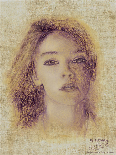
Missing You
Just had some fun using the Unsplash photo to create an interesting portrait effect using the Photoshop’s Art History Brush. If you have not tried this, you should as it can give some really nice results without really painting much. I will admit that I used my sketch brush to clean up her eyes and mouth especially. The background texture is from Kim Klassen called Hellodecember-0312. If you want to learn how to use the Art History Brush, follow a 5-minute YouTube video by Brady at Texturelabs called Ultra-realistic Sketches in Seconds! He gives you a link to the two Art History brushes that were used on this image. (If you are interested in more of Brady’s info and some more free brushes, check out another excellent video called Anyone Can Create Incredible Paintings in Photoshop with a Single Tool.) I recommend you give this type of painting a try if you want to try something different on your image…..Digital Lady Syd
Winter in Indiana
Just practicing my painting and decided to do an abstract from one of my childhood haunts. The originals of this image were really of the lake trying to freeze but I decided to add a little more drama for my image. In this case, the lake has frozen and melted several times to get this rough edge.
One reason this image was done was to try out a couple Smudge brushes created since I discovered I don’t have any in my favorite painting tool set. Basically followed the older Digital Painting Techniques Volume 1 from Brian Recktenwald tutorial. It served the purpose and several brushes were made and used on this image. Also a lot of painting was done with my SJ Pastel 3-Painting (have used this brush forever – great for just painting in solids with a little texture in it.) I also downloaded Daarken’s brushes and used one called Texture Sample Brush 45 3 to add the icy feel to the image. Used Carlos Cabrera’s brush for the overcast clouds from the same book. The bird set is called Bird Brushes by Canmax Stock-SB 3. Lots of other brushes were used like Kyle’s Animator Pencil 2016 and his Glide Sketch Pencil and David Belliveau Mixer Brush. Last step used Viveza 2 to get a nice focal point to the birds……Digital Lady Syd
American Goldfinch
Spent what seems like hours working on this gorgeous Goldfinch. The reference photo was by Stephen Walker at Unsplash. Totally drawing and painted following the technique in the Behance Video called Painting Beautiful Birds in Photoshop with Maddy Bellwoar. I am still working on the second half, but the technique used on this bird is from the first part. She provides brushes to draw and paint with and spend a lot of time showing how to draw birds. Excellent tutorial! The flower brushes are from her Hand-Painted Gouache Brushes for PS and Procreate that she just released. I used some of them as Pattern Stamp brushes. The Pattern used was from Jessica Johnson at Creators Couture using her Romantic English Garden Multi-color Floral Set – this set has some beautiful floral patterns, and some great Pattern Stamp brushes too. The background was created using Kyle T. Webster’s 2020 Summer Set’s Brix Brush in Photoshop. A Lookup Table using the Cerulean preset gives it this bold dark blue/purple effect. Otherwise bunches of layers and brushes and hours but lots of fun to do!…..Digital Lady Syd
Let’s Have a Little Chat
Going to make this short and sweet. Been practicing my digital painting and thought I would post this guy whose image is from a pack from ISO Republics 30 Free Images (be sure to change Image Size from 72 ppi to 300 ppi before starting so image is of a manageable size). The real trick is to find the right brushes to use – mainly the Mixers, Regular Brush and Smudge Brushes. The main Mixer Blender brush is from one I brought into Photoshop from Corel Painted and just make a bunch of iterations of regular, smudge and mixers from the tip. (See my older blog called How to Bring a Corel Painter Brush into Photoshop – it still works!) Most of the painting effect was placed on a layer above the original painting (Option Bar setting were Load the Brush After Each Stroke off, Wet 100%, Load 50%, Mix 80%, Flow 100% and Sample All Layers check on. Then used several layers to do whiskers, eyes, nose, etc. A Shadow and a Highlight layer was added to distribute the lighting correctly. Added an Autumn Colors Color Lookup Adjustment Layer at 63% and a Gradient Map set to light yellow to white, Multiply blend mode, and 47% opacity. That’s about it. Lots of fun here!…..Digital Lady Syd
Some Sunshine when It Is Raining

Had some fun painting these wonderful sunflowers in Corel Painter. If you have Painter, I hope you are following Karen Bonaker who has a great website on how to use the program. Last week she shared the image and several brushes and taught us how to paint the flowers. It has been a long time since using Painter so it felt good to get back to it. And of course for me, I have to finish up in Photoshop and do my same adjustments on photos to my digital art. Anyway, it felt great to be painting again……Digital Lady Syd
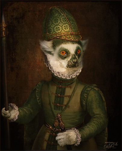
A Distinguished Forefather Lemur
I have always wanted to try this and I finally found a really great Photoshop tutorial on how to do it. This image started with a wonderful painting by Sofonsiba Anguissola called Portrait of a Spanish Prince from 1567 (it is probably an image of Prince Phillip III – the link gives some interesting perspective on this guy). Anyway, I will not go into all the steps since I pretty much just followed the steps presented in Chris Spooner’s video called How to Make a Fun Oil Painting Pet Portrait in Photoshop. This effect is especially popular with people’s pet images. The trick is to find an image that works with your pet image. It took a lot of manipulation using the Free Transform Tool with the Warp in the Options Bar to get it looking correct. And in this case, I had to use two other images of lemurs for the hands. The colors can be matched using the video after the images are combined. 2 Little Owl’s Carnevala 23 texture was added on top and set to Vivid Light at 65% layer opacity to get the illuminated effect in the background. If you want to have some fun, give this a try……Digital Lady Syd
Viewing the Moon from a Scary Place
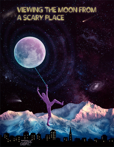
Just having fun with this crazy image of a guy hanging from the moon. Got part of the idea from Chris Spooner’s tutorial called How to Create 80’s Style Retrowave in Adobe Photoshop. Added several objects and blended in them using blend modes and opacity. Items included: Milky Way background image, White and Black Mountain image, Wireframe Vectors 30 by Designer Candies, Valentine by Julie Mead Valentine Gift6 to add some background fog, Wikimedia Commons Full Moon 2010, LifeLine by Gamarai Urb Brushes for the person and cityscape, Obsidian Dawn’s Space brushes for the comets, galaxy, and dust. The font is called Clip. After this just added a few adjustment layers: Darken Curve, Lighten Curve, and Color Balance. That was it. Sometimes it is just fun to create something different!…..Digital Lady Syd
Introducing the Beautiful Fox
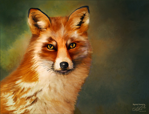
Enjoyed painting this beautiful fox – used Unsplash image by Linnea Sandbakk as a base for the painting. This follows pretty much the same painting process as used in my Wolf image except the body was not sketched first. This image contains 64 layers, so it took quite a bit of effort to get this result. Three textures were used to get the result and numerous brushes. I would go into more detail, but it is basically just finding a workflow and some brushes that work, and then painting. This is really so relaxing and fun to do!…..Digital Lady Syd
Visiting My Castle
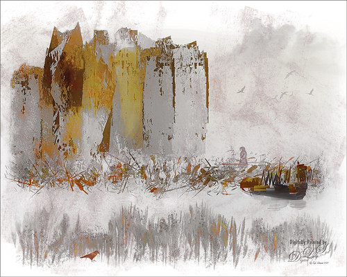
This image was totally painted in Photoshop CC using several elements created originally using different brushes in both Corel Painter and PS, then saving the results down as a PNG objects. Several bird, cloud, plant and grit brushes were used. Different adjustment layers clipped the elements to adjust the colors and tones. The person was just painted in. Topaz (see sidebar for website link) ReStyle’s Silver and Ivory Cloak preset was used to add the colors into the overall image. It was just a lot of fun to put everything together into something creative…..Digital Lady Syd
The Magic Violin
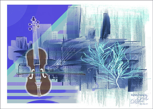
This image was inspired by a wonderful piece of clip-art from The Design Shop called Vintage Violin clip art. From there the image just kept building. The background abstract city element was created in Corel Painter and a few cool brushes created in PS for more detailed elements. This whole image was just a lot of fun to do and no filters this time!…..Digital Lady Syd


