Complimenting Those Complementary Colors
Have you ever started an image and thought – what color will really make my image pop with the color I am using?
I found this tip in a wonderful book (which it and its latest version are chocked full of tidbits and, no, they are not the same as some on Amazon have said) called “The Photoshop WOW! Book for CS/CS2” by Linnea Dayton and Cristen Gillespie. Remember, in this case complementary colors are based upon the “RGB Color Wheel.” (The “Artist Color Wheel” does not use the same complementary colors but here is a quick link that explains the basic difference.)
The very basic steps are as follows:
- It is easiest to convert your image to Black and White first. Use the Channel Mixer Adjustment Layer (click the Monochromatic box) or the Black and White Adjustment Layer – they can easily be deleted after you get your colors set up.
- Click on the Foreground swatch in the Toolbar to bring up the Color Picker. Move the vertical slider to pick a Color Family and choose a precise color in the large box.
- Create a New Layer above your current layer and fill with this Foreground Color (CTRL+BACKSPACE or COM+DELETE). Can now save color to Color Swatches by going to the Swatches Panel and clicking the “Create New Swatch of Foreground Color” icon to save.
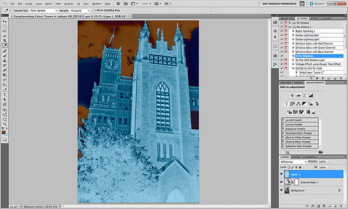
- Now change the Layer Blend Mode to Difference – you will see the original Foreground color appear over the black areas, and the complementary color appear over the white.
- Exchange the Foreground and Background colors on the Toolbar swatch and sample the opposite color in the image for use on your image. Save new foreground color to the Swatches Panel to retain.
- Can now delete the adjustment layer converting the image to Black and White.
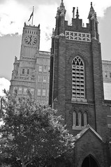
That’s it. In the photo below, I used a Channel Mixer Adjustment Layer with Monochromatic checked to make a black and white of my original image. Then I followed the above steps getting a brownish red as a complement to the light blue color.


I posted the black and white image so you can see that the original Foreground color which is a fairly light blue color (in the black area of the image like the foreground trees and top of the church door) created a fairly light brown complementary color (in the white of the clouds – sample in the white cloud to get the exact complementary color). The book noted that if the original color is dark, the complement will be the opposite tonality and the same goes for light colors. Both colors will be equally saturated or neutral.
Well I hope this little tidbit will help you get that perfect color to really make your images pop. ……Digital Lady Syd


