Bleach Bypass Look on a Landscape Image
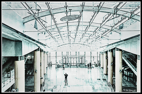
This may be the most beautiful and interesting library ever made. I posted a couple times on Flickr with other images (see Minsk Library, Inside Minsk Library, and Minsk Library at Night) but this time I decided to process the inside ceiling which is all glass – totally breathtaking! As you can see, I caught the eye of the guard down below, but he lends a wonderful scale to the image. I had a hard time deciding what to do with the image as the original was not that bad but I wanted to enhance the light and airy feel in the image. So I tried everything I could think of and this is what I got!
First applied Topaz (see sidebar for website link) DeNoise 5 – the image was shot at ISO 1600 so it had some issues. Used the Overall Strength set to .17 and set the Shadows to .82. The layer was copied and Topaz Detail 3 was applied using the Architectural Detail II preset – this image was perfect for this preset. Next Black & White Effects was applied where I mainly applied a regular black and white preset and started moving sliders. What I think really made the image pop was the application of the Creative Effects Diffusion effect where the Softness was set to 0.10, but the Diffusion slider was set high at .91 and Diffusion Transition set to 0.61. This really made the roof lines pop without being too sketchy looking. Then Kim Klassen’s Cloth & Paper Reign texture was applied and set to Soft Light blend mode to lighten the image and add some blue tones back into the image. It was duplicated and this time set to Multiply at 24% layer opacity. Next a Levels Adjustment Layer was added to lighten the image more by moving the Output Levels to 23/255 and the midtone slider to 1.39. Next a Curves Adjustment Layer was added to lighten it even, and a bit of a vignette was painted around the edges of the layer mask. It still did not look quite right – almost blown out. That is when I tried a Color Lookup Adjustment Layer and clipped (ALT+click between the layers) it to the top texture layer. The 3DLUT File was set to Bleach Bypass.look in the drop-down, although several look rather nice. The last step involved creating a composite (CTRL+ALT+SHIFT+E) on top and adding my SJ B&W Border Frame. I really like how the diffused settings made the ceiling lines look. Anyway, it was once again a lot of fun to experiment!…..Digital Lady Syd
A Little OnOne Perfect Effects Vintage Look
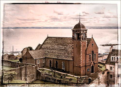
This beautiful Scottish Church was taken from a train going from Edinburgh to St. Andrews. This is a wonderful way to capture some of the countryside. I am surprised how sharp this image was since the train was moving – my settings using a 18-200mm Nikon lens were F/13, 1/200 sec, ISO 400 using a 45 mm lens. For post-processing, the first thing done was to create three Virtual Copies in Lightroom and set them at different exposure settings – one to about -2, one using the original, and one set to +1. This is a way to get an HDR look using a single image. The first two where then taken individually into Topaz DeNoise 5 (see sidebar for website link) and adjusted for noise issues. The +1 just used a little adjustment in Lightroom since the over-exposed image did not have a lot of noise. All three images were then selected in Lightroom and right-clicked to get menu – Open In -> Merge to HDR in Photoshop. That is how the bottom layer was created. Next by applying OnOne Perfect Effects (see sidebar for website link), the image took on a great look. This plug-in can do interesting things to images – usually when I just can’t put my finger on what I need for a photo, Perfect Effects has a solution. This image uses these filters presets stacked: Black and White->Warm Gray with colors swapped in Effects Options, Detail->Texture Booster, and Borders->Russell with Scale set to 4 in Effect Options. Back in Photoshop Nik’s Viveza 2 was applied to add a little soft color in the sky, sharpen the cupola, and add a little brightness to the front of the church. Then Topaz DeNoise 5 was applied one more time to get rid of some noise created by the plug-in application – this time it was targeted to the sky and water using an Overall Strength setting of .11, and for the lighter areas, Adjust Highlights set to .28. Recover Detail was set to .30 and Reduced Blur to .13. This sounds like it was a lot of effort, but it really was very quick to apply. The hardest part was adjusting the noise in the three virtual copies in Lightroom. …..Digital Lady Syd
Digital Lady Syd Related Blogs:
Can a Pseudo HDR Image be as Good as the Real Thing? (Part One)
Can a Pseudo HDR Image be as Good as the Real Thing? (Part Two)
Topaz DeNoise 5 and InstaTone
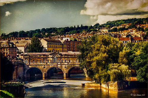
This image had an ISO of 2500 – that is really high for me but I actually took this shot from a moving tour bus – it is the Pulteney Bridge over the Avon River near Bath in England. The basic workflow involved running Topaz (see sidebar for website link) DeNoise first – must be sure that the Sharpening and Noise Reduction sliders are set to 0 in Lightroom or Adobe Camera Raw so you are not applying noise correction twice. I usually apply DeNoise on it’s own layer – that way it can be selectively removed if it is too soft in some places. The Overall Strength was set to 17. Topaz cautions about overdoing this or it will lose detail and edges will be soft. The Detail Recovery slider was set to 19. That was all that was needed. In Topaz photoFXlab, the new plug-in interface, the InstaTone tab was selected and the tones from a 500 px image called Nobody by shachar levcovich turned this image into an old English look. Topaz Simplify 4 was added and my BuzSim Modified preset was applied – this is one I had created in Simplify 3 but I still love it. (Selected BuzSim and changed: Simplify panel – Simplify Size to .15, and Edges panel: Edge Type Color Edge Fine and Edge Strength to 1.50.) Back in Photoshop a vignette was added to focus on the bridge and ShadowHouse Creations Scratch Overlay Texture set to Overlay with the center painted out in black in the layer mask so the texture basically frames the image. Now I have a beautiful vintage feel but not overly painterly. I can imagine the beautiful bridge looking like this a long time ago. Beautiful place!…..Digital Lady Syd
Digital Lady Syd Related Blogs:
Digital Lady Syd Reviews Topaz DeNoise 5
InstaTone in photoFXlabs – Great Fun and Great Results!
Digital Lady Syd’s Review of Topaz photoFXlab v1.1
Digital Lady Syd Reviews Topaz Simplify 4

