Another Selfie???
Used the same selfie from my Creating an AI Selfie? Fun Photoshop Blog using a different variation this time selfie image (used Dave Kelly’s free Gen Fill Photo Painting Action set to GF Painting 40 and Generative Fill Prompt: Oil Painting). Really liked the way the hair was done by Photoshop’s Generative Fill command and the background texture was really nice. Lots of clean up on the original was done due to the many messed up areas (like the earrings did not match up, her face look chopped up, etc.) that AI often seems to create. And a lot of time was spent cleaning up the image with Photoshop’s Mixer brushes – ended up using some old Picasso Mixer brushes made by Fay Sirkis. The key was to find the right brush dab to get a somewhat closely matched up painterly stroke to the AI effect and didn’t smooth things out too much – this to me is the biggest problem with PS’s Mixers. Fay’s Picasso brushes used a Bristle Brush as the foundation for her mixers. Guess that is what is important – finding the right brush for the image!…..Digital Lady Syd
A Little Brush Fun!
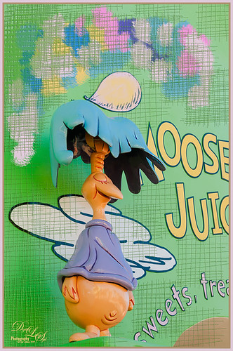
This funny character was part of a sign on a candy store in Dr. Seuss Land at Universal Studios-Orlando and looked like it would be fun to just play with it. Since he was on such an overwhelming green background, I added a new layer and just started using a Mixer Brush to add different blotches of paint to the image. Then on a New Layer above, a brush that I had created was used for the cross hatching effect- just liked the look of it once I added a Bevel and Emboss Layer style to it and set the layer opacity to 55%. To get the hatching off the lettering, a layer mask was added, but first the “Layer Mask Hides Effects” check box was checked in the Layer Style dialog. That way the hatching could be carefully removed from the figure and lettering. The Sharpen Tool was used on the character’s face. A stamped layer (CTRL+ALT+SHIFT+E) was created on top and my free SJ Mid Size Double Edge Frame was added – colors were sampled from the image. This a really cute image was jazzed up a bit by just adding some creative brush strokes!……Digital Lady Syd
Which Tool to Use – Smudge or Mixer Brush?
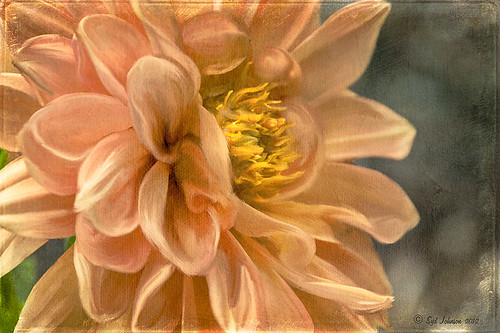
I ran across an old tutorial that was in the very first Photoshop Creative magazine back in 2006. It was on how to create a digital painting by using the Smudge Tool. Well that was something I had to try out – couldn’t believe I had not tried this before! I really like the Mixer Brushes, which is what I usually use (see my blog Adobe Photoshop CS5’s Mixer Brushes). Once I started playing around with the Smudge Tool using different brushes and sizes and opacities, it was actually fun. My curiosity got the best of me and now I needed to know what IS the difference between the two tools – they create very similar results? I was able to find a reasonable answer on the Internet at Model Mayhem.com. Here is what they said:
“The Smudge Tool simulates the effect you see when you drag a finger through wet paint. The tool picks up color where the stroke begins and pushes it in the direction you drag……The Mixer Brush simulates realistic painting techniques such as mixing colors on the canvas, combining colors on a brush, and varying paint wetness across a stroke.”
I think this is a nice short explanation of what is happening. For my Peach Dahlia I found it was nice to use both tools. It seemed it was easier to blend colors with the Mixer Brush and then smooth edges and shape color using the Smudge Tool. The Photoshop Wow Book for CS3 and CS4 (still my favorite Photoshop book) had a nice section on painting with the Smudge Tool. They recommended using the Natural Brushes that come with Photoshop and start by using short strokes, which samples the color underneath more frequently. Then use a small brush size for detail.
To create this image, first a blank layer was placed on top. Then these two brushes were used to paint: Mixer Brush – created tool preset brush with these settings: Stipple Dense 26 pixels from Natural Brushes set (Options Bar: No Current Brush Load, Load the Brush After Each Stroke, Wet 100%, Load 1%, Mix 91%, Flow 100%, Check Sample All Layers). Smudge Brush Tool Preset created using Stipple 54 pixels from Natural Brushes preset with Options Bar set to Mode Normal, Strength 78%, and Checked Sample All Layers. Be sure to save these brushes as Tool Presets so the Options Bar settings are retained – if just saved as brushes, the settings might not be correct. Also, note that if the Finger Painting box is checked in the Smudge Tool options bar, the smear stroke will start with the Foreground color. If turned off, the color under the cursor is sampled first. At 100% Strength, only the first color sampled is applied – at lower settings it fades out the first color and picks up the new one. Then I just alternated mixing and smudging until I liked what I saw. The last step involved adding three textures to the image to give a real painting look: the first one is a light gray canvas texture (I created it by taking a picture of a portion of the canvas on a large oil painting in my dining room – try this – you might really like the results) set to Soft Light at 53% opacity; next ShadowHouse Creations Old Photo 2 set to Overlay at 100% opacity – it provides the interesting edging on the image; and Flypaper Textures Aquaflora taster set to Overlay at 80% opacity. I painted out a little bit of the texture on the top two textures just to direct the eye to the center of the flower. A Curves Adjustment layer was added on top to give just a small contrast boost. Overall it was really fun to try out a new tool and learn something about it!…..Digital Lady Syd
Just Another Topaz Black & White Effect Example
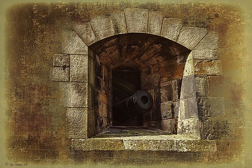
This image was taken at Edinburgh Castle in Scotland. I just keep playing around and finding new looks for images. The cannon and opening were selected and placed on their own layer, then a white layer was added below it, and a texture from ShadowHouse Creations Another Mixed Bag Texture Set (some really beautiful free textures on this site) was added. On several layers above and below using different colors from the image, various brush marks were added using Gorjuss Grunge Again brushes (unfortunately these are no long available), some really nice brushes to add a bit of color and detail. Create a composite and duplicate this layer. Next use the Topaz Black and White plug-in with the Opalotype Collection Effect and Yellow Lilac preset as a start. A lot of changes were made in the Conversion and Finishing Touches panels and Detail and Burn brushes were used to emphasize the stone. (See my Fun Photoshop Blog “Topaz B&W Effects Plug-in – a Real Winner!) and Tidbits Blog “Topaz B&W Effects vs. Nik’s Silver Efex Pro” for more information on this plug-in.) The plug-in layer was set to 52% opacity back in Photoshop. A Curves Adjustment Layer was added and some sharpening applied. It was a really fun image to do.
Hope you got an idea for creating a little different effect with this plug-in…..Digital Lady Syd


