Vintage Roman Bath
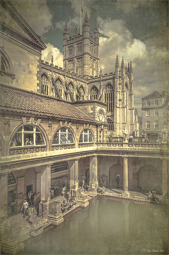
Since I have been revisiting my old images from England and Scotland recently, here is one of my latest concoctions! Love how this image turned out very vintage and I can actually visualize being in the water per the Jane Austin book Persuasion description. I have to chuckle as there are at least 5 people in this image talking on their cell phones. Such for the real vintage effect! Anyway, The Roman Baths at Bath, England, are quite interesting to visit and definitely have a real vintage feel to them.
So the steps to getting this effect are pretty easy. First the Basic sliders in Lightroom along with some building straightening using the new Lens Correction Upright feature was applied. In Photoshop, the Background layer was duplicated and added a black layer mask added. Then just the water was painted back – the layer was set to 76% opacity and that was all – just softened the color a little. Next a Curves Adjustment Layer was added and the mask filled with black. This time the heavy building shadow in the water was painted back in white. The Curve was used to lighten the shadow to match the rest of the water’s color. (See my Using Curves Adjustment Layers to Get Rid of Shadows and Highlights blog for info on doing this or could use the How to Use a Selection to Draw Focus in an Image blog using Levels Adjustment Layers.) A stamped composite layer was created (CTRL+ALT+SHIFT+E) on top and duplicated. Next Topaz (see sidebar for website link) Black & White Effects was applied twice. First a Quad Tone preset I had created (see settings below) was applied, and then Topaz’s Classic preset. 2 Lil’s Owls (see sidebar for website link) Enchanted4-3 overlay (from the Texture Workshop Ebook Bundle) was added to give the beautiful linen-like texture to the image, and a Curves Adjustment Layer was used to add back a little contrast. That was it. Black & White Effects really gave this image the vintage feel – it is a great plug-in for this type of effect……Digital Lady Syd
SJ Quad DkB_Gr_Yel_Wh preset settings: Quad Tone: Color 1 Region: Color (R1/G1/B12) and set to 15.08, Color Region 2: Color (R63/G78/B85) and set to 143.9, Color Region 3: Color (R216/G211/B129) and set to 227.5, and Color Region 4: Color (R255/G254/B237) and set to 255.0: and Transparency: Overall Transparency 1.00.
Digital Lady Syd Related Blogs:
Lightroom 5′s New Upright Adjustment Feature
Quad Tones in Topaz Black and White Effects Plug-in
The Art Corner: Painting and Sculpture by Tassaert
Digital Lady Syd’s Rule No. 10: Use What You Know!
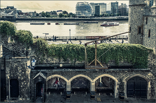
Just thought I would remind everyone that you do not have to keep changing every workflow to incorporate that new technique into it. Sometimes it is better and faster to use what you know, especially if you are just doing a little processing of an image. That is exactly what I did on this image. I like this image of the Tower of London because you can a little boy peaking out at the sidewalk and the Thames River. There is also part of another little boy in the guard house. So much going on in London!
I really wanted to do a black and white, and it looked good with a slight sepia tone on it, but when I took this image into Topaz (see sidebar for website link) Black & White Effects 2, my Sunny preset brought out the colors the way I liked them. In Lightroom there was just the regular slider adjustments going on (see my How to Use Adobe Camera Raw (ACR) or Lightroom 4 Quickly blog) and the Upright Adjustment was also used to straighten the image out (see my Lightroom 5′s New Upright Adjustments Section blog). Once in Photoshop, I went into Black & White Effects and just applied my preset, that’s all – for all the settings for this preset, see my Sunny Preset for Topaz Black and White Effects blog. (This is one of my favorite presets for the program.) Did some clean up on a New Layer. Then created two New Layers, a Darken and a Lighten layer, set to Overlay for dodging and burning (see my The Best Dodging and Burning Technique! blog link). That was it.
As you can see, I really do use the techniques I present. Everything in this blog is what I normally look at when post-processing an image. Hope it gives you ideas on how to do your images too!…..Digital Lady Syd
Bleach Bypass Look on a Landscape Image
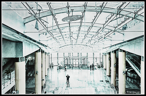
This may be the most beautiful and interesting library ever made. I posted a couple times on Flickr with other images (see Minsk Library, Inside Minsk Library, and Minsk Library at Night) but this time I decided to process the inside ceiling which is all glass – totally breathtaking! As you can see, I caught the eye of the guard down below, but he lends a wonderful scale to the image. I had a hard time deciding what to do with the image as the original was not that bad but I wanted to enhance the light and airy feel in the image. So I tried everything I could think of and this is what I got!
First applied Topaz (see sidebar for website link) DeNoise 5 – the image was shot at ISO 1600 so it had some issues. Used the Overall Strength set to .17 and set the Shadows to .82. The layer was copied and Topaz Detail 3 was applied using the Architectural Detail II preset – this image was perfect for this preset. Next Black & White Effects was applied where I mainly applied a regular black and white preset and started moving sliders. What I think really made the image pop was the application of the Creative Effects Diffusion effect where the Softness was set to 0.10, but the Diffusion slider was set high at .91 and Diffusion Transition set to 0.61. This really made the roof lines pop without being too sketchy looking. Then Kim Klassen’s Cloth & Paper Reign texture was applied and set to Soft Light blend mode to lighten the image and add some blue tones back into the image. It was duplicated and this time set to Multiply at 24% layer opacity. Next a Levels Adjustment Layer was added to lighten the image more by moving the Output Levels to 23/255 and the midtone slider to 1.39. Next a Curves Adjustment Layer was added to lighten it even, and a bit of a vignette was painted around the edges of the layer mask. It still did not look quite right – almost blown out. That is when I tried a Color Lookup Adjustment Layer and clipped (ALT+click between the layers) it to the top texture layer. The 3DLUT File was set to Bleach Bypass.look in the drop-down, although several look rather nice. The last step involved creating a composite (CTRL+ALT+SHIFT+E) on top and adding my SJ B&W Border Frame. I really like how the diffused settings made the ceiling lines look. Anyway, it was once again a lot of fun to experiment!…..Digital Lady Syd
Where Am I?
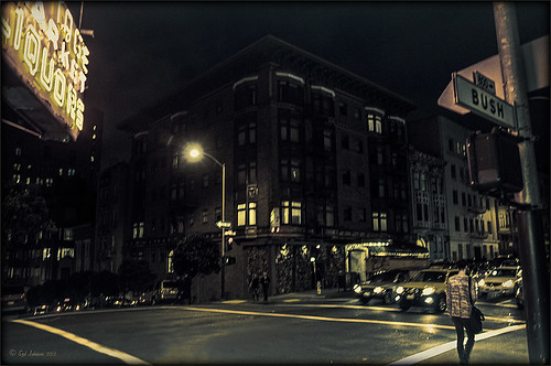
This is an image of San Francisco taken at night in February in a brisk and cold breeze. I just listened to another interesting webinar by Nichole Paschale from Topaz (see sidebar for website link) called Night Photography Enhanced with Adjust, Black and White Effects and Star Effects. I am always surprised how much I learn from these short videos – there were several good tips in this one, even though I know these programs pretty well. My image was not that great, but I needed a nighttime image to try some of the techniques on. Now I rather like the effect. Of course it uses one of my favorite plug-ins, Black and White Effects, so I am not surprised I like the results. The preset was set to my Old Vintage Effect (see Quad Tones in Topaz Black and White Effects Plug-in to create), one I use on a lot of my images. Next the Star Effects plug-in was used to enhance the streetlight using Sun Flare 1 preset. A Flypaper Texture Lemoncello Taster texture layer was added using the Multiply blend mode at 35% opacity. It still did not have the feel I wanted, so I added a Black and White Adjustment layer and mainly lowered the yellow and added some reds and greens and blues. The opacity was set to 26%. A layer style was added to frame the image. I can honestly say this is exactly how the street looked to me as I was walking to dinner on that cold dark night. If you have not tried out some of Topaz’s videos, give them a listen. Lots of cool things to try in them!…..Digital Lady Syd


