Yes, these two rather vicious looking lionfish are probably friends. I had one for several years that was very tame. He would follow me around the tank when I was in the room. Who knew? (Check out Ray Hunziker’s book on Marine Aquarium Basic Setup and Maintenance on pg. 67 – he had similar experiences!) Had to take some pix of my Leo the Lionfish relatives when I had the chance. Since they were both moving and the tank itself gave some pretty weird shadows, it was a challenge. Using Topaz DeNoise AI and Sharpen AI totally saved the image – that is why it was never post-processed before due to the high level of noise. Many steps were involved, but probably the most important thing was the lighting on the two fish. Overlay and Multiply layers were used to create the shadow and highlight effects…..Digital Lady Syd

Latest
The Bubble Creature
This is a little creature I created following Adobe Evangelist Julieanne Kost’s How to Create a Smoke-Flake in Photoshop short video and written tutorial. There is an action used to created the basic geometric flake that can downloaded if you scroll to the end of the linked site. It was created from a smoke image and totally surprised me as to how easy it was to do. My flake was Free Transformed and a background was created. A few items were added and the bubbles painted on were from a PS brush set called bubble_brushes_by_jennyle88-d7bl6zd from DeviantArts. When doing this technique, make sure your image is not too big. My initial image came out to be over 4 Gigs (Yikes!). To compensate, the smoke image was changed to an 8 bit mode, and 6 inches X 6 inches at 200 res in the Canvas Size dialog. This is just a fun thing to play with in PS!…..Digital Lady Syd
The Chocolate Shop
Had fun post-processing this image from Kilwin’s Chocolate Shop in St. Augustine, Florida – excellent chocolate! This image was pretty tricky to do as that little train was moving all over the place and it was in front of the food sign to make it even harder. It really helped to have Topaz Sharpen AI (see sidebar for website link) on this one – use it as a first step almost on every RAW image. The biggest problem was all the spectral reflections on the sign – totally blocked out some of the lettering. Therefore, a lot of clone stamping and painting was done on this image. For cloning, a brush from PS Guru Aaron Nace that is just a 30-pixel round brush set to 25% Spacing and 28% Hardness – the Options Bar was set to 100% Opacity and 80% Flow, Aligned checked and Sample Current & Below. It does a pretty good of job but is a little choppy looking where the strokes stop. To fix that, another clone brush was used – one I call Soft Build up Clone by Pratik Naik, a famous retoucher. It is a very simple brush too – Size 100 pixels, Spacing and Hardness 25% and Build-up checked in the Brush Settings Panel. In the Options Bar, the brush has an Opacity 100% and a Flow of 9% – be sure to turn on the Airbrush – also turn on Aligned and Sample Current & Below. If this does not smooth out the lines enough, just increase the Flow a little. This brush is really fabulous! Just cloned over other lettering to reconstruct the bad letters. Also used Kyle’s Drawing Box-Glide Sketch Pencil/14% (for smoothing) Sm brush and my SJ Pastel3-Painting brush (all over my blogs if you want the settings) for clean up. The font is one I really like – Onamura Thin. That was about it – took some time but overall a good final result!…..Digital Lady Syd
Ice Princess
Just a quick blog to give some credit here. Loved how this wintry effect turned out thanks to a really fun video by Paul Trani called Photoshop Masterclass: Surreal Winter Poster at Adobe Creative Cloud. He did his image really fast, but it took me a while to get my image looking right. This beautiful model image is by Jerzy Gorecki at Pixabay (check out this his other model images – really fabulous!). The background is a Laura Kuhn image from Pixabay that was deeply blurred and desaturated using Gaussian Blur and Hue Saturation Adjustment. Otherwise lots of “hand painting” to get the total effect wanted. Paul gives you a lot of information on how to get this effect, but lots of my own brushes and adjustments were used since this is a very different picture from his. Overall, lots of fun for this wintry season…..Digital Lady Syd
Winter in Indiana
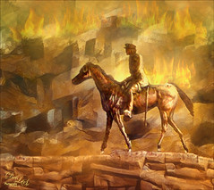
Just practicing my painting and decided to do an abstract from one of my childhood haunts. The originals of this image were really of the lake trying to freeze but I decided to add a little more drama for my image. In this case, the lake has frozen and melted several times to get this rough edge.
One reason this image was done was to try out a couple Smudge brushes created since I discovered I don’t have any in my favorite painting tool set. Basically followed the older Digital Painting Techniques Volume 1 from Brian Recktenwald tutorial. It served the purpose and several brushes were made and used on this image. Also a lot of painting was done with my SJ Pastel 3-Painting (have used this brush forever – great for just painting in solids with a little texture in it.) I also downloaded Daarken’s brushes and used one called Texture Sample Brush 45 3 to add the icy feel to the image. Used Carlos Cabrera’s brush for the overcast clouds from the same book. The bird set is called Bird Brushes by Canmax Stock-SB 3. Lots of other brushes were used like Kyle’s Animator Pencil 2016 and his Glide Sketch Pencil and David Belliveau Mixer Brush. Last step used Viveza 2 to get a nice focal point to the birds……Digital Lady Syd
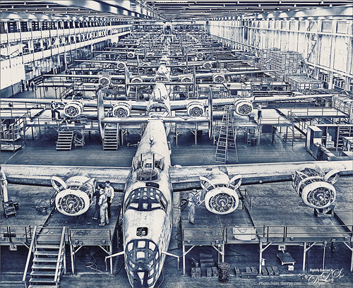
B-24E (Liberator) Bombers – 1943
I love Shorpy.com and whenever a really interesting image appears, I love to try and do something unique with it. This image is called Avenging Angels 1943 and is of the Assembly Plant that was in Michigan and it was a huge facility. I love seeing the woman looking at the engine and another in the front center window – very busy people in this place! Check out the comments for some really interesting information.
Since the original is a black and white image, First I ran the image through Lucis Pro to really sharped the edges of the image. I wanted to add a little color so a Gradient Map Adjustment Layer with purples and blues set Soft Light blend mode and a Color Lookup Table Adjustment Layer using my Sharply Dark LUT at 86% layer opacity. Painted in some lightening and darkening using Sam Peterson’s brush and technique (see my Fun Photoshop Blog – A Few Photoshop and Lightroom Tips and Tricks-Step 2). Last step was to add a Black and White Adjustment Layer set to Luminosity blend mode and setting the Blues and Cyans to get a good contrast. …..Digital Lady Syd
The Christmas Tree
This image is from ISO Republic and is one of my favorites to try new techniques on. This time a Photoshop file was used to get the original painterly effect, then I painted on a black and white version and added a free music sheet to give a holiday flair. The PS file is from Deeezy called Free Paint Art Creator – has a smart object in it and you just add your own folder and adjust all the layer settings – no PS action involved. Lots of fun! Then obviously several adjustment layers were added on top. A black and white version was created. Painted over layers set to Linear Burn blend mode for the dark red paint layer and Soft Light blend mode for the lighter green and beige layers. No particular brush is needed – just something you like to use. I will caution that the file gets quite large due to all the layers in the PS file. After doing this changes, I created a stamped layer on top and made a new document – to do this right click on the layer and select Duplicate Layer – in drop-down Document field, chose New and rename it to a new name. Then immediately save it as a new document using this name. Now there are two documents and you can finish up the post-work on one that is not so large. Happy Holidays Everyone!….Digital Lady Syd
American Goldfinch
Spent what seems like hours working on this gorgeous Goldfinch. The reference photo was by Stephen Walker at Unsplash. Totally drawing and painted following the technique in the Behance Video called Painting Beautiful Birds in Photoshop with Maddy Bellwoar. I am still working on the second half, but the technique used on this bird is from the first part. She provides brushes to draw and paint with and spend a lot of time showing how to draw birds. Excellent tutorial! The flower brushes are from her Hand-Painted Gouache Brushes for PS and Procreate that she just released. I used some of them as Pattern Stamp brushes. The Pattern used was from Jessica Johnson at Creators Couture using her Romantic English Garden Multi-color Floral Set – this set has some beautiful floral patterns, and some great Pattern Stamp brushes too. The background was created using Kyle T. Webster’s 2020 Summer Set’s Brix Brush in Photoshop. A Lookup Table using the Cerulean preset gives it this bold dark blue/purple effect. Otherwise bunches of layers and brushes and hours but lots of fun to do!…..Digital Lady Syd
A Duck Enjoying his Habitat
This beautiful and rather friendly male Mallard Duck was swimming all over the place while several people were trying to take his picture at Ames Park, Ormond Beach, Florida. His coloration is what attracted me to this image. Did my basic workflow on this image but thought I would share that Topaz (see sidebar for website link) Sharpen AI was used to really sharpen him up. The Lucis Pro filter was also used – too bad no one has decided to make this great little filter available again. Also Viveza 2 was used – my go to filter to finish up a look. ……. Digital Lady Syd
Red Hot Music!
Had some fun today working with the wonderful violin image from Pixabay which I use a lot for practicing. Created the lines on the violin by following a YouTube video from Unmesh Dinda called Turn Yourself into Line Man with Photoshop. Once the lines were made, a layer style was added to the stripes layer with Bevel and Emboss, Pattern Overlay and Outer Glow. Pretty simple and just followed his tips and tricks in the video. Above the black background, just used Kyle’s Brix Brush (found in Kyle’s Summer 2020 set) with a bright orange red to add the texture. Used the Notes brushes made from Adobe Creative Live’s Paul Trani’s video called Create a Custom Brush with Music Notes. On this layer another layer style was added using Bevel and Emboss and Color Overlay. Next Shadows and Highlights layers were added using Sam Peterson’s tip (see my A Few Photoshop and Lightroom Tips and Tricks blog – tip number #2) – lowered the opacity on these layers. The last step was a Color Lookup Adjustment Layer using a film look to give a sort of poster feel to the image. Lots of fun to do and enjoyed trying some new things…..Digital Lady Syd


