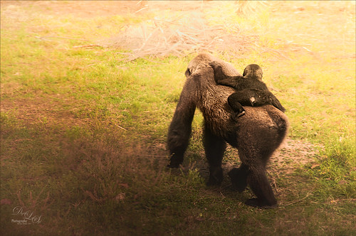
This image was taken at the Jacksonville Zoo – this little guy was hitching a ride across the large field for the Lowland Gorillas. The image was first processed in Lightroom using Seim’s Magic – Harsh Sun Fixer preset and then adding Dave Delnea’s Backlight 002 Horiz preset to it to give the interesting lighting effect. Dave’s preset was adjusted before sending the image to Photoshop. Adding this kind of lighting can really pop a boring image. In Photoshop Topaz (see sidebar for website link) Detail 3 was applied using my Little Med Large Detail preset – added a black layer mask and painted back the detail just on the back of the gorilla and the little gorilla. On a stamped (CTRL+ALT+SHIFT+E) layer, Nik Color Efex Pro 4 was added using these filters: Darken/Lighten Center, Color Effex: Vintage set to Film Type 2 and 82% overall opacity, Brilliance/Warmth set only to Warmth at 32%, and Glamour Glow to soften the image a little. Nik Viveza 2 was used to adjust the lighting on the gorillas. I love post processing and painting images from the zoo!…..Digital Lady Syd

Latest
Smiling Wolf
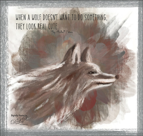
This is my attempt at drawing a wolf. It actually looks a lot like a dog so I am not sure what I was really drawing here. Used a tutorial in the Digital Painting Techniques book on Painting Fur by Richard Tilbury. First a thin black brush was used to the original sketch of the wolf on it own layer to begin the drawing. On layers underneath, the wolf was painted using the Pastel Scratchy Photoshop brush from Corel Painter Master Melissa Gallo’s Painting with Photoshop class to paint the hair. (Her class and PS brushes are terrific even though it is a few years old.) A couple of Fay Sirkis’s (another great painter and Corel Painter Master) Pet PS brushes were also used but they are hard to run down now – these are still some of the best around. (KelbyOne has her very good Four Seasons PS Painting tutorials with brushes to download if you are a member.) Topaz (see sidebar for website link) Impressions was opened and a preset created using the steps in a great video by Topaz Labs called RAW to Envisioned with Bobbie Goodrich (third example). The main text is Catalina Anacapa Sans from Creative Market and by Kimmy Design – a really nice clean font. The small text is in called Chiller. The last step was creating a border using a my Pencil Thin Vertical Lines brush (pencil lines were scanned and a brush was created – then in Brush Panel set the Angle to 90 degrees and Roundness to 12%) by changing the Angle and adding around the edges in a brown color. I will be practicing more animal drawings so look out!…..Digital Lady Syd
Who’s Watching Who?
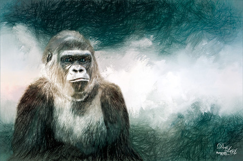
This gorilla I have used in several blogs – he was very much aware of everything going on around him and all who were watching him. I believe he was concerned for the little gorillas that were playing near him. There was a lot of clean up done to get him ready for the texture and Topaz Impression filter used in the image. The Gorilla was separated from his background using the Select and Mask Tool. It was okay that the selection was not perfect since just this layer was going to be taken into Impression. But first one of Jai Johnson’s fabulous natural textures was placed behind him – one called Daily Textures Captured Light Sea 4 (free download if you sign up for her newsletter). A Hue/Saturation Adjustment Layer was used to desaturate the texture a little and remove the warm gold color, and a Levels Adjustment Layer were used to make the yellow color even more white. Then a Color Balance Adjustment Layer was set to Highlights and Just the Yellow-Blue slider was set to +35 to add a little blue tone into the whites. After reading Jai Johnson’s Being Expressive blog, I decided to try the effect she described. On a Stamped layer (CTRL+ALT+SHIFT+E), the layer with both gorilla and texture was taken into Topaz Impression 2 where the Quick Sketch I preset was applied with these changes: Color Overall Sat -1.00 and Overall Lightness -0.52; Set to Hard Light bm at 54% layer opacity. The just some clean was done in PS and the texture was reapplied on top, set to Overlay blend mode and 52% layer opacity to add some warmth back into the fur of the gorilla. A Black and White Adjustment Layer was added and set to Luminosity to get the colors just right. Just took a lot of clean up but eventually it came out like I wanted it! I really liked the effect that Jai came up with – give it a try!…..Digital Lady Syd
Danger – Gang of Ferocious Fish
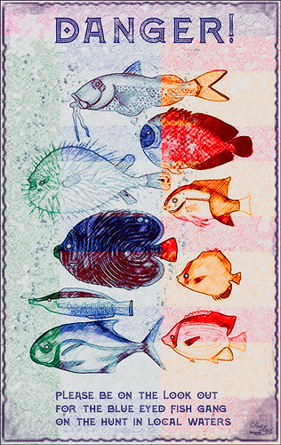
Just had some fun making this poster from fish that were in one of the old volumes from 1754 volume Poissons Ecrevisses et Crabes by Louis Renard. These fish apparently are all examples of fish in the Indian Ocean. I personally thought they looked a little ferocious. Not sure what came over me to create this but once again it was fun. It was all part of the experimenting I was doing for my How to Create Vintage Text for Images Fun Photoshop Blog. These fish were copied from a page in the old volume and converted to a black and white image. An abstract pattern from Deal Jumbo was used in a Pattern Fill Adjustment Layer to add the different colors. Just dragged around on the image and adjusted the Scale to make it look interesting. On a separate layer bubbles were painted on the image by using Grut’s (see sidebar for website link) FX IL Flick Tub brush (in the Inky Leaks Splatter Brush set) and turning on a Bevel & Emboss Layer Style. All fish eyes were turned to blue on another layer. Some text was added. A frame by Rotfuschs was added. It really was just a fun image to play with…..Digital Lady Syd
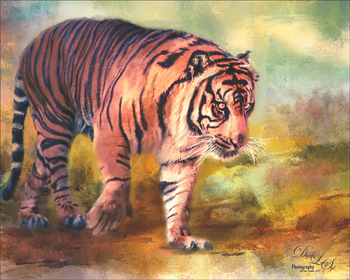
I’m Just a Little Kitty Cat
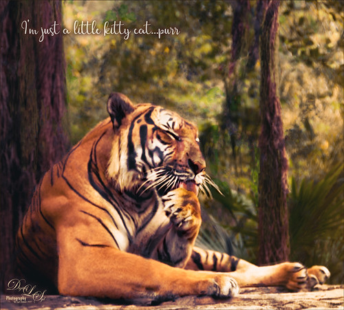
I just love to photograph the big cats – they are so interesting and beautiful! This tiger image had fencing all over it and the Healing Brush in Topaz Studio (see sidebar for website link) actually took almost all of it out of the image – I was totally surprised. They have just recently added it into the program. For me to get it to work well a very small size of 0.03 was used and by dragging the brush first over the color that you want added in, it tends to fill in with that color. Then just a Curves Adjustment Layer for color adjustment and then a Levels Adjustment Layer for contrast correction for a bit of a vintage matte feel. A Color Look Up Table set to the TealOrangePlusContrast preset and the opacity to 29%. Topaz Detail was used to sharpen the face. A Red Luminosity Curve was used to add a little more contrast. A left side yellow-orange light leak was added to the image to lighten it up a little. Created a composite layer on top (CTRL+ALT+SHIFT+E), made it a Smart Object (right click on menu and select), and opened the Camera Raw Filter. Went to the HSL sliders and adjusted mainly the orange and yellow colors in all the sections to get the tiger color and background just right. Last step was to add the text – used the Streetlight script font. What a cool tiger!…..Digital Lady Syd
Night at the Museum
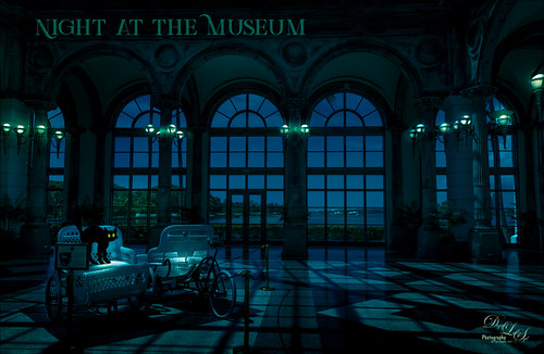
Had some fun creating a night scene out of this image. The image was darkened in Lightroom using Serge Ramelli’s American Night Darker preset to start and adding radial light effects on all the different lamps. Once in Photoshop the cat was added from an image by Graphics Fairy and then his outline was smudged to give it some hair effect. Some whiskers were drawn in and a shadow was added underneath his body. Some text was added using the Green Light Bold Inline Grunge font. A 50% gray layer was added and set to Overlay blend mode where the lights were painted in at 20% layer opacity to get the correct flare effect on the walls behind. That was it. A lot of fun to do!…..Digital Lady Syd
Just a Pretty Flower
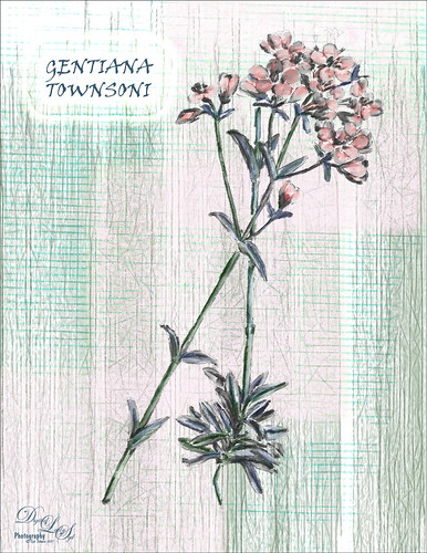
This pretty flower is from an old album called Illustrations of the New Zealand Flora (Plate 139) published in 1914. It was just a black and white line drawing and I added the color and texture. The image was removed from a page on the downloaded PDF file using the steps in my How to Create Vintage Text for Images Fun Photoshop Blog -just go towards the end for steps to pull images. I am afraid I took a little color liberty here as the volume says the flowers are actually white, but I liked the pink color. The flowers pink color was created by using a Curves Adjustment Layer’s individual Red channel with the layer mask filled with black (CTRL+I in the mask) – just painted in the pink on the petals – layer was set to Color blend mode. On a separate blank layer under the outline, painted in the green textures using Grut’s I Qwillo (I love this brush for drawing and painting!) and a Mixer blender to paint in the leaves and stem. Below that but above a white background layer a texture was painted – just experimented with a couple of my brushes and took just the texture layer into Topaz Studio. The Radiance filter was applied so the fine lines showed up – I thought it matched the line drawing effect of the flower. The font is Viner Hand ITC and an Outer Glow layer style with a Contour change was used to make the text stand out. The original outline was set to 15% layer opacity at the top of the layer stack. That was it. Lots of fun. I really enjoy looking at the old volumes of animals and plants. ….. Digital Lady Syd
Happy 4th of July!
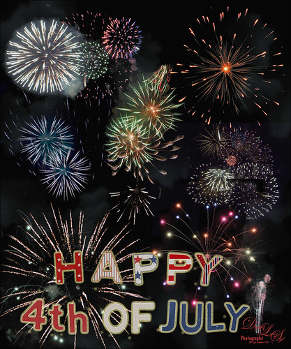
Just a quick Happy 4th of July blog – hope everyone in the US are enjoying the fireworks. I created a similar image in a blog from several years ago. (See my Faking Fireworks Fun Photoshop Blog – some good fireworks resources in this blog.) The fireworks are from freeimages.com and Jai Johnson’s Fireworks Overlay Collection. The letters were scanned using some inexpensive letter templates and then layer styles using Shadowhouse Creations free Patriotic Pattern set. Used a different one for each letter by placing each letter on a different layer first. A Levels Adjustment Layer was used to add some contrast back. Then it seemed like there was not enough smoke in the background that fireworks always generate. Therefore Phlearn’s free Fog Brush set to light blue and 11% opacity was applied. A Gaussian Blur was then applied to the layer to soften the edges of the fog a little.
Hope everyone has been having a wonderful holiday! Happy Birthday America!…..Digital Lady Syd
A Very Unusual Place!
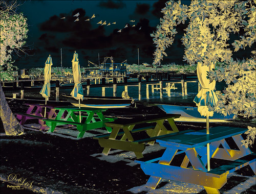
This image was taken at New Plymouth, Green Turtle Cay, the Bahamas. Had fun playing with several different adjustment layers and filters. On a New Layer above image, a bird brush was created using Aaron Nace’s Creating a Custom Brush video. Just added a little Angle Jitter to it. The layer was set to Multiply blend mode at 70% layer opacity. Then a Pattern Adjustment Layer was clipped to the birds and a coffee colored watercolor pattern was used – this is how the wings have a tipped color effect. (See my Patterns, Patterns, Patterns Fun Photoshop Blog for more on this.) A Black and White Adjustment Layer was set to Luminosity on top. Next a Levels Adjustment Layer to add some contrast. Then a Color Balance Adjustment Layer. The Color Negative preset was applied with a Color Lookup Adjustment Layer. Next a Hue/Saturation Adjustment Layer was added and the Master Hue was flipped to the end to get the color palette seen in the image. The Blend If This Layer black tab was split to 0/145 and Underlying Layer’s white tab was split to 130/210 (ALT click on the tabs to split) to let some of the color leak through. Another Black and White Adjustment Layer was added and set to Soft Light and adjusted to get just the right color effect. A Red Channel Luminosity Curve Adjustment Layer was added. A stamped layer was placed on top (CTRL+ALT+SHIFT+E) and Topaz (see sidebar for website link) Restyle’s Gunsmoke and Jordy Blue preset was applied – in the plugin, Restyle section was set to Screen blend mode at 41% opacity and Basic section set to Multiply blend mode and 64% opacity – a few changes were made to the Tint, Tone, and Detail sections. It basically added yellow where the color was white and really brightened up the image. That was it. Not sure I could do it again, but it was fun to figure out a new look!…..Digital Lady Syd
On the Prowl
Felt an urge to paint one of my favorite subjects – the large cats. This beautiful Malayan Tiger was romping around at the Jacksonville Zoo, and definitely not stopping for a photo op. Luckily I spotted him and took the shot. (Okay – he was in his enclosure.) So this followed my basic painting workflow. In Lightroom a crop was performed and Serge Ramelli’s Bad Weather Basic preset was used and then adjusted. In Photoshop Topaz (see sidebar for website link to free program) Studio’s Sharpening Lens Blur filter was used to sharpen the image overall. Then one of my Corel painted textures was added underneath the tiger along with Jai Johnson’s Explorations (10) texture that was set to Linear Light blend mode and 55% layer opacity. On the Tiger layer, a black layer mask was created and the tiger painted and further defined in the Select and Mask panel. After than, just a lot of painting. One of the Mixer brushes that worked well on this image was a free one from Adobe called Munch-Round Ratty and was set to 45 pixels. to create a nice blend when painted over the edges of the tiger body. Several layers of both regular brushes and mixers to paint him in. An Exposure Adjustment Layer was used for the eyes, and Nik Viveza 2 was used to draw eye to his head. Finished off with a Curves Adjustment Layer to bring back contrast. It was a lot of to paint again!…..Digital Lady Syd
Topaz Labs AI Gigapixel
Check out AI Gigapixel stand-alone software for upsizing your images. It’s incredible! And it can now be used as a plugin when in Photoshop. Also Topaz Labs Photo AI has some great sharpening and denoise tools along with Photo Video AI.

Luminar Neo
Click here to visit Luminar for more info and check out their new AI Filters.

GRUT BRUSHES – Photoshop Brushes for Digital Artists
Click here to visit GrutBrushes.com
And be sure to check out his Free Brush of the Week and Brush Sampler! These are the best brushes you can find!

Topaz Studio 2 and Legacy Topaz Labs Filters
Unfortunately Topaz Studio 2 and other Topaz Lab filters are no longer available for sale as of 2020. If you had bought these filters and would like to put them back on, here is a link to the Legacy Apps where they can be downloaded again. Below is an example of the wonderful Remix AI Filter from Studio 2. The wonderful Impression still works fine in Photoshop right now along with Adjust (all versions), ReStyle, and even PhotoFXLab!

On1 Photo Raw
Wonderful software to use as a substitute for or plugin with Photoshop. Many great filter effects and lots of AI capabilities!
