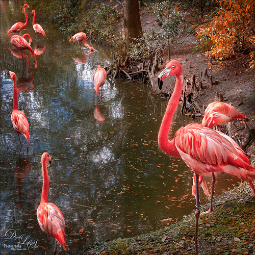
These birds look just like bathing beauties stepping into the water daintily. I just love Flamingos – they are so much fun to watch and photograph. Took this image of some Flamingos a while back at the Jacksonville Zoo and did not think it was that great. After watching a couple videos on On1 Photo Raw 2018 (see sidebar for website link), I decided to give it a go and see if I could get this image to look better and I was pretty pleased. When I did a Fun Photoshop blog on sharpening (see my Comparing Some Sharpening Techniques blog), I mentioned how good both On1 Effects Dynamic Contrast and Sharpening filters were. Well once again, I am pretty pleased with the results. If you have On1 software, check out Colby Brown’s video on Top 5 Tips for Wildlife Photography where he discusses how to use these filters. Then the rest of the image was post-processed in Photoshop. A stamped layer set to Hard Mix blend mode at 6% Fill Opacity was used to add an overall sharpening to the image (this was also mentioned in my sharpening blog). A Spotlight Layer set to Overlay blend mode and white was painted on the feathers (see my How to Add a Spot of Light blog.) Then a little vibrance was added using the Channel Mixer Adjustment Layer – learned this nifty trick from Denny Tang in his Vibrancy Masking Photoshop Tutorial video. Nik Viveza 2 was used to direct the focus, a Black and White Adjustment Layer set to Luminosity blend mode at 36% layer opacity, and a darken/lighten layer to emphasize the eyes and beaks a little. and a Matt K vignette (see my How to Create a Subtle Vignette blog). I might add that I used Artistic Profile 03 in the new Lightroom update to begin working on this image. I love it when I try out a new technique and it works really well……Digital Lady Syd

Latest
New York! New York!
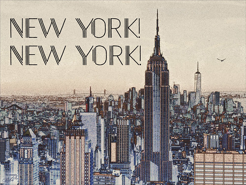
Just having some fun with this image using a little High Contrast Sketch tutorial from an older book called Photoshop Blending Modes Cookbook for Digital Photographers. This is good for low contrast images. This image was from a set of New York images from Deeezy to try this out on. Basically duplicate the background layer, turn it to Overlay blend mode, and set the layer to 60% opacity. Next go to Filter -> Stylize -> Find Edges. Do these steps two more times. If too much, try adding a Filter -> Blur -> Gaussian Blur Filter on the second Overlay layer using a Radius of 60 px. (This image did not need it.) A text layer using Naive Deco Sans font was applied. Obsidian Dawn’s single bird was added. Then a Curves Adjustment Layer was used so the grain would show up more in the sky and a Color Lookup Adjustment Layer using a new LUT called Dystopia…16 (they are in with the Lightroom presets) was added. This was a lot of fun to do and pretty simple…… Digital Lady Syd
Planet X
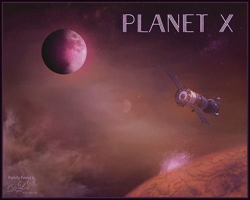
Just had some fun creating this. Design Cuts gave everyone a freebie pack called Vintage Style 3D Lettering Moon Phase Graphic and Sunbeam Photo Overlay (Phew!). It contained the moon in the above and got me thinking about what I could do with it since Astronomy is one of my major hobbies. Created an New Image and added the Moon image into it. Next added a Solid Fill Adjustment Layer set to black on the white background layer since it is a space scene. Decided to use the Starfield png in the pack and put it behind the moon. Then added one of the smoke layers from the psd in the pack. Then just started adding in elements. Used one of my Corel painted backgrounds that created the lighting effect for the whole image by placing it just above the Solid Black Fill Adjustment Layer. The satellite was from the space satellite in orbit image from Free design file.com. Some brushes called Galaxies by LoRdaNdRe were used to add in little elements to the sky. The foreground Planet X was created by first just painting an orange corner into the image. Then took just this layer into Topaz Studio and applied the Impression adjustment (settings: Darker Color blend mode, Stroke Type 16, Number of Strokes Medium, Brush Size 0.89, Paint Volume 0.93, Large Brush Volume 0.58, Print Opacity 0.60, Stroke Rotation 0.26, Rotation Variation 0.22, Stroke Color Variation 0.18, Stroke Width 0.18, Stroke Length 0.04) which created the interesting cracks on the surface. The spewing fountain on the planet was created by using another galaxy brush and then adding a watery flume to it with a sparkle brush. The moon in the distance is in the Moon Brush Set by EMelody – changed the angle of the moon to fit the image. A Color Grading Action called Blackberry Stain by Chris Spooner was also used to get a little bit of a cinematic effect. The font is Naive Deco Sans. That was it – just a lot of fun to put together!…..Digital Lady Syd
Darling Dahlia
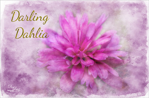
Image of a little dahlia that just poked up its head in my winter spring bed a month ago. It was only about 2 inches wide but just lovely! First sharpened the image using Photoshop’s Shake Reduction filter. Then sharpened again by duplicating the layer, setting it to Hard Mix blend mode, adding a Gaussian Blur set to Radius 3, and setting the Layer Fill slider to 5%. Next took Belle Fleur called Rose Garden texture into Alien Skin’s Snap Art 4 and set it to Watercolor Abstract preset (Brush Size 81, Photorealism 58, Coverage 57, Stroke Length 62, Color Variation 43, and Default Brush Style. It was set to Soft Light blend mode. Added another texture, one of mine named SJ The Phyllis Sky (created with Grut’s Charcoal Shin Ding Brush – painted a texture background in three colors – blue, turquoise and brown – gave a lovely texture and cloud feel that was saved to use again). A Hue/Saturation Adjustment layer was clipped to the texture so it became purplish in color (Hue 292, Saturation 19, and Lightness -8). A layer mask was added to paint out a lot of the flower to bring through the warm color of the flower from the texture underneath. On a layer above some painting clean up was done on some of the petals. Added a New Layer filled it with 50% gray using the Edit -> Fill. Set it to Soft Light blend mode and used a black and white brush to paint back areas for lightening or darkening the image. Added a Curves Adjustment Layer to add back some contrast – painted in the layer mask to lighten the effect in the center of the flower. Added a Text Layer using the Dancing Script OT font – in layer style turned on the Bevel & Emboss default settings and a Stroke effect using the Structure Size of 18, and Fill Type Pattern – Graphic 09 at 47% Scale. A Canvas Vignette was added on top to give a painterly look. This flower was so pretty…..Digital Lady Syd
Enjoying the Attention
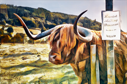
Here is an image of one of the most beloved creatures in Scotland – Hamish McKay Denovan, the Highland Cow. This guy was as tame and sweet as could be. (Another Flickr contributor noted that “Hamish the Highland Bull at Kilmahog, a popular stop off point on the road through the Trossachs to Lochaber and the western isle” in Scotland is where this guy can be found.) It had not been post-processed since it had a fence going everywhere in the image, but Photoshop’s terrific spot healing brush took the lines out completely. Just Basic Panel changes were done in Lightroom. Then in Photoshop, after removing the fencing, a stamped layer was created. Topaz Studio (see sidebar for website link) was opened and once again and three Adjustments were added, Precision Contrast and two AI ReMix (settings were: Precision Contrast: Micro -0.52, Low 0.72, Medium 0.27, High 0.45, Shadow 0.51, and Midtone 0.12; AI ReMix: Opacity 0.79, Low, Row 13/Col 2 swatch, Brightness 0.14, Contrast 1.15, Sat 0.75; and AI ReMix: Opacity 0.89, Color bm, Low, Col 17/Row 1 swatch, Painted out the animal slightly). The sign on the fence post was different and faded so I put some text in it for this highland cow – three different text layers were used, grouped, duplicated, turned off, and the copy was rasterized. Then the text could be transformed using the Warp to fit the paper. Some clean up was done and some darkening and lightening using two Curves Adjustment Layers with black layer masks. Google Nik Viveza 2 was used to emphasize the focal point. Then my final workflow steps were done: added a Red Channel Luminosity Curves adjustment layer, a Gradient Map adjustment layer using a reddish tone to light blue color gradient, added a layer for a white spotlight effect on his face, and finished up with Matt Kloskowski’s vignette. Love how the Topaz AI ReMix can produce this type of interesting texture…..Digital Lady Syd
Stand Tall
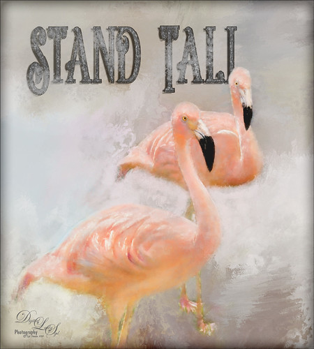
Just love Flamingos – this image taken in Hawaii a while back of some beautiful flamingos at the Hilton Waikoloa Village. This image needed to be made bigger so some more space was added on the right side using Image -> Canvas Size and setting to 120% for the width. Then used Content Aware Fill to fill in the area. Topaz Impression was added to the flamingos. A painted background I created in Corel Painter was taken into Topaz Studio (see sidebar for website link) and my SJ AI Graphic Design Effect preset was added (in community). It was turned into a black and white using a Black and White Adjustment Layer. The Flamingo Shadow font was used and a couple layers were placed above and below. Grut’s Charcoal Shin Ding brush was used to add a slight smokey feeling around the text. My Silver Pattern created using my Glitter texture was added to the text. (See my How to Quickly Add a Touch of Gold to Your Text blog on how to do this.) Nik Viveza 2 was used to emphasize the heads and a darken layer was created to highlight a few of the lines between the birds. That was it. I really love the color of Flamingos…..Digital Lady Syd
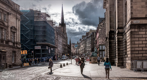
Parliament
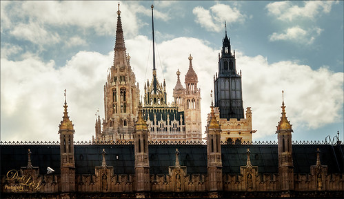
This is an image of Parliament taken from Westminster Abbey in London. I was trying out a few different tricks on this image to see if they worked. The Smart Sharpen Filter ws used to sharpen the image (Amount 155%, Radius 8.1, Reduce Noise 33%, Remove Motion Blur at 53 degrees, Shadows Fade Amount 16%, Tonal Width 27%, Radius 7, Highlights Fade Amount 9%, Tonal Width 49% and Radius 8 px). This is from a video by Deke McCClelland (a Photoshop Guru from Photoshop World) called Sharpening Details – Compensating for Camera Shake. I could actually see a difference using these settings. Next I followed Denny Tang’s Tone and Color Chart for Photoshop video – this worked very nicely on this image. A couple Spot Light layers were used in different colors set to Overlay blend mode to add some focus. A new layer was set to Saturation blend mode and with a bright colored brush, the gold areas were painted – the layer opacity was set back to 87%. Nik Viveza 2 was used to even out the clouds a little. Finished up creating a vignette effect using Matt Kloskowski’s technique. (See my How to Create a Subtle Vignette blog.) Love the gold in this image……Digital Lady Syd
Dodging the Fire
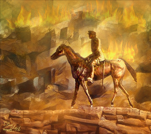
This image is a composite put together using a really bad image I took a while back of a Statue of WWI Field Marshall Earl Haig riding on a horse that was located at the entrance to Edinburgh, Scotland (it has now been relocated to outside the National War Museum inside the castle walls). As a personal challenge I decided to figure out if there was any way this major blurry image could be rescued. Surprisingly, this turned out much better than I thought was possible. First step was to try and remove some of the major blurring. The PS Shake Reduction Filter was applied and it worked just a little. Next sharpening was tried by using the Hard Mix blend mode (see my Storm on the Way Tidbits Blog) and it helped a little bit more. On a stamped layer I tried Topaz (see sidebar for website link) Infocus and it actually helped even more. Much better but still not that great. Therefore, I decided to try something different. One of my Painter backgrounds was added as a layer, and a copy of the Infocus layer was placed on top of it. A layer mask was added and just the statue was left. Next a stamped layer (CTRL+ALT+SHIFT+E) was created and Topaz Studio’s AI ReMix adjustment was added twice. (Settings were: 1st Adjustment: Style Strength Low, Row 2/Col 2 swatch, Brightness -0.17, Contrast 1.04, and Sat 0.75; and AI ReMix – 2nd Adjustment: Opacity 0.66, Style Strength Low, Row 13/Col 2, Brightness -0.55, Contrast 0.96, Sat 0.58, and Smooth Edge 0.01.) Back in PS the statue was cleaned up. The Flames Filter was opened and flames were placed in the background. Several smoke layers were created in yellow and orange tones using Grut’s FX Cloud Heft (from his fabulous cloud set) – see sidebar for website link. More flames were created in the midground area. A Pink to Beige Gradient Adjustment Layer was added to lighten up the image with some warm color – Soft Light blend mode and Linear gradient style. To finish up, a vignette was created around the rider. This was really fun to do!…..Digital Lady Syd
Storm on the Way
I decided to work on this image using an old sharpening technique I recently learned. This image was taken into Topaz (see sidebar for website link) Studio and one of my old presets was applied which is just a Precision Contrast adjustment and a HSL Color Tuning adjustment where the individual colors were tweaked. The next step was to sharpen it in Photoshop by duplicating the Topaz layer and setting it to Hard Mix blend mode. Then a Gaussian Blur was set to Radius 3 pixels and the Fill (not the opacity) slider in the Layers Panel was set to 6%. This is a great way to sharpen and does not usually cause haloing. A little dodge and burning was done and a Red Channel Luminosity Curves Adjustment Layer was added. Last step was to add a Vignette using Topaz Lens Effects’s Soft Pearl preset with a few changes to sliders. In PS it was set to 73% opacity. That was it. It looks extremely sharp I think…..Digital Lady Syd
A Scottish Countryside Town
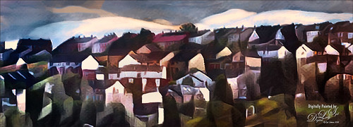
Loved how this image turned out using the new Topaz (see sidebar for website link) Studio AI ReMix Adjustment. I am finding that to get AI Remix to look really good, it helps to stack this adjustment a couple times to get an interesting look. In this case a Precision Contrast adjustment was added first, then an AI ReMix adjustment using the Row 13/Col 2 swatch, then AI ReMix adjustment was applied again using Row 6/Col 3 swatch set to Lighten color blend mode at 0.59 opacity, next an Edges adjustment set to Multiply blend mode, and finally a Color Theme adjustment to change some of the colors of the image (this adjustment seems to work best for changing the colors in these swatches). I created a preset called SJ AI Blocked Blue Look and put it up in the community group if you would like to try it. Back in PS the layer was set to the Luminosity blend mode, did a crop, and a little painting clean up was done in the background. A stamped layer (CTRL+ALT+SHIFT+E) and Nik Viveza 2 was opened and 4 control points were used to adjust the color. The last step was to go back into Topaz Studio and apply the Pony Express preset from the Simplify section. Back in PS it was set to 26% layer opacity. Last step was to add a Matt K vignette. (See my How to Create a Subtle Vignette blog). I really like the texture and color in this image…..Digital Lady Syd
Topaz Labs AI Gigapixel
Check out AI Gigapixel stand-alone software for upsizing your images. It’s incredible! And it can now be used as a plugin when in Photoshop. Also Topaz Labs Photo AI has some great sharpening and denoise tools along with Photo Video AI.

Luminar Neo
Click here to visit Luminar for more info and check out their new AI Filters.

GRUT BRUSHES – Photoshop Brushes for Digital Artists
Click here to visit GrutBrushes.com
And be sure to check out his Free Brush of the Week and Brush Sampler! These are the best brushes you can find!

Topaz Studio 2 and Legacy Topaz Labs Filters
Unfortunately Topaz Studio 2 and other Topaz Lab filters are no longer available for sale as of 2020. If you had bought these filters and would like to put them back on, here is a link to the Legacy Apps where they can be downloaded again. Below is an example of the wonderful Remix AI Filter from Studio 2. The wonderful Impression still works fine in Photoshop right now along with Adjust (all versions), ReStyle, and even PhotoFXLab!

On1 Photo Raw
Wonderful software to use as a substitute for or plugin with Photoshop. Many great filter effects and lots of AI capabilities!
