Artistic Daisy!

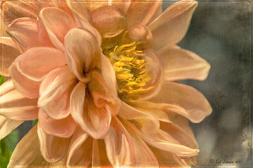
This yellow daisy has a very interesting texture by French Kiss Textures called Lakeside – she actually offers it for free at her website (she also has some great tutorials on how to use textures on her site). I was not that familiar with her textures until recently – she has some beautiful textures that have more of an artistic flair to them than most sites. This texture was actually placed behind my daisy. A Hue/Saturation Adjustment Layer was placed above the texture and the colors were changed from the blue-yellow-green to the green-purple tones by setting Hue to -117, Saturation to -41 and Lightness to -8. The daisy had been cut out as an object using Select -> Color Range and selecting just the flower and stem. The flower was processed in Topaz (see sidebar for website link) Simplify 4 using the Oil Paint Toned V preset – the Tone and Edge Sections were turned off and the color space set to RGB. The layer was set to 75% opacity to tone it down a little. A pink textured border (see my SJ PNG Borders) was placed round the image and the color was changed to light brown using another Hue/Saturation Adjustment Layer set to Hue +48, Saturation -3, and Lightness 0. A Curves Adjustment Layer was added to get the final contrast in the image. That was it. Try downloading her free texture package and see if you like them as much as I do!….Digital Lady Syd
Digital Lady Syd Related Posts:
Getting a Nice Painterly Landscape Effect with Topaz Simplify and Texture
A Little Hollywood for My Butterfly Model
Digital Lady Syd Reviews Topaz Simplify 4
Digital Lady Syd’s Rule No. 8: Get Textures From Objects Inside Your Home!
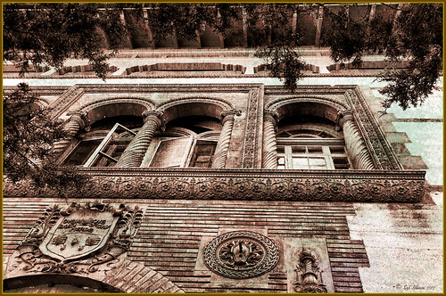
This image is of the area above an entryway onto a courtyard at Flagler College (it actually was the ladies entryway to the courtyard at the old Ponce de Leon Hotel) in St. Augustine, Florida. In Photoshop I added a texture created from a shot of the corner of a large oil painting of a beautiful white cat in my living room to use on this image. (It can be downloaded here.) It is medium gray with lots of paint stroke texture that I find I am using quite often. Try going around your home to see if you have some interesting textures that could spice up an image. I took some of the lace in my dining room curtains and even my living room couch material. The kitchen countertop also made a nice dark texture.
The bricks throughout the college are colored that beautiful brick red-orange tone. This image definitely needed to be put into a sepia tone to see the detail so it was converted into black and white using Nik’s Silver Efex Pro 2 and the High Structure (Harsh) preset used as a starting point. Back in Photoshop my Cat Painting Canvas texture was applied and the layer set to Color Burn blend mode at 50% opacity. Next a Hue/Saturation Adjustment Layer was added and clipped to the texture (CTRL+Click between the layers to do this) so changes only apply to the texture and not the whole image. Colorize was checked and the Saturation set to 10 which gave a little more of a deep red sepia feel. Next a New Layer was added on top and Nakatoni’s Amazing Texture 2 brush (does not appear to be available anymore but any smooth grunge brush would do) was selected to paint with a dark brown color sampled from the image. By filling this layer with grungy strokes, and then setting the layer to Subtract blend mode at 90% opacity, the bluish almost duotone feel was created and also more texture was added. By double-clicking on the middle of the layer, the Layer Style dialog was opened and the Blend If Gray – This Layer white tab was split (ALT+click and drag to get a smooth transition) and set to 56/89 and the Blend If Red – This Layer white tab was split and set to 91/211 that really changed the red tone. It surprised me how nice it looked! A Curves Adjustment Layer was applied to add a little more blue by adjusting the Blue channel curve. A composite (CTRL+ALT+SHIFT+E) was created on top, and my Thin Double Edge Frame layer style was used (can download here), keeping the default colors. Once again, this produced a totally different image and I created the textures myself very quickly and inexpensively! Have fun exploring!…..Digital Lady Syd
Cold Dolphin Fountain in Florida
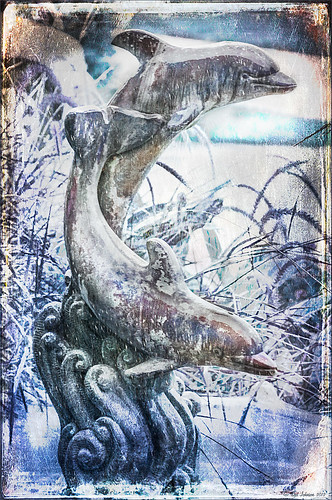
Sometimes I find I just need to do something sort of funny and just play around in Photoshop. That is how I got this crazy image of my cold dolphins instead of the warm Florida dolphin fountain in my front yard – actually it really was raining at the time I took this picture from the front porch. Essentially this image was just color corrected in Lightroom and brought into Photoshop where four textures were stacked using Dr. Brown’s Paper Texture panel (Ash texture 30, a bluish texture which is no long available, set to Hue at 74%; Bittbox Grunge Ice Texture set to Linear Dodge at 15%; Florabella Snow 3 texture, which may not be available anymore, set to Lighten at 15%; and ShadowHouse Creations Old Photo 6 texture set to Hard Light at 100% (see sidebar for blog link) – all are free except the Ash texture). Several Curves Layers were created to isolate and enhance parts of the image by filling the layer mask with black (CTRL+I on mask) and painting back using a low opacity brush. Not sure it is something I would put up on my wall, but it was a lot of fun to do!…..Digital Lady Syd
Digital Lady Syd Related Blogs:
Russell Brown’s Paper Texture Panel Updated!
Creating That Vintage Texture Feel
Click on Textures on right in Categories for more blogs
Which Tool to Use – Smudge or Mixer Brush?
I ran across an old tutorial that was in the very first Photoshop Creative magazine back in 2006. It was on how to create a digital painting by using the Smudge Tool. Well that was something I had to try out – couldn’t believe I had not tried this before! I really like the Mixer Brushes, which is what I usually use (see my blog Adobe Photoshop CS5’s Mixer Brushes). Once I started playing around with the Smudge Tool using different brushes and sizes and opacities, it was actually fun. My curiosity got the best of me and now I needed to know what IS the difference between the two tools – they create very similar results? I was able to find a reasonable answer on the Internet at Model Mayhem.com. Here is what they said:
“The Smudge Tool simulates the effect you see when you drag a finger through wet paint. The tool picks up color where the stroke begins and pushes it in the direction you drag……The Mixer Brush simulates realistic painting techniques such as mixing colors on the canvas, combining colors on a brush, and varying paint wetness across a stroke.”
I think this is a nice short explanation of what is happening. For my Peach Dahlia I found it was nice to use both tools. It seemed it was easier to blend colors with the Mixer Brush and then smooth edges and shape color using the Smudge Tool. The Photoshop Wow Book for CS3 and CS4 (still my favorite Photoshop book) had a nice section on painting with the Smudge Tool. They recommended using the Natural Brushes that come with Photoshop and start by using short strokes, which samples the color underneath more frequently. Then use a small brush size for detail.
To create this image, first a blank layer was placed on top. Then these two brushes were used to paint: Mixer Brush – created tool preset brush with these settings: Stipple Dense 26 pixels from Natural Brushes set (Options Bar: No Current Brush Load, Load the Brush After Each Stroke, Wet 100%, Load 1%, Mix 91%, Flow 100%, Check Sample All Layers). Smudge Brush Tool Preset created using Stipple 54 pixels from Natural Brushes preset with Options Bar set to Mode Normal, Strength 78%, and Checked Sample All Layers. Be sure to save these brushes as Tool Presets so the Options Bar settings are retained – if just saved as brushes, the settings might not be correct. Also, note that if the Finger Painting box is checked in the Smudge Tool options bar, the smear stroke will start with the Foreground color. If turned off, the color under the cursor is sampled first. At 100% Strength, only the first color sampled is applied – at lower settings it fades out the first color and picks up the new one. Then I just alternated mixing and smudging until I liked what I saw. The last step involved adding three textures to the image to give a real painting look: the first one is a light gray canvas texture (I created it by taking a picture of a portion of the canvas on a large oil painting in my dining room – try this – you might really like the results) set to Soft Light at 53% opacity; next ShadowHouse Creations Old Photo 2 set to Overlay at 100% opacity – it provides the interesting edging on the image; and Flypaper Textures Aquaflora taster set to Overlay at 80% opacity. I painted out a little bit of the texture on the top two textures just to direct the eye to the center of the flower. A Curves Adjustment layer was added on top to give just a small contrast boost. Overall it was really fun to try out a new tool and learn something about it!…..Digital Lady Syd
Little Girl Statue at Lightner Museum
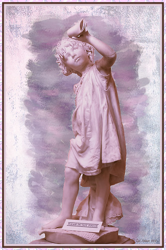
If you follow my blog much, you know I am a big fan of the Lightner Museum. It is not that fancy and not that big, but totally interesting with their wide range of the late 18th and early 19th century items – lots of fun to just drop-in for an afternoon. And of course St. Augustine is a great city to visit as there is a lot to do, even just walking around is fun! This little girl is one of the beautiful statues that is located in the museum – I have no information on who created her but she has a wonderful expression. (To see a different view of this statue, see my Fun Photoshop Blog Getting that High-Fashion Desaturated Look.)
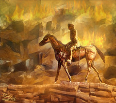
I initially was going to give a the whole image a painterly effect. I decided I liked just having the background with the artistic feel and keeping the actual statue very detailed but with a softer color. I was trying to follow the Photoshop Workbench – Watercolor Composite by Mark Johnson (his tutorials are great!) but I changed a lot of the steps for this image as I did not like the way it was turning out. Textures were added using using Russell Brown’s Texture Panel (see Russell Brown’s Paper Texture Panel Updated!) – Sarah Gardner’s Blush Cherry set to Overlay Blend Mode at 100% Opacity, Princess of Shadow Texture 3 Hard Light at 43% Opacity, and Shadowhouse Creations Oil Painting-2 set to Overlay at 49% Opacity. Then painting was done above for them to get the colorful background using Mark’s tutorial.
Just goes to show that Photoshop is so much fun! And it is fun to remember the beautiful art that I run across……Digital Lady Syd
Digital Lady Syd Related Blogs (all links related to Lightner Museum)
Lidden Urn from Carl Thieme
The Art Corner: Little Girl Knitting – A Mystery Sculpture!
Black and White Photo or Not? Give It a Try on That Difficult Image
Cafe Alcazar and Vintage Topaz Adjust
Photoshop’s CS6 (and Pixel Bender’s) Oil Paint Filter
Where Am I?
Soft Bokeh Texture for a Flower Image
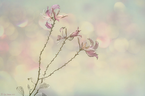
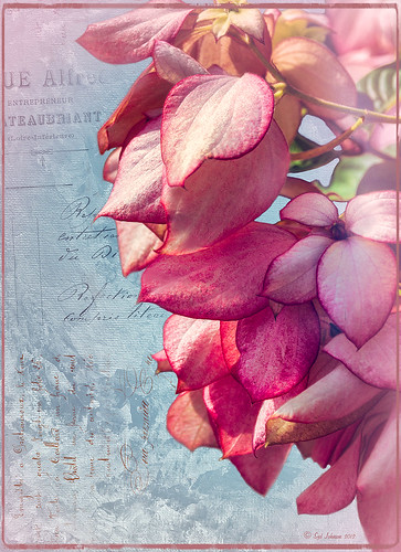
This image of pink orchids in Hawaii had a background layer showing the flowers against a clear blue sky – perfect for adding textures. I really love the bokeh texture used in this image. As many of you know who follow me, I am a big fan of Shadowhouse Creations textures. This image stacked three of his beautiful textures to get this wonderful soft look: Oil Painting 5 set to Color Blend Mode at 100% opacity – a white layer mask was added and the flowers and part of the stems were painted in black lightly to bring back a little bit of the green and pink color; Gorgeous Tones Texture 3 (third one down) set to Screen Blend Mode at 32% opacity; and Bokeh Texture 4 set to Darken Blend Mode at 28% opacity. If you like the bokeh effect, this texture is one of the best…..Digital Lady Syd
Digital Lady Syd Related Blogs:
Russell Brown’s Paper Texture Panel Updated!
Soft-Look Flowers Using Textures
Tips for Flower Textures
Lidden Urn from Carl Thieme
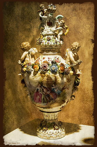
The above image is of a beautiful porcelain Lidden Urn by Carl Thieme of Potschappel, Saxony in Germany from the late 19th century. It is on display at the Lightner Museum in St. Augustine, Florida. I have to be honest and say I did not have a good appreciation for this type of art, but after researching a little on the internet, I am fascinated by the history. If you have an interest, here is a link on the interesting history of the area called Antique Lamps-Dresden, A History Lost, and links to Live Auctioneer showing two similar pieces: piece one and piece two. I am actually very glad to have learned something different in the art world! Actually, I guess that is what a museum is all about – introducing people to new things!
To process this image, I did not do that much to it. ShadowHouse Creations has issued a new free painterly pack of textures and I had to try them out! I put them in a folder and used them with Russell Brown’s Paper Texture Panel (see my blog Russell Brown’s Paper Texture Panel Updated! to download). This effect was created by stacking Painterly-6 (Overlay Blend Mode at 60%) and Painterly-1 (set to Overlay Blend Mode at 100%). I painted out the texture from the painting on the lower part of the urn using a white layer mask and soft black brush at a low opacity so it shows up very clearly. OnOne PhotoFrame (see sidebar for website link) acid burn 12 was added using a color sampled from the image.
Try shooting images in museums, you might get something really interesting. And be sure to shoot any information about the piece too!…..Digital Lady Syd
Digital Lady Syd’s Related Blogs: (All related Lightner Museum links)
The Art Corner: Little Girl Knitting – A Mystery Sculpture!
Black and White Photo or Not? Give It a Try on That Difficult Image
Where Am I?
Hibiscus Flowers – I Love to Photograph Them!

These beautiful Red Chinese Hibiscus blooms appeared on Mothers Day last week so I had to take their picture! Used my favorite artistic plug-in – Topaz Black and White Effects (see sidebar for website link) – and applied a preset I had created earlier called Water Landscape Sunny (Adaptive Exposure section – Adaptive Exposure 0.18, Region as 26.10, Detail 1.11, and Detail Boost 1.09; Quad Tones which creates the interesting effect used Color 1 Region set to R1G1B12 and 9.60, Color 2 Region set to R63G78B85 and 95.97, Color 3 Region set to R216G211B129 at 141.2, and Color 4 Region set to R255G254B237 and 255.0; Edge Exposure set to Edge Size 0.19, Edge Exposure -0.43, and Edge Transition 0.27 for all sides; and Transparency set to 1.00.) While in the plug-in, the Detail brush was used to sharpen the center of the flowers and to go around the petal edges where they overlap each other. Next ShadowHouse Creations Marshmellow Skies texture set to Overlay at 100% opacity was added to give the soft green-turquoise feel to the background – a white layer mask and a soft black brush was used to take the texture effect off the flowers. A Curves Adjustment Layer was added and OnOne PhotoFrame (see sidebar for website link) grunge 04 set to 75% opacity was also added. Not hard and once again a really beautiful effect. I love Black and White Effects! I could do this all day! As you can see by the number of related blogs below, this is definitely one of my favorite plug-ins – check them out for several other examples on how to use it!…..Digital Lady Syd
Digital Lady Syd Related Blogs:
Black and White Effects on Outside Art
Cleaning Up a Messed Up Photo
Topaz Black and White Effects Quad Tones Are Great!
Sunny Preset for Topaz Black and White Effects
My Office Friend Ted
Loving Both Filters!
The Art Corner: Painting and Sculpture by Tassaert
Quad Tones in Topaz Black and White Effects Plug-in
Get Rid of Those Power Lines Fast – with Paths and Spot Healing Tool!
Topaz B&W Effects vs. Nik’s Silver Efex Pro
Just Another Topaz Black and White Effect Example
Topaz B&W Effects Plug-In-A Real Winner!
Hyacinths and OnOne PhotoFrames
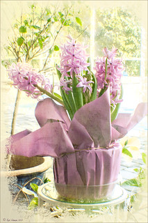
I recently did a blog called My Favorite Photo Frame Plug-In – OnOne PhotoFrames (hum!) on the really nice OnOne PhotoFrames (see sidebar for website link) that I use on many of my images. Here is another nice example of their beautiful frames. (This frame is the Taufer Frame 08 using a light beige color – Russell Brown’s Paper Texture Panel was used on this image – see my Fun Photoshop Blog Russell Brown’s Paper Texture Panel – A Real Winner!)
Give these frames a try – they are easy to use and can really enhance your final image. You can download a 30-day free trial at their website or while in website go to the Products header -> Free Products and select Edge and Framing Effects where you can download 30 frames to use for free! Give it a try! ….Digital Lady Syd
Russell Brown Texture Panel Landscape Image
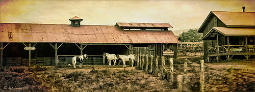
I call this photo Hawaiian Horses Chatting – they look deep in conversation. Hum?? Anyway, this weekend I did a Fun Photoshop Blog called “Russell Brown’s Paper Texture Panel – A Real Winner!” (I seem to like real winners!) This is another one of his great free Photoshop panels that creates texturized images very quickly and allows you to experiment easily to get an interesting effect. Check out my other blog for the download links and details on how this panel works. I will say that Flypaper Textures has given you several beautiful textures to play with in the panel until Russell gets an update to include other textures. This image used three Flypaper textures stacked: Texture Aquarius set to Soft Light Blend Mode at 84% layer opacity, Texture Creme Anglaise set to Multiply Blend Mode at 100%, and Texture Colosseum Sienna set to Vivid Light Blend Mode at 46%. I had been having a hard time getting a look I liked for this image until I tried the texture panel – it really surprised me how beautiful the effect ended up. Give this panel a try if you have Photoshop CS5 or CS6 and you love textures like I do. Definitely worth the effort!…..Digital Lady Syd
Soft-Look Flowers Using Textures
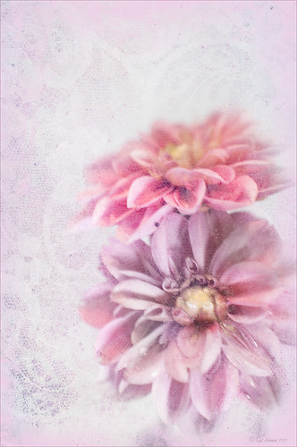
These beautiful dahlia flowers are now planted in a flower bed in my front yard. To get this effect, it was a pretty simple process. I sharpened the center and darkened the green stems first. Next ShadowHouse Creations Subtle Tones ST-8 texture was set to Color Blend Mode. With a layer mask I painted out the texture over the flowers very lightly using a soft 13% opacity brush and building up the effect until it looked the way I liked it. Next ShadowHouse Creations 3 Assorted Texture Set T 2 texture was set to Hard Light Blend Mode to add a very feminine look – also a layer mask was used to clear the lacy texture from on top of the flowers. A Hue/Saturation Adjustment Layer was added on top to select the correct texture color by adjusting the Hue slider. The last step added OnOnePhotoFrames toner scratch 21 (see sidebar for website) with a very light purple-pink color. That was it. I loved the final result. I hope you will try using some of the beautiful textures from ShadowHouse Creations website where there is a huge selection of textures that can be downloaded for free. Major thanks for what he does to help us budget-minded Photoshoppers!…..Digital Lady Syd
The flowers were photographed on a table with a science fair 3-sided white board behind them and natural light from a window – shot with a Nikkor 60 mm Macro Lens set to F/3.2, 1/15 sec at ISO 400 with an attached Bower 0.5 x High Resolution Digital Lens with Macro lens, which gives the large depth-of-field effect.
Let’s Focus on OnOne’s Focus Point 2 – Nice Little Plug-in!
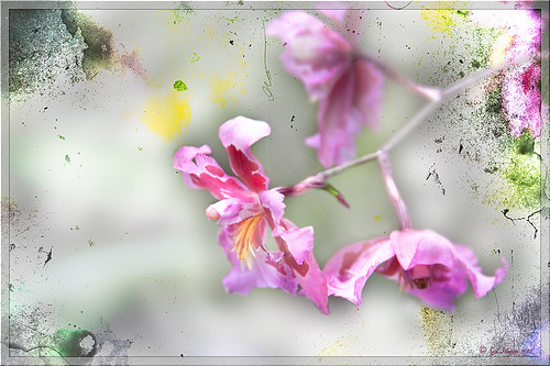
These beautiful pink and white orchids were captured at the Hawaii Tropical Botanical Garden on the Big Island in Hawaii – they had a huge assortment of orchids in their Orchid Island exhibit, many varieties I had never seen before! If you look closely, you will see a tiny white spider web connecting the blossoms.
On this image I used OnOne’s Focal Point 2 – a really wonderful plug-in that is part of the OnOne Perfect Photo Suite 6.0 (see sidebar for website link). I had not used it before but after listening to OnOne’s short video called “Selectively Draw the Viewer’s Eyes Where You Want It To Go” (scroll down to 1/9/12), it proved to be very easy to apply and quite effective. It uses the Focus Bug technology like its other products, and the effect can be painted in or out with the Focus Brush. A soft blurred vignette can easily be added also. ShadowHouse Creations Pseudo Film Scratches Texture Heavily Scratched 2 was added with the layer set to Divide which gave the bright splotches of color throughout the image. The Sharpen Tool was used to selectively sharpen the forward edges of the flowers, and a composite layer (CTRL+SHIFT+ALT+E) was created on top to add a Layer Style. In this case, an oldie but goodie layer style from a book I bought years ago called “Adobe Photoshop 7 One-Click Wow!” by Jack Davis and Linnea Dayton was added using Wow Frame 09. The cool thing about this little book is that is shows what all the styles look like when applied. These styles are also included on the accompanying DVD to my favorite Photoshop Book “Photoshop CS3/CS4 WOW! Book” by Linnea Dayton and Christen Gillespie, where the original book is basically reproduced in the Appendices. Give Focal Point a try if you like this type of effect – very easy to use and gives very dramatic portrait or landscape effects also…..Digital Lady Syd
More Texture Fun!
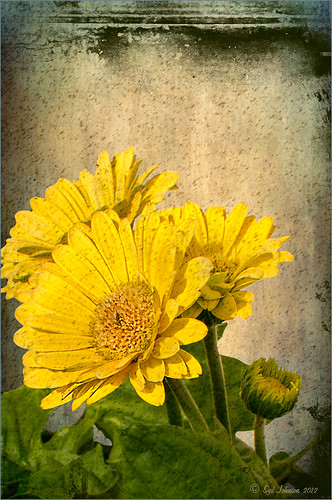 |
I did a Fun Photoshop Blog called Tips for Flower Textures last week and I thought I would show another example. Yellow is a very powerful color and it is not different for this image. Once again the texture opacities and blend modes are varied to get this effect. Hover over the image to see how the photo looks with just a few Lightroom adjustments applied. To create this look, the following steps were followed:
1. Duplicate the original layer.
2. Select the background with the Quick Selection Tool and then click the layer mask icon to create a mask that will remove the background.
3. Next a texture by ShadowHouse Creations called In the Beginning was copies and placed under the selected flower layer to create a new background set to Normal Blend Mode at 100% opacity.
4. ShadowHouse Creations texture Photo-Tints Orange Overlay was moved on top of the flowers and was set to Vivid Light Blend Mode and 52% opacity. A Layer Mask was added and the center of the yellow flowers was softly painted out so the orange color is only on the tips.
5. A Hue/Saturation Adjustment Layer was clipped (3rd icon at bottom of adjustment layer) to the layer and Master was set to Hue +22, Saturation -26 and Lightness +35 to soften the redness.
6. ShadowHouse Creations texture You’d Be Surprised was applied next and set to Color Dodge Blend Mode at 35% opacity. A Layer Mask was applied to the center of the front flower.
7. Sharpen Tool was used on the flowers only.
8. To get the grunge spots, Florabella’s Snow 3 (the link is to her Facebook page with the free download on the left side)was applied and set to Subtract Blend Mode at 37% opacity.
9. The last step involves adding OnOne’s PhotoFrame Taufer Texture 10 – link to OnOne software is on the right. They simply have the best frames!
I hope you will try to add some textures to your photos. As you can see, the original photo was not anything really exceptional, but with a few free downloadable textures, the whole look changes. And do not be afraid to try different blend modes – I love the way the snow texture turns into a more grunge look with the Subtract Blend Mode. Check out my related blogs below for more beautiful textures to download…..Digital Lady Syd
Digital Lady Syd Related Blogs:
Tips for Flower Textures
Adding a Texture for Flair
Elements & CS5 Friday: Adding a Texture for a Totally New Look to an Image
Fixing Up a Boring Picture
Trying Out Lightroom 4 Beta
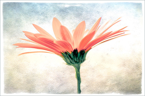
Well it is here – it’s been almost two years since Lightroom 3 came out so the new version is ready for testing. Anyone can download it to beta test and it will be available for use until March 31, 2012. So give it a try – it now edits video. Adobe has replaced the Recover and Fill Light with Shadows and Whites sliders giving a much improved result. The Adjustment Brush and Gradient now have the same choices as the Basic Panel sliders so you can localize changes to particular parts of the image – this is a big upgrade IMHO. Clarity slider no long gives halos when set over 80 – another great enhancement. They now have a Book module where you can design your own photo books and a Map module to help with CPS classifying. There is soft-proofing for your images before printing to see how they will look when printed, and in the Print module, there are Brightness and Contrast sliders to help with the conversion from monitor to print media. Guess there are lots of other little things going on in the new version, but I have not had time to do a complete run through. The biggest drawback as far as I can tell is that the presets do now work great from Lightroom 3 because of the slider changes in the Basic Panel – this will take a while to adjust your old ones over to the new version. Otherwise it seems to be a great new upgrade. So far plug-ins seem to working – the image of above used OnOne’s Perfect Layers plug-in and it ran fine in Lightroom 4 beta. (The texture is Shadowhouse Creations Oil Painting 3.)
Download the beta version of Adobe Lightroom 4
Two great resources for information about the new features are :
Launch Center – Lightroom 4 from NAPP featuring Scott Kelby and Matt Kloskowski (Owner of Killer Lightroom Tips blog)
Introduction to Lightroom 4 Beta from Adobe featuring Julieanne Kost (One of my favorite gurus)
This program is definitely worth taking a look at if you do photography or Photoshop much at all. I love this program – the simplicity of the layout makes it very easy to use. Download the free beta version and see what you think! Once I get a chance to try out all the new features, I will report back – I am a Lightroom nut too!…..Digital Lady Syd
Elements & CS5 Friday: Adding a Texture for a Totally New Look to an Image
Friday blogs are going to be for Adobe Photoshop Elements along with some techniques crossing over with Adobe Photoshop CS5. I realize there is a huge group of digital fanatics out there using the quite capable little sister to CS5. So let’s start.
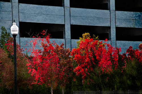 |
Unfortunately these beautiful trees are in a very run-down part of the city and located in front of a parking garage. I guess my point is that just because something is not in a gorgeous settng, it can make a really nice image with just a little effort. Hover over the image to see what the original image looked like.
To achieve this nice effect, all that was done is to add an interesting texture image as a layer on top of your basic picture. In this case, a really grungy looking texture creates this wonderful effect on the building and in the tree colors. This free texture is from Shadowhouse Creations and is called You’d Be Surprised – download it here. This is one of the best texture sites I have found on the internet – beautiful textures all for free!
Here are the steps required to create this look:
1. Open your image in Photoshop Elements (or CS5).
2. Clean up any areas that need to be touched up using the Clone Stamp Tool or Content Aware Healing Brush.
3. Go to File -> Open and navigate to the downloaded texture, in this case You’d Be Surprised, to open in Elements (or CS5) as a separate image.
4. Select image (CTRL + A), copy (CTRL + C) and then go to the original image and paste (CTRL +V) into the file which now puts the new image on top of your image. Close the texture image without saving.
5. Since the texture is probably too small to cover your image, we will use a Free Transform (CTRL+T) to expand the image – just drag the corners out to completely cover the original layer underneath.
6. Change the texture layer to Overlay Blend Mode at the top of the Layers Panel (click on down arrow to the right of Normal).
7. (Optional Step) If certain areas would look better without the texture, highlight this layer and click the Add a Mask icon (2nd icon over from left at bottom of the Layers Panel). This adds a white layer mask – click on it in the Layers Panel and paint with a black soft brush set to 50% opacity. Paint into areas you do not want the texture affecting.
For this image, the lamppost and light were painted out in black along with a little bit of the red leaves in the trees to increase the color range in the leaves, and some of the dark green bushes to add some lighter highlights for interest.
8. (Optional Step) To sharpen parts of the image to make certain areas stand out, click on the Create a New Layer icon (1st icon at the bottom of the Layers Panel and 6th icon from left for CS5). Select the Sharpen Tool (it is nested with the Blur Tool and Smudge Tool – 3rd icon from the bottom on the Tool Bar or 11 from bottom for CS5) and leave the top options set to the default settings except check Sample All Layers. On this new layer, with a soft edged brush paint over the objects you want to sharpen – since the brush is set to a default Strength of 50%, go over the object a few times to build up a really sharp effect. Watch out for artifacts if too much is applied. The nice thing is, since this sharpening is on its own layer, it can be deleted and started over or the opacity can be reduced if too much is added.
In the image above, just the lamppost and light and a few of the top red and yellow leaves were sharpened.
You are done! And this texture creates a very beautiful look. Look at some of the other images Shadowhouse Creations used with this texture at the download site link above.
Well I hope you enjoyed this blog – I did. I love working with textures and this workflow can be used over and over again to achieve some beautiful results using any texture. Have Fun Creating!…..Digital Lady Syd
“Perfect” Perfect Layers!
I keep finding excuses to use Perfect Layers, this fairly new plug-in for Lightroom, by OnOne Software. I really did not think that I would use it that much, but then I start playing around with an image, and there I go, back into Perfect Layers! It is so easy to try out the effects of my favorite textures on my images, and it is easy to stack virtual copies (and other textures or images – the layers can be dragged up or down in the stack) to get a totally unexpected look.
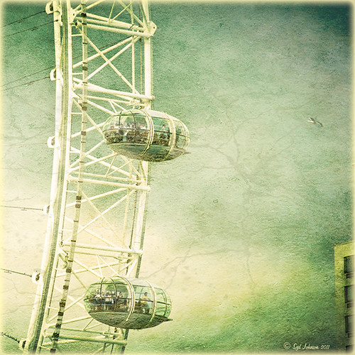
For this image of the London Eye, I cropped the original image and then created a Lomographic Preset (follow this very simple video from Michael Rather at the Digital Photography Connection on “Creating a Lomography Image) on a Virtual Copy of the cropped image. Select both the original and virtual copy images and open them up in Perfect Layers to create two layers stacked. A new image, Shadowhouse Creations Oil Painting-5 texture, was then imported and stacked as a layer on top and set to Hard Light. The top two layer’s opacity was adjusted to taste, and voila – a pretty nice texturized image! (By the way, I keep using this set of textures all the time – gives a real painterly canvas look to the image.) Here is a link to Lomo Presets from Matt Kloskowski’s Lightroom Killer Tips that have similar settings but a slightly different color and look. I have actually seen presets with a blue tint instead of green for this effect.
Definitely give this plug-in a try if you have Lightroom. I believe there is room for a lot of creativity and it is much quicker than going into Photoshop to see what results you are getting. Have fun creating!…..Digital Lady Syd
Just a Tree!
Sometimes I find that combining recent effects I have learned in Photoshop can create something that is quite unique. Obviously not all things I create are that great, but even so, I am learning something about how all the different elements go together. This image is an example of this type of creativity. Just had fun putting together some of my favorite brushes and filters and came up with this tree.
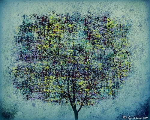
The tree is one of Mels Winter Tree Brushes placed on a layer above the background, and on the next layer foliage was added using several of Gorguss Grunge Again (click on upper right – Photoshop Brushes) brushes. Both brush sets are favorites of mine. Two of ShadowHouse Creation Textures (5 Assorted Textures Set and Vintage Oil Painting Texture Set-2) were stacked underneath. A composite layer was made (CTRL+SHIFT+ALT+E) and opened up in Topaz B&W Effects plug-in (see sidebar for link) – a Cyanotype Collection preset was used to get the bluish appearance, and the Transparency was lowered so some of the colors showed through. Back in Photoshop a new layer was created on top and using Texturemate’s Rough Sand Texture brush 9 in blue on top at 70% opacity. That was it. I really like the effect.
It can really be a lot of fun to mix and match – give it a try!…..Digital Lady Syd
Just Another Topaz Black & White Effect Example
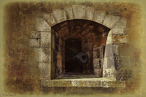
This image was taken at Edinburgh Castle in Scotland. I just keep playing around and finding new looks for images. The cannon and opening were selected and placed on their own layer, then a white layer was added below it, and a texture from ShadowHouse Creations Another Mixed Bag Texture Set (some really beautiful free textures on this site) was added. On several layers above and below using different colors from the image, various brush marks were added using Gorjuss Grunge Again brushes (unfortunately these are no long available), some really nice brushes to add a bit of color and detail. Create a composite and duplicate this layer. Next use the Topaz Black and White plug-in with the Opalotype Collection Effect and Yellow Lilac preset as a start. A lot of changes were made in the Conversion and Finishing Touches panels and Detail and Burn brushes were used to emphasize the stone. (See my Fun Photoshop Blog “Topaz B&W Effects Plug-in – a Real Winner!) and Tidbits Blog “Topaz B&W Effects vs. Nik’s Silver Efex Pro” for more information on this plug-in.) The plug-in layer was set to 52% opacity back in Photoshop. A Curves Adjustment Layer was added and some sharpening applied. It was a really fun image to do.
Hope you got an idea for creating a little different effect with this plug-in…..Digital Lady Syd
Brushing up on Circles!
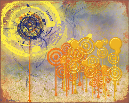
Well, for some reason I felt a little inspired and decided to play around with some really nice circle brushes. I know I have seen a similar look in some of the images sold in discount stores. With a couple textures added, a very nice grunge look can be achieved, and the best part is that you can choose your own colors to get the feel you want.
If you are interested in the circle brushes, both sets can be downloaded from Ar-Bent-Ing called 10 Dripping Photoshop Circle Brushes and 15 Grunge Circle Brushes. A couple textures, one from Shadowhouse Creations, were added, some layer styles to the brush layers, and basically that is it. Not real hard and a lot of fun! (Digital Lady Syd’s Rule No. 2) ……Digital Lady Syd
Fixing up a Boring Picture
When you need a twist for an average looking image, try a texture or two to give it a new look. Here is a fairly average looking water tank image from Madison, Mississippi, that I shot because for some reason I love to photograph them. Hover over the image to see the before shot (only electrical lines had been removed at this point).
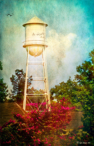 |
I was really pleased with the results. I found some beautiful vintage oil painting textures from a site called Shadowhouse Creations. This site has some wonderful resources so check it out when you have a chance. I applied the first two textures to my image, both layers set to Hard Light at 80% opacity. Added layer masks to clean up where the texture was too harsh. Painted in using my SJ-Cloud Brush Set – Brush #1 and some birds. That’s it.
I love the way Photoshop can make anything look great by just using a little creativity! Try it out!……..Digital Lady Syd
(BTW-For more information on textures, check out my Fun Photoshop Blog called “Adding a Texture for Flair!” )


