Flats in Minsk
This older image had a big tree trunk in the middle of it. Now that Photoshop has improved so much, it was easily removed and the buildings were blended together beautifully. I actually did this image with pastel oranges and yellows and a bright blue sky which looked pretty good – this is how the original appeared. But I decided to give it a more industrial look using the now defunct filters Lucis Pro and Topaz ReStyle’s Rum Purple preset. Did a Sky Replacement using the PS Night Skies Package1-001 by Clifford Mervil. Added a Color Lookup Adjustment Layer using On1 Moody Clouds preset (if you own On1, you probably have this one – they do work in PS). Otherwise lots of clean up. I love the fact that unusable images from a while back can now be saved! ….Digital Lady Syd
Some Pretty Trees with the Help of AI
Had to post my first attempt at trying out the Adobe Photoshop Beta version with its new Generative Fill ability. This image was just of a beautiful fall tree line. I decided to make the image longer and then had the Generative Fill function fill in the area added. It gives you three choices which I did not like so another group of three was generated – this was the forth one generated. It was created with no description in the field – just clicked the generate button. The Portraits – Moody Blues Adjustment preset was added. Then I typed in the generative field “foreground oak tree” – had to clone out a shiny spot in one small area but overall it looks great! That was it! It took all of five minutes to get this final fantastic image from one that was pretty good to begin with. ….. Digital Lady Syd
Sneaking a Quick Snack

Here is Gulliver, one of my favorite animals at the Jacksonville Zoo. He loves to perform for all the visitors and is always available to entertain you. Just thought I would give him a little bit of Joel Sartore, the famous National Geographic photographer) clean classic style. His PhotoArk images are currently being displayed all around the Jacksonville Zoo which was a real treat. A perfect selection of the subject is essential to get this effect. It took me a bit of time to get the edges just the way I wanted them with no discoloration from the green background – used a brush with sharp edges and cloned away the bad parts. (See my How to Save a Photoshop CC2018 Regular Brush as a Different Tool blog which tells how to create this fur brush.) Then a very small blender mixer brush was used to fix some of the hairs around his body. The other crucial part of this type of image is getting the lighting on the animal correct. I had taken this image through a plastic smeary glass with some glare, so the contrast had to be really adjusted to get a clear look. It was pretty labor intensive but worth it when you get a final image you like…..Digital Lady Syd
Bird of Paradise
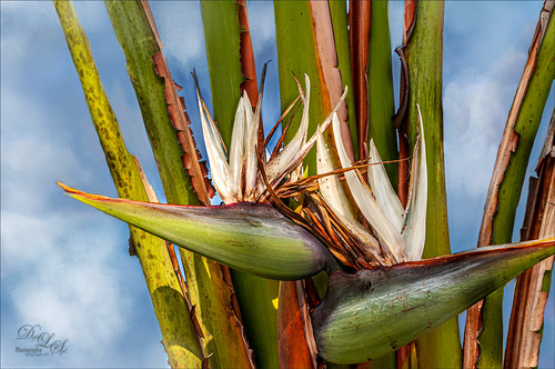
This is a rather towering Bird of Paradise plant that grows by my garage and protects the house from intruders. Well, maybe not the intruder thing but it is pretty intimidating for a plant. I just had some fun trying out the new Photoshop 2020 Content-Aware Fill update that works incredibly well when the Custom mode is used. My house and other parts of the plant were around this part of the plant, and they were removed pretty quickly with the Custom mode and the paint brush where you paint over the part of the image you want your selection to use for the replacement. It is a little bit like the Patch Tool. It did an incredible job of adding in the clouds, which I painted in by the way, to give a beautiful sky for the background. Otherwise not much to this image – just had fun trying this new functionality. ….. Digital Lady Syd
A Pretty Design
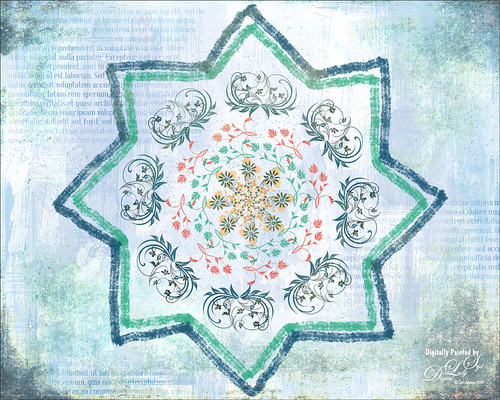
Decided to try out the Paint Symmetry in Photoshop CC 2018 – to load go to Preferences -> Technology Previews -> Enable Paint Symmetry. A little butterfly icon shows up in the Options Bar when the Brush Tool (or Eraser Tool or Pencil Tool) is chosen. Click the icon and several choices can be made from a drop-down menu. Once a shape mode is selected, it can be manipulated by adjusting the already activated transform controls or any of the Path Tools. Since this image would be using a special option called the Radial Symmetry, the New Dual Axis was chosen. The path in the Paths Panel was renamed to “radial symmetry 8” (can set up to 12 segments) – this can be added anytime while you are adding strokes. This will create the identical lines all around the design. There is also a Mandala Symmetry which is a little more complicated and will give a different look – just rename the path “mandala symmetry 8” (can be set up to 10 segments). Then go to the Layer Panel and choose a brush (does not support airbrush, bristles tip or erodible types) to create your effect. With a little experimentation, some great looks can be obtained. The thick lines are regular brush strokes using Grut’s G Flow Co brush, and the floral designs were created by a single stamp from 3 different brushes in a set by Coy Dreamer Floral Brushes and. Under these layers one of my Gesso textures was placed which had text added. On a new layer on top, a gritty brush effect was added to the edges. The last step used 2 Lil’ Owls Studio (see sidebar for website link) Cosmos 18 set to Pin Light at 77% layer opacity. This was just a fun little project to see learn how the Symmetry Painting worked. I wonder if Adobe will have some new features when it is actually added into the program. …..Digital Lady Syd
A Very Unusual Place!
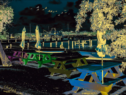
This image was taken at New Plymouth, Green Turtle Cay, the Bahamas. Had fun playing with several different adjustment layers and filters. On a New Layer above image, a bird brush was created using Aaron Nace’s Creating a Custom Brush video. Just added a little Angle Jitter to it. The layer was set to Multiply blend mode at 70% layer opacity. Then a Pattern Adjustment Layer was clipped to the birds and a coffee colored watercolor pattern was used – this is how the wings have a tipped color effect. (See my Patterns, Patterns, Patterns Fun Photoshop Blog for more on this.) A Black and White Adjustment Layer was set to Luminosity on top. Next a Levels Adjustment Layer to add some contrast. Then a Color Balance Adjustment Layer. The Color Negative preset was applied with a Color Lookup Adjustment Layer. Next a Hue/Saturation Adjustment Layer was added and the Master Hue was flipped to the end to get the color palette seen in the image. The Blend If This Layer black tab was split to 0/145 and Underlying Layer’s white tab was split to 130/210 (ALT click on the tabs to split) to let some of the color leak through. Another Black and White Adjustment Layer was added and set to Soft Light and adjusted to get just the right color effect. A Red Channel Luminosity Curve Adjustment Layer was added. A stamped layer was placed on top (CTRL+ALT+SHIFT+E) and Topaz (see sidebar for website link) Restyle’s Gunsmoke and Jordy Blue preset was applied – in the plugin, Restyle section was set to Screen blend mode at 41% opacity and Basic section set to Multiply blend mode and 64% opacity – a few changes were made to the Tint, Tone, and Detail sections. It basically added yellow where the color was white and really brightened up the image. That was it. Not sure I could do it again, but it was fun to figure out a new look!…..Digital Lady Syd
Bird in Paradise
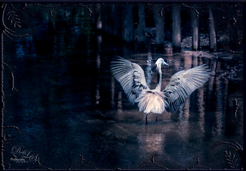
This male Tri-colored Egret is actually retrieving nesting material for his beautiful red-eyed female from a few posts ago. He would fly into the water, find a stick, run back to the nest, give it mate, then take off again to the same spot. I thought he was rather brave since there are alligators in the water at the St. Augustine Alligator Farm Rookery. This image was not altered as far as what the setting looked like – just added a couple textures, darkened down the image, and finished up with Nik Viveza 2 to even everything out. He definitely had a beautiful wing spread. The frame is from Shadowhouse Creations – Borders CM1 set (could not find a link) where the frame was taken into Select -> Color Range and just the frame was selected. Then placed on its own layer (CTRL+J), bottom layer deleted, and saved as PNG file. Now it can be placed on any image using any color or patterns. A Bevel and Emboss and Satin Layer Styles were used to give a dark wrought iron effect. Overall it turned out to look like a pretty serene place to be!…..Digital Lady Syd
My Imaginary Landscape
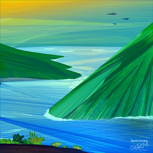
This image was my first created in the new Corel Painter 2016. This used a Spring Particle brush that Corel Master Winifred Whitfield is giving away to use with the her video called Watercolor Spring Particles. This brush can be very addictive, especially if you follow her instructions and make a few variants of your own. Most of the image was created in Painter which can put each color and stroke on different layers if you want. The surf effect was created using the Eraser Tool in Painter. In Photoshop some of the sharp edges on those painted patterned layers were cleaned up where the Painter strokes overlapped a little too much. On a stamped layer (CTRL+ALT+SHIFT+E) on top, Topaz Lens Effects was opened. A Dual Tone filter was applied using the Top Left Red Leak preset and changing a few of the sliders to get a more pronounced sunset feeling in the sky. The last step was to use Nik Viveza 2 to help guide the eye through the image. Both of these filters could have been applied in Painter. That was it. Lots of fun with this brush and the new Painter version……Digital Lady Syd
Smudging Those Petals!
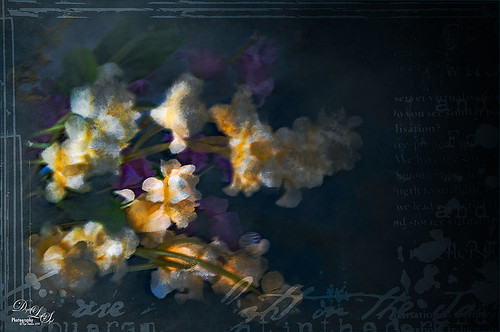
Last week I did a blog on using the smudge tool on my Fun Photoshop Blog (see How to Use the Smudge Tool). Thought I would post another example of the some of the nice results you can get when using it. In Lightroom Jared Platt‘s Pops Image preset was applied from one of his Presets, Presets, Presets! CreativeLive classes – this particular preset uses a Linear Tone Curve. In Photoshop some clean up was done, and Topaz (see sidebar for image website) Detail 3 was used to sharpen my focal point area. Next Topaz Simplify 4 was set to BuzSim preset with the Edge Strength set to 1.54. Once applied, a layer mask was used so just the center of the focal point has the plug-in applied. On a New Layer the Smudge Brush was used at 80% Strength to give the painterly effect to the petals. Just painted to give different opacities to each petal. Jai Johnson‘s Intenseblue-Canvas texture was applied and the flowers painted back softly in a layer mask using my chalk brush. On a stamped layer (CTRL+ALT+SHIFT+E) the Camera Raw filter was applied as a Smart Object and the Radial Filter was used to create the soft vignette. The last step involved using a mask created by Studio Viva Artistry on Studio Girls Scrapbookgraphics called Viva_Pennmanship_mask3 to add some additional interest. I really like the effect the Smudge Brush gives!…..Digital Lady Syd
Using Pattern Overlay Layer Style to Get a Retro Feel
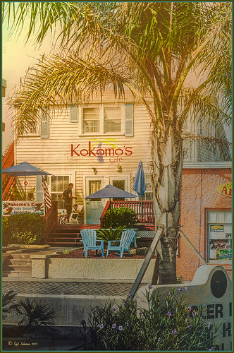
Had to visit Kokomo Cafe on Flagler Beach in Florida since I grew up in Kokomo, Indiana. Wonderful little place to get a nice breakfast (the pastries are to die for) or lunch and only a block off the beach. Did the regular processing in Lightroom before opening up in Photoshop. Painted Textures Mist was added and the Layer Style was opened. A Gradient Overlay using a Linear Dodge (Added) at 24% opacity and using Grad 2 gradient and a Pattern Overlay was added using the original image turned into a pattern (on background layer go to Edit -> Define Pattern – it appears at bottom of list) and set to blend mode Hard Light at 54% opacity and Scale to 120%. Now you can actually turn off the bottom layer and image shows up in the texture. Pretty cool! A Levels Adjustment Layer was added with black tab setting of 14 and Midtone setting of 0.71 to add contrast back into the image. Topaz (see sidebar for website link) ReStyle was added using the Hanging Orangutan preset. (Plug-ing settings were: ReStyle Opacity to 76%, Color Restyle changes: Sat Third (-0.41) and Fourth (-0.39); and Texture Strength 0.73; Basic Tone Midtones (-0.23); and Detail Structure (-0.67) and Sharpness 0.81.) Nik Viveza 2 was added using three control points to direct attention into the center of the image. The last step involved adding my free SJ Thin Double Edge Frame, sampling the Inner Glow color from the image. Once again there is a nice retro feel to this image, which so fits the area…..Digital Lady Syd
Digital Lady Syd Related Blogs:
How to Add a Little Retro to Your Shots
Vintage Roman Bath
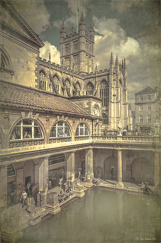
Since I have been revisiting my old images from England and Scotland recently, here is one of my latest concoctions! Love how this image turned out very vintage and I can actually visualize being in the water per the Jane Austin book Persuasion description. I have to chuckle as there are at least 5 people in this image talking on their cell phones. Such for the real vintage effect! Anyway, The Roman Baths at Bath, England, are quite interesting to visit and definitely have a real vintage feel to them.
So the steps to getting this effect are pretty easy. First the Basic sliders in Lightroom along with some building straightening using the new Lens Correction Upright feature was applied. In Photoshop, the Background layer was duplicated and added a black layer mask added. Then just the water was painted back – the layer was set to 76% opacity and that was all – just softened the color a little. Next a Curves Adjustment Layer was added and the mask filled with black. This time the heavy building shadow in the water was painted back in white. The Curve was used to lighten the shadow to match the rest of the water’s color. (See my Using Curves Adjustment Layers to Get Rid of Shadows and Highlights blog for info on doing this or could use the How to Use a Selection to Draw Focus in an Image blog using Levels Adjustment Layers.) A stamped composite layer was created (CTRL+ALT+SHIFT+E) on top and duplicated. Next Topaz (see sidebar for website link) Black & White Effects was applied twice. First a Quad Tone preset I had created (see settings below) was applied, and then Topaz’s Classic preset. 2 Lil’s Owls (see sidebar for website link) Enchanted4-3 overlay (from the Texture Workshop Ebook Bundle) was added to give the beautiful linen-like texture to the image, and a Curves Adjustment Layer was used to add back a little contrast. That was it. Black & White Effects really gave this image the vintage feel – it is a great plug-in for this type of effect……Digital Lady Syd
SJ Quad DkB_Gr_Yel_Wh preset settings: Quad Tone: Color 1 Region: Color (R1/G1/B12) and set to 15.08, Color Region 2: Color (R63/G78/B85) and set to 143.9, Color Region 3: Color (R216/G211/B129) and set to 227.5, and Color Region 4: Color (R255/G254/B237) and set to 255.0: and Transparency: Overall Transparency 1.00.
Digital Lady Syd Related Blogs:
Lightroom 5′s New Upright Adjustment Feature
Quad Tones in Topaz Black and White Effects Plug-in
The Art Corner: Painting and Sculpture by Tassaert
If At First You Don’t Succeed, Try Try Again!
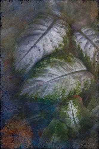
Love how this image turned out with a beautiful texture added to it. This is a very sentimental favorite plant for me since it came from my parents home in Indiana many years ago – it loves Florida. It is a Dieffenbachia, which is a poisonous plant around animals and kids so not the plant for everybody, but is very pretty in your home.
This image was processed using my basic Lightroom workflow. (See my How to Use Adobe Camera Raw (ACR) or Lightroom 4 Quickly blog.) Once in Photoshop, Karen Burn’s Day’s End texture was added on top (check out her Flickr account – great textures and images here), flipped (CTRL+T), and set to Normal blend mode at 58% layer opacity. A white layer mask was added and using the Photoshop Charcoal brush set to 250 pixels and a low opacity 12% brush, the leaves were lightly painted back in the mask – this brush gives a bit of a gray rough edge result that blends with the background nicely. I use it a lot for this effect. Just keep painting over the area you want the focus of the image to be. I was not really happy with the overall pastel feel of the image, so a Curves Adjustment Layer was added and the Blue channel and Red channel curves were adjusted to get a better colors. I still was not happy with the color so a Selective Color Adjustment Layer was added on top and in the Reds selected – Cyan was set to -48 and Yellows +46, in the Cyans – Cyan was set to +60, in the Blues – Yellow was set to -46, and in the Neutrals – Black was set to +19. That really made the color sing – sometimes it takes several different methods to get the look you are after. Overall, with just a little effort, this rather average image was turned into something quite stunning!…..Digital Lady Syd
Meeting a Belarusian Horse!
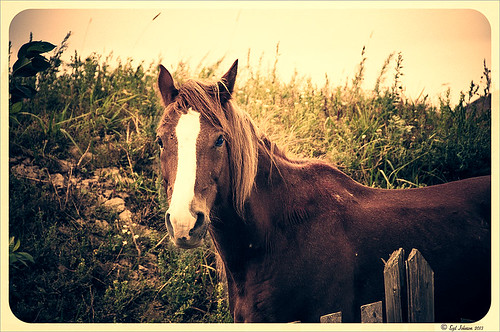
This beautiful horse was in a field outside an old wooden windmill in Belarus. I had forgotten I had taken his pix. Since I did a blog called Can You Get a Painting Look With a Photoshop Action? Jack Davis Can!, this image was processed in Lightroom using his Wow! Antique 03 preset, which included the framing. Check out my other blog for downloading info of his Lightroom presets. The image was taken into Photoshop and the Burn and Dodge Tools were used directly on a duplicate copy of the background. I would never have tried this if I had not watched a short video on Lynda.com called Black and White with Lightroom and Photoshop by Bryan Hughes O’Neill, Adobe Photoshop Senior Product Manager who really knows what all the sliders do in these programs. It was very interesting and I learned to use these tools. The main thing to remember is to keep Protect Tones checked. With the Dodge Tool set to Shadows at 50% Exposure, the horses eyes were painted over to make them pop. Burning Tool was used to separate his face from the field using Midtones and Highlights selected. A New Layer was created for the Sharpen Tool – therefore be sure to check Sample All Layers and Protect Detail in Options Bar. The Strength was set to 12% and the effect was built up slowly where sharpening needed to be added. It does not introduce a lot of artifacts this way. A Curves Adjustment Layer was added on top and dragged down in image to get a little more contrast. That was all that was done to get this lovely effect. What a beautiful creature!…..Digital Lady Syd
Digital Lady Syd Related Blogs:
Using Old Wallpaper for a Vintage Look
My Favorite Adobe Lightroom 5 Features
Windsor Castle
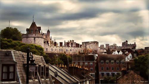
Here is another example of an image that used a Curves Adjustment Layer to adjust the color of the stone in this image of Windsor Castle in England. It turned too brown due to a filter treatment applied to the total image – Topaz (see sidebar for website link) Adjust 5’s French Countryside preset was applied to the image once it was brought into Photoshop – this preset is one of my very favorites but it definitely has a very brown tone to it. Nik Viveza 2 was applied next to selectively sharpen parts of the image. A regular Curves Adjustment Layer was added to increase the contrast in the image. Next another Curves Adjustment Layer was added and this time the Blue Channel Curve was adjusted to get rid of some of the yellow tones in the stone. The Layer Mask was filled with black and just the castle stonework was painted back in with a low opacity soft white brush. That is it! I love the final result – it really gives a different perspective on how large this castle really is!…..Digital Lady Syd
Digital Lady Syd’s Related Blogs:
Using Curves Adjustment Layers to Get Rid of Shadows and Highlights
I Didn’t Know That! Curves Adjustment Layers
Digital Lady Syd’s Rule No. 9: Get the Shot!
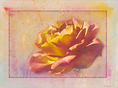
I took this beautiful little rose at Lowe’s with my inexpensive Kodak C1450 14-mp point-and-shoot camera and it turned out very nice! These little cameras really do a great job for those unexpected shots! Since most people have decent cameras on their phones (mine is still a 2 megapixel so I carry this camera), there really is no reason not to get the shot. It just may not be quite as sharp or colorful as your good camera, but at least you get the shot, the memory, and something you can work with in Photoshop. That is what I did with this rose – it was a little soft except where it was focused, but the colors were still beautiful and overall, not that bad an image.
One of the issues I had with this image is that it is a JPG and there was a lot of Chromatic Aberration in the image – I tried to remove it in Lightroom, but it still looked rather bad so I treated it with a soft texture treatment to blend in the petals where the bleeding was bad. Some noiseware was also applied. Two gorgeous textures were stacked from French Kiss Textures – Artiste Fantasie at 80% opacity and Artiste LaDanse set to 68% opacity and her Spatter Brushes were used over the rose. Following Dave Cross’s path tutorial from his Photoshop CS5 Finishing Touches for Photographers class at Kelby Training (but it is also in his really good Photoshop Finishing Touches book), I created a fancy edge around the flower. Dave’s book was published a while back, but most of the tutorials work fine in CS6.
So get the shot, even if you do not have your best equipment with you – it may be a great image anyway!…..Digital Lady Syd
Digital Lady Syd’s Free Layer Style Frames
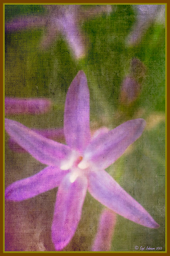
To download the free layer style frame above, a thinner version of it, and a nice black and white double edged frame, go to my Deviant Art site and click on the SJ Double Edge Frame Styles Download File button in upper right corner. To load into Photoshop, the Style Panel needs to be open (Windows -> Styles) – click on the upper right corner icon on panel to open pop-out menu and select Load Styles – navigate to folder where the file was downloaded and click Load. (To add them to listed styles in pop-out, load the style manually. If using Windows 7, go to Local C Drive/Users/user name/AppData/Roaming/Adobe/Adobe Photoshop CS6/Presets/Styles and move downloaded .asl file here – this adds file to Photoshop internal settings.) When using these styles, be sure the top layer is a complete layer (see Step 1 below) or it will not apply correctly.
TIP: If you want to use the colors from your image, just double click on the effect in the Layers Panel which brings up the dialog box for that effect. Click on the color swatch in the effect and when the Color Picker opens, sample image using the eyedropper that appears when hovering in your image – click to add that color into the frame. For the Inner Shadow effect, if you are not seeing any color update when sampling, change the Blend Mode to Normal from Multiply. Note that the next time you use the Layer Style, it will return to whatever colors you set originally, so save it as a New Layer Style if you want to keep the new color settings (see Step 5 below). Sampling colors from the image can often frame it beautifully!
Below are the steps on how to create my layer styles. I am using the frame colors seen above as they seem to look nice on many of my images.
1. Need to have an image layer on top for the layer style to work correctly. To do this, highlight the top layer in the Layers Panel and press CTRL+ALT+SHIFT+E to create a layer that combines all the active layers (eyeballs showing on left edge) in the image. Need to remember this shortcut as it is very useful when doing a lot of things in Photoshop!
2. Double-click on the top layer and the Blending Options dialog box appears. Be sure Blending Options: Default is highlighted on left side.
3. Check and click on Inner Shadow effect and change just these settings: Blend Mode to Multiply, Color Swatch set to brownish color (R165/G120/B0), Opacity 100, Distance 0, Choke 83, and Size 15 pixels.
4. Check and click on Inner Glow effect and change just these settings: Blend Mode Normal, Opacity 100, Color Swatch to greenish color (R115/G121/B42), Technique Softer, Source Edge, Choke 90%, and Size 19 pixels.
5. To save these settings as a Layer Style preset for using on other images, click the New Style button and name it and leave checked Include Layer Effects. Now click on Styles at top left in dialog box or open the Style Panel (Window -> Styles), and it will appear at bottom of the listed styles.
To create the little thinner frame around your image, in Step 3 set Size to 21 and in Step 4 set Size to 29. (For example, see my blog 32-Bit HDR Using Lightroom and CS6.) To create a nice Black and White framing, set Inner Shadow to Normal Blend Mode and Color Swatch to Black – still using Size 51 pixels, and Inner Glow to a White Color Swatch and Size 62 pixels. Of course you can adjust the sizes to look good on your image if they need it. If you do not like the way the style looks after applying, just CTRL+Z to delete and try another one. Try adjusting all the sliders and seeing if you can get an even nicer look.
This image of my pretty little purple Agapanthus bloom was processed using Nik Color Efex Pro 4 – BiColor User Defined filter set to white and light pink colors, Darken/Lighten Center centered on the flower center, and Glamour Glow filters. Two textures were added using Dr. Brown’s Paper Texture Panel (see my blog Russell Brown’s Paper Texture Panel Updated!) and Flypaper’s Apple Blush taster texture using Linear Light at 39% opacity and Creme Anglaise taster texture set to Overlay at 100 opacity. The last step was clicking on my SJ Double Edge Frame layer style in Styles Panel to apply.
Try using these layer styles – I think you will like them. The framing gives a clean sharp edge to an image, especially for posting on the internet……Digital Lady Syd
Which Tool to Use – Smudge or Mixer Brush?
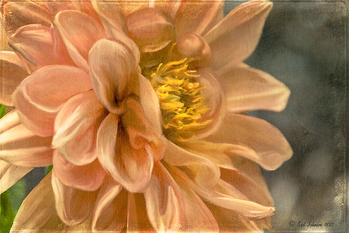
I ran across an old tutorial that was in the very first Photoshop Creative magazine back in 2006. It was on how to create a digital painting by using the Smudge Tool. Well that was something I had to try out – couldn’t believe I had not tried this before! I really like the Mixer Brushes, which is what I usually use (see my blog Adobe Photoshop CS5’s Mixer Brushes). Once I started playing around with the Smudge Tool using different brushes and sizes and opacities, it was actually fun. My curiosity got the best of me and now I needed to know what IS the difference between the two tools – they create very similar results? I was able to find a reasonable answer on the Internet at Model Mayhem.com. Here is what they said:
“The Smudge Tool simulates the effect you see when you drag a finger through wet paint. The tool picks up color where the stroke begins and pushes it in the direction you drag……The Mixer Brush simulates realistic painting techniques such as mixing colors on the canvas, combining colors on a brush, and varying paint wetness across a stroke.”
I think this is a nice short explanation of what is happening. For my Peach Dahlia I found it was nice to use both tools. It seemed it was easier to blend colors with the Mixer Brush and then smooth edges and shape color using the Smudge Tool. The Photoshop Wow Book for CS3 and CS4 (still my favorite Photoshop book) had a nice section on painting with the Smudge Tool. They recommended using the Natural Brushes that come with Photoshop and start by using short strokes, which samples the color underneath more frequently. Then use a small brush size for detail.
To create this image, first a blank layer was placed on top. Then these two brushes were used to paint: Mixer Brush – created tool preset brush with these settings: Stipple Dense 26 pixels from Natural Brushes set (Options Bar: No Current Brush Load, Load the Brush After Each Stroke, Wet 100%, Load 1%, Mix 91%, Flow 100%, Check Sample All Layers). Smudge Brush Tool Preset created using Stipple 54 pixels from Natural Brushes preset with Options Bar set to Mode Normal, Strength 78%, and Checked Sample All Layers. Be sure to save these brushes as Tool Presets so the Options Bar settings are retained – if just saved as brushes, the settings might not be correct. Also, note that if the Finger Painting box is checked in the Smudge Tool options bar, the smear stroke will start with the Foreground color. If turned off, the color under the cursor is sampled first. At 100% Strength, only the first color sampled is applied – at lower settings it fades out the first color and picks up the new one. Then I just alternated mixing and smudging until I liked what I saw. The last step involved adding three textures to the image to give a real painting look: the first one is a light gray canvas texture (I created it by taking a picture of a portion of the canvas on a large oil painting in my dining room – try this – you might really like the results) set to Soft Light at 53% opacity; next ShadowHouse Creations Old Photo 2 set to Overlay at 100% opacity – it provides the interesting edging on the image; and Flypaper Textures Aquaflora taster set to Overlay at 80% opacity. I painted out a little bit of the texture on the top two textures just to direct the eye to the center of the flower. A Curves Adjustment layer was added on top to give just a small contrast boost. Overall it was really fun to try out a new tool and learn something about it!…..Digital Lady Syd
Purple Lily Pads!

Here is one of my first attempts at creating an image using a color palette I liked and not the one in the image. I just finished John Paul Caponigro‘s tutorial on Photoshop Color Strategies at Kelby Training where he teaches you how to change hues naturally to give a very believable feel to an image. He is one of my very favorite Photoshop gurus and he does beautiful fine art photography. This image actually contains: three Hue/Sat Adjustment Layers each addressing a different area of the image, a Color Balance Adjustment Layer, a Gaussian Blur filter applied to the image and selectively painted out, a Curves Adjustment Layer, a Replace Color layer, a Topaz Simplify 3 plug-in using the BuzSim preset set to a low Simplify Size, and a Wow-Frame 10 layer style. I was really pleased how the purple colors and cool tones could replace the greens and yellows and give such a wonder effect!…..Digital Lady Syd
Where Am I?
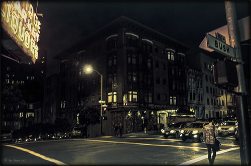
This is an image of San Francisco taken at night in February in a brisk and cold breeze. I just listened to another interesting webinar by Nichole Paschale from Topaz (see sidebar for website link) called Night Photography Enhanced with Adjust, Black and White Effects and Star Effects. I am always surprised how much I learn from these short videos – there were several good tips in this one, even though I know these programs pretty well. My image was not that great, but I needed a nighttime image to try some of the techniques on. Now I rather like the effect. Of course it uses one of my favorite plug-ins, Black and White Effects, so I am not surprised I like the results. The preset was set to my Old Vintage Effect (see Quad Tones in Topaz Black and White Effects Plug-in to create), one I use on a lot of my images. Next the Star Effects plug-in was used to enhance the streetlight using Sun Flare 1 preset. A Flypaper Texture Lemoncello Taster texture layer was added using the Multiply blend mode at 35% opacity. It still did not have the feel I wanted, so I added a Black and White Adjustment layer and mainly lowered the yellow and added some reds and greens and blues. The opacity was set to 26%. A layer style was added to frame the image. I can honestly say this is exactly how the street looked to me as I was walking to dinner on that cold dark night. If you have not tried out some of Topaz’s videos, give them a listen. Lots of cool things to try in them!…..Digital Lady Syd
I Didn’t Know That! Eyedropper Tool and Magic Wand Tied Together by Sample Size!
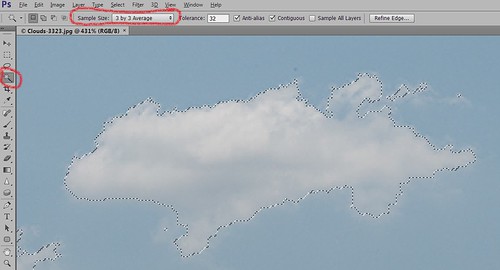
Adobe has come out with a Beta Version of Photoshop CS6 (Adobe download link) that is free to use for a couple months. While watching some of the videos on the new features, I came across an interesting comment by Deke McClelland, another Photoshop guru who does a lot of tutorials at Lynda.com and also does great Photoshop books. He has posted a series of short videos called Free Photoshop CS6 beta training at Lynda.com and in one called “Exploring the Wide World of Layer Enhancements,” he mentions that you can throw off how the Magic Wand Tool uses its Tolerance setting if the Eyedropper Tool is set to a very large Sample Size in its Options Bar – the two Tools are tied together! In previous versions of Photoshop, only in the Eyedropper Tool Options Bar could the Sample Size be set. If you had the Eyedropper Tool Sample Size field set incorrectly, the Magic Wand Tool would not function properly. I have always set mine to 3 pixels for more accurate color correction per Scott Kelby recommendations (head of NAPP and his Photoshop books are must-haves) – he says the larger sampling sizes are for “super-high-resolution” images. Now in the Magic Wand Tool’s Options Bar (see image above), it shows what the Sample Size setting is and now it can be changed without going back into the Eyedropper Tool options. Just remember if you change one tool, the other one automatically changes.
I do not know how important this is but it was a surprise these two tools had anything to do with each other! With higher resolution images now being shot with the new cameras, this might be a bigger issue. Thought I would pass this Tidbit along…..Digital Lady Syd
Creating Your Own Art (and Cards) While You Are At It!
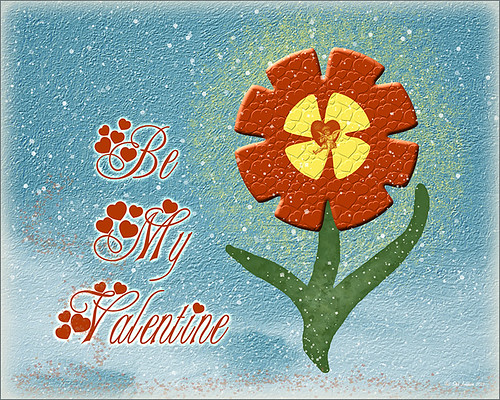
More Valentine resources if you are feeling in that creative mood and want to make your own. Here is how I created this funny little valentine.
1. I created a New Document and then added a New Layer on top where a red circle was painted and then a yellow circle was painted inside it.
2. Next this layer was taken into Photoshop’s Liquify Filter and where I came up with this funny looking flower. This is a fun filter that can give some really interesting results if you take the time to learn what the various tools do. A Layer Style (double click on the layer in the Layers Palette) was added to create this nifty embossed heart look – by adding a Bevel and Emboss Layer Style and checking Texture. Now the trick is to double click on the word Texture on the left, and you get a new dialog where you can change the Pattern you use for the texture. In this case, the San Valentine Pattern by succo-design was used with the Scale set to 69% and Depth to +6. These are the same patterns you will see in the Pattern Overlay section, except they are embossed and have not color! This is really a great way to use patterns!
3. On a separate layer I painted a stem and a few leaves. Add a Layer Style to this layer and select Pattern Overlay from the left side. To show you the different from step 2, choose a pattern to add some texture to your stem. In this case I choose Obsidian Dawn’s Dirty Patterns-Texture 1 set to Scale 31% and Opacity 36%. Then an Inner Glow was set using a dark green color set to Size 125 pixels to add a little shading to the outside shape of the leaves and stem. You can see how this pattern was applied differently from the pattern in Step 2.
4. I was not really sure what to do next so I decided to add a colored background. I choose ShadowHouse Creations Raised Textured Effect 2 to give some interest to the background. All the textures in this group are beautiful.
5. On a New Layer ShadowHouse Creations Assorted Brush Pack 2 Soft Clouds-NewBrush 18 was used to for a soft white background.
6. On another New Layer, Obsidian Dawns Glitter Set-Random Swirls 2 was used for the slight yellow glow behind the flower.
7. Above that on another New Layer I used SJ Basic Star Scatter Brush to drop some large white flakes on the background for a bit of a wintry addition. (I set up a star scatter brush using the soft brush set to 30 pixels and spacing 1000%. In the Scatter dialog, set the Jitter to 1000% both axis and the Jitter Count to 100. I saved the settings to use the brush again. This brush is used in my Fun Photoshop Blog “Trying Out Topaz Star Effects” but it creates a nice snowing effect also.)
8. Above the flower, a New Layer was created and the little cupid painted in red (click twice to get dark enough) using Glass Prism CupidReq09 brush.
9. Under this layer, create a New Layer and paint all over image with Snow Drops by FrostBo to finish the snowy feel. You do not want snow on the cupid as it will blur the cupid so this is why the layer is under the snow drop one.
10. A Text Layer was created using the font MC Sweetie Hearts and a white Outer Glow Layer Style set to 21 pixels was used to make the letters stand out.
11. On top of the font a New Layer was created and small hearts using the Valentine Brush by digitalTouch with a white as foreground color and red as background color was painted along the bottom leaving a small heart trail along where the ground would be.
12. A composite layer was created on top (CTRL+ALT+SHIFT+E) and a Layer Style was created to frame the image Stroke set to a gray 4 pixels inside stroke, and a Inner Glow style set to light gray and 125 strokes.
Here is what the layer structure looks like in case you got lost.
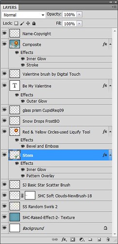
It sounds like it is hard to do, but I wanted to show how easy it is to construct some very creative cards with nothing but Photoshop and some nice resources. The trick is to add each element on individual layers and make sure they re named so you know what you did. Much of the home art you see in Wal-Mart or TJ Maxx is basically just doing exactly what I did here. Check out my blogs below for other ideas just using Photoshop. Take some time to play around with some of the resources available for download and see if you don’t get some really nice art…..Digital Lady Syd
Digital Lady Syd Related Blogs:
Just Plain Fun Brush Effects!
Tree Brushes with a Little Grunge
Just a Tree
Brushing Up on Circles!
Create a Great Shot with a Good Crop
Thought I would show you what a difference a good crop can do for turning an ordinary image into something that has some real eye appeal. The rain on the petals could not even be seen in the original shot.
For Lightroom Users: The above image was first cropped in Lightroom using the Crop Tool, but you can do this in Adobe Camera Raw or even Photoshop or Elements to get the correct look. I have found that by zooming in on an image using the Navigator at a canned magnification zoom like 2:1, then using the hand to move the image around, gives you a quick feel for what kind of crop you need. Then it was adjusted using the other sliders.
For Photoshop or Elements: Open your image in Adobe Camera Raw and select the Crop Tool from the Camera Raw Tools at top (6th icon over). Use the Zoom pop-down box in the lower left to try different zoom magnifications. Hold down the Space Bar to move image around to see how a crop would look. Click the little arrow in the right bottom corner of the Crop Tool – this should be set to Constrain to Image and in my case, 2 to 3 since I want a 4 X 6 image to print. There are corner tabs that can be pulled out to adjust the crop at this point and get the final look. Now do your adjustments in ACR and the final crop will be applied once it is opened in Photoshop or Elements. Similar steps can be done using the Crop Tool in Photoshop or Elements after exiting ACR.
Below is my original RAW file. As you can see, it was blown out a bit and not well composed. Note that sometimes the close-up cropping just does not work for the image. JPG’s usually do not have as much information as RAW files and may not have enough information to give a clean close-up crop. But it is still worth a try to see.
After applying ACR adjustments, the image was opened up in Topaz Black and White Effects plug-in using a Traditional Collection preset as a starting point. A Transparency of 1.00 was set to bring back the some color into the black and white image, and Quad Tones were added using the colors Black, Darker Blue, Light Blue and White to add the bluish tones. In Local Adjustments the center color was painted back in, details painted in, and a little dodge to add contrast.
Next time you think an image is just not going to work, try some different types of cropping. You might find a really interesting look!…..Digital Lady Syd
Christmas Card from Digital Lady Syd!

Thought I would post this card I did today which follows a really interesting tutorial called “Fun & Exciting Text Effect in Photoshop” where patterns were inserted onto each letter to create this interesting effect. The basic tutorial steps were OK but they forgot to mention that each letter has to be on an individual text layer so a different pattern Layer Style can be applied for each layer. This was a fun project and I like the way it turned out.
There were many resources in this card that I will mention in one lump group. Please check out their sites, these people generously give their expertise away for free so they deserve some recognition! Resources are as follows: Grunge brushes were from Websoulz Super Grunge set; yellow (#3) and green (#1) lines from Swirls by Rocked Out set-these apparently are no long available but try this set of Flowing Line Brushes by Thurgood; background snow brushes are Snow Drop brush by Frostbo and Snow White brush #36 from Supreme-neko; the font is 02 from a Cosmi font set I bought years ago and is not longer available as far as I can tell, but go to daFont.com and look for a larger fat font – there should be several available; the bottom font is my favorite Fantaisie Artistique; Patterns were from Grungy Dirty Patterns from Obsidian Dawn, Free Christmas Patterns, Christmas Patterns by Peter Plastic, Free Christmas Patterns by Succo Design, and Christmas Patterns by slave to fashion 69; Sleigh brush from Obsidian Dawn’s Holiday set; and Dave Cross _01 OnOne PhotoFrame (see sidebar for link to website).
Hope everyone has a wonderful holiday and try out this text effect – great effect for any occasion……Digital Lady Syd
Digital Lady Syd Related Blogs:
How to Add Images to Text
Playing in Photoshop
How to Create Photoshop Brushes from Objects or Text
Free Christmas Card Templates-Part 2
Digital Lady Syd’s Free Christmas Card Template Using Photoshop Elements
Digital Lady Syd’s Free Christmas Card Template
Free Christmas Card Vectors and Brushes
Some Holiday Cheer


