The Mighty Zebra
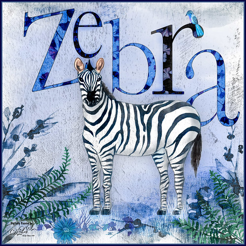
Just had a little fun with this one – started by painting a blue background with a large watercolor brush. Next added a background template by Anastezia-Luneva which added the side detail. Next a Zebra from Freepik was added. The letters from Ginko Textured Watercolor Graphics by Paperly Studio were added underneath along with the green ferns and flowers in foreground. Topaz (see sidebar for website link) Studio was opened and the new Topaz AI ReMix adjustment (see my What is Topaz AI ReMix???? blog) was applied using the swatch that looks like a B&W drawing (Col 2/Row 9). The adjustment was set to Opacity 0.47 and Overlay blend mode. Then added a Texture adjustment and used my cat painting texture (can download at my Deviant Art site) and painted the texture off the dark parts of the lettering. Last added an HSL Color Tuning adjustment and changed the Blue and Gray saturation sliders. The brush used to create the grass was from one of my very favorite natural brush sets at DeviantArt called Grass Set2 Frostbo Grass. A basic little painted bird was added. Some shading was painted onto the Zebra to give him some depth. The border is my Layer Style with sampled colors from the image (can download here). That is all that was done but it was a lot of fun to do!…..Digital Lady Syd
What a View!

Had some fun with this image of London along the Thames River in England. This is basically stacking a couple layers using different presets in Topaz Studio (see sidebar for website link), specifically the Simplify presets. First duplicated the background (actually did some clean up on the image first) and in Topaz Studio, applied the Flat I preset. This really just blocks in color as if it were painted as an underpainting layer. A Hue/Saturation Adjustment Layer and Curves Adjustment Layer were added to adjust the color. Went back to the original layer and duplicated it again. This time it was put on top and back into Topaz Studio, this time using my SJ Graphic Sketch 1 preset (it can be downloaded from the Community if you search for it) and set it to Luminosity blend mode at 71% layer opacity. 2 Lil’ Owls (see sidebar for website link) Color Bokeh Grunge Set no. 5 texture was applied and set to 54% layer opacity. On a layer above used Grut’s fabulous Cloud brushes (the best ones you will ever find!) to create some clouds in the flat sky – the layer was set to 40. Added a Black and White Adjustment Layer on top, adjusted the slider so the colors were not so over-the-top bright and set it to 20% layer opacity. Last step was to add a Red Channel Luminosity Curves Adjustment Layer. I love the painterly effect these presets created!…..Digital Lady Syd
Lots of Bikes at Flagler College

This is a different angle of some of the colorful bikes taken at Flagler College (the old Ponce de Leon Hotel) in St. Augustine, Florida. In Lightroom used the Auto button to tweak the original image and added a little more color into the bike colors. In Photoshop had to use the Adaptive Wide Angle filter to straighten the walls and then used Topaz Studio (see sidebar for website link) and applied SJ Subtle Colored Pencil which is up in the Community for your use. Back in Photoshop a Red Channel Luminosity Curves Adjustment Layer was used to increase contrast. Nik Viveza 2 was used to add a slight vignette. Last step was to add a Levels Adjustment Layer with the black Output Levels set to 27 and the Midtone slider set to 0.81 to get that flat matte Instagram effect. Really love these bikes!…..Digital Lady Syd
View from the Road
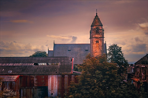
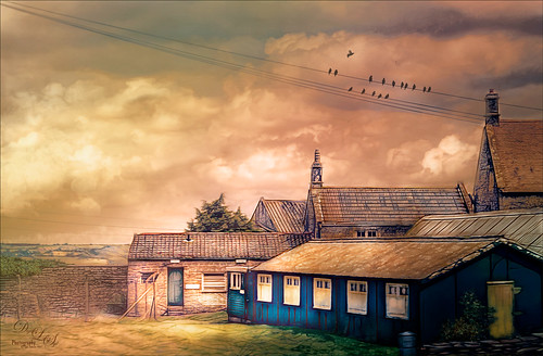
This image was taken somewhere in Scotland. I tried a few different effects but finally ended up with this rather simple result. Used Topaz (see sidebar for website link) Studio for this image. Started with the Desaturated Blush I preset and changed several sliders. Then used the Tone Theme Filter which made the barn more of an orange color – this is a really nice filter and you should check it out if you own it. Back in PS, created a stamped layer (CTRL+ALT+SHIFT+E), applied a Black and White Adjustment Layer set to Luminosity blend mode, a Red Channel Luminosity Curves Adjustment Layer, and a regular Curves Adjustment Layer. Next applied Topaz ReStyle Zambezi Zest to the image at 42% layer opacity. Again back in PS, did some clean up and Black and White Adjustment Layers. A Gradient Fill Adjustment Layer to add a soft vignette and a Selective Color Adjustment Layer for a corner blue sky issue were then applied. Next added a Blake Rudis 5 Tone Heat Map to add a really pleasing look to the image. ……Digital Lady Syd
Countryside Contentment
This image was take on the highway to Bath, England. I did not realize what a beautiful sky was in the image so I had not looked at it in Photoshop. Now I think it looks rather idyllic. This image actually took a lot of layers to get it looking the way I wanted: Topaz (see sidebar for website link) Studio was used to bring the contrast into the image and the Radiance Adjustment was used to get some very precise lines. Some spotlight effect was used to direct the eye and Nik Viveza 2. To warm the sky a Light Gradient using clear, yellow and pink colors was added to warm up the whole image. Blake Rudis’s gradient map vignette technique was used to finish up the image. (See my Yet Another Great Way to Create a Vignette! blog.) Overall a lot of fun to do!…..Digital Lady Syd
Smokestacks in New York City

The above image is from the Library of Congress and is an image taken of the Business District in Manhattan, New York City, cc1900. Shorpy.com showed it as a blog image and has posted some really interesting info about what buildings were in this original image. What intrigued me is the smoke from all the smokestacks and all the American Flags (I counted at least 160), most flying on top of the buildings. A lot of clean up was done first and the image had to be converted to RBG from Grayscale and reasonable size needed to be set. On a cleaned up stamped image (CTRL+ALT+SHIFT+E), Topaz Studio was opened and one of my uploaded Community presets (SJ Building Sharp) was applied. I did go through and tweak the four adjustments (Basic, Precision Contrast, Precision Detail, and Dehaze) in this preset, but it is pretty much the same settings. The last step in Topaz was to reduce the total effect in the sky – used a Mask Transparency of 0.33 with a brush and then added a Feather of 0.23 in the More Mask Options section. In Photoshop a Color Lookup FoggyNight preset added at 11% layer opacity and Linear Burn blend mode. Two textures from Flypaper were added: Alice set to Overlay blend mode and 100% layer opacity and Villa Adriana set to 36% layer opacity and Overlay blend mode. Last step was to open Nik Viveza 2 and add a little lightness on the buildings facing the sun and in the corners for a subtle vignette effect. Really fun picture to work with……..Digital Lady Syd
Going to Windsor Castle
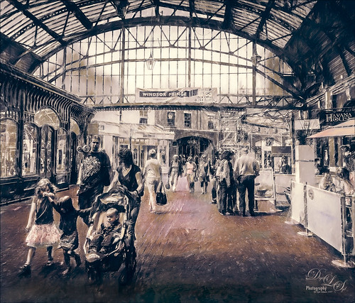
Enjoyed working with this image of a little shopping and restaurant area that led into Windsor Castle in England – lots of different tourists. I find this kind of image totally entertaining! Will just go over the basics as a lot of work went into this image. Mainly did basic adjustments in Lightroom including converting it to black and white. In Photoshop the image was taken into Topaz (see sidebar for website link) Studio where Precision Detail, Color Theme where some color was added back in some different gray color tones, and Impression where the default was used and the Painting Progress slider set to 0.43 – that is why it is not overly painterly. Added a little pink color, a Nik Viveza 2 filter to clean up some of the lighting issues, several Curves Adjustment Layers, and a Color Lookup to add more pink tones in. On a stamped layer applied Topaz ReStyle’s Wedgewood Blue and Tan preset set to Color blend mode and a Levels Adjustment Layer for final adjustment of contrast. It took a lot of tweaking as the people looked too crisp with some of the settings. I just really liked the feel created by the glass dome and all the activity. Lots of fun…..Digital Lady Syd

