Never Thought I Would Use a Wax Crayon Effect!
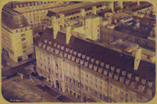 |
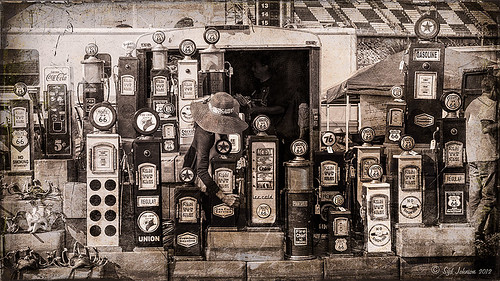
Yep, this image was processed using the wax crayon brush in Snap Art 3. I totally love the vintage feel to this image. I am adding the Lightroom image as brought into Photoshop so you can see the difference – just click on the image. I really liked the before image as it was processed using one of my favorite presets, GA B&W Infrared 01 preset which gave it a little bit of a blown out look. Jack Davis’s Bluish Split Toning preset was applied after this (the presets use different settings so both can be applied – Jack’s preset can be downloaded from his Facebook Freebies section and selecting his Lightroom Wow 4 Presets.) White rounded corners were created in the Post-Crop Vignetting section using Style: Highlight Priority, Amount +100, Midpoint 32, Roundness -93 and Feather 0. Once in Photoshop the background layer was duplicated and made into a Smart Object. Alien Skin’s Snap Art 3 was opened and the Pastel (sketch) preset was selected. Three layers were used to adjust the parameters for the Wax Crayon I was using on the image – just basically played around with the settings until I liked them. Since it is a Smart Object, I can always go back and change anything I don’t like. Next 2 Lil’ Owls Studio Color Bokeh Grunge (see sidebar for website link) Sweetness overlay was added using the Subtract blend mode at 58% layer opacity. Curves, Levels and Hue/Sat Adjustment Layers were added to add more contrast and color into the image. The last step used Nik Viveza 2 with a control point on the front of the building to draw attention to this area. That was it – I really like the final result! Not at all what I had in mind, but love it just the same!…..Digital Lady Syd
Digital Lady Syd Related Blogs:
Digital Lady Syd Reviews Alien Skin Snap Art 3
Get Great Results with Alien Skin Snap Art 3 and Topaz ReStyle Together!!
Snap Art and Simplify – Now That’s Painterly!
Viveza 2 Does It Again!
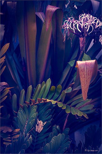
This huge Barking Treefrog got thrown out of a Palm Tree frond that was being trimmed and ended up in my Cardboard Palm. The blooming plant in upper right is a Queen Emma Lily Crinum . The lawn guys said he was the biggest frog they had seen in Florida (he was at least 4 inches long). Anyway, the frong was gorgeous and very calm and let me take his photo. This image was processed a lot in Lightroom using a Jack Davis Bluish Split Toning preset. The frog was sharpened slightly using the Adjustment Brush. A Radial Gradient was added to darken down the outside edge and give a slight vignette. It was taken into Photoshop and a New Layer was created to clean up the leaves with the Spot Healing Tool. A Curves Adjustment Layer was added to add some tone to the image. The layer was duplicated and converted to a Smart Object. My favorite filter was applied – Nik Viveza 2 – to add highlights to the frog and the plant by adding control points to these areas. This really gave the image the final look it needed. In this case Viveza 2 really popped this image!…..Digital Lady Syd
Boring Image to Fabulous Image!
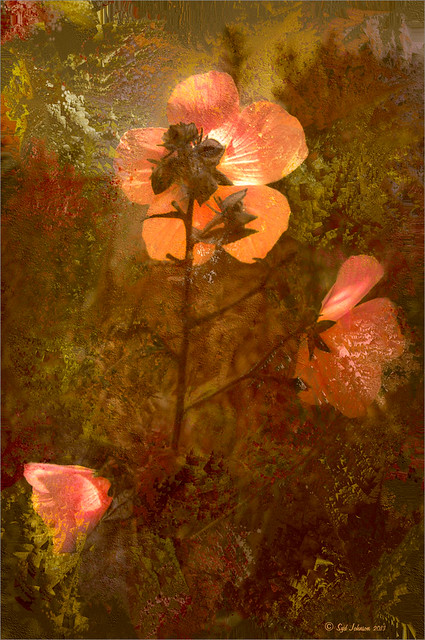
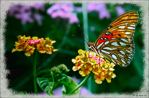
As you can see, this little pink flowers pix taken at the ICW (Halifax River) in Ormond Beach, Florida, was not that great to begin with, but by adding this gorgeous texture from Painted Textures, the image was totally turned around. In Lightroom 5, the image was desaturated using an Adjustment Brush and just leaving the flowers pink. Two Radial Gradients were applied – one for the outside where the Exposure slider was further darkened, and one for the inside area where the Clarity and Sharpness sliders were reduced to make the flowers appear softer and Shadows increased to 20 to give just a glimpse of the background details. Screenshot shows how image looked as a RAW file, and then after Lightroom adjustments right before taking it into Photoshop.

The image was taken into Photoshop CC where a clean up layer was added to get rid of the spots on the flower petals. Next Painted Texture’s beautiful August Sand Texture was added and set to Linear Light at 77% layer opacity. A Hue Saturation Adjustment Layer was clipped (ALT+Click between the layers) and the Hue was set to -4 and Saturation -23. Then a Curves Adjustment Layer was added to increase contrast, which adding textures often requires, by dragging in the image with the little hand icon tool from the top of the panel and pulling down. A New Layer was added on top and set to Overlay – a burn layer was created using a black brush at 12% and following down the stems. (See my The Best Dodging and Burning Technique! blog ). It was also set to 44% layer opacity to keep it from being overdone. No layer masks or fancy selections or filters were used on this one – the texture totally made this image!……Digital Lady Syd
Image Saved With Shake Reduction Filter

Since horse images seem to be all the rage, I decided to post another one taken in Belarus at the Old Village of Ayaymku. This gal looks pretty scared as she was just caught after going for a romp around the place. See another image of the Horse I took on Flickr. If you like horse stories, you should check Shanna Rae’s (of Florabella Collection) personal blog called Velvet Willow – beautiful story and images of her horses.
In Lightroom the preset called GA B&W Infrared 01 was applied before bringing it into Photoshop. Since I wanted to try out the new Shake Reduction Filter in Photoshop CC, this filter was applied first. Wow – totally saved this image. It was soft and just a little off. Just one sample spot in a bad area and it was cleared up pretty nicely. Then just some clean up and eye sharpening using the Sharpen Tool was used. The last step added the Blending Frame from Tim in Ohio texture set to Linear Dodge at 100% layer opacity. That was all that was done. I think the black and white treatment really enhanced the mood of this image……Digital Lady Syd
Take the Time to Get the Fun Shots!

Going through my older photos I found this crazy image of an ostrich at The Old Village of Ayaymku outside Minsk in Belarus. (At this point I think I am the only person who has posted images on this charming place.) This was a totally fun place to visit – I am not sure they have had too many American tourists, but it is a very popular place for the locals, especial for bridal parties. In fact we saw two brides having photo-shoots while there! Here are a couple links to some of my other images posted on Flicker: The Old Village of Ayaymku and The Old Candy Shop at the Village. This is a replica of an old Belarusian village where there are many beautiful craft and food shops. And then they had this little zoo area with all kinds of animals, including this crazy guy! (Here is another Ostrich image from the Village.) He was mainly retouched in Lightroom 5 where David duChemin’s Toxic Warmth preset was applied. In Photoshop, Nik Viveza 2 was used to emphasize his eyes and tongue and downplay the background. Hope to present some more images from this Village in the future…..Digital Lady Syd
Digital Lady Syd Related Blogs:
Unexpected Humor in an Image
How to Pop a Picture in Lightroom 5
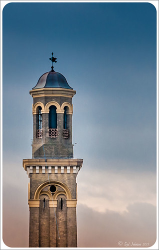
This image of a pretty cupola taken in London uses several of the new Lightroom 5 features. In fact nothing was done in Photoshop to this image. First it was cropped down – only had the very top as shown but it needed to be composed. Then the basic sliders were set just like in previous versions of Photoshop (see my How to Use Adobe Camera Raw (ACR) or Lightroom 4 Quickly blog for tips on this). The HSL panel was used to set the color. Two Graduated Filters were added – one for the blue sky (Temp -22 and Exposure -1.18) and one to bring out the pretty sky and cloud effect (Exposure -0.42, Highlights -60, Shadows 87, Clarity 55 and a light orange color Hue 28/Sat 59). Some Sharpening was done with an Adjustment Brush (Sharpness 100, Shadows -68, and Clarity 100) and the detail painted over. A Radial Filter was applied to just the the cupola – used -1.18 Exposure with the Invert Mask checked. A Post-Crop Vignetting was added using Highlight Priority Style, Amount +100, Midpoint 18, Roundness -100, and Feather 0 – this gives the nice white frame. That was all that was done – a very plain image turned out to be quite striking!…..Digital Lady Syd
Digital Lady Syd Related Blogs:
Lightroom 5′s New Upright Adjustments Section
My Favorite Adobe Lightroom 5 Features
Meeting a Belarusian Horse!
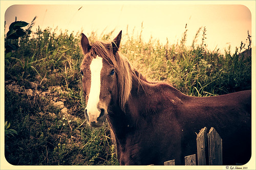
This beautiful horse was in a field outside an old wooden windmill in Belarus. I had forgotten I had taken his pix. Since I did a blog called Can You Get a Painting Look With a Photoshop Action? Jack Davis Can!, this image was processed in Lightroom using his Wow! Antique 03 preset, which included the framing. Check out my other blog for downloading info of his Lightroom presets. The image was taken into Photoshop and the Burn and Dodge Tools were used directly on a duplicate copy of the background. I would never have tried this if I had not watched a short video on Lynda.com called Black and White with Lightroom and Photoshop by Bryan Hughes O’Neill, Adobe Photoshop Senior Product Manager who really knows what all the sliders do in these programs. It was very interesting and I learned to use these tools. The main thing to remember is to keep Protect Tones checked. With the Dodge Tool set to Shadows at 50% Exposure, the horses eyes were painted over to make them pop. Burning Tool was used to separate his face from the field using Midtones and Highlights selected. A New Layer was created for the Sharpen Tool – therefore be sure to check Sample All Layers and Protect Detail in Options Bar. The Strength was set to 12% and the effect was built up slowly where sharpening needed to be added. It does not introduce a lot of artifacts this way. A Curves Adjustment Layer was added on top and dragged down in image to get a little more contrast. That was all that was done to get this lovely effect. What a beautiful creature!…..Digital Lady Syd
Digital Lady Syd Related Blogs:
Using Old Wallpaper for a Vintage Look
My Favorite Adobe Lightroom 5 Features
Aliona’s Birthday

Thought I would do a quick Lightroom post of an image I did of my very photogenic daughter-in-law on her birthday. She does not love this image, but I really love the vintage treatment. To begin the process, Matt Kloskowsky’s That 70’s Look preset was applied (the new version for Lightroom 4 is in the NAPP preset group but I am not sure where I found it). Three Adjustment Brushes were used on her face: 1) on eye iris the Exposure, Clarity and Sharpness were increased to make them pop a little; 2) the whites of her eyes were painted and the Saturation set to -52 to whiten a little; and 3) her lip color was changed to match her dress by using a little clarity and sharpness and a sampled pink color. In Photoshop all that was done was a little Liquify filter was used to adjust the dress folds. That was it – quick and easy and a beautiful look!…..Digital Lady Syd
Lightroom 5’s New Upright Adjustment Feature
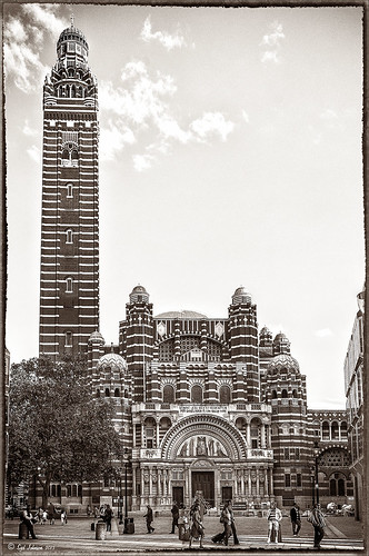
Hover over the above image of Westminster Cathedral to see what the original RAW image looked like or (here to see on flickr)- pretty awful! Wanted to show you what Lightroom 5 did with one click of the Lens Correction section’s new Auto button in the Basic Upright area. I was blown away! I did not adjust it any more – it is not perfect but much faster than anything I could get by using Photoshop’s Puppet Warp or filter tools. Check out a short blog by Julianne Kost, one of the Adobe Photoshop Evangelist, that gives some good info on when to use the Reanalyze button. In Photoshop a couple little items were cloned out on a separate New Layer. Nik’s Sharpener Pro 3’s Raw Presharpener was used at default values on a duplicate layer. A Hue/Saturation Adjustment Layer was added to get rid of a little yellow cast the sharpener filter gave to the top of the tower – used a black layer mask and painted back the correct color where needed in white on the mask. Next Nik Silver Efex Pro 2 was used and the custom preset called Sepia Grain Border was applied. Just a few little changes were done on the sliders to make the image sharper, but that was all that was done. Pretty nice sepia tone image!…..Digital Lady Syd
What a Cute Little Alligator!
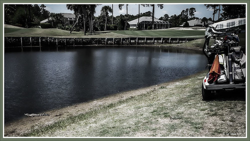
Thought I would post my wonderful recent golf experience – we were almost done playing – hole 18 – and then I shot the ball in the water. (That’s how good I am!) Almost clobbered this little sunning alligator, but he did not even move when we pulled the ball out of the water. First alligator I have seen this year, and I would not have gotten the shot if I did not have my cheap Kodak point-and-shoot camera. The image was processed very simply. First I used a Lightroom preset created a while back from a video called True Grit by Michael Rather. (Since I keep referencing it, here are the settings from the short video: Basic Panel – Contrast +100, Highlights -80, Shadows +100, Whites and Blacks sliders to taste, Clarity +100, Vibrance -82, and Saturation -7; and Lens Correction Panel – in Manual tab set Lens Vignetting Amount to -76 and the Midpoint to +19. Use these settings as a starting point and adjust them to taste. My preset actually is set to Clarity of +67 and Vibrance of -82 and were used in the image above.) Next my favorite sharpening plug-in, Topaz (see sidebar for website link) Detail 3, was applied using the Soft and Dreamy II preset. In the Effect Mask section, the effect was removed from the alligator using the brush strength set to 1.00 and partially on the golf clubs and cart canvas top using a o.21 brush strength. The Overall Opacity was set to 0.87. Back in Photoshop a Levels Adjustment Layer was added setting the middle tab to 0.86. Next a Darken/Lighten layer was created (see my Best Dodging and Burning Technique! blog for info on how to do this). The last step involved adding my free SJ B&W Border Frame Layer Style – changed the black color to a sampled green color from the image. It was great to get outside after a pretty cold and ugly winter/early spring and it was fun to see this little guy, even though he was a little scary. …..Digital Lady Syd
Digital Lady Syd Related Blogs:
Trying Out Some New Techniques!
Vintage Toy Processing
Fake Panoramic Effect
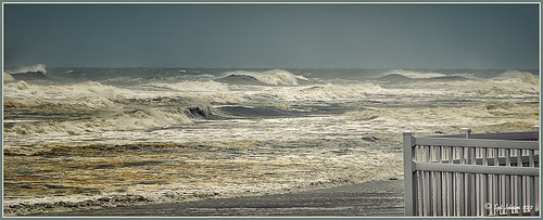 |
Taken the morning after Hurricane Sandy went past Ormond Beach in Florida, this image showed how strong the surf was and how gray the sky appeared even though the ferocious hurricane was not a direct hit. We were so fortunate that the storm did not hit Florida directly.
What I really like about the shot is how sharp the texture in the waves and beach surf is. To get this effect, the image was first processed in Lightroom where just basic slider corrections were made and a custom crop was created. I usually do not do this, but this image seemed to scream panorama to me as the sky was so plain and the main subject is the large expanse of water. Since everything was moving, a several shot panorama was out of the question, so it had to be faked. Click on image to see Lightroom version – it is very flat, not at all how I remember it. In Nik Color Efex Pro 4, a Cross Processing filter using Method C04 at 27% strength, Detail Extractor filter set to Normal (Detail Extractor at 64%, Contrast at 31%, and Saturation at16%) with 6 Control Points to restrict the filter effect to the sky area, and a Lens Vignette filter (Amount -9, toward Rectangle,Size 57% and Brightness -16%). In Nik Viveza 2 the Center was brightened. The Spot Healing Brush was used on a clean up layer, and Contrast was boosted with a Curves Adjustment Layer. The default preset in Imagenomics Noiseware was applied. When noiseware is applied, the image detail will usually get softer – therefore, in a white layer mask, I painted with a soft black brush the waves back so you can see the water mist detail. The last step was to apply my free SJ Thin Double Edge Frame layer style sampling colors from the image. Now I get the result I remember!…..Digital Lady Syd
Beautiful Christmas Flowers
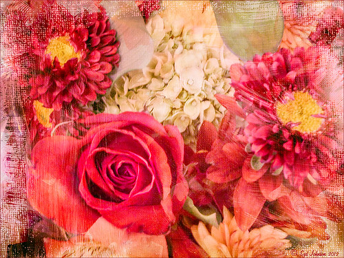
These flowers were once again taken at the local grocery store with my little Kodak Point-and-Shoot camera. I bought four textures from Melissa Gallo’s Painted Textures website on Black Friday and love them. These are very painterly textures and create a different look! She also has some very interesting tutorial videos on how to apply a texture – keeping the texture on an image and painting in color to remove texture from parts of the image, which is what was done here. Check out her website if you enjoy textures as much as I do.
The biggest change I did on this image was in Lightroom where the White Balance eyedropper was sampled throughout the image until I found something different that I liked – it turned a rather dark fall colored image into a bright red and pink image. Totally awesome! I also used a Lightroom Adjustment Brush to sharpen the yellow centers of the flowers and some of the rose petal edges. Now following Melissa’s tutorial, Shadowhouse Creations Vintage Soft Grunge texture V32b texture in Set 3 was applied using the Multiply blend mode at 84% opacity, along with Painted Textures Taupe Canva using Hard Light blend mode at 35% and Pink Impasto using Hard Light blend mode at 67%. A Color Balance Adjustment Layer was added to increase the red color a little in the Highlights and greens in the Shadows. A Curves Adjustment Layer was added to lighten the overall contrast of the image.
Totally loved the result!…..Digital Lady Syd
Digital Lady Syd Related Blogs:
For Tidbit Blogs, click on the Texture Category to get several more.
Where to Find Those Cool Free Christmas Card Templates?
How to Create Unique Textured Backgrounds
How to Create Unique Watercolor Background Texture
Creating That Vintage Texture Feel
Russell Brown’s Paper Texture Panel Updated!
Tips for Flower Textures
Some Free Christmas Overlays to Spice Up Your Christmas Cards
Spotlight on the Pink Spica!

Just another example of the wonderful Camera Raw sliders now updated with Adobe Photoshop CS6 and Lightroom 4. This beautiful pink spica was taken at the Hawaii Botanical Tropical Garden and was first processed in Lightroom 4 by following Scott Kelby’s workflow in my How to Use Adobe Camera Raw (ACR) or Lightroom 4 Quickly blog. The White Balance was left as shot, Exposure set to -0.10, Contrast +24, Highlights -100, Shadows +100, Whites +10, Black -6, and no Clarity or Vibrance were used. The Green slider was set to -30 in the HSL Saturation section to reduce the color just a little. Noise reduction Luminance was set to 22, the Lens Correction profile was set to my camera lens, and in Effects a Highlight Priority Style Post-Crop Vignetting Amount set to -41.
In Photoshop a lot of clean up was done on the leaves – they had spots everywhere but the Spot Healing Brush worked wonders on most of it – just set to Content Aware in the Options Bar and swipe away. Scott’s Highlight Effect was applied to spotlight the flower (duplicate the layer and set it to Multiply blend mode, then add a layer mask and paint back in your object with a big soft black brush). Topaz (see sidebar for website link) Simplify 4’s Watercolor II preset was applied to soften the flower a little. A black layer mask was added and the flower was painted back with a low opacity brush in white to give just a hint of the painterly look. My Thin Double Edge Frame layer style was applied with colors sampled from the image. Very quick and very easy. Love the final look…..Digital Lady Syd
Digital Lady Syd Related Blogs:
Spotlight Effect With the New Subtract Blend Mode
A Little OnOne Perfect Effects Vintage Look
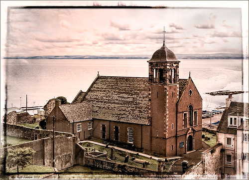
This beautiful Scottish Church was taken from a train going from Edinburgh to St. Andrews. This is a wonderful way to capture some of the countryside. I am surprised how sharp this image was since the train was moving – my settings using a 18-200mm Nikon lens were F/13, 1/200 sec, ISO 400 using a 45 mm lens. For post-processing, the first thing done was to create three Virtual Copies in Lightroom and set them at different exposure settings – one to about -2, one using the original, and one set to +1. This is a way to get an HDR look using a single image. The first two where then taken individually into Topaz DeNoise 5 (see sidebar for website link) and adjusted for noise issues. The +1 just used a little adjustment in Lightroom since the over-exposed image did not have a lot of noise. All three images were then selected in Lightroom and right-clicked to get menu – Open In -> Merge to HDR in Photoshop. That is how the bottom layer was created. Next by applying OnOne Perfect Effects (see sidebar for website link), the image took on a great look. This plug-in can do interesting things to images – usually when I just can’t put my finger on what I need for a photo, Perfect Effects has a solution. This image uses these filters presets stacked: Black and White->Warm Gray with colors swapped in Effects Options, Detail->Texture Booster, and Borders->Russell with Scale set to 4 in Effect Options. Back in Photoshop Nik’s Viveza 2 was applied to add a little soft color in the sky, sharpen the cupola, and add a little brightness to the front of the church. Then Topaz DeNoise 5 was applied one more time to get rid of some noise created by the plug-in application – this time it was targeted to the sky and water using an Overall Strength setting of .11, and for the lighter areas, Adjust Highlights set to .28. Recover Detail was set to .30 and Reduced Blur to .13. This sounds like it was a lot of effort, but it really was very quick to apply. The hardest part was adjusting the noise in the three virtual copies in Lightroom. …..Digital Lady Syd
Digital Lady Syd Related Blogs:
Can a Pseudo HDR Image be as Good as the Real Thing? (Part One)
Can a Pseudo HDR Image be as Good as the Real Thing? (Part Two)
Trying Out Some New Techniques!

Just thought I would try out a couple new tricks. The image was a JPG shot with my little point-and-shoot Kodak camera at Flagler Beach on a beautiful early evening. A short Lightroom video called True Grit by Michael Rather was followed to create a nice gritty effect preset. I tried it on this landscape image (he used an image of a boy’s face) and really liked the effect. Next Topaz released Simplify 4 (see sidebar for website link) so I applied this plug-in to the photo in Photoshop. This is a free upgrade for anyone that has the bundle or has bought the Simpify plug-in previously. Lots of fun here. This was basically just playing around with the settings to get to know the program and getting a nice look. In Photoshop a Hue/Saturation Adjustment Layer was added where the Red Hue slider was moved so it was not so bright. I also added a layer mask to the Simplify layer and painted back in just a little of the white wave detail using a soft, low opacity black brush in the mask. The last step is my Black and White Layer Style. …..Digital Lady Syd
Digital Lady Syd Related Blogs:
Using Topaz Simplify for That Artistic Feel!
Blue Flowers and Layer Style Frame
I Didn’t Know That! Converting Lightroom Preset to Adobe Camera Raw Preset
Big Sky Preset for Lightroom 4.1

This is my “big sky” view above my little lake and what I have been seeing every afternoon this summer in Florida. Beautiful but very scarey! I wanted to try out Matt Kloskowski‘s (one of the Photoshop Guys from NAPP) new free Lightroom presets called Big Sky as a starting point – Strong in this case. After making adjustments in Lightroom, the image was taken into Photoshop and first Nik’s Color Efex Pro 4 was applied stacking these filters: Brilliance/Warmth with Sat at 32%, Warmth 49%, and Perceptual Sat 40%; High Key With Dynamic High Key set to 61%; and Pastel Using Method 2. Next two Selective Color Adjustment Layers were created with black filled into their layer masks. One Adjustment layer was for the green grass so in the layer mask I painted back just the green area for that layer and the other targeted for the slight reddish color in the roofs. Next the new Color Lookup Adjustment Layer set to 3DLUT DropBlues.3DL was added – the sky was then painted over with a light gray to soften the change. (To learn more about Color Lookup, see TipsSquirrel’s Richard Hoffman’s short video here.) Next Nik Viveza 2 was used to smooth out the clouds and sharpen the house lines. Finally Imagenomics Noiseware was set to Full Stronger Noise preset. The last steps created a Curves Adjustment Layer for a little more blue using just the Blue Channel to increase the color and set to 70% opacity. Finally my Layer Style frame was used sampling the colors from the image (see DLS Free Layer Style Frames). I liked the way the preset worked – it looks very similar to how it appeared originally in Lightroom without all the adjustments and blue cast. The final result looks a bit like an architectural rendering seen in house brochures. And you got to love the clouds!…..Digital Lady Syd
Lightroom 4’s Graduated Filter – Check it Out for Landscapes!
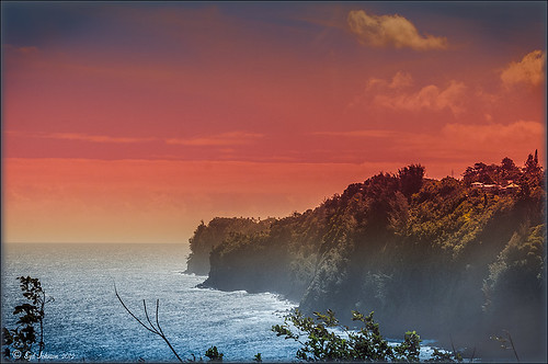
I have never used Lightroom’s Graduated Filter much as I usually do that kind of adjustment in Photoshop with the Gradient Tool on a mask. Recently I came upon a very interesting blog/videos, Adobe Photoshop Lightroom 4’s Graduated Filter Controls by David Marx, that discussed how much improved the Graduated Filter is and how to use it get some great landscape effects.
The image above is on the way to Hilo from Waipi’o Valley and shot through a car window???? Still thought it would be a good opportunity to see what I could do with it using this technique since the valley and water were so pretty and the clouds in the sky were a nice addition. This image was first tweaked in Lightroom globally, then 5 graduated filters were added, four for the sky colors and one for the water color coming up from below. I used the Color Wash technique on all four sky filters created, making some quite small to give a nice sunrise feel to the image. Finally it was taken into Photoshop where a layer using BBs Fogs and Mists Brushes were used to create an early morning foggy feel was added (and to cover up some uneven lighting on the valley walls) and for some noise reduction using Imagenomics Noiseware‘s Default setting (you could use Lightroom Noise Removal for a pretty nice result). Here is a small image of the original so you can see what the Camera Raw file looked like:

Once again, a pretty bad image was turned into something that really reminds me of my trip to the Big Island, even though it is not exactly as I shot it???? If you own Lightroom 4, definitely take a look at these very easy to follow videos – the results are quite amazing…..Digital Lady Syd
32-Bit HDR Using Lightroom and CS6
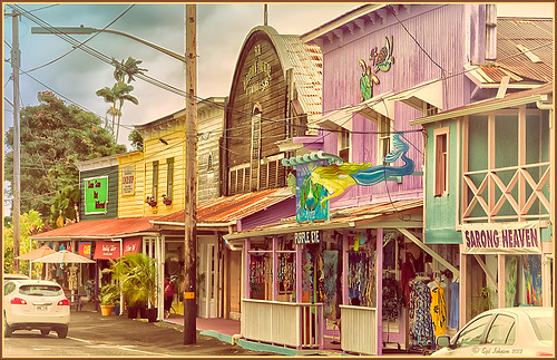
This is a beautiful little town called Honomu is on the road to Akaka Falls on the Hilo side of the Big Island. I love how this image turned out – the original tonemapped file was totally flat. This image was processed as a 32-bit HDR image in Photoshop CS6’s Merge to HDR program, then brought back into Lightroom 4.1 as a TIFF file where it was adjusted using mainly the Basic sliders, then edited back in Photoshop CS6 as a 16-bit PSD file. From there, Nik’s Color Efex Pro 4‘s was opened and these filters stacked: Detail Extractor at 68%, Graduated Filters using Blue No.1 as the sky was an ugly gray color, and finally the Film Efex Vintage set to Film Type 21. Next Nik’s Viveza 2 was added and that is what really made the difference in this image – the detail was popped in the signage areas but smoothed in the sky. Imagenomics Noiseware was added to smooth out the roughness of the whole image. The frame I used is called SJ Thin Double Edge Frame and can be downloaded at my Tidbits Blog DLS Free Layer Style Frames. The colors for frame were sampled from the image. Once again an image that did not have too much going for it turned out really nice……Digital Lady Syd
Digital Lady Syd Related Blogs:
New Lightroom and Photoshop 32-bit Processing Capability


