Butterfly Beauty!
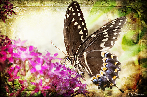
Today I had a chance to get some wonderful shots of one of the beautiful butterflies that are flying all around my neighborhood. This is a female Palamedes Swallowtail Butterfly and she is loving the pink pentas in my front yard (the males are smaller and more black in color). I was so surprised that she stayed around while I shot several pictures. The trick to getting the shot since her wings are flapping like crazy – set your ISO to 1600 and shot at F11 and higher. I was able to get many very clear shots. Three textures were applied using Russell Brown’s Paper Texture Panel: ShadowHouse Creations Scratched Overlay set to Hard Light blend mode at 100% layer opacity and Softly Blurred Edges set to Overlayat 100% opacity (see sidebar for website link), and Gavin Hoey’s Grunge Border set to Overlay at 100%. All had layer mask applied and the butterfly was painted out completely using a black brush in the mask. A Curves Adjustment Layer was created to adjust just the blue channel curve to bring out her blue spots, then the mask was filled with black (with white Foreground color, CTRL+BACKSPACE to fill with mask with black). Just painted back in the blue dots in the Curves Layer Mask with a white brush. That is all that was done to the image – what a showgirl!……Digital Lady Syd
Digital Lady Syd’s Related Blogs:
Digital Lady Syd’s Rule No. 5: Just Step Outside and Look Around!
Which Tool to Use – Smudge or Mixer Brush?
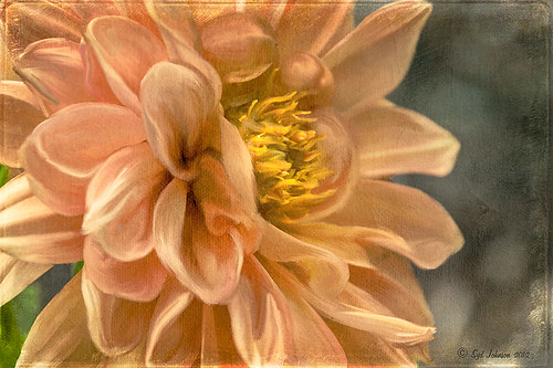
I ran across an old tutorial that was in the very first Photoshop Creative magazine back in 2006. It was on how to create a digital painting by using the Smudge Tool. Well that was something I had to try out – couldn’t believe I had not tried this before! I really like the Mixer Brushes, which is what I usually use (see my blog Adobe Photoshop CS5’s Mixer Brushes). Once I started playing around with the Smudge Tool using different brushes and sizes and opacities, it was actually fun. My curiosity got the best of me and now I needed to know what IS the difference between the two tools – they create very similar results? I was able to find a reasonable answer on the Internet at Model Mayhem.com. Here is what they said:
“The Smudge Tool simulates the effect you see when you drag a finger through wet paint. The tool picks up color where the stroke begins and pushes it in the direction you drag……The Mixer Brush simulates realistic painting techniques such as mixing colors on the canvas, combining colors on a brush, and varying paint wetness across a stroke.”
I think this is a nice short explanation of what is happening. For my Peach Dahlia I found it was nice to use both tools. It seemed it was easier to blend colors with the Mixer Brush and then smooth edges and shape color using the Smudge Tool. The Photoshop Wow Book for CS3 and CS4 (still my favorite Photoshop book) had a nice section on painting with the Smudge Tool. They recommended using the Natural Brushes that come with Photoshop and start by using short strokes, which samples the color underneath more frequently. Then use a small brush size for detail.
To create this image, first a blank layer was placed on top. Then these two brushes were used to paint: Mixer Brush – created tool preset brush with these settings: Stipple Dense 26 pixels from Natural Brushes set (Options Bar: No Current Brush Load, Load the Brush After Each Stroke, Wet 100%, Load 1%, Mix 91%, Flow 100%, Check Sample All Layers). Smudge Brush Tool Preset created using Stipple 54 pixels from Natural Brushes preset with Options Bar set to Mode Normal, Strength 78%, and Checked Sample All Layers. Be sure to save these brushes as Tool Presets so the Options Bar settings are retained – if just saved as brushes, the settings might not be correct. Also, note that if the Finger Painting box is checked in the Smudge Tool options bar, the smear stroke will start with the Foreground color. If turned off, the color under the cursor is sampled first. At 100% Strength, only the first color sampled is applied – at lower settings it fades out the first color and picks up the new one. Then I just alternated mixing and smudging until I liked what I saw. The last step involved adding three textures to the image to give a real painting look: the first one is a light gray canvas texture (I created it by taking a picture of a portion of the canvas on a large oil painting in my dining room – try this – you might really like the results) set to Soft Light at 53% opacity; next ShadowHouse Creations Old Photo 2 set to Overlay at 100% opacity – it provides the interesting edging on the image; and Flypaper Textures Aquaflora taster set to Overlay at 80% opacity. I painted out a little bit of the texture on the top two textures just to direct the eye to the center of the flower. A Curves Adjustment layer was added on top to give just a small contrast boost. Overall it was really fun to try out a new tool and learn something about it!…..Digital Lady Syd
Unknown Little Girl Statue
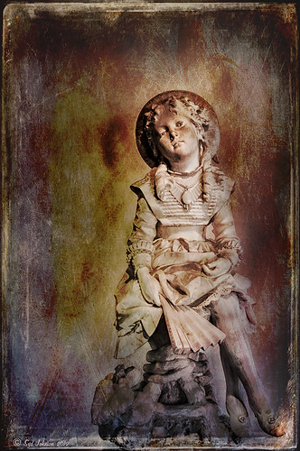
Here is another beautiful little girl statue from an unknown sculptor at the Lightner Museum (old Hotel Alcazar) in St. Augustine, Florida. I decided to use several of my own textures on this image. First it was cropped, processed a little in Lightroom, brought into Photoshop CS6 where Nik Viveza 2 was used to sharpen only the statue. Nik Color Efex Pro was opened and Dark Contrast Filter and Glamour Glow filters were stacked. I then used four layers of my own textures that I created (two were made by painting on a white background with soft colors using a large Mixer Brush and one is of my lace curtains) and finally finished off with ShadowHouse Creations Old Photo 6 texture used twice – once as a Color Dodge layer at 43% and one as a Linear Burn at 88% on the background only. I loved the way it has an old Western look – she reminds me of Rebecca of Sunnybrook Farm. Textures are so much fun!…..Digital Lady Syd
Little Girl Statue at Lightner Museum
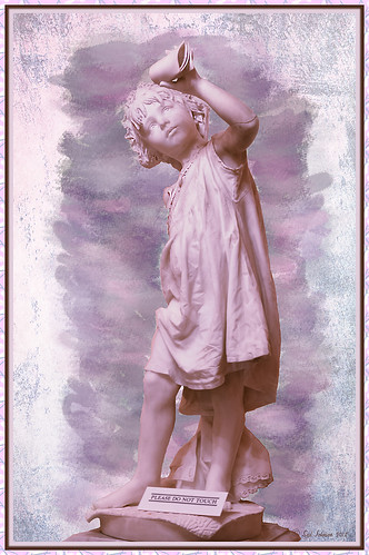
If you follow my blog much, you know I am a big fan of the Lightner Museum. It is not that fancy and not that big, but totally interesting with their wide range of the late 18th and early 19th century items – lots of fun to just drop-in for an afternoon. And of course St. Augustine is a great city to visit as there is a lot to do, even just walking around is fun! This little girl is one of the beautiful statues that is located in the museum – I have no information on who created her but she has a wonderful expression. (To see a different view of this statue, see my Fun Photoshop Blog Getting that High-Fashion Desaturated Look.)
I initially was going to give a the whole image a painterly effect. I decided I liked just having the background with the artistic feel and keeping the actual statue very detailed but with a softer color. I was trying to follow the Photoshop Workbench – Watercolor Composite by Mark Johnson (his tutorials are great!) but I changed a lot of the steps for this image as I did not like the way it was turning out. Textures were added using using Russell Brown’s Texture Panel (see Russell Brown’s Paper Texture Panel Updated!) – Sarah Gardner’s Blush Cherry set to Overlay Blend Mode at 100% Opacity, Princess of Shadow Texture 3 Hard Light at 43% Opacity, and Shadowhouse Creations Oil Painting-2 set to Overlay at 49% Opacity. Then painting was done above for them to get the colorful background using Mark’s tutorial.
Just goes to show that Photoshop is so much fun! And it is fun to remember the beautiful art that I run across……Digital Lady Syd
Digital Lady Syd Related Blogs (all links related to Lightner Museum)
Lidden Urn from Carl Thieme
The Art Corner: Little Girl Knitting – A Mystery Sculpture!
Black and White Photo or Not? Give It a Try on That Difficult Image
Cafe Alcazar and Vintage Topaz Adjust
Photoshop’s CS6 (and Pixel Bender’s) Oil Paint Filter
Where Am I?
Using photoFXlab v1.1
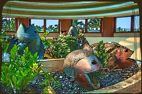
These sculptured fish mark the entrance to a huge breakfast buffet at the Hilton Waikoloa Village where you can have breakfast with several hundred of your closest tourist friends! Since I have been trying out Topaz photoFXlab v1.1 (see sidebar for website link), I thought I would try it out on this image that was adjusted in Lightroom first. Since it has a comical appearance to it, I thought the Topaz Simplify Cartoon preset would suit this shot. Basically some minor adjustments were made to the preset and then the Adjustments tab in photoFXlab was opened and these sliders were used: Dynamics (the Topaz Adjust HDR slider and is really a great new addition) was set to 56, Sharpness 44, Highlights 49 and Shadows -34. After application of the plug-in, a Curves Adjustment Layer was added in Photoshop along with OnOne PhotoFrame lines 04 (see sidebar for website link) with color sampled from the image. That’s it! Pretty fast and I really like it. Also it did not need any more sharpening or clean up.
Not all images work out this easy in the plug-in, but it really is nice once you start using it……Digital Lady Syd
Digital Lady Syd Related Blogs:
Digital Lady Syd’s Review of Topaz photoFXlab v1.1
Corel Painter and Photoshop Together to Create a Pastel Painting

I just finished my first attempt at creating a pastel in Corel Painter 11. I tried to create one in Photoshop using pastel brushes, and just could not get the hang of it. Painter is great for converting your digital images into beautiful works of art. I have found the best book to use if you are just learning is Martin Addison’s Painter 11 for Photographers (if you are using or trying out Corel Painter 12, check Amazon for the updated version of this book).
The image was created by first using the Auto Painting part of the program (this is explained in his book) and a brush from the Smart Stroke Brushes category called Pastel Tapered using the brush default settings. My computer took forever to do the auto-painting – this program is a real memory hog! After getting almost all the painting covered using this technique, I created a New Layer in Painter and used a smaller brush (17.2 pixels) at 54% opacity to fill in the white holes and some of the details I wanted brought back into the image. The layer was set to 78% opacity after finishing. Saved the image as a PSD file and opened it up in Photoshop where I could clean it up more. The first thing I did was create a New Layer and used the Clone Stamp Tool at 70% opacity to clean up some of the ragged looking strokes – it did not need a lot of touch up. Next I added a Curves Adjustment Layer to lighten up the front door texture since it came out very dark in the Painter rendition – the layer mask was filled with black and only the door was painted back in at 60% opacity. I had put a large white edge around the image in Painter so it could have a soft painted framing – I did not like the look of it. In Photoshop on a composite layer (CTRL+ALT-SHIFT+E) and using the Quick Selection Tool, the white frame was selected and a layer mask added. The layer mask had to be inverted (CTRL+I on mask) so the frame was turned black to conceal. Next a texture, in this case a free one by Sarah Gardner called Blush Ginger (it is no longer available but there are many free texture resources – click on my Textures category on right for other blogs with links) was added below the image and set to 50%. It matched the image very nicely and has a great texture to it. Finally the top image was highlighted and a Inner Glow Layer Style was added to soften the edges of the image to match the texture underneath – the Color was changed by sampling the texture color and setting the Blend Mode to Normal and the Opacity to 88%.
Corel Painter is an expensive program but they do have great Education discounts if you are a student. I love the program but find I do not use it that much, especially since Photoshop CS6 has made some great strides towards achieving some of these same painterly effects. On the other hand, the Auto Painting function is very realistic and the program has so many more choices for brushes and styles of painting that I do not believe Photoshop will ever be able to completely compete in this area. Painter is definitely for those with the artistic flair……Digital Lady Syd
Digital Lady Syd Related Blogs:
Adobe Photoshop CS5′s Mixer Brushes
Digital Lady Syd’s Rule No. 6 – Try Something New!
Blue Flowers and Layer Style Frame
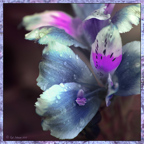
This image is actually of my pink and white Jazze Rose Frost Alestroemeria (see my blog Magnificent Macros with Nik Plug-Ins) but the colors were changed to purple and blue. I first tried this in a blog called Purple Lily Pads! using a slightly different technique with similar results. Just couldn’t resist posting again how easy it was to do this. First I applied the Topaz (see website link in sidebar) Simplify filter to get the soft petal look. I used a Simplify Size of .85 and Feature Boost of .78 to get a really painterly feel. In Nik’s Viveza (my favorite overall plug-in), the color sliders were changed to get the blue and purple colors. Control Points were added to adjust the background and parts of the flowers to get good detailed structure. The frame was created by just making a Photoshop Layer Style. In the Stroke tab the Size was set to 54 pixels, Inside Position, and Fill Type Pattern – just select any pattern that fits your image colors. I am using a pattern from Victorian Dreams by Princess of Shadows – texture 10 at a Scale of 1000. In the Inner Shadow tab set the Size t0 70. It is very easy to make frames for your images this way since there are so many patterns available to use. Anyway, it was a lot of fun to do!…..Digital Lady Syd
Some Beach Fun!
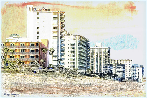
Thought I would put up an image I created a couple years ago of Ormond Beach, Florida, where Granada Boulevard runs into the Atlantic Ocean – it is a beautiful stretch of beach if you are in the area. The old Hotel Ormond, a large 300-bed hotel that was built in 1887, was located near this beach. This was one of my first attempts at adding a texture to an image – not sure what texture this is, but it definitely is a watercolor texture that goes from a yellow tone on top to blues on the bottom – the layer was set to a Color Dodge Blend Mode at 30% opacity.
The image below is also of the same stretch of beach but from 1903 – there were beautiful houses instead of high-rises overlooking the ocean. In this winter image, the sails helped move the bikes on the hard sand beach coasting at up to speeds of 20-25 mph. The image is from Shorpy Historical Photo Archive – a great site to follow on a daily basis if you love American history like me as they post a new image every day from the past. To see this image in high resolution on their site, just click on it – and click here for a similar lower resolution shot of the same bikes racing a car. This beach is where the first official automobile race was held in 1903 and the town of Ormond Beach is still known as the “Birthplace of Speed.”

I hope to shoot more local images in the near future – it is fun to live in an area that has some great local historical interest. In the meantime, try out some textures to add a little interest and fun to your own images……Digital Lady Syd
Digital Lady Syd’s Related Blogs:
Where Am I?
Getting That Vintage Look!
Russell Brown’s Paper Texture Panel Updated!
Purple Lily Pads!

Here is one of my first attempts at creating an image using a color palette I liked and not the one in the image. I just finished John Paul Caponigro‘s tutorial on Photoshop Color Strategies at Kelby Training where he teaches you how to change hues naturally to give a very believable feel to an image. He is one of my very favorite Photoshop gurus and he does beautiful fine art photography. This image actually contains: three Hue/Sat Adjustment Layers each addressing a different area of the image, a Color Balance Adjustment Layer, a Gaussian Blur filter applied to the image and selectively painted out, a Curves Adjustment Layer, a Replace Color layer, a Topaz Simplify 3 plug-in using the BuzSim preset set to a low Simplify Size, and a Wow-Frame 10 layer style. I was really pleased how the purple colors and cool tones could replace the greens and yellows and give such a wonder effect!…..Digital Lady Syd
Digital Lady Syd’s Rule No. 6: Try Something New!
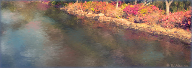
I have not done a Digital Lady Syd’s Rule recently so here is one – Try something new! This is my first attempt at creating a Monet impressionistic type painting. I used a photo from my trip to the Big Island and really cropped it down since I am still learning all the strokes and blending needed for a larger image. I followed a couple tutorials by Fay Sirkis that are now available on the NAPP website (see Painting With Your Camera and A Stroke of Genius-Photoshop Art Studio with Fay Sirkis under the Webinar link). If you want to try to paint like the famous painters of past generations, Fay Sirkis is the one who teaches it best. Can’t say enough good things about Fay – she is a great teacher, fun to listen to, and very knowledgeable about all the techniques of many famous artists. The nice thing about Fay is she provides you with all the Photoshop brushes, mainly Mixer brushes, to create the painter’s style you want to try. Therefore, when trying to do a Monet painting, you have Monet Impressionist brushes for blending, adding highlights, underpainting, etc., at your disposal, and she teaches you how she made them and how to use them. This article from Professional Photographer is a good example of her teaching method – Fay Sirkis: Painting Magic, Adobe Photoshop CS5. She also teaches classes at Photoshop World and on Kelby Training, and is one of the Corel Painter Masters.
I may not be Monet but this image was definitely a lot of fun to do – I have never tried anything like this, and it has given me a new appreciation for the type of art that Monet and the Impressionists created. I hope to try some other Master’s styles and brushes from Fay soon. So do like me and try something new!…..Digital Lady Syd
For my other Rules, click on sidebar entry called Digital Lady Syd’s Photoshop Rules.

