A Halloween AI Party
I have always loved doing Halloween images so it was a lot of fun to create this one after this rather weird AI generated background from the Photoshop Beta software was produced. The prompt used on this one was “flowers and river oil painting” – see my AI Digital Oil Painting – How To Do This Fun Photoshop Blog for more on how this was done (used Method 2 by Brian Mataish called Photoshop Generative Fill AI Can Turn Photos into Paintings. This Tidbits Blog is on just the post-processing steps used after the AI background was created.
The original AI background had this pretty scary vampire looking guy on the right, so that felt very much like Halloween. A Halloween theme was created using a free Color Lookup Adjustment Layer called SS Vieru 02 for the basic color that I thought looked really good (to download click Sparkle Stock Canyon Film). On a New Layer the Vampire was painted in using my SJ-Pastel-3 Painting Brush (see my How to Create My Favorite Brush Fun Photoshop Blog for the settings) and some cloning was done on another layer. The Remove Tool/Spot Healing Brush layer was created to remove some bad looking areas – I am finding I do switch between them (see center of my Photoshop Beta AI with Fenced Zoo Images Fun Photoshop Blog for more on this). The Pot and Fire were both generated in two different generation layer prompts and read “Halloween black witches pot” and “flames” – then smoke was added on layer above using some really old smoke brushes. The bat was generated using “Halloween bat” in the prompt. The cat is from a Halloween Obsidian Dawn vectors set ($4 set) which had the cat brush, skeleton brush and the raven brush. The cat was painted with a Cheetah Fur brush that the great Aaron Blaise taught how to make (see How to Make a Digital Brush using a Photo) and the tail was flared out to look scary (used Coyote Mange Rough Tough brush for this – still the best animal fur brushes around!). The Dark Skin Cobra Attacking Pose Snake is from PixelSquid, the greatest object resource item around – hopefully even after AI – it is a pay-to-use site. (For more info on them, check out my Some Compositing Tips and Resources Fun Photoshop Blog halfway down.) A sampled light orange was used on a New Layer to add some Fog (used Grut-I Fixray brush – he has the best brushes around – and a free brush weekly!) and then on another New Layer used the same brush with a darker sampled color for a slight vignette effect. Two layers were added as Darken and Highlight layers using Sam Peterson’s brush and colors – see my A Few Photoshop and Lightroom Tips and Tricks Fun Photoshop Blog – Tip 2 – use this for pinpointing light and shadows on an object. A Black and White Adjustment Layer set to Luminosity (because it always looks good) was added next. Used Pratik Naik’s technique Tip 2 for lightening and darkening parts of image (on new layers above set to Overlay blend mode – use at least a 100 px soft round brush set to Airbrush in the Options Bar and Flow at 9% and use white or light color to lighten image or black or darker color to darken image – different colors give some great results – use layer opacity to lower effect). This enhanced the light at the top coming and the dark in areas for more of a cave feel. Last step involved adding a New Layer on top with a few little sprinklers to add some texture in the lighted areas. Phew! That was it – took a while to complete!…..Digital Lady Syd
Another AI Oil Painted Image of the Natural Bridge
The process used for this AI image is from Brian Mataish’s video called Photoshop Generative Fill AI Can Turn Photos into Paintings using the Quick Mask to set the partial opacity selection. Check out my blog at AI Digital Oil Painting – How To Do Fun Photoshop Blog for info on this technique. This blog is to show the post-processing after the Generative Fill was created to demonstrate what can be done with an AI generated image.
Had to use the Remove Tool/Spot Healing Brush on a layer first thing (see center of my Photoshop Beta AI with Fenced Zoo Images Fun Photoshop Blog for more on this). Then a Color Lookup Adjustment Layer using On1’s Heat Wave 7 preset (yep they work in PS too) was added. I was not happy with the results yet so this time Luminar’s Neo was opened and only my favorite filter called Mystical (a bit like the Orton Effect) was selected. It was masked so the foreground water mainly used it. A swan was added using Midnightstouch Swan Lake set brush #22 (the set is on DeviantArt) – just painted over it with my SJ Pastel-3 Painting brush (it is set to 67% opacity most of the time – see my How to Create My Favorite Brush Fun Photoshop Blog for the settings) and lowered the layer opacity to blend it in. I felt a focal point needed to be supplied. A bluish texture was applied using the Adobe Paper Texture Pro panel (Caspian) set to Saturation blend mode at 79% layer opacity, and used a Levels Adjustment Layer to fine tune the using only the color Channels (followed Aaron Nace’s video called Make Amazing Photoshop Composites Quickly-part 1 at the 22-minute point – really interesting technique). A Curves Adjustment Layer for tone was added (see Denny Tang’s site with a Tone Chart Photoshop Action to download for doing this – have been using this technique as an action for over 5 years – it’s the best way to do this and use it on almost every image). There was this ugly blob on the right side of the image which was supposed to be a tree. Selected the tree area – generated it and got what you see in this image which looks so much better. The color was off a little so a Curves Adjustment Layer was clipped to it to make it match – to clip use the first icon at the bottom. Some sparkly dots were added to add a texture interest on two different layers – one using light colors and one using darker ones. Last step used Pratik Naik’s technique (see How to Create a Fun Cartoon Tip 2 Fun Photoshop Blog – on a layer above set to Overlay blend mode – use at least a 100 px soft round brush set to Airbrush in the Options Bar and Flow at 9% and use white or light color to lighten image or black or darker – different colors give some great results – use layer opacity to lower effect) to draw the eye to the swan. Still using a pretty basic workflow!…..Digital Lady Syd
AI Painted Image of Natural Bridge
Here is another AI generated Oil painted image using the same Natural Bridge photo but has a totally different feel to it. To see how this was created and what the original image looked like, check out my AI Digital Oil Painting – How To Do This Fun Photoshop Blog. The post-processing for this image was pretty simple after the AI Generated Fill background was selected (used the prompt “river and flowers oil painting”).
Started with a Color Lookup Adjustment Layer with bluish tones in it and set to 79% layer opacity (see Sparkle Stock’s free Bleak – Trellick 01 preset); a Curves Adjustment Layer for tone (see Denny Tang’s site with a Tone Chart Photoshop Action to download for doing this – have been using this technique as an action for over 5 years – it’s the best way to do this and use it on almost every image); a Levels Adjustment Layer to adjust the Blue color (followed Aaron Nace’s video called Make Amazing Photoshop Composites Quickly-part 1 at the 22-minute point – really interesting technique); a Black and White Adjustment Layer set to Luminosity blend mode (because it always looks good – see my How to Use a Black & White Adjustment Layer to See Contrast in a Layer Fun Photoshop Blog); Lighten and Darken layers using Pratik Naik’s technique (see How to Create a Fun Cartoon Tip 2 Fun Photoshop Blog – on a layer above set to Overlay blend mode – use at least a 100 px soft round brush set to Airbrush in the Options Bar and Flow at 9% and use white or light color to lighten image or black or darker – different colors give some great results – use layer opacity to lower effect) which was used especially where the light is coming into the image; and finished with a Remove Tool layer for smoothing out a couple tiny water issues. In other words most of my basic workflow – now you know what I do! Quite a difference from the original image!…Digital Lady Syd
The Tiger
Watched the Kyle T. Webster (the Adobe Brush Evangelist) video called Brush Hour: Digital Pastels. I thought he would go over his various pastel brushes he has created for Adobe Photoshop, but instead he demonstrated how to create a relatively interesting pastel painting using just a few. This was my first attempt at trying a pastel painting, but it was a lot of fun – and a little bit challenging. The tiger is the actual sketch created using an Aaron Blaise tutorial (see my A Little Aaron Blaise Digital Drawing Practice Fun Photoshop Blog). I also adjusted one of my own pastel brushes to get the nice pastel background effect as I had trouble getting the correct pressure with Kyle’s brush. It has been a long time since I used traditional pastels and doing this digitally is definitely a lot less messy!…..Digital Lady Syd
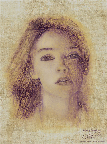
Missing You
Just had some fun using the Unsplash photo to create an interesting portrait effect using the Photoshop’s Art History Brush. If you have not tried this, you should as it can give some really nice results without really painting much. I will admit that I used my sketch brush to clean up her eyes and mouth especially. The background texture is from Kim Klassen called Hellodecember-0312. If you want to learn how to use the Art History Brush, follow a 5-minute YouTube video by Brady at Texturelabs called Ultra-realistic Sketches in Seconds! He gives you a link to the two Art History brushes that were used on this image. (If you are interested in more of Brady’s info and some more free brushes, check out another excellent video called Anyone Can Create Incredible Paintings in Photoshop with a Single Tool.) I recommend you give this type of painting a try if you want to try something different on your image…..Digital Lady Syd
Cherry Blossoms

Been missing the beautiful Spring in Virginia and the DC area so created this digital painting to get the essence of the beautiful colors of the Cherry Trees. It was started by using an image taken at the Jacksonville Zoo of trees covered with white Spanish Moss in February. Two textures by Kim Klassen were added: her Granny Cupboard (where the Blend If This Layer black tab was split and set to 187/221 to show just the tree trunks coming through this light colored texture) and Shine (a pinkish texture which was set to Darken blend mode). After that, just various layers were added using 6 different brushes in Photoshop. Also two Impasto Layer was created using a Layer Style created in my How to Create an Impasto Layer Style blog. I used Fay Sirkis’s Palette Knive Reflection Soft Blender #2 mixer brush to add the general impasto effect (KelbyOne is the only place I know that still has her brushes). Used one of Grut’s brushes to make tiny flowers – had changed it to create the blossom effect I wanted – basically little bunches of dots with Color Dynamics turned on. This brush was also used on the the Layer Style to add some depth to the brush strokes made on an earlier layer. Also used Topaz (see sidebar for website link) Lens Effects to create the soft pink color, add some light to the left side of the image, and add a graduated fog vignette. Overall it was a lot of fun to do. This is a great time to try out new techniques……Digital Lady Syd
The Red Cedar Stump

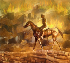
Had fun with this great image from Shorpy’s – the historical photo archive site. This image was called Pacific Highway through a Washington Red Cedar Stump and was taken in 1920. Here is a link for info on this stump which is still standing in the State of Washington. Is this guy really looking at his phone????
Recently I did a Fun Photoshop blog called How to Convert Black and White Images to Colorful Paintings with Topaz Studio 2. This image followed this technique except a different Look that was created in Studio 1 a long time ago was applied. Three filters were in the Look: Color Themes, AI ReMix (used Wave of Color Style), and Precision Contrast. Also HSL Color Tuning and Details (with settings in the minus to give a painterly effect) filters were added. Back in Photoshop Viveza was used to balance it all out. Last step involved adding a bit of a vignette so car and man stood out. It was a nice image to colorize. ….. Digital Lady Syd
Landscape of Old

Finally got back to painting. A lot I have forgotten and a lot more to learn but it was nice to get back into Corel Painter. If you have Painter, check out Davey Baker’s Painter 2018 Awe-Inspiring Environment Painting. The video was actually done in 2017 I believe, but Corel has re-released it and runs for almost an hour. He only used one brush called Wet Brush (check out his short video called How to Create Custom Wet Brush for more on this). I changed my brush from his slightly and created two more variants to do the detail work. What I did learn was that to be able to do this, you need to understand how to use the brush so practice with it on a separate layer before painting. Davey’s video had several tips on painting and other things. In Photoshop I actually used Grut’s FX Cloud Lumens (the best Cloud brushes ever made) to create the clouds as I did not like how mine looked using Dave’s Wet Brush settings in Painter. Also used Perfectly Clear v3 Magic Hour preset to adjust the exposure correctly. For final clean up work, used Fay Sirkis’s (a Corel Master but she also did PS videos and brushes at one time) Precious Oil Diamond Blender Mixer brush that I have used for years (the only place her brushes are still available is on KelbyOne – if you are a member, do a search for her name – she has 5 webinars, which are still great, and brushes can be downloaded). This was so much fun but it took several hours to complete……Digital Lady Syd
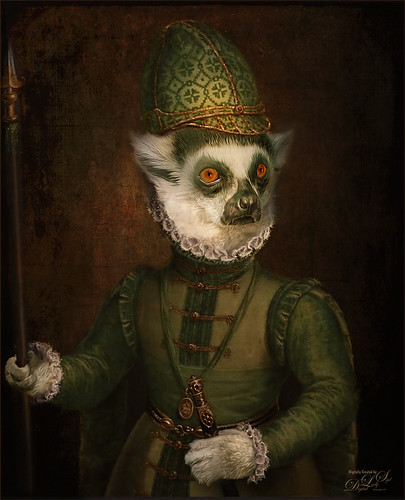
A Distinguished Forefather Lemur
I have always wanted to try this and I finally found a really great Photoshop tutorial on how to do it. This image started with a wonderful painting by Sofonsiba Anguissola called Portrait of a Spanish Prince from 1567 (it is probably an image of Prince Phillip III – the link gives some interesting perspective on this guy). Anyway, I will not go into all the steps since I pretty much just followed the steps presented in Chris Spooner’s video called How to Make a Fun Oil Painting Pet Portrait in Photoshop. This effect is especially popular with people’s pet images. The trick is to find an image that works with your pet image. It took a lot of manipulation using the Free Transform Tool with the Warp in the Options Bar to get it looking correct. And in this case, I had to use two other images of lemurs for the hands. The colors can be matched using the video after the images are combined. 2 Little Owl’s Carnevala 23 texture was added on top and set to Vivid Light at 65% layer opacity to get the illuminated effect in the background. If you want to have some fun, give this a try……Digital Lady Syd
Posing for a Portrait
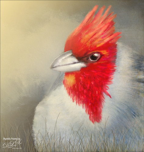
This guy is a Red Crested Cardinal and is not related to the beautiful red cardinals in the US. Although not native to Hawaii either (his image was taken at a park in Oahu), they are quite common. He was not very large in my image so the image was cropped in closely and run through my new favorite program, Topaz (see sidebar for website link) AI Gigapixel. Then I had a great image to work with. In Photoshop the same basic steps were followed that I did with my Wolf and Fox images completed recently. (See my Learning to Draw a Wolf! blog and Introducing the Beautiful Fox blog.) Since the image could be used as a guideline, I first started by sketching on a New Layer called Rough Drawing. Local Color, Shadows, Highlights, and Detail layers were added before working on the fur, textures, and overall lighting effects. Lots of layers, brushes, and time. Need to check out Aaron Blaise’s videos (links in Wolf blog) to learn the workflow. Anyway, I find it very relaxing to paint my bird buddies…..Digital Lady Syd
Introducing the Beautiful Fox
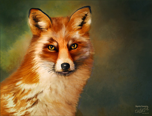
Enjoyed painting this beautiful fox – used Unsplash image by Linnea Sandbakk as a base for the painting. This follows pretty much the same painting process as used in my Wolf image except the body was not sketched first. This image contains 64 layers, so it took quite a bit of effort to get this result. Three textures were used to get the result and numerous brushes. I would go into more detail, but it is basically just finding a workflow and some brushes that work, and then painting. This is really so relaxing and fun to do!…..Digital Lady Syd
A Miniature Horse
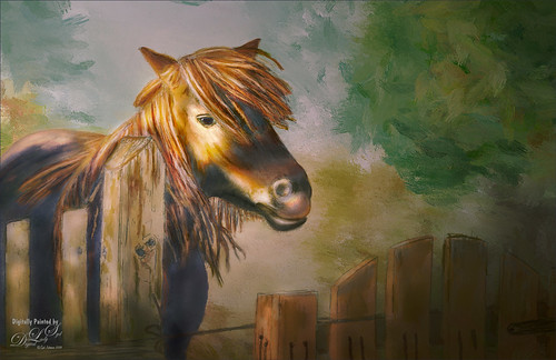
Doing a little more drawing and painting practice. This was a little miniature horse whose image was taken outside Minsk in Belarus. He was totally adorable. I decided he would make a good subject to paint. This time I did cheat a little on the rough drawing – used Topaz Simplify to create a very loose outline of the image and then removed the white using Select -> Color Range using the Shadows in the drop down. Then the Refined Drawing was done from this. After that the Local Color was added, Shadows and Highlights, and finally the texture was added to the horse, fence and gate. It is essentially the same workflow as was used in my Wolf drawing – see my Learning to Draw a Wolf! blog. Follow the links in my wolf blog for the great video by Aaron Blaise on how to do this. The background is one I created in Corel Painter a while ago and just seemed to fit this wonderful little guy. I am really enjoying trying out this new painting style in Photoshop. …..Digital Lady Syd
Blowing a Kiss
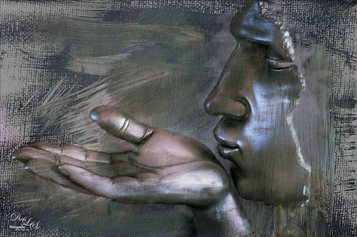
On my Fun Photoshop blog (see my Using a 50 mm Lens as a Macro Lens – Really? blog) recently I had two image taken as macro’s on the face of the above sculptor. Thought I would do another macro image, this time using my regular lens and not a flipped 50 mm lens, and get a little creative with the RAW file. This image was just basically post-processed in Lightroom using mainly the Basic Panel. Then in Photoshop Melissa Gallo’s Taupe Canvas (no longer available) was placed on the bottom, then a black layer mask was placed on the LR image on top. Just painted back in what I wanted to see using a couple different brushes at different brush opacities. Created a Darken Layer to outlines the focal point lines and a New Layer for a white Spotlight Effect on the face and hand. A Black and White Adjustment Layer set to Luminosity blend mode to adjust the colors. Then Blake Rudis’s action called 5 Tone Heat Map was used to add some more subtle color to the image – set to 88% layer opacity. I sort of like the feel of the image…..Digital Lady Syd
Blowing in the Wind
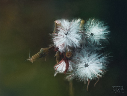
Got back to basics and painted this image of what I believe is some variety of dandelion. Painted using three main parts: a background layer to begin, then blocked in the main subject on a middle layer, and detail was added on top, which took several layers and different brushes. Mainly used Fay Sirkis’s (a Corel Painter Master) PS mixer brushes. (These brushes are pretty hard to find now but worth it if you paint in PS – KelbyOne still has them if you are a member – just search for her name.) Hypothermia action was applied at 24% layer opacity (See Chris Spooner’s 10 Free Winter Blues Photo Effect Actions for Adobe Photoshop blog). And another fabulous action by Blake Rudis was applied – got to check out How to Use the 5 Tone Heat Map in Photoshop video and try this. Last step added a grain layer I built a while ago and put in my Library in PS. Lots of fun to paint again…..Digital Lady Syd
Me and My Shadow
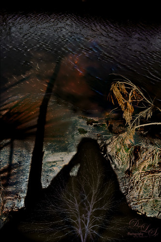
This image represents to me a contemplative mood – a connection with the Fall season and nature, and the nature of man with nature. It was a lot of fun to create. A tree from Pixelsquid was added into the shadow. Some of the colors are from using Lucis Pro. Topaz (see sidebar for website link) ReStyle’s Single Fawn was applied to the image. This image was taken into Luminar 2018 (see sidebar for website link) and the Adjustable Gradient Filter was added to the whole photo and the Sun Rays filter was added to just the foreground tree by using a layer mask. Loved how the tree turned out. PS Liquify filter was used to stretch the foreground tree where I wanted it. Some clean up layers and that was it. Love the whole concept of this image…..Digital Lady Syd
Just a Pretty Flower
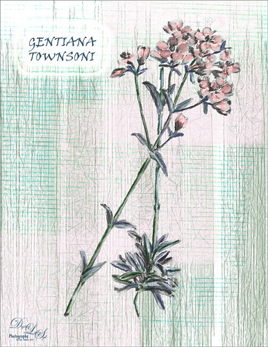
This pretty flower is from an old album called Illustrations of the New Zealand Flora (Plate 139) published in 1914. It was just a black and white line drawing and I added the color and texture. The image was removed from a page on the downloaded PDF file using the steps in my How to Create Vintage Text for Images Fun Photoshop Blog -just go towards the end for steps to pull images. I am afraid I took a little color liberty here as the volume says the flowers are actually white, but I liked the pink color. The flowers pink color was created by using a Curves Adjustment Layer’s individual Red channel with the layer mask filled with black (CTRL+I in the mask) – just painted in the pink on the petals – layer was set to Color blend mode. On a separate blank layer under the outline, painted in the green textures using Grut’s I Qwillo (I love this brush for drawing and painting!) and a Mixer blender to paint in the leaves and stem. Below that but above a white background layer a texture was painted – just experimented with a couple of my brushes and took just the texture layer into Topaz Studio. The Radiance filter was applied so the fine lines showed up – I thought it matched the line drawing effect of the flower. The font is Viner Hand ITC and an Outer Glow layer style with a Contour change was used to make the text stand out. The original outline was set to 15% layer opacity at the top of the layer stack. That was it. Lots of fun. I really enjoy looking at the old volumes of animals and plants. ….. Digital Lady Syd
Who Got into the Paint Pots?
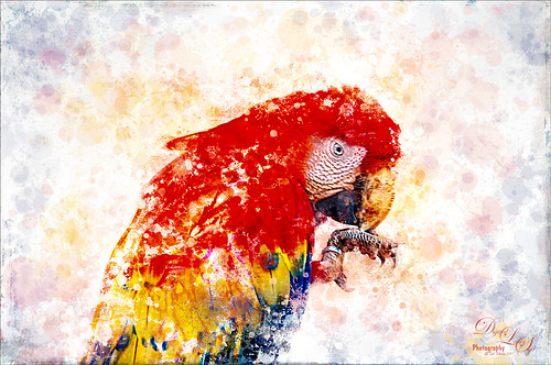
Just had a lot of fun playing with this image by following an older video by Aaron Nace called How to Turn a Portrait into Painting in Photoshop. It is sort of a crazy and long workflow, but I enjoyed making a few new brushes to just splash around with color. Lots of problems with the original macaw image taken at the Palm Beach Zoo. There were fence line shadows over the whole bird, then the bird had to be selected with Mask & Select in PS before adding the several PS filters shown in the video. Finally the fun began with lots of layers and brushes and some Topaz (see sidebar for website link) Glow and Nik Viveza 2 to sharpen him up a little. This took a while to do, but it really was a lot of “fun!”…..Digital Lady Syd
Meet Elvis
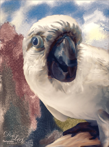
How often is it that you are walking in your neighborhood and a neighbor walks by with a beautiful white cookatoo on her shoulder? This was one of the nicest, most engaging birds I have ever seen. Quite willing to pose, talk a little, raise his feathers for a “photo-op,” and look at pictures on a phone. Wow! What a personality! My camera phone does not do him justice!
In Lightroom Trey Radcliff’s Sunday Time Alone preset was applied, and the Radial Filter was used to add a slight vignette feel. In Photoshop a couple clean up layers were done and one of my Liquid Ink textures from Corel Painter was added behind him. This bird is a super-model!…..Digital Lady Syd
A Wintry Scene
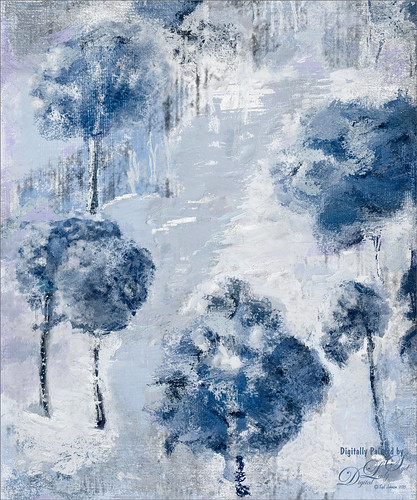
Just practicing my painting some more. Love painting these wintry scenes even though it is so hot outside. Not too much to this image other than it was first painted in Painter, then taken back into Photoshop, taken back to Painter, and ended up in Photoshop. Phew! Used several brushes in each program. Two textures, each with a Hue/Saturation Adjustments Level clipped to it, with the Saturation slider set to -100 so no color was added, only texture. Just fun to paint!…..Digital Lady Syd
I See You! Checking Out a Snowy Egret
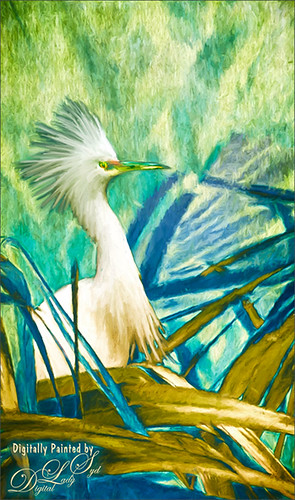
Another shot of a beautiful Snowy Egret from the St. Augustine Alligator Farm Rookery. This time it was painted twice – once using Mixer Brushes and once applying Topaz (see sidebar for website link) Impression Cezanne II preset. Photoshop’s Flat Angle Mixer was used to do a lot of the paint clean up……Digital Lady Syd
Taking Off From the Rookery Runway
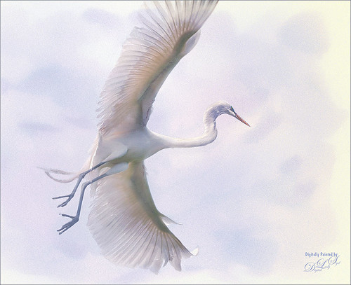
I have photographed similar images to this one of a Great Egret, but I never get tired of it. These birds are just beautiful, and in flight, even grander. This time I used a new technique from one of my favorite texture people and nature photographer. Jai Johnson recently created a video called Peach Blush Texture Demonstration on her techniques for getting her exquisite images. The one caveat is that she uses Topaz (see sidebar for website link) photoFXeffects, which I love, but does not work with CC2014 – therefore you must use CC or CS6 to use the PS interface. She also does not use Photoshop, but does all her work in the stand-alone of this interface. In Jai’s case, it does not matter as she has figured out some incredible ways to get a painterly effect by using basically the photoFX’s mask feature. I had a lot of fun doing this, but it took a while to get this correct effect. The background was one I created in Painter, and the overall grainy effect was created by setting the FX plug-in layer to Dissolve at 64% – it really give the painterly look. I used Nik Viveza 2 and a Curves Adjustment Layer to do final adjustments. Totally love the results I got using her technique. Thank you Jai!…..Digital Lady Syd
Digital Lady Syd Related Blogs:
Digital Lady Syd’s Review of Topaz photoFXlab v1.1
A Wintry Scene
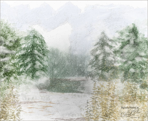
This is just a another image I created using mainly Aaron Blaise’s Foliage and Water brushes in Photoshop. In Painter some of the snow effects were created using Gel’s 2009 Holiday brushes and Fay Sirkis’ blender brushes. The Impasto sky was created using on one of Melissa Gallo’s brushes. In Photoshop three snow layers were added and Shadowhouse Creations Assorted Brush set tree brush 4 for background effect. As you can see, this is made up of a lot of different brushes and a little of my own painting. Not sure why I went wintry today, but it was a lot of fun to do…..Digital Lady Syd.
Sailing!
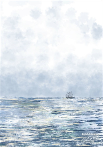
Totally love these new inexpensive Photoshop brushes I purchased from Aaron Blaise’s (a former Disney artist) website. This image used both his Water Brush Set and his Cloud Brush Set. (Check out his videos as he gives lots of just great digital painting tips throughout his demos.) This image was composed of one Cloud layer using his SB 46-12 brush (a major cool cloud brush) and three Water layers using three brushes: his SB 44-13, a really nice larger waves brush, SB 45-13, smaller sized waves for more distant effects, and SB 50-40, a very flat thin wave effect that could be used for horizons or fill in color waves. The sailboat is from Vector Art Box – set to a 40% layer opacity to give a slightly dimmed look. The layer was set to Multiply at 100% layer opacity, then duplicated and set to 21% layer opacity just to make the boat show just right. Last step was a Curves Adjustment Layer to add a little contrast to the image. Done! This was so easy to create and it is so much fun to use these brushes……Digital Lady Syd
Digital Lady Syd Related Blogs:
Just Some Photoshop Fun This Week!
How to Create a Watercolor/Ink Image in Photoshop
An Artsy Sketch

Just playing around with an effect I learned from a tutorial by Lesa Snider called How to Convert a Photo to a Colored Sketch with Photoshop. It actually did a pretty nice job on this image. After converting the image to a sketch, I went to the Select -> Color Range and chose Highlights in the drop-down menu. Check Invert box and say OK-a layer mask is applied to the image selecting the background. Next I applied two textures I have created underneath the sketch with the top layer set to Hard Light and the Blend If This Layer black layer set to 101. Created a stamped layer (CTRL+ALT+SHIFT+E) and added a Curves Adjustment Layer for some contrast. Next several layers were created and just different areas were painted to emphasize them. Created another stamped layer and applied Topaz (see sidebar for website link) ReStyle (Peach Prairie preset with changes to Sat Primary 0.02, Third -0.05, and Fifth 0.25; and Primary -0.58, Third -0.20, and Fourth -0.36; Basic set to Color Blend Mode , Tone White Level -0.37; and Details Structure -1.00 and Sharpness -1.00 to get a more painterly look on the colors). Added a copy of the image before ReStyle was added and set it to Luminosity at 42% layer opacity to tone down the colors a little. Sort of a crazy looking image, but was still a lot of fun to play with all the colors……Digital Lady Syd


