The Lioness
This drawing is one created by following the great Disney drawer Aaron Blaise’s tutorial on creating Lion Heads in his How to Draw Big Cats set. He provides a head skull drawing to use as a template to draw the actual structure of the head for eye, jaw, cheek, and ear placement. Fabulous technique! He also gives lots of tips about the actual animal and its traits. The background was created using three different textures: the bottom one was just a middle gray color; the one on top was one I had previously created in his Wildlife Painting Bundle – Lion Painting Tutorial (87% layer opacity); and the top used one of the free Japanese textures (to convert to pattern go to Edit -> Define a Pattern) from Resource Boy at DealJumbo (Pat 268 rev at 10.23 Angle and 297% Scale) – it was converted into a pattern. To get the pretty orange and turquoise colors in the background a Color Lookup Adjustment Layer using SparkleStock Clover 3DLUT file SS Sham Rocker 02.cube (link for the free ones but can’t fine direct line to the free Clover LUTs) with the Table Order set to RGB (was set to BGR), Lighter Color blend mode, and Layer Opacity of 88%. A couple other adjustment layers and a Camera Raw filter for a slight vignette were added to finish up. I totally love Aaron’s drawing tutorials and all the great tips he gives you!…..Digital Lady Syd
Dancing Maiden

Had a lot of fun just being creative with this one. First ran a Grok AI Image Generator character using the prompt “create vector black and white full length sketch of a young lady dancing gracefully” to get the pretty maiden dancing. Then decided to put her in a free file called Scribble Portrait Effect by Deeezy. Also downloaded Deal Jumbo’s 500 Free Photoshop Brushes and added a couple to the image along with the scribble border (use Free Transform to get the brush stroke to fit the image). An old Melissa Gallo impasto texture was added at the bottom. After making all the changes, put a stamped image into an old filter by Topaz called ReStyle to get the pretty frozen look. Added in some snow and free text also from Deeezy is Fladeo inline grunge. That was it!….Digital Lady Syd
Looking Forward
No AI – just drawing and painting. Another Mark English inspired image. Love using a Chalk Brush to paint these little portrait images. This one used the same brushes as in my short Tidbits Blog called How I Am Feeling ATM. Used one of my older Melissa Gallo textures – she used to sell the most beautiful textures and this is one of them. The netting and detail on the dress are all brushes by Jessica Johnson (need to get her E-mail as she gives away some really fun brushes). And to get this nice bright color feel, a little tip I learned using the Photo Filter Adjustment Layer. Try setting to Warming Filter 85 to start with and a Density of 85 – change layer blend mode to Multiply and reduce the layer opacity to taste. Instead for this image, the Filter was set to Red, Density to 52 with Preserve Luminosity on, Linear Burn blend mode, and 48% opacity. Can really adjust as you wish! ….. Digital Lady Syd
Merry Christmas!
Merry Christmas to everyone – hope this Holiday brings you much good cheer! I enjoyed making this candle card – pretty simple and lots of fun. Basically ran from the Contextural Task Bar a prompt saying “Lit Yellow candle in the middle of the image with no decorations around it” – Cinematic and Cartoon Effects were check. Took 4 Variation runs to get the one I liked, but finally did. To get the pretty greenery, just followed Jessica Johnson’s Behance video called Creating a Stylized Holiday Holly Illustration in Photoshop & New Brushes. By using a simple Pointed Arrow as a brush tip, many different kinds of fern-like greenery can be created. Most of them were Pattern Stamp brushes with different color swatch patterns used to create the interesting colors in the branches. Mixer used to paint the berries and a little gold dazzle using a gold layer style. She has lots of info on how to do this on her website. I found it was a lot of fun to create this card and make some new brushes. Happy Holiday!…..Digital Lady Syd
How I Am Feeling ATM
I like Mark English‘s work a lot and decided to try it again to get my creative vibe flowing. Not sure this is exactly a “self-portrait,” but I do think it represents my recent feelings. For info on how I discovered his art, check out my Masked Tidbits Blog with more info on this. No AI was used in this image – all digitally drawn and painted in Adobe Photoshop 2024. Just a couple things make this image unique for me – I created a brush to give a really heavy texture feel to the image. In a 50-pixel Chalk brush, I added a texture pattern from Jessica Johnson – she uses this pattern (TM-6) a lot in her brushes (see Texture section of brush to download-check the little + sign on right of pattern), but I did not use her Pattern Stamp brushes, just the texture. Since Transfer’s Flow Control Panel was set to Pen Pressure only, it can be painted over to get a more dense effect if needed. Used the same texture pattern in a layer style for the hair with the Pattern Overlay set to Opacity 17 and Scale 93 – layer was set to 46 Opacity and Fill 0, and just the hair was painted over on the layer. Otherwise just the same workflow for drawing. Lots of fun to create this…..Digital Lady Syd
Lighting up Piccadilly Circus
Very classic view of Piccadilly Circus – added the Milky way to spice it up a bit. Decided to try out the new Lightroom Detail’s AI Noise Reduction Denoise Filter on an older image taken at night. It worked pretty darn good! If you have LR, check it out. It may take a while to process, but it will improve you image! In Photoshop used the Remove Tool to try to get ride of some of the more obvious people in the image and some distracting bright spots – worked fine also. Then added Serge Ramelli‘s Milky Way texture and set it to Color Dodge. By using the Blend If in the Layer Style (Current Layer black tab split and set to 0/96), it looked more natural in a city setting. A Color Lookup Adjustment Layer using Africa from Photo Focus – set to Screen blend mode. Used a Selective Color Adjustment Layer to adjust colors a little and that was it. Totally impressed how well an unusable turned out!…..Digital Lady Syd
Beaching It
Flipped my selfie to give a little different look here. The selfie bathing suit was generated in Photoshop using the prompt “digital oil painting bathing suit.” This time, the background was generated in Adobe Firefly using the prompt “digital oil painting ocean beach scene with people in the background” and using the styles of Art and Acrylic paint. It was saved as a jpg and brought into the selfie file as a layer underneath her. The selfie blocks the people that were on the beach. The red palm tree over her head was generated in Photoshop afterwards. By using Apply Image and using a layer mask, it could be added to the Firefly layer. Otherwise it was just the usual brushes. Wish I was in this scene!…..Digital Lady Syd
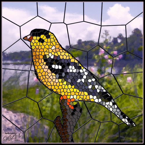
My Stained Glass Birdie!
Had fun creating a different type of image. I found a video from Marty at Blue Lightning called How to Transform Photos into Stained Glass Windows in Photoshop! Marty has been doing PS videos for a long time and has some really nice ones. This video has a lot of steps but overall it is pretty easy. The main filter used was PS’s Filter Gallery-Stained Glass filter in the Texture group. I did need to add some clean up layers underneath the stained glass layer where some of the colors were off. Also had to adjust the layer styles to fit the resolution of my image so the stained glass leading looked right. The bird is one I drew (see my Tidbits American Goldfinch blog for how this was done) – just used the drawn bird and not my original background. This background is from a photo taken of the Halifax River (International Coastal Waterway or ICW) in Ormond Beach, Florida (see my Fun Photoshop Painting Effects – Which Ones to Use? blog that used this photo.) PS’s Filter Gallery-Glass filter in the Distort group was used on it. Overall just enjoyed trying a new effect. …..Digital Lady Syd
The Frontier Saga Movie Poster
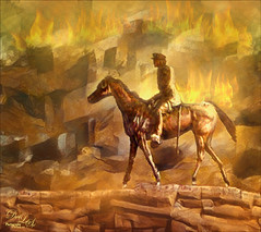
Just had fun creating this after watching a couple videos this weekend that got me inspired. The original image is from Unsplash (etty fidele-457310-Bologna Italy – can’t find a link as it is an old download). It was cropped down using the Default Crop, and then followed a pretty cool video by Marty at Blue Lightning called Create a Pencil Drawing from a Photo (he supplies you with brushes and a paper texture also). My image was turned into a brown and yellow one by adding a Gradient Map on top that went from oranges to reds and was set to Vivid Light blend mode at 98% opacity. Next extended down the image using the new Crop Tool Generative Expand – incredible. In the prompt typed “brown and yellow western scene pencil effect” and that is where the little scene at the bottom appeared in the one of the choices. How did I know to do this? I also watched this really interesting video by Lisa Carney (Hollywood poster creator) and Tomasz Opansinski (Creative Technologist for AI/ML at Adobe) where they talked about everything posters. It was called Adobe Firefly Live Weekly Meetup: Using Ai for Entertainment Design and that is how I knew to add a little scene at the bottom – classic poster design. His glasses were removed using the Remove Tool which did a great job on this. The rest was just basic Photoshop creating 3 Text layers and some glows around them and some clean up. Creating digital posters is really fun to do!…..Digital Lady Syd
Older Woman of Another Generation
I recently read an interesting article Unveiling the Intriguing World of Face Cubism: Exploring the Artistic Journey on how to do a Basic Cubism Portrait so it seemed like a good idea to try it out in PS Beta AI. Using an image by Jude Infantini at Unsplash, it did not work well, but I did get an effect that I sort of liked. Actually it looked like a man with all this hair (because I used Dave Kelly’s Gen Fill Photo Painting Action set to 40% so the image will not look much like the original), but the overall image was quite striking. Added several New Layers on top and just started painting in the image the way I wanted it. Added in the necklace using AI – with the Lasso Tool selected where necklace should go, I ran Generative AI again (Prompt: Native American Necklace). Ended up using a Curves Adjustment Layer, the Sharpen Tool, and a Layer Style to finish off the image. I am currently reading The Travels of Marco Polo, and I think this rather older woman could possibly look like what a women of this region from back in the 13th Century. Anyway, it was fun to ponder…..Digital Lady Syd
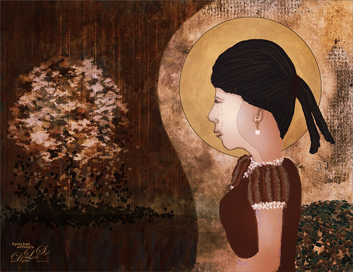
Masked
Kyle T. Webster, the Photoshop Evangelist at Adobe, recently did two Masterclass YouTube videos called Learn from Greats – Mark English – Part One and Part Two. In Part One many of the Mark’s various pieces of art and how he created the images were discussed, and in the other Kyle created an image showing how to use some of these same techniques. That is what was attempted with this image, but it is a lot less abstract than most of Mark’s images. 26 different PS brushes were used – some created on the fly. Several layer styles were added and even PS’s Craquelure filter was used (lower right bush). Three Color Lookup Adjustment Layers and three Texture Layers were used. Lots going on here, but it was a lot of fun to try and get some of the expression that Mark English had in his paintings. I am going to try and get a better example using his techniques soon!…..Digital Lady Syd
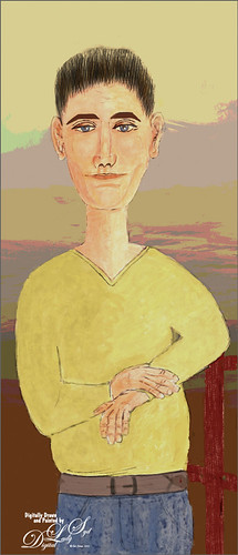
Modigliana Guy
Totally had fun creating this sort of cowboy-looking guy while trying to do another Modigliana figure as in my recent Fun Photoshop Blog (A Few Photoshop Digital Painting Tricks You May Not Know). Been following some of the tips in Aaron Blaise’s class on Clear Expression to learn face object placement (watch for great sales on his various classes). The painting took a long time to do, but eventually it was drawn to get a Modigliana perspective. The background was created with one of my Painter backgrounds and setting 9 Levels in a Posterize Adjustment Layer. A Kyle T. Webster Tilty Pencil Variant (from Winter 2022 set) Mixer was converted to a regular brush (changed Erodible Tip to Small Round and 9 px Tip; added Shape Dynamics Size Jitter 11%; Texture Scale slider changed to 28%, Brightness 60, Contrast 10, and Texture Each Tip checked; and Transfer With Opacity Jitter also checked – use all other settings from the Mixer and it turns into a really nice sketch brush). Also Kyle’s the Hunky and Heroes Heavy brushes from the free Bowie Set (located in the Adobe Cloud-search for Bowie Toolkit) were used to paint his clothes. Aaron Blaise’s favorite brush was used for the face and skin. Used The Etherington Brothers various tips for the face and hands – lots of good information here. He may not be the best thing I have ever drawn, but I am learning a lot about drawing!…..Digital Lady Syd
Uber Driver in Venice
Just had fun with this one mainly trying out different brushes to see what would happen. The really cool texture effect for the orange buildings came from Kyle T. Webster’s Winter 2022 set – using the Winter BG Variant on the orange buildings. In the Spring 2022 set from Kyle, The Marshall was used to create the bridge and The Marshall Var was used to create the white church building. The Tilty Pencil Soft and the Tilty Pencil Variant were used to create a few of the black sketch lines in the image. In the 2022 Spring Set Tree Leaf Mess Alt and Fresh Leaf were used to create the leaves in the tree and plant. Just used a pencil brush I created to paint the Boat and Gondolier – pretty rough sketching here. Three textures were used: Kim Klasson’s Womandweathered (Soft Light blend mode at 50% opacity), 2 Lil’ Owls Mosaic Set Celeste (Linear Burn blend mode at 23% opacity), and Adobe Paper Texture Pro Villa Adriana (Overlay blend mode at 40% opacity). Had to blend out some of the shadows with a Mixer blender brush. That meant I had to go into the Camera Raw Filter and add some grain in so it did not look too smooth. Overall it was cool to try out some of the new brushes. ….. Digital Lady Syd
The Tiger
Watched the Kyle T. Webster (the Adobe Brush Evangelist) video called Brush Hour: Digital Pastels. I thought he would go over his various pastel brushes he has created for Adobe Photoshop, but instead he demonstrated how to create a relatively interesting pastel painting using just a few. This was my first attempt at trying a pastel painting, but it was a lot of fun – and a little bit challenging. The tiger is the actual sketch created using an Aaron Blaise tutorial (see my A Little Aaron Blaise Digital Drawing Practice Fun Photoshop Blog). I also adjusted one of my own pastel brushes to get the nice pastel background effect as I had trouble getting the correct pressure with Kyle’s brush. It has been a long time since I used traditional pastels and doing this digitally is definitely a lot less messy!…..Digital Lady Syd
Early Morning Tree Jumping
This image was taken at the St. Augustine Alligator Farm. The sky was bright and clear so I decided to try adding some fog into the image. It was actually a lot of fun – just followed Glen Dewis’s video called Try This for Adding Smoke, Fog, Mist and Clouds into Your Pictures Using Photoshop. It is a pretty simple technique. Also, to get the color I wanted, a Color Lookup Adjustment Layer using the Late Sunset preset set 88% layer opacity was used. On some of the areas that did not have blur on them, a large soft Mixer Blender brush was used (could have used a Smudge Tool instead) to paint over, and then immediately after stroking, went to Edit -> Fade to bring back some of the detail from underneath. Really helped balance out the fog spots. The font is Argentina Script…..Digital Lady Syd
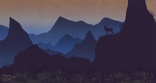
Waiting for Sunset
Just had some fun creating a little atmospherics image. Following Aaron Blaise’s Digital Painting videos – these are from 2017 but they are still really relevant. One of the sections is called Creating Atmospheric Perspective using Layers. It was a lot of fun to do and pretty easy. Just used a Hard Round PS brush with Transfer on for the mountains layers and with a lighter color added using the Gradient Tool for atmosphere layers. Can make as many mountains and as much atmosphere as you want. The foreground flowers are from Maddy Bellwoar Hand Painted Gouache Brushes Plant and Flower set – Wildflower Stamp 9 – really nice. The deer shape is from a Photoshop set by Timoes Animal Shapes from 2002 and the grass reeds were created in Aaron’s class. Lots of fun. And Aaron has just released a new digital class but I have not tried it yet. I am sure it is also great!…..Digital Lady Syd
The Bubble Creature
This is a little creature I created following Adobe Evangelist Julieanne Kost’s How to Create a Smoke-Flake in Photoshop short video and written tutorial. There is an action used to created the basic geometric flake that can downloaded if you scroll to the end of the linked site. It was created from a smoke image and totally surprised me as to how easy it was to do. My flake was Free Transformed and a background was created. A few items were added and the bubbles painted on were from a PS brush set called bubble_brushes_by_jennyle88-d7bl6zd from DeviantArts. When doing this technique, make sure your image is not too big. My initial image came out to be over 4 Gigs (Yikes!). To compensate, the smoke image was changed to an 8 bit mode, and 6 inches X 6 inches at 200 res in the Canvas Size dialog. This is just a fun thing to play with in PS!…..Digital Lady Syd
Winter in Indiana
Just practicing my painting and decided to do an abstract from one of my childhood haunts. The originals of this image were really of the lake trying to freeze but I decided to add a little more drama for my image. In this case, the lake has frozen and melted several times to get this rough edge.
One reason this image was done was to try out a couple Smudge brushes created since I discovered I don’t have any in my favorite painting tool set. Basically followed the older Digital Painting Techniques Volume 1 from Brian Recktenwald tutorial. It served the purpose and several brushes were made and used on this image. Also a lot of painting was done with my SJ Pastel 3-Painting (have used this brush forever – great for just painting in solids with a little texture in it.) I also downloaded Daarken’s brushes and used one called Texture Sample Brush 45 3 to add the icy feel to the image. Used Carlos Cabrera’s brush for the overcast clouds from the same book. The bird set is called Bird Brushes by Canmax Stock-SB 3. Lots of other brushes were used like Kyle’s Animator Pencil 2016 and his Glide Sketch Pencil and David Belliveau Mixer Brush. Last step used Viveza 2 to get a nice focal point to the birds……Digital Lady Syd
The Christmas Tree
This image is from ISO Republic and is one of my favorites to try new techniques on. This time a Photoshop file was used to get the original painterly effect, then I painted on a black and white version and added a free music sheet to give a holiday flair. The PS file is from Deeezy called Free Paint Art Creator – has a smart object in it and you just add your own folder and adjust all the layer settings – no PS action involved. Lots of fun! Then obviously several adjustment layers were added on top. A black and white version was created. Painted over layers set to Linear Burn blend mode for the dark red paint layer and Soft Light blend mode for the lighter green and beige layers. No particular brush is needed – just something you like to use. I will caution that the file gets quite large due to all the layers in the PS file. After doing this changes, I created a stamped layer on top and made a new document – to do this right click on the layer and select Duplicate Layer – in drop-down Document field, chose New and rename it to a new name. Then immediately save it as a new document using this name. Now there are two documents and you can finish up the post-work on one that is not so large. Happy Holidays Everyone!….Digital Lady Syd
American Goldfinch
Spent what seems like hours working on this gorgeous Goldfinch. The reference photo was by Stephen Walker at Unsplash. Totally drawing and painted following the technique in the Behance Video called Painting Beautiful Birds in Photoshop with Maddy Bellwoar. I am still working on the second half, but the technique used on this bird is from the first part. She provides brushes to draw and paint with and spend a lot of time showing how to draw birds. Excellent tutorial! The flower brushes are from her Hand-Painted Gouache Brushes for PS and Procreate that she just released. I used some of them as Pattern Stamp brushes. The Pattern used was from Jessica Johnson at Creators Couture using her Romantic English Garden Multi-color Floral Set – this set has some beautiful floral patterns, and some great Pattern Stamp brushes too. The background was created using Kyle T. Webster’s 2020 Summer Set’s Brix Brush in Photoshop. A Lookup Table using the Cerulean preset gives it this bold dark blue/purple effect. Otherwise bunches of layers and brushes and hours but lots of fun to do!…..Digital Lady Syd
Who’s Looking at You?
Had some fun creating this rather strange composite using the landscape file Autumn 18 by Moonloop and a free deer object from Tara Lesher (this guy has shown up in several of my images). The first thing was to go into Edit -> Sky Replacement and choose a new sky (in the Photoshop Spectacular group – 005byJKost) and several of the sliders were adjusted to match the sky tones to the overall image. This layer was duplicated and a selection of the foreground with the trees was made – used the Quick Selection Tool to select the sky and inverse the selection (CTRL+SHIFT+I). Added a layer mask to the duplicated image layer and the sky is now removed with only the foreground on the layer. Placed the Deer object under this layer and moved it around so his head sticks out from behind the trees. To make him blend in better, a Multiply blend mode Shadow layer was created and clipped to the Deer using a light gray tone to paint some shadow on the left side of his face and lower body. Then a Color Balance Adjustment Layer was clipped to the Deer also and just the Shadows were adjusted. Above that a Levels Adjustment Layer was clipped to the Deer where the Output black slider was set to 28 to remove some of the dark contrast on him. Clean up was done in the mask on a few of the tree edges that did not get selected completely. Added a Color Lookup Layer Adjustment set to Choi Hung Estate LUT from SparkleStock. Used the Sharpen Tool to slightly sharpen the Deer eyes, whiskers and right ear. Then created another Multiply Shadow layer and Color Dodge Highlight layer to tweak the lighting effects just a bit. Last step was to make a very light vignette on image using a Levels Adjustment Layer (see my Using a Levels Adjustment Layer for a Vignette blog). To learn how some of these steps were done in more detail, check out Sam Peterson’s Photoshop Daily Creative Challenge Day 3 on Photoshop Manipulation YouTube video from Adobe Creative Live – he explains this whole process very well. Lots of fun here…..Digital Lady Syd
Celebrating Winter
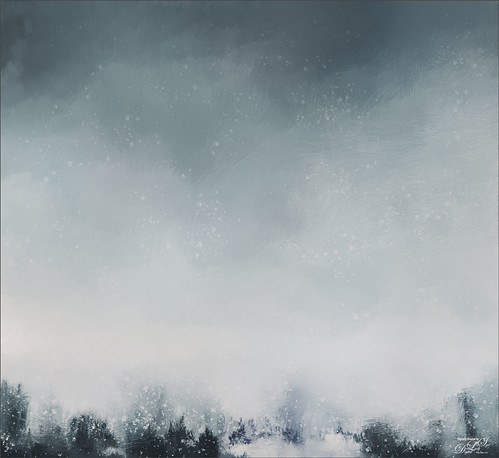
Just practicing painting. This is one that I created following a set of videos called Painting with Photoshop from Corel Painter Master, Melissa Gallo from many years ago. This series is still the best one out there to learn how to paint in Photoshop. This image used several variations of her Pencil Sketch Brush which comes with the workshop. If you really want to learn how to do this, it is totally worth the money. Created this image due to the fact that everyone is getting large amounts of snow this week. Enjoy the beauty of wintry mess!…..Digital Lady Syd
Expressing with Music
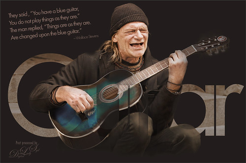
Was rather taken by this image of a man playing guitar from Pixabay. I used to play some guitar years ago so I am sort of partial to this instrument. There was another Photoshop Virtual Summit and one of my favorite presenters, Corey Barker, had a great video which included the above text effect. My first step involved adding three Luminosity masks for Highlights, Shadows, and Midtones – action info thanks to Blake Rudis, another excellent presenter. Then just Sharpening and Hue/Saturation Adjustment Layer changes. The last step involved creating the text effect by converting it to a Shape Object and using the Paths panel to drop out the text. A lot of new things to learn here and lots of fun…..Digital Lady Syd
Enjoying the Day
This is another example of an image that I colorized using the steps from my How to Convert Black and White Images to Colorful Paintings with Topaz Studio 2. I did use Topaz (see sidebar for website link) Sharpen AI and of course Topaz Studio 2 using the same preset as in the my original blog except the ReMix filter was set to Colored Marker for a style. Added a Color Theme filter to get the colors just right. To get a really nice effect, Topaz Lens Effect was applied for a bit of golden feel. That was about it. So fun to do these vintage images!…..Digital Lady Syd


