The Lioness
This drawing is one created by following the great Disney drawer Aaron Blaise’s tutorial on creating Lion Heads in his How to Draw Big Cats set. He provides a head skull drawing to use as a template to draw the actual structure of the head for eye, jaw, cheek, and ear placement. Fabulous technique! He also gives lots of tips about the actual animal and its traits. The background was created using three different textures: the bottom one was just a middle gray color; the one on top was one I had previously created in his Wildlife Painting Bundle – Lion Painting Tutorial (87% layer opacity); and the top used one of the free Japanese textures (to convert to pattern go to Edit -> Define a Pattern) from Resource Boy at DealJumbo (Pat 268 rev at 10.23 Angle and 297% Scale) – it was converted into a pattern. To get the pretty orange and turquoise colors in the background a Color Lookup Adjustment Layer using SparkleStock Clover 3DLUT file SS Sham Rocker 02.cube (link for the free ones but can’t fine direct line to the free Clover LUTs) with the Table Order set to RGB (was set to BGR), Lighter Color blend mode, and Layer Opacity of 88%. A couple other adjustment layers and a Camera Raw filter for a slight vignette were added to finish up. I totally love Aaron’s drawing tutorials and all the great tips he gives you!…..Digital Lady Syd
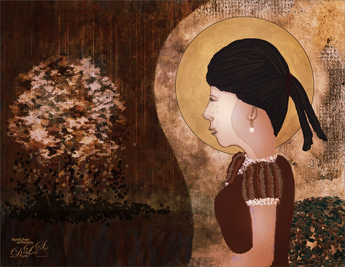
Contemplating Life
Still using the Chalk Brush to paint. And Mark English does always inspire me even though my drawing does not look like his work. This image used a Melissa Gallo Pastel Texture for the background. A Pattern Fill Adjustment Layer was applied to create the shirt patterning. My old version of Viveza 2 was added to pop the colors (still my favorite overall filter). PS’s Camera Raw Filter was used to brighten up his face. Enjoying making these little portrait images!….Digital Lady Syd
Looking Forward
No AI – just drawing and painting. Another Mark English inspired image. Love using a Chalk Brush to paint these little portrait images. This one used the same brushes as in my short Tidbits Blog called How I Am Feeling ATM. Used one of my older Melissa Gallo textures – she used to sell the most beautiful textures and this is one of them. The netting and detail on the dress are all brushes by Jessica Johnson (need to get her E-mail as she gives away some really fun brushes). And to get this nice bright color feel, a little tip I learned using the Photo Filter Adjustment Layer. Try setting to Warming Filter 85 to start with and a Density of 85 – change layer blend mode to Multiply and reduce the layer opacity to taste. Instead for this image, the Filter was set to Red, Density to 52 with Preserve Luminosity on, Linear Burn blend mode, and 48% opacity. Can really adjust as you wish! ….. Digital Lady Syd
Masked
Kyle T. Webster, the Photoshop Evangelist at Adobe, recently did two Masterclass YouTube videos called Learn from Greats – Mark English – Part One and Part Two. In Part One many of the Mark’s various pieces of art and how he created the images were discussed, and in the other Kyle created an image showing how to use some of these same techniques. That is what was attempted with this image, but it is a lot less abstract than most of Mark’s images. 26 different PS brushes were used – some created on the fly. Several layer styles were added and even PS’s Craquelure filter was used (lower right bush). Three Color Lookup Adjustment Layers and three Texture Layers were used. Lots going on here, but it was a lot of fun to try and get some of the expression that Mark English had in his paintings. I am going to try and get a better example using his techniques soon!…..Digital Lady Syd
Uber Driver in Venice
Just had fun with this one mainly trying out different brushes to see what would happen. The really cool texture effect for the orange buildings came from Kyle T. Webster’s Winter 2022 set – using the Winter BG Variant on the orange buildings. In the Spring 2022 set from Kyle, The Marshall was used to create the bridge and The Marshall Var was used to create the white church building. The Tilty Pencil Soft and the Tilty Pencil Variant were used to create a few of the black sketch lines in the image. In the 2022 Spring Set Tree Leaf Mess Alt and Fresh Leaf were used to create the leaves in the tree and plant. Just used a pencil brush I created to paint the Boat and Gondolier – pretty rough sketching here. Three textures were used: Kim Klasson’s Womandweathered (Soft Light blend mode at 50% opacity), 2 Lil’ Owls Mosaic Set Celeste (Linear Burn blend mode at 23% opacity), and Adobe Paper Texture Pro Villa Adriana (Overlay blend mode at 40% opacity). Had to blend out some of the shadows with a Mixer blender brush. That meant I had to go into the Camera Raw Filter and add some grain in so it did not look too smooth. Overall it was cool to try out some of the new brushes. ….. Digital Lady Syd
The Pirate
Am I the only one who photographs mannequins – yep this guy was in the gift shop at Universal Studios-Orlando. They have some wonderful displays if you look around. Of course, he was not exactly a pirate – I added the hat, hook and map from PixelSquid to make him look authentic. Otherwise pretty normal post-processing. Topaz Sharpen set to Out of Focus was used to really sharpen him up. Sam Peterson Shadows and Highlights layers were used first to even out the lighting (See My Fun Photoshop Blog A Few Photoshop and Lightroom Tips and Tricks, Tip 2 for info on how to do this). Then Viveza was used for adjusting everything. Three textures were added: Kim Klassen’s Pinitonly and Stay textures (not sure these are still available), and 2 Lil’ Owls Workbook texture from forever ago. Some of the texture was masked out using Kyle’s Megapack Drawing Box-Shady Graphite Fat Dry brush – really nice for when you want a little grain. A Color Lookup Adjustment Layer was added using On1’s Urban Explorer preset and set to 83%. PS Camera Raw Filter was used to create a slight vignette effect. The Font is called Fratello Nick. That is about all that was done. I have a couple other images like this one for a set……Digital Lady Syd
The Mighty Dragonfly
Had some fun giving this guy new background. The original background e was pretty much out of focus the image was shot at F5/6, and so a splash brush was used on a layer above to add some texture over the original background. (See my recent How to Use a Spatter Brush for a Background Effect blog for how to do this.) Topaz (see sidebar for website link) Sharpen AI was used to sharpen just the dragonfly. Some Dodging and Burning and Spotlight Effect was used on him. Last step was a Gradient Map Adjustment Layer using just reds and warm cream color. ….. Digital Lady Syd
Bathing Beauties
These beauties were enjoying all the attention they got at the Jacksonville Zoo. I learned one thing about Flamingos – it is hard to get an image where they are all in a “descent” grouping. They are just like taking pictures of groups of people. For some reason I decided to give them a magical background by using one of 2 Lil’ Studios great textures set to 40% layer opacity – a mask was added to painted a bit of the middle. Also the birds were taken into Topaz (see sidebar for website link) Studio 2 and a basic dose of Impression was added to give them a bit of a painterly look. It was painted softly off their faces though. And yes, one of the Flamingos had to be brought in from another image because someone decided to show a not very interesting area of their bird body to the camera. Sort of like the “class clown!” A Color Lookup Adjustment Layer was added using the Foggy Night preset. That was it. This was a lot of fun to do!…..Digital Lady Syd
Butterflies

Ended 2019 with a butterfly graphic image. Had fun just trying some of the new techniques from this year. Mainly trying out a little blend if technique to remove the backgrounds from the butterflies. A couple Color Lookup Adjustments Layers and a Gradient Map Adjustment Layer were used to add in a little more effect. The original background texture is called Butterfly Flutters by French Kiss and the font is one of my favorites, Argentina Script. There is so much that can be practiced with Photoshop……Digital Lady Syd
Blushing Roses

Loved the way these roses were lined up at the Harry P. Leu Gardens so I decided to give them a texture and post them. These flowers were first post processed in the updated Topaz (see sidebar for website link) Studio 2 using the Impression filter’s default with Type 03 brush, then tried out one of my old Topaz Studio 1 presets (now Looks) that was migrated over in to the new program – it had a Texture filter and a HSL Color Tuning filter. Adobe’s Paper Texture Pro was opened and the texture named Newt was added using the Overlay blend mode at 76% blend mode. Viveza 2 was used to sharpen up the top flower, and Topaz ReStyle using a preset from an old image’s colors saved down as a preset finished up the effect. I ended up with the sort of dreamy look I wanted!…..Digital Lady Syd
Hibiscus Stamen

This interesting stamen was part of a huge Hibiscus flower at the Harry P. Leu Gardens in Orlando, Florida. Luminar (see sidebar for website link) Flex was used to sharpen up a stacked macro image. Then PS mixer Flat Blender was used to paint and add texture into the strokes. A variation was created to add color using the same brush. One of my Corel Painter Textures was added on top – the Blend If sliders were used to add a little more texture effect in the background. It took a while to finish up, but it was a lot of fun to create!…..Digital Lady Syd
Pretty in Pink

This little beauty was on display at the Harry P. Leu Gardens in Orlando, Florida – most of the flowers were not in great shape but there were a few that looked very pretty. A Hue/Saturation Adjustment Layer was used. Topaz (see sidebar for website link) DeNoise AI was also applied and lots of painting layers to even out the edges. Viveza 2 was added along with some lighten and darken Curves Adjustment Layers. The texture is from Adobe Paper Texture Pro’s panel called Brushed Rose. It was set to Hard Light blend mode, 74% layer opacity and a Properties Density of 36. That was it. Roses are so pretty to photograph!…..Digital Lady Syd
Don’t Take My Picture!!!
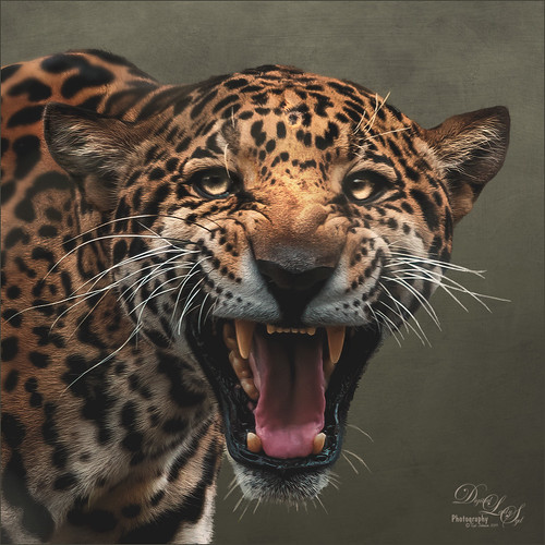
This unhappy Jaguar was stomping around his terrain at the Jacksonville Zoo when I creeped up on him to get his image – he was not at all happy about it – I guess he thought I was the paparazzi. Such a beautiful cat with such a humongous roar! Anyway I got his photo in spite of his attitude and luckily he was behind a fence. Used the technique from my How to Get Rid of Those Darn Fences in Zoo Shots blog. In Lightroom I just used settings that worked, then into PS and the Topaz (see sidebar for website link) AI Clear to sharpen it up a bit more (settings: Remove Noise – Auto and Enhance Sharpness Low – Exposure -0.12 and Clarity 0.19). Actually used the Shadows and Highlights Command to pop the eyes a bit (see my The Eyes Have It – How to Make them Pop in an Image blog). Then used some Darken and Lighten Curves Adjustments Layers. The texture was an old free basic one from Jai Johnson called coffee wall, and then a Hue/Saturation Adjustment Layer was used to fine tune the background color. That meant I needed to select the Jaguar to put him on the nicer background and it took a while – those whiskers were a problem and eventually they had to be painted back in by hand. A Color Lookup Adjustment Layer was added using the Candlelight preset set to 56% layer opacity. Now just some clean up was done. This guy took several hours to really catch his personality. Wow what a cat!!!…..Digital Lady Syd
My Bird Buddies
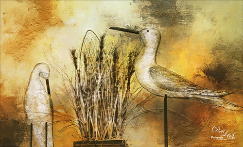
Had some fun with a shot of my birds that sit on top of my kitchen cabinets. Apparently one of the guys is a little shy. (How did that happen?) This image started off Lightroom with an old preset of mine called Kuboto Warm & Tasty B&W – it gave a little bit of brown and gray tones to the image. In Photoshop Topaz (see sidebar for website link) Studio’s AI Clear Adjustment was applied. I do this on every image now. Next an AI ReMix Adjustment was added using a preset I had created called SJ Illustrated Effect (uses Ink Blog style set to Medium, Brightness -0.24, Contrast 0.57, Sat 0.75, Smooth Edge 0.21, Sharpness 0.50). Then the Radiance Adjustment was set to Light, Strength 0.50, Width 0.73, Length -0.17, and Sat 0.44 – the mask was inverted so only the thick leaves and stems were affected by this adjustment. Back in PS a Jai Johnson texture called Explorations (7) was applied and set to Hard Light blend mode. This added the beautiful golden colors. Then a second texture called Texture 01 1920 X 1080 by Frostbo at Deviant Art set to Linear Burn at 52% opacity was applied. On a New Layer Kyle Webster Impasto Kit for Photoshop (not sure it is still available) from a long time ago was set to a Subtle Touch, and a second New Layer set to Medium was added. Both were set to 0 Fill Layer – a splatter brush was used to add in the texture. This is the same effect shown in my Fun Photoshop blog called How to Create an Impasto Texture Layer Style. Last step was to add a Color Lookup table using my SJ Sharply Dark LUT (created in my Fun Photoshop blog and video called How to Create Profiles in ACR from LR Presets and Some PS LUT Files). This impasto look can really add character to an image!…..Digital Lady Syd
Mockupped Sailboats
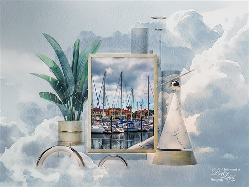
I have never used a Mockup File before to show off my images, but this one sort of seemed to fit this image since there is a strong triangle effect. First a free Abstract Mockup file by Best Pixels was opened up in Photoshop. The top layer is a Smart Object layer which must be opened by double-clicking on the thumbnail icon and then your own image can be placed in and aligned with a Free Transform (CTRL+T) if needed to fit the frame opening – must Save this image when warning comes up (the file does not appear anywhere in your folders but you still have to save to add in your image). This is where my Sailboat image from Camachee Cove was added into the image. On top of the bottom layer a Solid Color Fill Adjustment Layer was added using a light blue sky color. Next one of several free beautiful Watercolor Clouds Textures by Presets Galore was placed under the Smart Object ans set to 45% layer opacity. In a layer mask, the picture frame areas and few other places were masked out with a black brush. On top a Curves Adjustment Layer was added. Nik Viveza 2 was added on top where a little warmth was added into parts of the mockup. That was it. I love the dreamy feel this created…..Digital Lady Syd
Fishing the Osprey Way
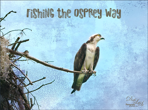
Here’s an image of a beautiful Osprey checking out the swampy area he apparently lives above. I don’t know how he balances on that tiny branch, but you can see how big his talons are so that explains it. Initially I did not think the image was sharp enough to use this cropped in. After adding Topaz (see sidebar for website link) Studio’s AI Clear adjustment and following Unmesh Dinda’s video called The Hidden 3D “Contrast” in Photoshop, the bird just sort of popped. Used a rather washed out texture I created behind him and added a Hue/Saturation Adjustment Layer on top for the blue tones. Then added a Curves Adjustment Layer to brighten the image back up. The free font is called Old Originals……Digital Lady Syd
Pretty as a Postcard
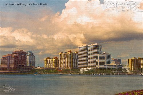
This is the Intracoastal Waterway (ICW) in Palm Beach, Florida. The skies were rather spectacular this day. Lucis Pro (now available for purchase again – see my Lucis Pro is Back!!!!! blog) was used on this image first. Then Photoshop’s Motion Blur Filter was opened and set to a Distance of 2000 pixels – once applied the far right icon on the layer was clicked and set to 63% opacity. A Selective Color Adjustment layer was applied to adjust the colors. On a stamped layer, Topaz Lens Effects (see sidebar for website link) Motion Blur was opened and 12.68 pixels was applied. Back in PS only the water was allowed to be visible in the layer mask so water looks smooth. The font Gabriola was used next. French Kiss (see sidebar for website link) Tableau Chateau was used to add texture to the image – this was done by clipping a Hue/Saturation Adjustment Layer to the image and setting the Saturation to -100. The texture was set to Hard Light at 15% layer opacity. Finally a Levels Adjustment Layer was also clipped to the texture to get the nice vintage postcard look. Nik Viveza 2 was added to add some emphasis to the buildings and a stamp from 2 Little Owls (see sidebar for website link) was added to further enhance the old look. I was love Palm Beach! …..Digital Lady Syd
Beautiful Blue Door
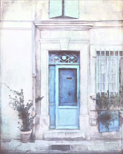
Just felt like doing a digital painting. This image was created using an image on Unsplash by Luca Bravo in Arles, France (unable to find link as it was downloaded 10 months ago). The original image is in beige tones and the door is more turquoise. Several of my Faye Sirkis mixer brushes along with some erodible mixer brushes from Photoshop were used for painting. Used different layers to create underpainting, more detailed layer, and fine details. The colors were changed using Topaz (see sidebar for website link) ReStyle’s Dull Cornflower preset. Five textures were layered : 3 from 2 Lil Owls Studio (see sidebar for website link) and 2 of mine using different blend modes and layer masks to fine tune the effects. A Curves Adjustment Layer was placed on top. That was it! It is so relaxing to paint!…..Digital Lady Syd
King Bladud’s Pig
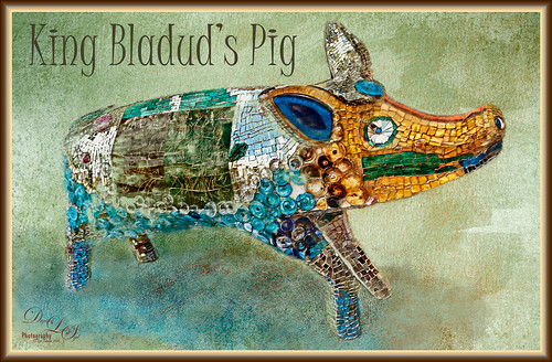
This little pig has an interesting story since the image was taken way back in 2008 when the Town of Bath in England was having a public art event to celebrate Bath’s origins and artists. King Bladud’s (cc863 BC) Pig (this is the pigs actual name and was created by Annette Martin) is one of 106 pigs that were on display all over the city (I only saw a few) and they were sold at auction to raise money for the benefit of Bath’s Two Tunnels Project.
The post-processing was minimal in Lightroom, just some Basic slider adjustments. In Photoshop, On1 Photo Raw Effects 2018 was used to sharpen the image (Dynamic Contrast filter, Sharpening filter and HDR Look filter – all just applied to the pig only with a mask). Lucis Pro filter was also used on further sharpen the pig. Next a texture by French Kiss (see sidebar for website link) called Color Wash Sage was added and a layer mask was used to paint the pig through the texture with a black brush. A New Layer was added and a shadow was painted in under the pig with a darker blue tone. Another texture by French Kiss called Redstrake was added and set to Color Burn blend mode at 65% Fill Opacity. Nik Viveza 2 was added to add a little vignetting. A text layer was added using a font called Juice ITC. Last step added one of my layer style frames (see my How to Create a Quick Layer Style Border or Frame blog). Wish I had taken more pics of these beautiful pigs!…..Digital Lady Syd
Beautiful Hibiscus
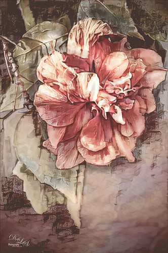
Had fun with this image. This is one of my peach hibiscus that I turned into a beautiful coral color. Used On1 (see sidebar for website link) Photo Raw 2018 Effects Dynamic Contrast on parts of the image by using the filter’s mask, and Sharpening filter. In Photoshop painted on the layer to fill in areas that were blown out. Added a Texture from Melissa Gallo Paints called Garden Canvas (from her Painting with Photoshop Workshop – excellent course and comes with some great brushes) at 26% layer opacity. Duplicated it and set Blend If Underlying Layer white tab split to 30/60. Three colored spotlight effects were painted on the petals. On a stamped layer, Topaz (see sidebar for website link) Studio was opened and the AI ReMix adjustment applied twice and Dehaze adjustment once. The image had a really bright red and orange effect color. Nik Viveza was opened to add some focus. Then applied my SJ Nastalgia profile (from a preset) in Camera Raw Filter. (See my How to Create Profiles in ACR from LR Presets and some PS LUT Files blog for info on this.) Now the colors are this pretty pink color. A couple layer of painting and burning and that was it. …..Digital Lady Syd
Posing for my Portrait
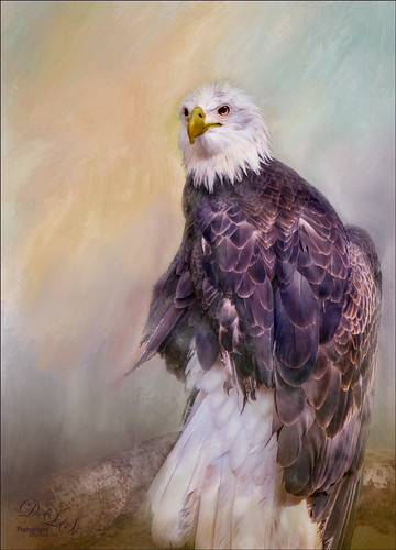
I love this shot of the Bald Eagle – he looks like a king posing for his portrait. I have no idea how he got his feathers this way – I took the image at the Jacksonville Zoo and he was sitting on an old tree stump I think. It is interesting to see his white feather plume. In Lightroom the Adobe Vivid profile was used. Then in Photoshop this guy was separated from the background using Topaz (see sidebar for website link) ReMask 5 as I could not get PS’s Select and Mask to give a good result. I usually can get a better result with ReMask if the selection is complicated. I used two of my own textures behind the eagle but could not quite get the look I wanted. So I took the Eagle layer into Corel Painter and created this soft version for a background. Back in PS the the other two textures were blended in. Used a couple Exposure Adjustment Layers for the eyes and the beak. Curves Adjustment Layers were clipped to each Exposure Adjustment Layer to get the right color in the eyes and beak. Several layers were created for painting out the edges a little with different mixer brushes. On a stamped layer Nik Viveza 2 was used to set the focus on the Eagle’s head and to clarify the feather detail. A Black and White Adjustment Layer set to Luminosity blend mode was used to further adjust the overall color. This is not really a painted image, but it has a painterly feel to it. …..Digital Lady Syd
Darling Dahlia
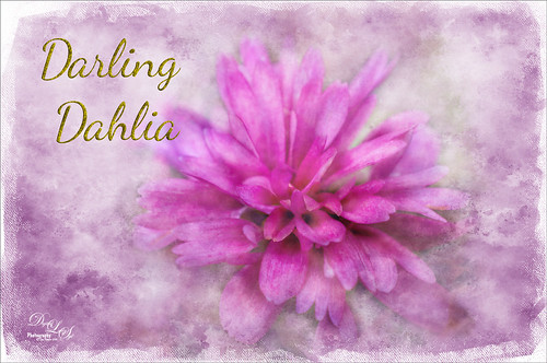
Image of a little dahlia that just poked up its head in my winter spring bed a month ago. It was only about 2 inches wide but just lovely! First sharpened the image using Photoshop’s Shake Reduction filter. Then sharpened again by duplicating the layer, setting it to Hard Mix blend mode, adding a Gaussian Blur set to Radius 3, and setting the Layer Fill slider to 5%. Next took Belle Fleur called Rose Garden texture into Alien Skin’s Snap Art 4 and set it to Watercolor Abstract preset (Brush Size 81, Photorealism 58, Coverage 57, Stroke Length 62, Color Variation 43, and Default Brush Style. It was set to Soft Light blend mode. Added another texture, one of mine named SJ The Phyllis Sky (created with Grut’s Charcoal Shin Ding Brush – painted a texture background in three colors – blue, turquoise and brown – gave a lovely texture and cloud feel that was saved to use again). A Hue/Saturation Adjustment layer was clipped to the texture so it became purplish in color (Hue 292, Saturation 19, and Lightness -8). A layer mask was added to paint out a lot of the flower to bring through the warm color of the flower from the texture underneath. On a layer above some painting clean up was done on some of the petals. Added a New Layer filled it with 50% gray using the Edit -> Fill. Set it to Soft Light blend mode and used a black and white brush to paint back areas for lightening or darkening the image. Added a Curves Adjustment Layer to add back some contrast – painted in the layer mask to lighten the effect in the center of the flower. Added a Text Layer using the Dancing Script OT font – in layer style turned on the Bevel & Emboss default settings and a Stroke effect using the Structure Size of 18, and Fill Type Pattern – Graphic 09 at 47% Scale. A Canvas Vignette was added on top to give a painterly look. This flower was so pretty…..Digital Lady Syd
Blowing a Kiss
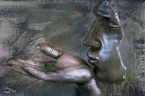
On my Fun Photoshop blog (see my Using a 50 mm Lens as a Macro Lens – Really? blog) recently I had two image taken as macro’s on the face of the above sculptor. Thought I would do another macro image, this time using my regular lens and not a flipped 50 mm lens, and get a little creative with the RAW file. This image was just basically post-processed in Lightroom using mainly the Basic Panel. Then in Photoshop Melissa Gallo’s Taupe Canvas (no longer available) was placed on the bottom, then a black layer mask was placed on the LR image on top. Just painted back in what I wanted to see using a couple different brushes at different brush opacities. Created a Darken Layer to outlines the focal point lines and a New Layer for a white Spotlight Effect on the face and hand. A Black and White Adjustment Layer set to Luminosity blend mode to adjust the colors. Then Blake Rudis’s action called 5 Tone Heat Map was used to add some more subtle color to the image – set to 88% layer opacity. I sort of like the feel of the image…..Digital Lady Syd
Smokestacks in New York City

The above image is from the Library of Congress and is an image taken of the Business District in Manhattan, New York City, cc1900. Shorpy.com showed it as a blog image and has posted some really interesting info about what buildings were in this original image. What intrigued me is the smoke from all the smokestacks and all the American Flags (I counted at least 160), most flying on top of the buildings. A lot of clean up was done first and the image had to be converted to RBG from Grayscale and reasonable size needed to be set. On a cleaned up stamped image (CTRL+ALT+SHIFT+E), Topaz Studio was opened and one of my uploaded Community presets (SJ Building Sharp) was applied. I did go through and tweak the four adjustments (Basic, Precision Contrast, Precision Detail, and Dehaze) in this preset, but it is pretty much the same settings. The last step in Topaz was to reduce the total effect in the sky – used a Mask Transparency of 0.33 with a brush and then added a Feather of 0.23 in the More Mask Options section. In Photoshop a Color Lookup FoggyNight preset added at 11% layer opacity and Linear Burn blend mode. Two textures from Flypaper were added: Alice set to Overlay blend mode and 100% layer opacity and Villa Adriana set to 36% layer opacity and Overlay blend mode. Last step was to open Nik Viveza 2 and add a little lightness on the buildings facing the sun and in the corners for a subtle vignette effect. Really fun picture to work with……..Digital Lady Syd


