St. Andrews Golf Shops & Hotels
Enjoying watching The British Open at the Old Course in St. Andrews for the next few days (yep, I am a golfer) and decided to find an image I had not post processed when I was there several years ago (I believe this is the 18th green). Had to do a bit of cloning on the sidewalk area – turned out better than using Content-Aware Fill. Still had a little Chromatic Aberration in this image even after using Lightroom to remove most of it. Therefore a duplicate image was created and a Gaussian Blue was set to Radius of 6.0 – then set layer to Color Blend Mode, added a black layer mask (press ALT+Layer Mask icon to create), and painted out the aberration colors. Worked like a charm! On a stamped layer, Topaz AI Sharpen Filter was set to Out of Focus with Auto settings to sharpen up the whole image. On another stamped layer, my favorite stand-by filter that is no longer available, Lucis Pro 6.0.9 was applied – love the effect! A Color Lookup Adjustment Layer was added and a free Sparkle Stock LUT set called Beautiful Day using Carnival 02 LUT. Last step involved adding New Layers for Darkening and Highlighting part of the image – used Sam Peterson’s technique to do this (see my blog A Few Photoshop and Lightroom Tips and Tricks – No. 2). That was it – wish I was there but I am enjoying the memories by working on this older image……Digital Lady Syd
Pink in Its Full Glory

This image of the beautiful pink Azaleas in bloom at the Ravine Gardens State Park in Palatka, Florida, was pretty difficult to post-process. It was taken around 9 AM in the morning, which was still enough sun to cause shadow problems on a sunny day. Listened to Matt Kloskowsky’s video called Channel Masks and Spring Color where he adjusted a similar type image. It really helped cut down on the overall sharp shadow effect and brought in the colors nicely. I can also say I used several of my own tricks and tips from my recent blogs on Topaz (see sidebar for website link) Sharpen AI, dodging and burning, spotlight effects, and vignetting. This actually looks pretty close to what I was seeing. Amazing!…..Digital Lady Syd
A Flamingo’s Private Park
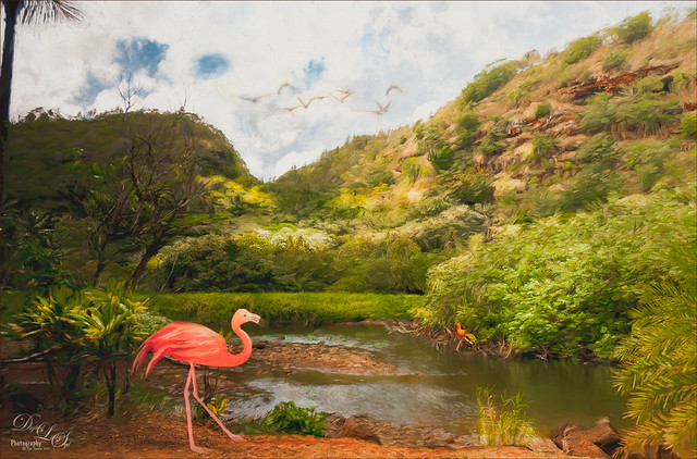
This image was created because I watched a couple really interesting videos and thought I would try them out. The original image was pretty nice, every image taken in Hawaii is usually pretty good, but it was boring. This is actually an image from Waimea Valley on Oahu. One technique I did try out was Dinda Unmesh’s technique for adding a Saturation layer mask to a Hue/Saturation adjustment layer. The video was called Saturation Mask? A Great Way to Enhance Colors. (This is very similar to my blog and video called Using Adobe Photoshop’s HSB/HSL Filter as a Saturation Mask). The Flamingo is one from PixelSquid – a polygonal looking bird that had to be painted to smooth him out. The Flying Birds are also from PixelSquid. The other bird near the water is free stock image. A shadow was created for the Flamingo using another new technique by Jesus Ramirez called How to Make Realistic Shadows in Photoshop – it used a 3D technique that was quite easy to do. Then his Color Matching in Photoshop Fast and Easy Method video was followed – this is major easy and works great using the Curves Adjustment Layer settings. Amazing! It blended all the objects into one image. Otherwise just followed my workflow to finish up and added a white painterly looking texture I created a while back. It was a lot of fun to try out some new techniques……Digital Lady Syd
A Somber Effect for a Somber Image
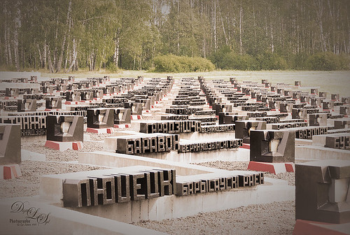
I thought this post-processing technique suited the somber image taken a few years ago portraying the Khatyn Memorial Complex in Belarus – a reminder of the devastation caused by the Nazi of the 5,295 settlements destroyed during WW2. The names in stone represent the settlements that were devastated. One of the most moving places I have ever seen.
This is a cinematic effect applied following Colin Smith’s technique in his Photoshop Secrets: Photographic Effects videos that are for CS5, but work fine in newer versions of PS. This effect looks good on architectural photos and landscapes. Mainly uses 3 adjustment layers and a gray layer that adds grain. Really liked this treatment for serious places…..Digital Lady Syd
Flower Power!
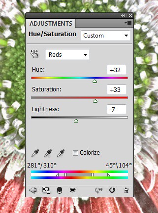
This image was created from a single white daisy shot taken in my front yard. The flower was cut out of this image by selecting the flower using a layer mask and then applying the layer mask. The flower color was changed using a Hue/Saturation Adjustment Layer clipped to the flower layer (CTRL+ALT between the layers to clip). French Kiss Bohemian texture was placed underneath the flower and the color changed to the violet colors. Distressed Textures HR Strawberry Juice On My Finger was added on top and set to 52% opacity. Only the center of the flower was painted out using a layer mask. The flower was duplicated two more times and Free Transformed (CTRL+T) and rotated – different colors were chosen for the other flowers using Hue/Saturation Adjustment Layers clipped to the flowers. Kim Klassen‘s Unleashed texture was added as an overlay (see my How to Create an Overlay Out of a Texture blog.) A Hue/Saturation Adjustment Layer was clipped to the texture and set to a violet color. Some text was added using Rough Typewriter font. A New Layer was added on top and a grunge brush I had created a long time ago was added in pinks and violets and set to 66% layer opacity. A Curves Adjustment Layer was added as a last step. I just love to play with textures and make textures…..Digital Lady Syd
Digital Lady Syd Related Blogs:
Texture Resources – So Many Choices! So Many Choices!
Painterly Textures to Create a Beautiful Floral Image
What a Cute Little Alligator!
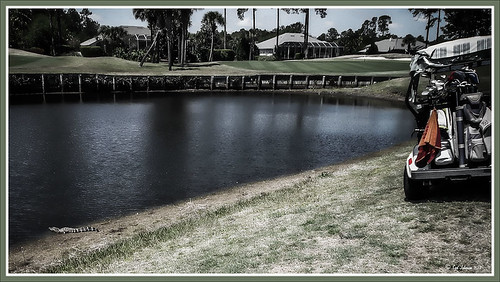
Thought I would post my wonderful recent golf experience – we were almost done playing – hole 18 – and then I shot the ball in the water. (That’s how good I am!) Almost clobbered this little sunning alligator, but he did not even move when we pulled the ball out of the water. First alligator I have seen this year, and I would not have gotten the shot if I did not have my cheap Kodak point-and-shoot camera. The image was processed very simply. First I used a Lightroom preset created a while back from a video called True Grit by Michael Rather. (Since I keep referencing it, here are the settings from the short video: Basic Panel – Contrast +100, Highlights -80, Shadows +100, Whites and Blacks sliders to taste, Clarity +100, Vibrance -82, and Saturation -7; and Lens Correction Panel – in Manual tab set Lens Vignetting Amount to -76 and the Midpoint to +19. Use these settings as a starting point and adjust them to taste. My preset actually is set to Clarity of +67 and Vibrance of -82 and were used in the image above.) Next my favorite sharpening plug-in, Topaz (see sidebar for website link) Detail 3, was applied using the Soft and Dreamy II preset. In the Effect Mask section, the effect was removed from the alligator using the brush strength set to 1.00 and partially on the golf clubs and cart canvas top using a o.21 brush strength. The Overall Opacity was set to 0.87. Back in Photoshop a Levels Adjustment Layer was added setting the middle tab to 0.86. Next a Darken/Lighten layer was created (see my Best Dodging and Burning Technique! blog for info on how to do this). The last step involved adding my free SJ B&W Border Frame Layer Style – changed the black color to a sampled green color from the image. It was great to get outside after a pretty cold and ugly winter/early spring and it was fun to see this little guy, even though he was a little scary. …..Digital Lady Syd
Digital Lady Syd Related Blogs:
Trying Out Some New Techniques!
Vintage Toy Processing
I Didn’t Know That! Adobe Photoshop CS6 Help and Tutorials Download
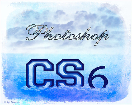
If you are like me, I have been frustrated recently with all the software that does not come with a manual. Usually you can find the manual on line and that is OK, but I am a person that likes to have the “book” in my hands. I was lucky enough to find the newest info from Adobe and if you would like to download it like I did, here is the PDF link to the 765 page PDF file called the Adobe Photoshop Help and Tutorials. I have also included the website link for Help documents for Creative Suite CS5, CS5.1, CS5.5, and CS6 applications (PDF and HTML) for all their associated programs. I am hoping this will help when I have a problem in Photoshop. There is also a link to a 66 page reference file on Photoshop CS6 Adobe Bridge, Mini Bridge and Camera Raw specifically. So far I have not found one for Lightroom, but I am still looking. Hope you get some use from it also……Digital Lady Syd
Here is a quick explanation of how I created this image: Created New Document and then added a Color Fill Adjustment Layer and used the a sampled light blue color from the Photoshop logo. Created the Photoshop text using Comsi Script 40 that I have had for ages and added a layer style I created following a tutorial called Elegant Glass-Gorgeous Text Effect. Next I used a different font called Freshman – added my Thin Double Edge Frame Layer Style and used dark blue and light blue for colors. Caleb Kimbrough from Lost & Taken’s Summer 4 texture was applied placing it above the Color Fill Adjustment Layer and setting the layer to Overlay at 100% opacity. On a New Layer above it, using my SJ Cloud 5 brush enlarged to fit, a darkish blue color was brushed once to look nice – the layer was then set to 39% opacity. The CS6 text layer was rasterized and then Free Transformed to make larger – a layer mask was applied and the center of the letters was lightly painted out to show the water inside. A New Layer was created and some white water looking waves were placed along the bottom edge of the type to make it look like it was floating. This layer was set to 56% opacity. The ShadowHouse Creations Mask Overlay MO8-2912-5 was placed on top and set to Overlay blend mode to frame the image.
Blue Flowers and Layer Style Frame
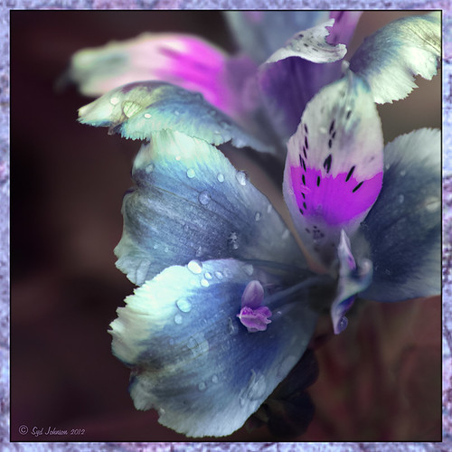
This image is actually of my pink and white Jazze Rose Frost Alestroemeria (see my blog Magnificent Macros with Nik Plug-Ins) but the colors were changed to purple and blue. I first tried this in a blog called Purple Lily Pads! using a slightly different technique with similar results. Just couldn’t resist posting again how easy it was to do this. First I applied the Topaz (see website link in sidebar) Simplify filter to get the soft petal look. I used a Simplify Size of .85 and Feature Boost of .78 to get a really painterly feel. In Nik’s Viveza (my favorite overall plug-in), the color sliders were changed to get the blue and purple colors. Control Points were added to adjust the background and parts of the flowers to get good detailed structure. The frame was created by just making a Photoshop Layer Style. In the Stroke tab the Size was set to 54 pixels, Inside Position, and Fill Type Pattern – just select any pattern that fits your image colors. I am using a pattern from Victorian Dreams by Princess of Shadows – texture 10 at a Scale of 1000. In the Inner Shadow tab set the Size t0 70. It is very easy to make frames for your images this way since there are so many patterns available to use. Anyway, it was a lot of fun to do!…..Digital Lady Syd
I Didn’t Know That! Converting Lightroom Preset to Adobe Camera Raw Preset
 |
I occasionally come across a need to take a Lightroom preset and use it as a preset in Adobe Camera Raw. This is not as complicated as it seems. Below are the steps required to accomplish this task.
1. Apply the preset in Lightroom and make sure you know which panels and sliders you used. (If preset not already created, to save preset in Lightroom, on left side of Presets line, click (+) for “Create New Preset.” Name preset.)
2. Right click on image in Lightroom and select Edit in -> Open as Smart Object in Photoshop. The image is opened in Photoshop with the Smart Object icon on bottom right of thumbnail in Layers Panel.
3. Double click on thumbnail and it opens up into Adobe Camera Raw. Go to Presets panel (9th icon over on righthand side under the histogram) and the click folder icon at the bottom of the panel to open the New Preset dialog. Name and click the items you want included in the preset, then click OK. Your new preset shows up in the Presets panel.
You can now use your Lightroom preset anytime you want in Adobe Camera Raw also. I usually start my personal preset names off with an SJ so I know they are mine. It is easy to get presets from many different sources as time goes on so it helps to know which are yours.
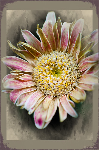
The image above is of a miniature mum in my yard. Hover over the image to see how the image looked with just a Lightroom preset I created called Dark Vignette – it makes the background very dark behind the flower. For information on how to create this preset and how the image was finished, see bottom of blog for details.
Hope this helped you get a little more organized…..Digital Lady Syd
To create this preset, changes were made to: the Tone Curve set to Highlights -24, Lights +41, Darks -56, and Shadows -54; HSL – Luminance sliders set to Red -41, Orange -9, Purple -2, Magenta -50 and all others 0, and Saturation sliders set to Red -2, Purple +32, Magenta +59 and all others set to 0; Effects Post-Crop Vignetting Style set to Highlight Priority with Amount -61, Midpoint 33 Feather 0 and others set to 0. To finish, image was sharpened and OnOne PhotoFrames (see sidebar for website link) acid burn controlled 15 was added and reduced in size in the plug in, and then grunge 12 was added on top – in Photoshop petals were painted over frame edge using a layer mask on first acid burn frame.
Digital Lady Syd Related Blogs:
Colorful Blown Out Look Lightroom and Adobe Camera Raw Preset
Settings for Vivid Drawing Look ACR/Lightroom Preset and NIK Color Efex Pro 4 Pseudo HDR Recipe
Humorous Shots Are Sometimes the Best
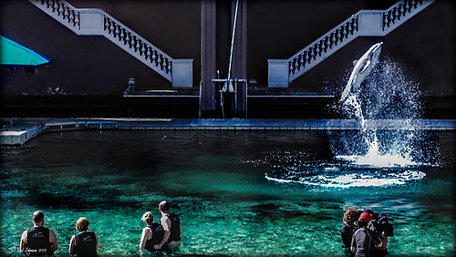
This image is one I found in my video I took while watching the dolphin program at the Dolphin Learning Center, one of the activities offered at the Hilton Waikoloa Village on the Big Island in Hawaii. When I processed this image, it seemed no one was paying any attention to the dolphin that is flying out of the water. Really struck me as a very funny shot! Anyway, thought I would share it.
The image was processed using two Virtual Copies of the image in Lightroom, one enhancing the water and dolphin and the other the people and pool. I selected the two Virtual Copies, right clicked and chose Edit In -> Open as Layers In Photoshop. This stacked the two Virtual Copies as layers in Photoshop. The one version layer created for the dolphin was masked out using a black layer mask. Then with a very low opacity white brush, the areas I liked from that version were painted back in on the black layer mask to give a little more contrast to the image. Really liked the result. This is a great way to pull detail out of a single image…..Digital Lady Syd
Using a Color Fill Adjustment Layer as a Spotlight

This image is of the Philippine Ground Orchid, a very dainty small pink flower. I am using this image as an example of how you can use a Color Fill Adjustment Layer as a subtle spotlight to direct the eye in the image but with a color vignette feel. I processed this image using Russell Brown’s Paper Texture Panel (I just love this panel and these textures – check out my blog Russell Brown’s Paper Texture Panel – A Real Winner! to download and use for free). Flypaper’s Apple Blush Texture was set to Hard Light Blend Mode at 71% Opacity and gave the image a very greenish look but with that great canvas texture. The Muscatel Texture was added next and set to Overlay Blend Mode at 29% Opacity to slightly darken the image and add some orange tones. Since I felt like the green was still a little overwhelming, a Color Fill Adjustment Layer was added – a royal blue color was selected and set to 54% Opacity. In the Color Fill Adjustment Layer’s white Layer Mask, a very soft large brush was set to 15% opacity and with black set as the color, the blue color was gently painted out to give the subtle spotlight effect from the light green tones underneath that will direct the eye. This is a great little trick if you need to draw the eye into a certain part of an image and works very well with flower images. I also like adding my own colors into an image. Have fun experimenting…..Digital Lady Syd
Digital Lady Syd’s Related Blogs:
That Soft, Dreamy Look
Russell Brown Texture Panel Landscape Image
Adding a Texture for Flair!
Keeping Focus Where You Want It Using Focal Point 2 and Color Fill Adjustment Layer
Getting Rid of Those Blown Out Areas in Your Image
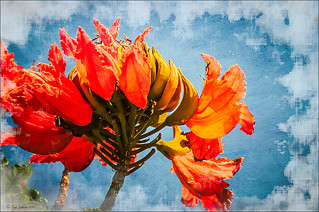 |
I thought I would give you a quick tip on how to get rid of those awful eye-drawing highlights on outdoor shots where you cannot control the light. Above are some beautiful African Tulip Tree flowers that I shot during the brightest time of day in Hawaii. It was so windy I felt lucky to get a fairly sharp shot much less control the light. Therefore, when the photo was opened up in Lightroom (or ACR), it became quickly apparent that there were several bright highlight areas that needed to be tamed. Hover over image to see original as brought into Photoshop. All my RAW adjustments were made before taking the image into Photoshop. (I used My Vivid Drawing Look preset which still works with Lightroom4 or ACR/Photoshop CS6 (note: change file extension to .xmp in zip folder to get file to work) – just be sure to adjust your new Highlights and Shadows sliders and the old Exposure slider-all other settings are the same.)
TIP: A New Layer was created right above the Background layer. Using a very soft round brush set to no more than 20% opacity, sample (ALT-Clicking the color right next to the blown out areas) and then gently paint over the white parts. Build up the color – if you overdo it, the layer opacity can be lowered or just add a Layer Mask to your painting layer and paint in white to remove or adjust the paint strokes.
Next Russell Brown’s Paper Texture Panel was opened and Flypaper Texture Dawn Grunge was added as a layer in Overlay Blend Mode at 100% opacity to give a very painterly feel to the image background. (See my Fun Photoshop Blog Russell Brown’s Paper Texture Panel – A Real Winner! for information on how to add this free panel to your program.) The turquoise and orange always makes a great combination for flower shots. Next a Curves Adjustment Layer was added to make the blue color pop in the background – by painting in the layer mask, the yellow fruit and green stalk color was brought back as it had become too dark. Finally OnOne PhotoFrame “napp frame 14” was added.
This is a great technique when you have a few distracting highlights and I find I use it a lot, but it won’t fix an overexposed image. Hope this helps you out a little…..Digital Lady Syd
I Didn’t Know That! Eyedropper Tool and Magic Wand Tied Together by Sample Size!
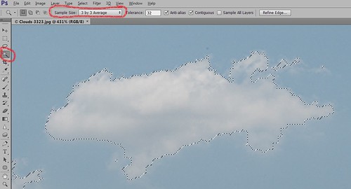
Adobe has come out with a Beta Version of Photoshop CS6 (Adobe download link) that is free to use for a couple months. While watching some of the videos on the new features, I came across an interesting comment by Deke McClelland, another Photoshop guru who does a lot of tutorials at Lynda.com and also does great Photoshop books. He has posted a series of short videos called Free Photoshop CS6 beta training at Lynda.com and in one called “Exploring the Wide World of Layer Enhancements,” he mentions that you can throw off how the Magic Wand Tool uses its Tolerance setting if the Eyedropper Tool is set to a very large Sample Size in its Options Bar – the two Tools are tied together! In previous versions of Photoshop, only in the Eyedropper Tool Options Bar could the Sample Size be set. If you had the Eyedropper Tool Sample Size field set incorrectly, the Magic Wand Tool would not function properly. I have always set mine to 3 pixels for more accurate color correction per Scott Kelby recommendations (head of NAPP and his Photoshop books are must-haves) – he says the larger sampling sizes are for “super-high-resolution” images. Now in the Magic Wand Tool’s Options Bar (see image above), it shows what the Sample Size setting is and now it can be changed without going back into the Eyedropper Tool options. Just remember if you change one tool, the other one automatically changes.
I do not know how important this is but it was a surprise these two tools had anything to do with each other! With higher resolution images now being shot with the new cameras, this might be a bigger issue. Thought I would pass this Tidbit along…..Digital Lady Syd
Soft-Look Flowers Using Textures
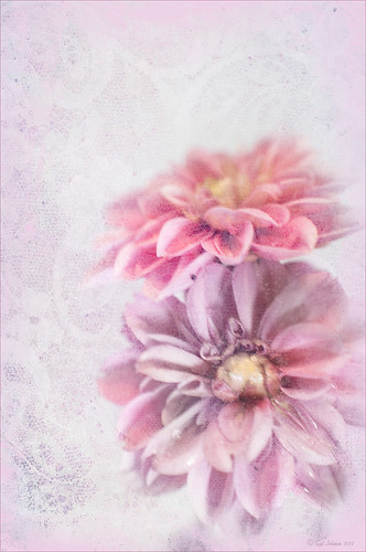
These beautiful dahlia flowers are now planted in a flower bed in my front yard. To get this effect, it was a pretty simple process. I sharpened the center and darkened the green stems first. Next ShadowHouse Creations Subtle Tones ST-8 texture was set to Color Blend Mode. With a layer mask I painted out the texture over the flowers very lightly using a soft 13% opacity brush and building up the effect until it looked the way I liked it. Next ShadowHouse Creations 3 Assorted Texture Set T 2 texture was set to Hard Light Blend Mode to add a very feminine look – also a layer mask was used to clear the lacy texture from on top of the flowers. A Hue/Saturation Adjustment Layer was added on top to select the correct texture color by adjusting the Hue slider. The last step added OnOnePhotoFrames toner scratch 21 (see sidebar for website) with a very light purple-pink color. That was it. I loved the final result. I hope you will try using some of the beautiful textures from ShadowHouse Creations website where there is a huge selection of textures that can be downloaded for free. Major thanks for what he does to help us budget-minded Photoshoppers!…..Digital Lady Syd
The flowers were photographed on a table with a science fair 3-sided white board behind them and natural light from a window – shot with a Nikkor 60 mm Macro Lens set to F/3.2, 1/15 sec at ISO 400 with an attached Bower 0.5 x High Resolution Digital Lens with Macro lens, which gives the large depth-of-field effect.
Keeping Focus Where You Want It Using Focal Point 2 and Color Fill Adjustment Layer
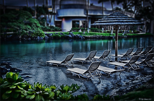 |
The above was shot in the early evening in the Lagoon Area at the Hilton Waikoloa Village – very near the Dolphin Learning Center. This is an HDR image processed in Nik’s HDR Efex Pro using three images. In my last blog OnOne’s Focal Point 2 (see sidebar for OnOne’s website link) was shown on a beautiful flower shot (see “Let’s Focus on OnOne’s Focus Point 2 – Nice Little Plug-in!“).
This time I wanted to show how pretty it works on a landscape. The Focus Bug was used to keep the lounge chairs in focus and the Focus Brush was used to keep the thatched umbrella in focus. Also a very nice dark vignette was added from inside the plug-in.
Here is a little tip on how to keep your highlights under control. In this case to keep the water highlights from becoming too dominant in the evening image, a Color Fill Adjustment Layer in any color was added, the layer masked filled with black (click on layer mask thumbnail and press backspace to fill with black), and then by double clicking on the adjustment layer color swatch, a dark blue color from the image water area was sampled so the fill color matches it. In the black layer mask, paint back with a very soft low opacity brush (between 10 and 30%) the areas you want darkened, in this case mainly the water areas around the lounge chairs – this is just a very subtle adjustment.
The last step involved adding a Curves Adjustment Layer to give a little darker feel to the image. That was it. To see the tonemapped image before the plug-in and color fill layers were added, hover over the image.
Give Focal Point 2 a try if you get chance (if you buy fine art photographer Vincent Versace’s book, “Welcome to Oz 2.0: A Cinematic Approach to Digital Still Photography with Photoshop,” the Focal Point 2 plug-in is a free download from the book which has good reviews. Also try using a Color Fill Adjustment Layer to reduce out-of-control highlights. It is a very simple technique that works very effectively!….Digital Lady Syd
I Didn’t Know That! Export Layers to Files in Photoshop
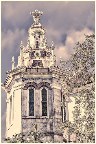 |
Every now and then I run into a situation where I want to take one of the layers I am working on in Photoshop and save it down as a separate file. Now it is possible to delete all the files and rename the file, etc., etc., etc. but this can take a while to do and it could cause you to lose the file you are working on if you get careless. This week I wanted one of the sky images I had imported into my image a while back to use again and to put in my Sky folder since I like it. (Hover over image to see sky image created from layer in psd file.) I found out there is a little known script sitting in Photoshop that will accomplish just what I wanted to do in just seconds.
Steps to Export Layer(s) to Files in Photoshop:
1. In your image, turn off all layers you do not want to create images of by clicking on the eyeballs on the left of the each layer in the Layers Panel. (To do this quickly, you can highlight the layer you want to export to a file and ALT+Click on the eyeball – all the other layers are turned off immediately.)
2. Go to File -> Scripts -> Export Layers to Files.
3. The Export Layers to Files dialog appears. Fill out as shown. Be sure to capture all the check boxes or you will get image files for each layer in your file.
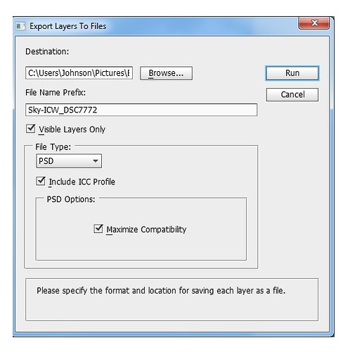
4. Click Run and that’s it – really quick and easy!
The image is of the Flagler Presbyterian Church in St. Augustine, Florida, where Henry Flagler and his family are buried. Topaz Adjust 5 and Topaz Black and White Effects were used on this image (see sidebar for website link). The sky is the one I moved in from an image I took on the International Coastal Waterway near St. Augustine while sailing.
Give this script a try next time you want to break apart an image…..Digital Lady Syd
Photoshop CS5 and Elements: Hand-Tinting the Easy Way
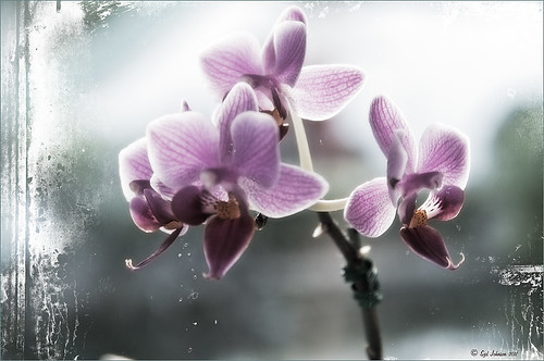 |
The above purple orchard was on the table at the Ming Court Restaurant in Orlando, Florida (one of our favorite restaurant in Orlando). I was not really happy with the original image (hover over image to see) – the flowers came out a little soft to my liking. I was pleased to see this hand-painting technique saved a beautiful flower image and gave it a soft painterly feel.
The steps to create this look are easy and could probably be put in an action. The process was taken from an article in Mastering Digital Photo Processing Magazine from the Fall 2008 issue. Here are the basic steps to creating this image:
1. Do any exposure adjusting in Lightroom or Adobe Camera Raw.
2. In Photoshop, create two copies of the original layer and turn off the top layer.
3. On middle layer convert image to black and white – I used the Black and White Adjustment Layer to get a nice conversion. There are so many ways to do this – choose your favorite. For Elements users, go to Enhance -> Convert to Black and White and select one of the canned styles as a starting point – then adjust the sliders, especially the contrast slider.
4. Turn on the top layer and add a Gaussian Blur filter with a Radius set to 18. Change blend mode to Overlay (or try others if you do not like the effect) and lower the opacity to get the pleasing hand-painted look. The opacity for the above was 61%.
Optional Step – Can add a Photo Filter Adjustment Layer. Choose a color using the Color swatch and adjust the Density slider. The magazine suggested this can “increase the sense of oils being applied over a black-and-white print.” I did not do this here, but it did give an interesting look with the default Warming Filter (85) color.
5. At this point a New Layer was created and the Sharpen Tool was used to show definition more clearly between the flower petals.
6. A Curves Adjustment Layer was added for contrast. Elements users add Levels Adjustment Layer.
7. To add a border or layer style, create a Composite Layer on top (CTRL+ALT+SHIFT+E). OnOne’s PhotoFrame Taufer_Texture_10 was added to give the frosted window effect – one of my favorite looks. (See sidebar for OnOne’s website link.)
That’s it! A pretty easy workflow and it gives a beautiful soft look. Hope you enjoy trying this short and sweet workflow – until next time…..Digital Lady Syd
Adding Copyright Information to Your Image
Well since it is that time of year when everything that has a date in it has to be updated, I am going to review with you how to put a copyright symbol and name on an image. This is pretty basic, but it is easy to forget how to do since you only have to do it once a year. This can be done in both Photoshop CS5/CS6 and Elements. And the time-savings by having it handy definitely makes it worth creating!
Simple steps:
1. Start a new document in Photoshop, set the foreground color to black, and Create a New Layer on top. For CS5/CS6 users, make sure the Image -> Mode is set to 8 bit.
2. It used to be that you could get a copyright symbol to appear with CTRL+ALT+C, but in CS5 on and Elements, the Canvas Size dialog box opens up so this does not work anymore. To find the copyright symbol, the work around is to select the Custom Shape Tool. For Photoshop users, in the Options bar set the tool to Fill Pixels (4th icon for over CS5 and 2nd icon over for CS6) and then select Shape from drop-down menu – highlight the copyright symbol from the default shape list in the drop-down menu (I like the one included in the Symbols set that can be loaded from the fly out menu in the Shape field). For Elements users, click the Shape drop-down menu, click the double arrow fly-out menu, and select Symbols – then select the copyright symbol. Drag out a Copyright symbol in black but do not make it too big. Hold SHIFT while doing this to keep the constrain and keep the symbol round.
3. Select the Text Tool and create a text layer with your signature in a font you use. Line it up with the Copyright Symbol and adjust text size to line up with the copyright symbol. I had to make my numbers smaller as they appear bigger than the letters when typed. The font I use is Freehand 575, a font I bought a while ago but there are many places to download free ones.
4. With the Rectangular Marquee Tool create a selection around both the symbol and the text. Make this a pretty tight rectangular – you do not need a lot of space around it.
5. Go to Edit -> Define Brush and name it – I called mine 2012 Copyright so that in Photoshop it will appear at the top of my Tool Picker Preset brush list in Step 8 and click OK. Deselect the Marquee Selection (CTRL+D).
6. Select the Brush Tool. In Photoshop the new brush will appear at the end of the Brush Presets Panel list. In Elements the brush will be at the end of the brush list in the brush drop-down menu (2nd arrow pointing down) at the top left Options Bar.
7. Now test out the brush and see what size you want as a default – I set mine at 367 which seems to work pretty well on 12 megapixel images.
8. The last step in crucial so that if you accidentally delete your brush or change the ones load, you can add it in easily.
Elements folks need to go to Edit -> Preset Manager and choose Save Set – then save the brush in the brushes preset file for the program (in Windows 7, go to (User Name) -> AppData -> Roaming -> Adobe -> Photoshop Elements -> 10.0 -> Presets -> Brushes) – I called mine SJ-Copyright Brush. Now anytime you need to add it to the brush group you are using, your Brush Preset Manager will go to this file so it can be reloaded.
Photoshop users, go up to the Tool Picker Preset, top left icon in the Options Bar, and open up the drop-down list. This contains the Preset List for the Brush Tool which means every time the Brush Tool is chosen, this group is available for quick access. Be sure the Current Tool Only box is checked or else a huge list shows up. Click on the bottom icon on the right side that says Create New Tool Preset. Keep the same name using a number first. This saves time by putting your brush at the top of the list since the Brush Tool Preset Picker has many Photoshop brushes in this list, and it is handy to keep the ones you use all time here also. Be sure to save this down as a set in the Preset Manager (2nd icon over at the bottom of the Brush Panel and then select Preset Type Tools – highlight the ones you created, drag to set up a different order if you want, and save. I usually make it a date like 010113 SJ – can back up all your created presets here) so that it is saved on your computer. If you load other people’s tools and lose yours, you can easily add them back in. See Step 8 in my Fun Photoshop How to Create Photoshop Brushes from Objects or Text blog for more info on how to do this.
That’s it! Now it is available every time you finish an image. Just add a New Layer on the top of your image, open the Tool Preset Picker for Photoshop or choose your brush in the brush drop-down list for Elements, select a nice color, and click once to paint in. The size of the brush can be changed – just CTRL+X to delete and change the size and click again. Sometimes it is helpful to adjust the opacity when the copyright becomes distracting in the image. Very handy…..Digital Lady Syd
More Holiday Card Fun!

Just a final card I thought I would share that was constructed completely in Elements with a little help from Topaz Adjust 5. I seem to be using the same holiday resources over and over – guess I have found the ones I like. This card started with three different layers of snowflakes – I created brushes from the custom shapes provided with the Shape Tool, but you can download them in lots of places (try these from Obsidian Dawn), and used layer styles and blend modes to get the various effects; the font is Fantaisie Artistique (my favorite) doubled up for each line of text and the bottom filled with black, then dragged out to form a sharp shadow edge; Snow Drops brush by Frostbo for small flake layer – adjust size to get different effects; Santa sleigh in Christmas Brushes by Fina with Outer Glow layer style; and finally Topaz Adjust 5 (see sidebar for link to website) using the Film Collection – Vintage Grunge III preset. This was very easy to create and pretty fast.
I hope you have Happy Holidays and enjoy!…..Digital Lady Syd
Christmas Card from Digital Lady Syd!

Thought I would post this card I did today which follows a really interesting tutorial called “Fun & Exciting Text Effect in Photoshop” where patterns were inserted onto each letter to create this interesting effect. The basic tutorial steps were OK but they forgot to mention that each letter has to be on an individual text layer so a different pattern Layer Style can be applied for each layer. This was a fun project and I like the way it turned out.
There were many resources in this card that I will mention in one lump group. Please check out their sites, these people generously give their expertise away for free so they deserve some recognition! Resources are as follows: Grunge brushes were from Websoulz Super Grunge set; yellow (#3) and green (#1) lines from Swirls by Rocked Out set-these apparently are no long available but try this set of Flowing Line Brushes by Thurgood; background snow brushes are Snow Drop brush by Frostbo and Snow White brush #36 from Supreme-neko; the font is 02 from a Cosmi font set I bought years ago and is not longer available as far as I can tell, but go to daFont.com and look for a larger fat font – there should be several available; the bottom font is my favorite Fantaisie Artistique; Patterns were from Grungy Dirty Patterns from Obsidian Dawn, Free Christmas Patterns, Christmas Patterns by Peter Plastic, Free Christmas Patterns by Succo Design, and Christmas Patterns by slave to fashion 69; Sleigh brush from Obsidian Dawn’s Holiday set; and Dave Cross _01 OnOne PhotoFrame (see sidebar for link to website).
Hope everyone has a wonderful holiday and try out this text effect – great effect for any occasion……Digital Lady Syd
Digital Lady Syd Related Blogs:
How to Add Images to Text
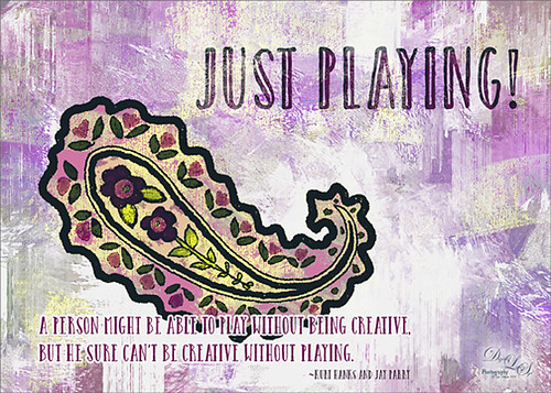
Playing in Photoshop
How to Create Photoshop Brushes from Objects or Text
Free Christmas Card Templates-Part 2
Digital Lady Syd’s Free Christmas Card Template Using Photoshop Elements
Digital Lady Syd’s Free Christmas Card Template
Free Christmas Card Vectors and Brushes
Some Holiday Cheer
Creating a Calendar in Adobe Lightroom

Since I have been presenting calendar techniques this past week, I thought I would pass along yet another way to create a calendar via the Lightroom and Photoshop guru, Matt Kloskowski, on his Killer Lightroom Tips Blog. See his blog “Creating Calendars in the Print Module.”
Basically the technique involves first downloading the calendars (Matt used some from iStockPhoto.com but I used this free download link from PrintRunner – scroll down to the Calendars section and select the first one). I used Photoshop to open the calendar files – go to File –> Open and select the month you want to insert from the downloaded Printrunner PDF file and click OK. NOTE: You must open the file from within Photoshop – I could not get the Bridge to open the PDF files to place into Photoshop.) Save to the Graphics folder as a jpg file.
Then go into Lightroom and highlight your Graphic’s folder or collection and enter the Print Module. In Page Set Up, select the size (Matt used 17″ X 22″ but my printer does not support this, so I used standard paper size 8 1/2″ X 11″.) Check the Lock Aspect Ratio in Cells section, and just drag your calendar month into your document along with an image for the top. Now you can Print to: Print or JPEG File (click Print to File to save down as a JPEG to E-mail out or post on-line). Very simple technique!
I personally like using my template (see links below) but this is definitely a nice alternative. Hope this gives you another great idea on creating your own personal calendars. Have a Happy New Year!…..Digital Lady Syd
Digital Lady Syd Related Blogs:
Free Calendar Template
Calendar Template for 2012
Create Calendar Photoshop Templates
Colorful Blown Out Look Lightroom and Adobe Camera Raw Preset


